A Sneak Peek at Atomix Magazine v2.0
I’ve long been interested in magzines on the iPad and how they can be adapted to make best use of the medium. I was therefore very excited when Atomix Magazine first launched in April last year as it was made exclusively for iPad and is focussed on videogames. At the time, most iPad magazines were using the Adobe publishing system which allows publishers to simply export their InDesign files to a custom iPad app. Whilst it works as a basic system for getting content to the iPad (which is better than no content), it is lacking when you consider that most magazines are at different physical sizes to the iPad. This means that unless publishers put the work in to rescale their content (and most don’t - I’m looking at you Future Publishing), then you end up needing to zoom in and pan around to read the content. Atomix was different in that the entire magazine was designed solely for the iPad and should have done away with these problems.
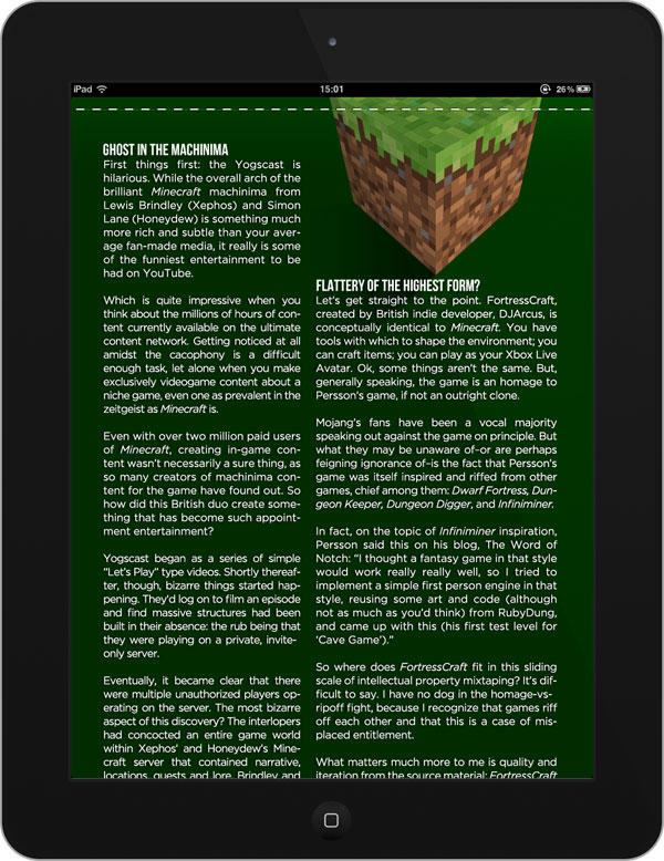
The content itself was absolutely fantastic but there were a number of issues I had with the app itself. In the first few issues they decided to go with a weird parralex background system which meant that the text scrolled differently to the background. You’d actually scroll – sometimes making the text unreadable – and then the background image would rubber band to where it should be. This was eventually sorted but then there were problem with fitting content onto a page (as shown in the image below). Whilst there were dividing lines which looked kind of like page breaks, the content would run to maybe 140% of the iPad height which meant you’d read one column, scroll to keep reading, then have to scroll back up to read the next column. These issues nearly made me give up on Atomix purely because reading it was so frustrating.

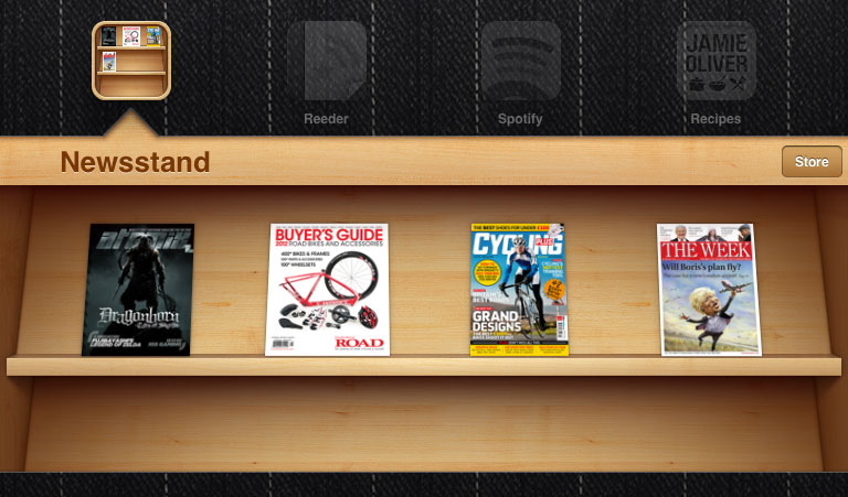
These layout problems were solved late last year (along with some problems relating to downloads) but by that point another bone of contention had cropped up; Newsstand. For those that don’t know, Newsstand was a system introduced with iOS 5 which basically made any magazine app able to show its latest issue as an app icon. This meant that you could see when a new issue was available and there were a number of useful additions such as the ability for new issues to download automatically in the background if you had a subscription. Atomix didn’t have Newsstand support when iOS 5 launched which I felt was unfortunate considering that iOS 5 had been in beta for nearly 3 months (plenty of time to integrate the new APIs for an app which is only available on iPad). Other readers obviously felt the same as the @AtomixMag twitter account was always bombarded with people looking for an update on Newsstand support.
Fortunately, this is now being implemented in version 2.0 of the app which will be available tomorrow. The Newsstand support extends not only to moving the app to the Newsstand folder, but also to implementing background downloads if you opt for a subscription. This is a great feature as issues can sometimes take a while to download (they’re around 300MB on average). Aside from Newsstand support, the app has been updated so that issues open a lot faster, has better graphics when you run or close an issue, and has a new download system meaning that any old issues you try to download will auto-resume if you close the app.

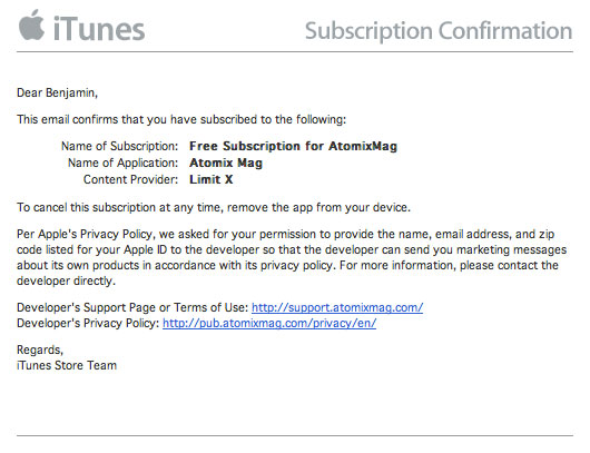
Aside from the new version of the app and a new issue of the magazine coming tomorrow, Atomix also promised a “big announcement” related to the publication. It turns out that this announcement relates to pricing in that Atomix Magazine will be free from now on! With Newsstand support, you are able to take out a free subscription that will work for future issues as well as allowing you to download previous issues free of charge. For this to work, you have to agree to pass on your personal information (a requisite for free subscriptions from Apple) but Atomix has said that they won’t actually store the information that is sent to them as they don’t need it.

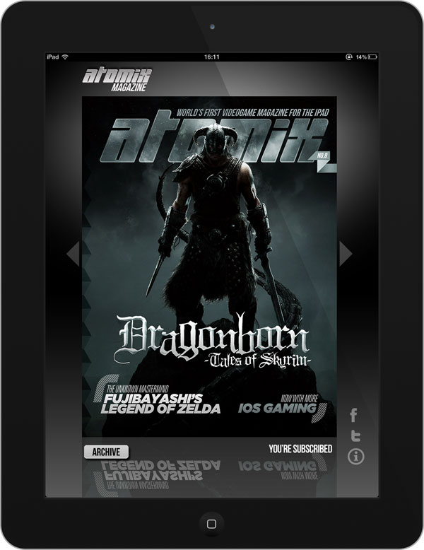
I’ve been reading the new issue of the magazine today and I have to say that the whole app does feel a lot snappier and easier to read. Proper paging has been implemented so that all of the content fits nicely into the space and the virtual layout works nicely. You scroll from left to right to go through the different stories but then these are paged vertically so you have to scroll down to read. Some articles have more content underneath so you scroll left to right to read it like a regular magazine but you are prevented from going to the next story unless you scroll to the top of the article. Overall I find it works very well and gives you a good overview of how pages are connected, something that is often a problem in tablet magazines. If I had one criticism, it’s that there is no indication of how far through the magazine you are and I’m hopeful this is something they will look to implement in future versions.
Whilst I was loathe to recommend it a few months ago, this update now makes Atomix a shining example of how iPad magazines should be. It doesn’t try to add too much interactivity but instead focusses on great content laid out in the best way possible with a few interactive elements that delight rather than annoy. If you are an app developer, I would urge you to download Atomix and compare it with a magazine such as Edge, a magazine that could have got it right but instead opted for the lazy InDesign route. The differences should be clear. With Apple promoting Newsstand in a big way, I would expect more magazine publishers to follow Atomix example and go down the bespoke app route.
If you’re a fan of video games, then you should definitely download this magazine. You won’t be disappointed.
