Show Me The Next
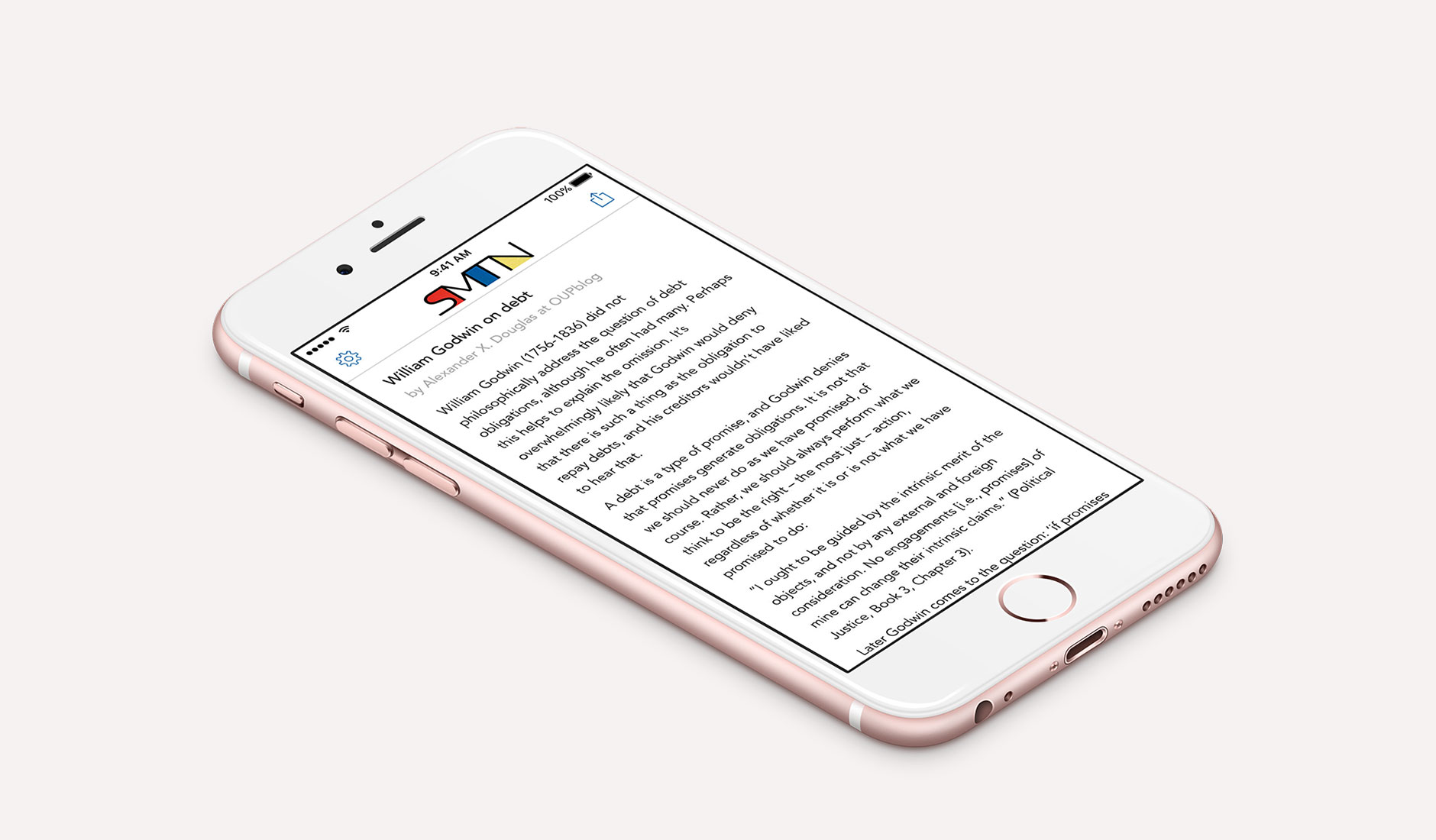
An iOS app I worked on for The Browser has gone live in the App Store today; Show Me The Next:

The concept is very simple; an app with curated articles that you read through at random with a simple swipe. No going back, no list no images, no videos, and no tracking; just fast offline access to interesting articles.
I made a quick mockup and then I added some extra features such as the ability to share articles, alter the font size, and change screen brightness1. I also built a simple CMS so that the articles embedded in the app could be updated remotely. The app is built using Swift 2.1, runs on all devices with iOS 9 or above, and is optimised for all the various shapes and sizes including iPad split screens.
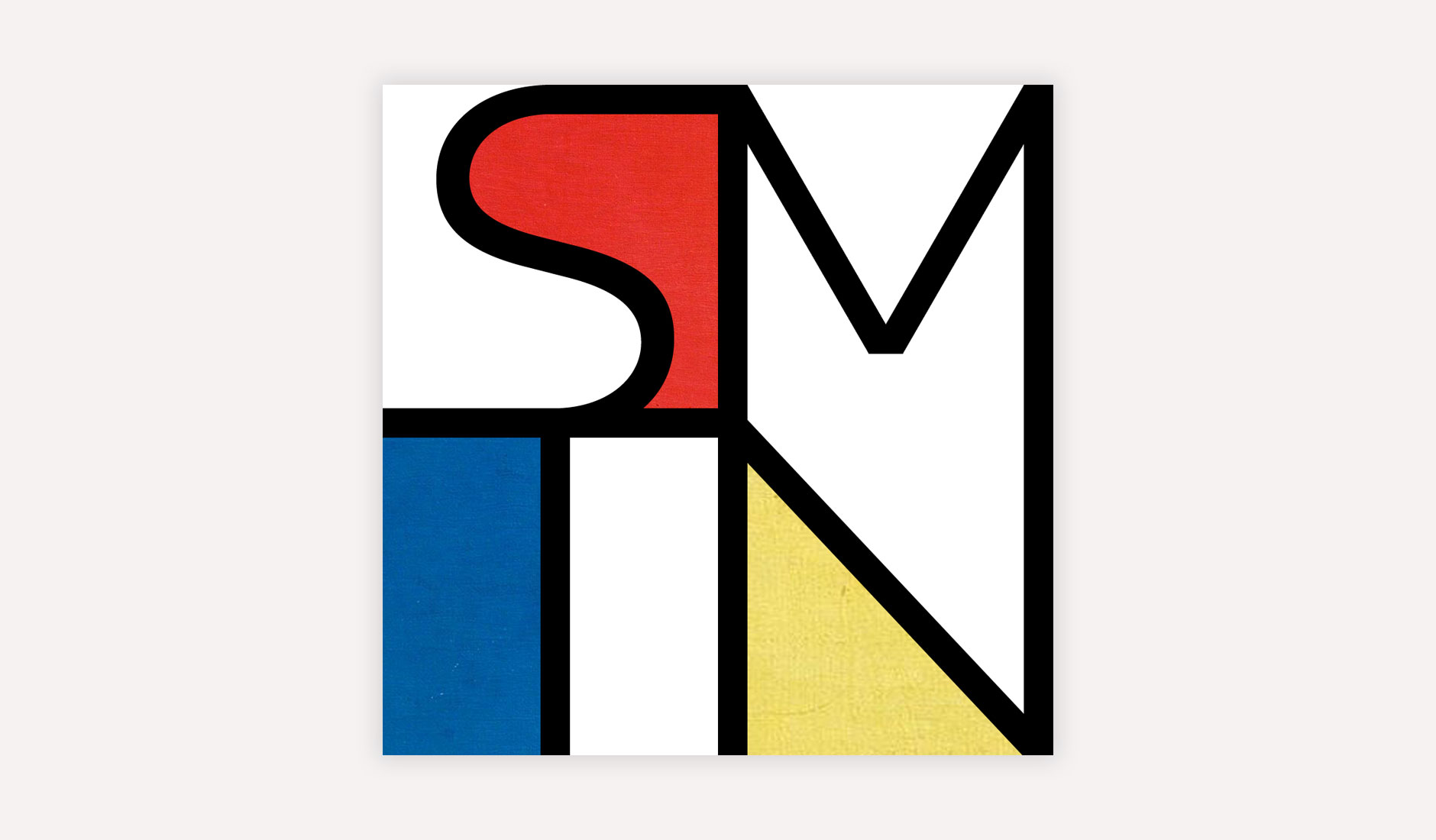
 As well as completely designing the app and the functionality, I was also asked to design the app icon and logo with a simple single sentence brief: “I admire the art of Mondrian“. I took inspiration from the work Composition II in Red, Blue, and Yellow and used the same colours and textures with lines to shape the letters SMTN. It was a fun design experiment and something a bit different for me!
Show Me The Next is a free app and is available on the App Store.
-
The client did not ask for these additions but I often like to add extra functionality free of charge when I feel it is of benefit to the app. ↩︎