Restoring the traditional icon-based tab bar on iPad with Liquid Glass
iPadOS 18 forced a UI change to tab bars that was arguably worse for users and added extra work for developers who had no choice but to support it. No longer would it render along the bottom of the screen with icons and text side-by-side, but instead would be more akin to a segmented control at the top of the screen with no icons at all. This change happened as soon as you recompiled with Xcode 15 and could not be opted out of.
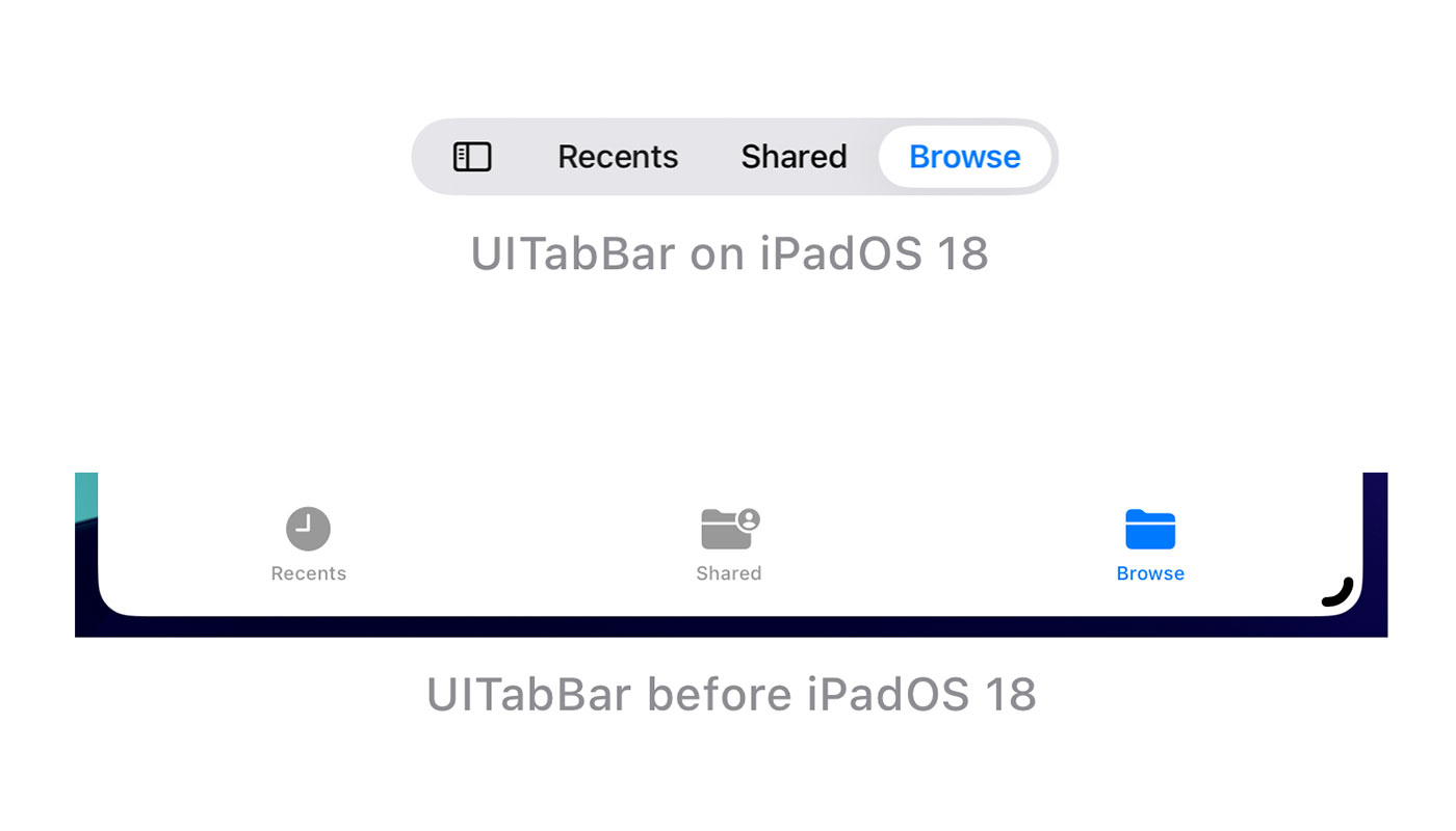
Apple’s goal with this redesign was to “provide more space for content and other functionality”. I’m not sure why the iPad with its massive screens would benefit from this more than the iPhone which did not get this change, but there are improvements when you consider the integrated search and the ability to animate from the segmented tab bar to a side bar navigation.
That said, I feel the overall change was negative as there were less visual affordances with the removal of icons1 and long text is frequently truncated (i.e. from localisations). There are further reductions in the user experience when you consider that the tab bar position changes from the bottom of the screen2 to the top of the screen as you switch between compact and regular size classes.
Fortunately, the design language of iOS 18 meant it was fairly easy for developers to create custom tab bars that looked like those on iOS 17.
Then, in the summer of 2025, Liquid Glass3 appeared…
Chromatic aberration! Real-time distortion! Bendy bubbles that react in real time to your swipes! These are all huge flexes for the Apple Silicon team but they suddenly make the idea of recreating the bottom iOS tab bar in iPadOS unrealistic as many of these design features are not available to developers.
The one “fix” I see regularly for this is to trick the tab bar into believing it is permanently running in compact mode (the size class that is used when you shrink iPad windows down to iPhone sizes):
// SwiftUI
TabView {
}
.environment(\.horizontalSizeClass, .compact)

// UIKit
tabBarController.traitOverrides.horizontalSizeClass = .compact
This works, to a point, but can lead to visual glitches in your navigation hierarchy. It also falls flat on iPadOS 26 as the tab bar is no longer full width but instead only as large as it needs to be; as the icon appears above the text in compact mode, this can lead to a very small tab bar on a 13” iPad Pro. This can be remedied by setting UIDesignRequiresCompatibility to YES in your Info.plist but this will disable Liquid Glass throughout your app and is only a stop-gap solution that is scheduled to be removed in iPadOS 274.
Fortunately there is another way. With just a single line of code, you can get the traditional tab bar back on iPadOS 18 and an updated Liquid Glass version of it on iPadOS 26:
UserDefaults.standard.register(defaults: ["UseFloatingTabBar": false])This works for both UIKit and SwiftUI apps, you just need to call it at the start of your application lifecycle.
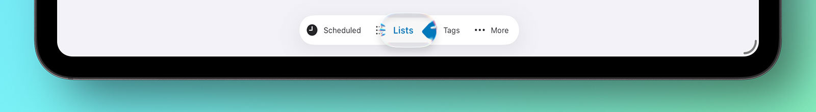
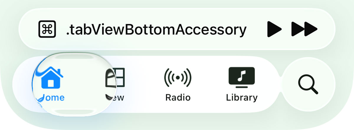
All of the iOS 26 additions are supported such as the new search API seamlessly splitting the tab bar in half and allowing the search text field to appear at the bottom of the screen. This extends to other modern tab bar features such as tabBarMinimizeBehavior and tabViewBottomAccessory. This is not a hacky solution, but something Apple engineers have clearly put a lot of consideration into.

There are two caveats to this approach:
-
This is an internal flag within the system similar to
defaults writeon macOS. That means it is officially unsupported and could be removed in a future version of iPadOS but the risks are manageable. I have used it in several production apps since the launch of iPadOS 18 in 2024 and have never had any issues with App Review. The fact that they redesigned this component for Liquid Glass makes me fairly confident it won’t be removed anytime soon. -
If your app is using UIKit storyboards and your initial view controller is a
UITabBarControllerthen simply registering the defaults in your App Delegate will not work because the storyboard will already be loaded. Instead, you’ll need to remove the automated way of having your storyboard load from Xcode and instead manually load it in the App Delegate by creating a UIWindow and assigning the initial view controller from your storyboard to it’srootViewControllerproperty.
If you do go down this route, just be prepared that a future iPadOS update may remove the setting5 so it is best to make sure your app would still function without it enabled.
I think this tab bar looks and works a lot better than the segmented control approach we currently have and I wish Apple would support it fully by providing an explicit opt-in on UITabBarController / TabView. The Liquid Glass version of the traditional tab bar arguably does a better job of meeting Apple’s stated goal of providing more space for content while retaining the visual affordances that have been present in the tab bar for nearly two decades.
-
It is ironic that the icons have been removed from tab bars when in macOS 26 (Tahoe) icons have been added throughout the menuing system to much dismay. ↩︎
-
The tab bar is at the bottom of the iPhone because it is easier for our thumbs to stretch that far; I would suggest that keeping it at the bottom of the iPad is also more beneficial as you don’t need to cover the display with your arm as you switch between tabs. ↩︎
-
I’m not going to delve into the rights and wrongs of Liquid Glass in this post but I am planning on talking about it in my newsletter, The Dodo Developer, in the next issue coming later this month. Join over 4000 discerning subscribers - it’s free! ↩︎
-
I applaud Apple for having the ability for developers to opt out of potentially breaking UI changes. This should have been the approach in iOS 18 for the tab bar in my opinion; letting developers have more time to adjust an iPad app to newer UI paradigms rather than forcing them immediately. ↩︎
-
Usually UI changes require the developer to recompile the app with the version of Xcode that released alongside it so an Xcode 15 compiled app running on iPadOS 18 will show the full tab bar - it is only when building with Xcode 16 that you get forced into the new UI. However, if a theoretical future iPadOS version removed support for the UserDefault, then the tab bar would revert to the segmented control version immediately upon the user updating their iPad. Make sure your app can still run if this default is not set even if it may not look visually how you would prefer. ↩︎