Ben Dodson

Freelance iOS, macOS, Apple Watch, and Apple TV Developer

Using an SSD with the Xbox One

I love my Xbox One but the one big issue I have with it is loading times. This is mainly due to the spinning hard drive1 inside and the huge amount of data it is expected to push for some of the bigger open world games like GTA V or The Witcher 3. In an effort to speed this up (and because the 500GB hard drive is almost full), I’ve upgraded my Xbox One with an external SSD2.

Process

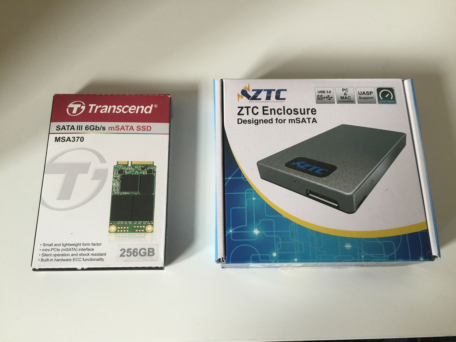
The process is actually incredibly simple. You’ll need the following two things:

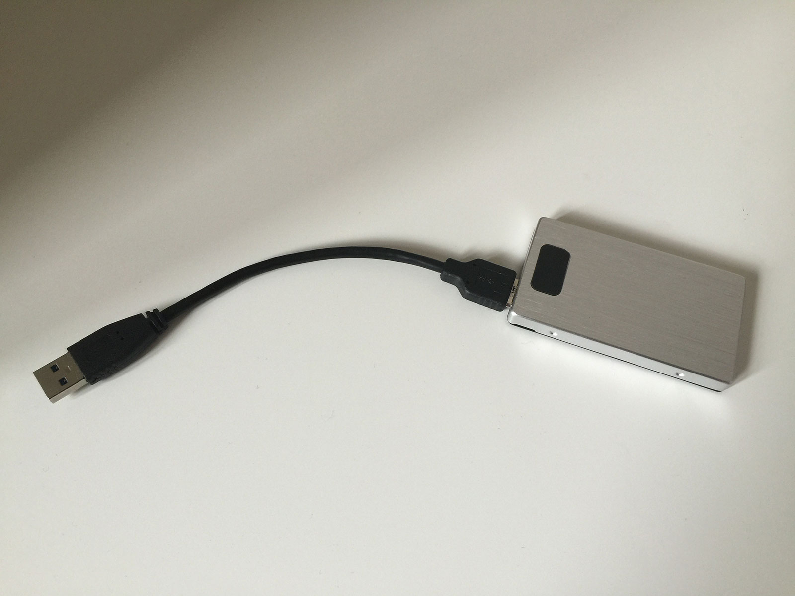
Once you have these, it’s a simple case of plugging the SSD into the enclosure and attaching the USB cable. This leaves you with an incredibly small device which can then be plugged into any of the 3 USB 3.0 ports on the Xbox One:

As soon as you turn the Xbox One on, you’ll be alerted that a new media device has been attached and given the option to format it for games and give it a name. When you have done this, you’ll be able to copy games and apps by going to their individual storage settings and choosing the move option.

Results

I’ve only put 3 games on the SSD so far but they are all dramatically faster for loading and saving. I’ve put a few benchmarks below:

GTA V

This is by far my slowest game. Testing was from a cold startup (which automatically loads your previous save point) to the point at which the game was playable:

  • Internal HDD - 2 minutes 31 seconds
  • External SSD - 1 minute 9 seconds

SSD produces a 60% reduction in loading time.

The Witcher 3: Wild Hunt

The first test was from a cold start to the opening menu.

  • Internal HDD - 40s
  • External SSD - 28s

SSD produces a 30% reduction in loading time (although that seemed to be as quick as it could go due to the logos and publisher videos at startup).

The second test was from resuming a game from the main menu.

  • Internal HDD - 1 minute 21 seconds
  • External SSD - 46 seconds

SSD produces a 57% reduction in loading time.

LEGO Jurassic World

For this test, I timed from the loading of the last save point on the main menu.

  • Internal HDD - 37 seconds
  • External HDD - 37 seconds

It looks like LEGO Jurassic World’s loading sequence is limited to 37 seconds in order to show 3 pieces of dinosaur trivia at 12 seconds each. Playing through the game though, the time it takes to start a story and fast travel to new locations seems much faster.

Overall, it seems that the SSD offers around a 55-60% reduction in speed unless there is something specifically limiting the load time (i.e. videos or placeholder content). I’m planning on just using the external drive for single player games at the moment as there isn’t much benefit in loading the Titanfall or Halo online textures any quicker when the limiting factor is the broadband connection along with everyone else. For me, the SSD option is definitely worth the cost for the big open world games that have a heavy loading time penalty when you die (looking at you GTA V) - it has also increased my overall storage space by 50% which is useful when some games are in the 100s of GB.

  1. Gross! One day I’ll look forward to telling my kids we used to store data on discs spinning at 7200rpm - it’ll be baffling to them. ↩︎

  2. As far as I’m aware, doing it internally would be slightly faster but would definitely invalidate any warranty! ↩︎

  3. The first enclosure I got was the EC-UKMS from Sabrent which was advertised as having UASP. It doesn’t and led to a 70% decrease in speed over the internal HDD with a load time of over 4 minutes for GTA V! This is the first product I’ve actually left a review for on Amazon as the title and images are blatent lies. ↩︎

Glenfiddich Residence Changhi

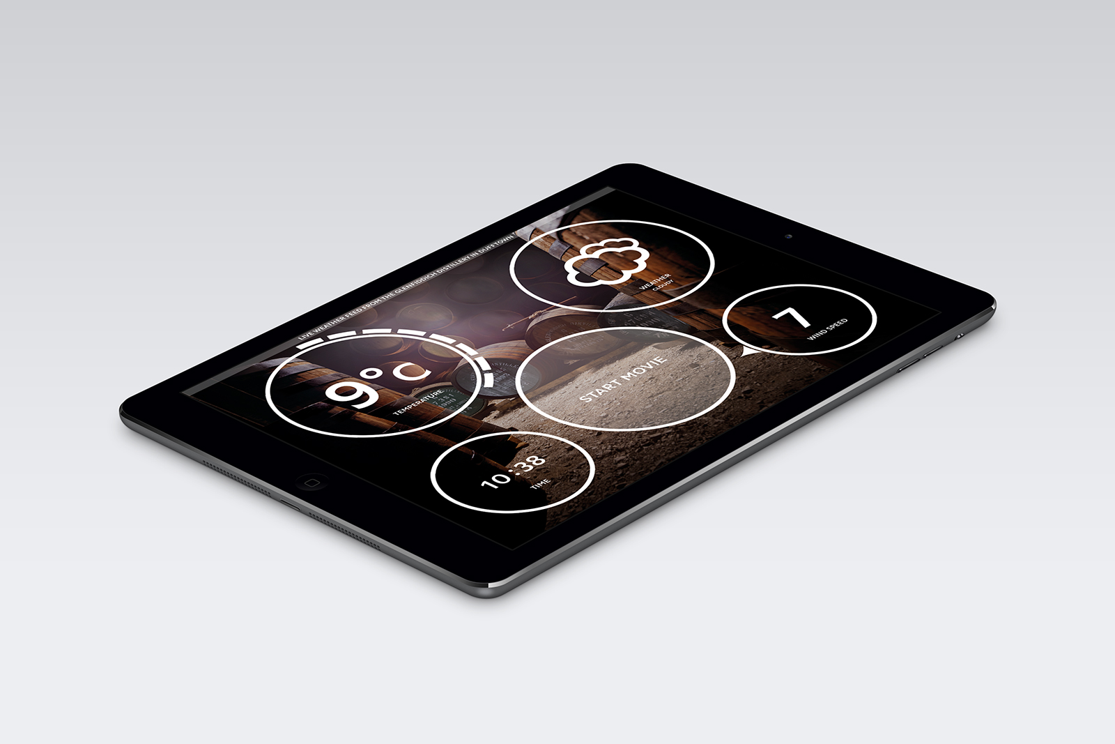
An iPad app I worked on a little while ago has recently gone live at a popup store in Changhi Airport: Glenfiddich Residence. This was a little different to the work I usually do as it isn’t for distribution on the App Store or ad hoc for enterprise but for a single iPad locked in a display stand. The app is part of a large installation to showcase a limited edition of Glenfiddich which is available exclusively at Changhi Airport. The single cask1 that has been selected by Glenfiddich is on display within a specially constructed glass chamber that showcases the weather and atmospheric conditions of the distillery in Dufftown, Scotland.

The iPad app allows for customers to see the current conditions in Dufftown including temperature, wind speed and direction, weather conditions, and the local time. This is paired with multiple sound effects which match with the weather conditions2. The app also talks with a control PC via a direct socket connection over WiFi in order to control the weather effects within the chamber simulating morning fog, wind, and even rain!

There is a continuous slideshow of images from around the distillery and nearly everything is animated to entice customers to interact with it. All conditions are in realtime from a weather station near the distillery.

The final aspect is the “start movie” button which reduces the weather effects and begins playback of a video from the Glenfiddich Malt Master on a 1080p portrait screen inside the glass chamber. This video gives an overview of the distillery and details on the bottles from the limited edition cask that are available at the store.

The app is written entirely in Swift 1.2 and the iPad is locked down with Guided Access to prevent customers accessing anything else.

This was a really exciting project to work on as it is very different to the usual iOS apps I do. If you’re visiting Changhi Airport or passing through, be sure to visit the Glenfiddich Residence; I believe it will be there for the next year.

  1. Cask #8247 with a 1992 Glenfiddich to be precise. ↩︎

  2. For example, a thunder storm with a strong wind will have a very different array of sounds to a sunny day with no wind. ↩︎

Working out with Apple Watch

In an effort to get fitter, I’ve been using the two exercise apps available on the Apple Watch; Workout and Activity. It seemed strange to me that they were separate apps (which also feed into the Activity and Health apps on the iPhone) but after a bit of time with them I’m starting to understand the distinction.

Activity

The Apple Watch tries to get you active by introducing you to the three activity circles; Move, Exercise, and Stand.

  • Move: This is basically active calories and is a measurement of how much movement you’ve done. Your goal is based on height and weight but mine started off at 410 calories.
  • Exercise: I’m not 100% sure on how this is calculated but it seems to be doing anything that gets your heart rate up. The goal is 30 minutes per day.
  • Stand: This is designed to make you stand up for at least 1 minute every hour. If you get to 50 minutes past the hour and you haven’t stood up, you get a little reminder. The goal is 12 instances of standing for 1 minute per hour (so standing up for 12 minutes in a row won’t complete the circle - has to be at least 1 minute for 12 hours).

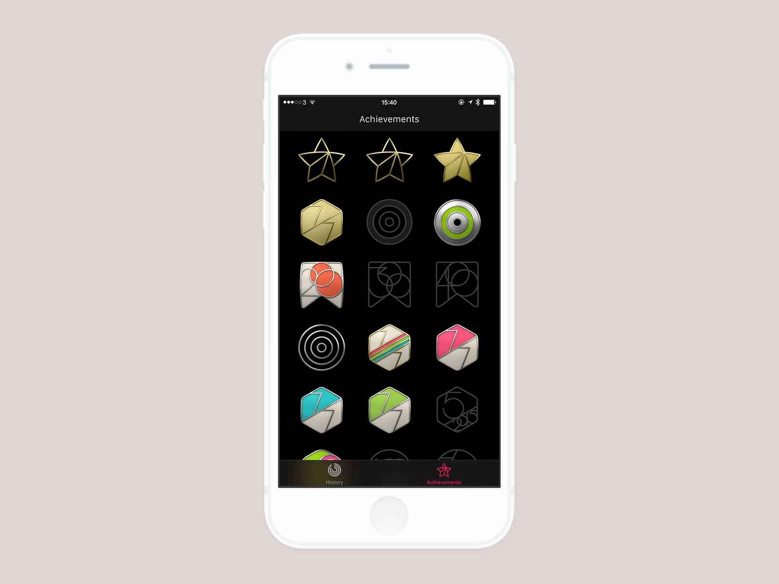
Along with the goals, there are also awards to motivate you to complete your circles each day. These look really nice1 and they use a decent curve so you start off getting quite a lot of achievements in order to make you persist with it. I’ve got most of them now so the next major ones are more tricky ones like “reach your move goal 100 times” or “complete your circles for every day of a month”.
Activity Complication

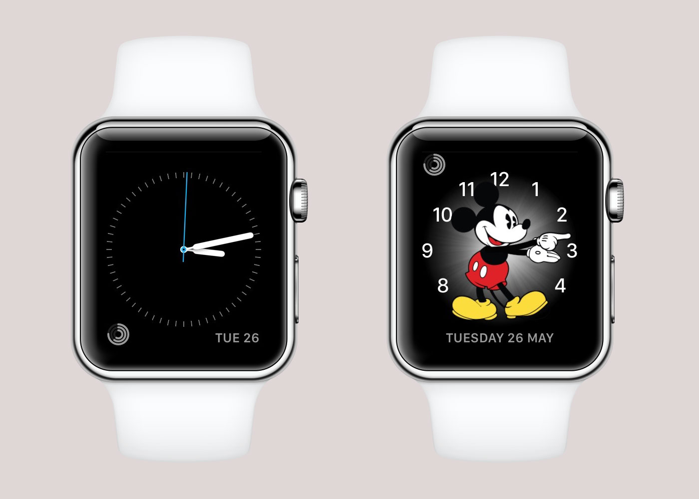
The nice thing about the circular design they’ve gone for is that it fits nicely as a complication on the watch face. I alternate between two watch faces — Simple in the week, Mickey at the weekends — and Activity is the only complication I have active (aside from the date). It highlights the best use of a complication in that I can quickly glance at my watch without touching it and see how far I am for each of my goals; if I want to see specifics, I can tap the complication to go into the Activity app proper. I used to use a FitBit2 but the problem with those is that you either had to use the iPhone app to see how far you’d got or tap multiple times to go through the different views (steps, distance, calories, etc). With the Apple Watch, I can see the 3 important things without getting my phone out and that is a big advantage in my opinion3. It is very motivating as you can see how close you are to completing a circle throughout the day.
Workout

This is the app to use when you are doing a proper piece of exercise. There are presets for things like Running, Walking4, Cycling, etc, but I’ve been using the Elliptical whilst on my Crosstrainer. I’m desperately unfit so I only do a 15-minute session each day (along with a brisk walk to get to my 30 minutes of Exercise) but the app is quite good at prompting me to extend my session on the next day. You get tapped when you’re at the halfway point and you can check your heart rate and calories burned during the workout. Speaking of heart rate, the Apple Watch does continuously track your heart rate throughout the day at intervals of around 10-20 minutes (it seems to check more the more movement you are doing). However, if you are doing a workout, it constantly checks your heart rate in order to more accurately see how many calories are being burned. I like to listen to music whilst I’m exercising so I have a pair of Bluetooth headphones which I pair to the watch (not my phone) and then I listen to a playlist I have synced across. This means I can exercise without my phone. I haven’t tried this on a run but my wife has and on doing a few runs with and without her phone the measurements are pretty accurate (on an 8 mile run, the distance was only off by 0.05 miles compared to GPS). When you finish a workout, you are given the option to “save” or “discard” it - this was slightly confusing as when you press “save” you are taken back to the app carousel and there is no way of seeing those stats again on the watch5. It turns out the workout is actually saved to the Activity app on the iPhone:

Activity iPhone App

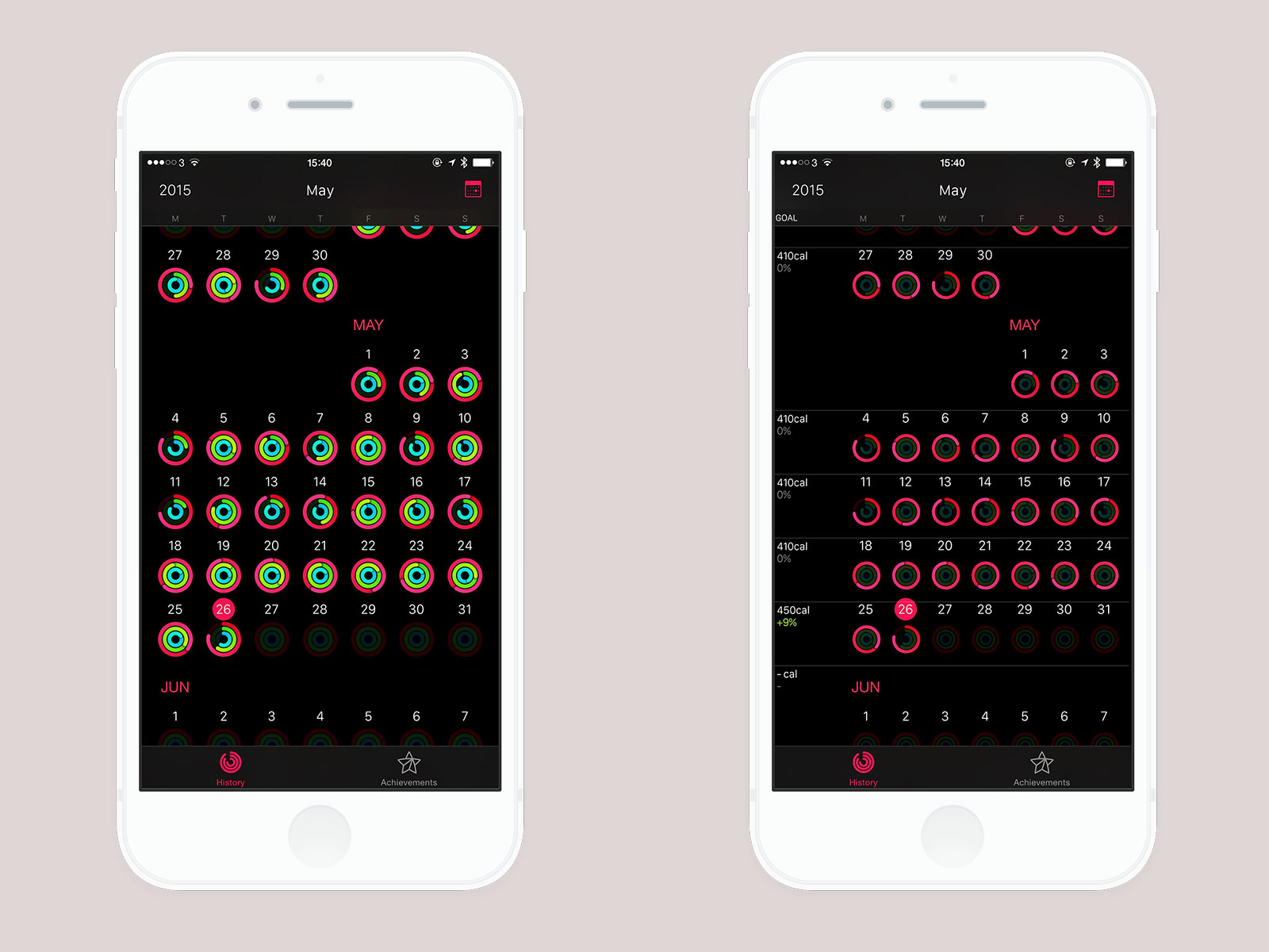
The Activity app on the iPhone only appears once you have paired an Apple Watch. It works the same as the Activity app on the watch in that you have your 3 circles but the difference is that you can see historical data here, review your achievements, and see more numbers and graphs. The History window shows your circles at a glance but if you pull from the left you can see how your daily move goal has changed over time (so in the screenshots below you can see how this week the watch asked me if I wanted to increase my daily move goal from 410 calories to 450 calories):
You can also look at your day and your workouts in more detail such as this elliptical workout I did at lunchtime today:
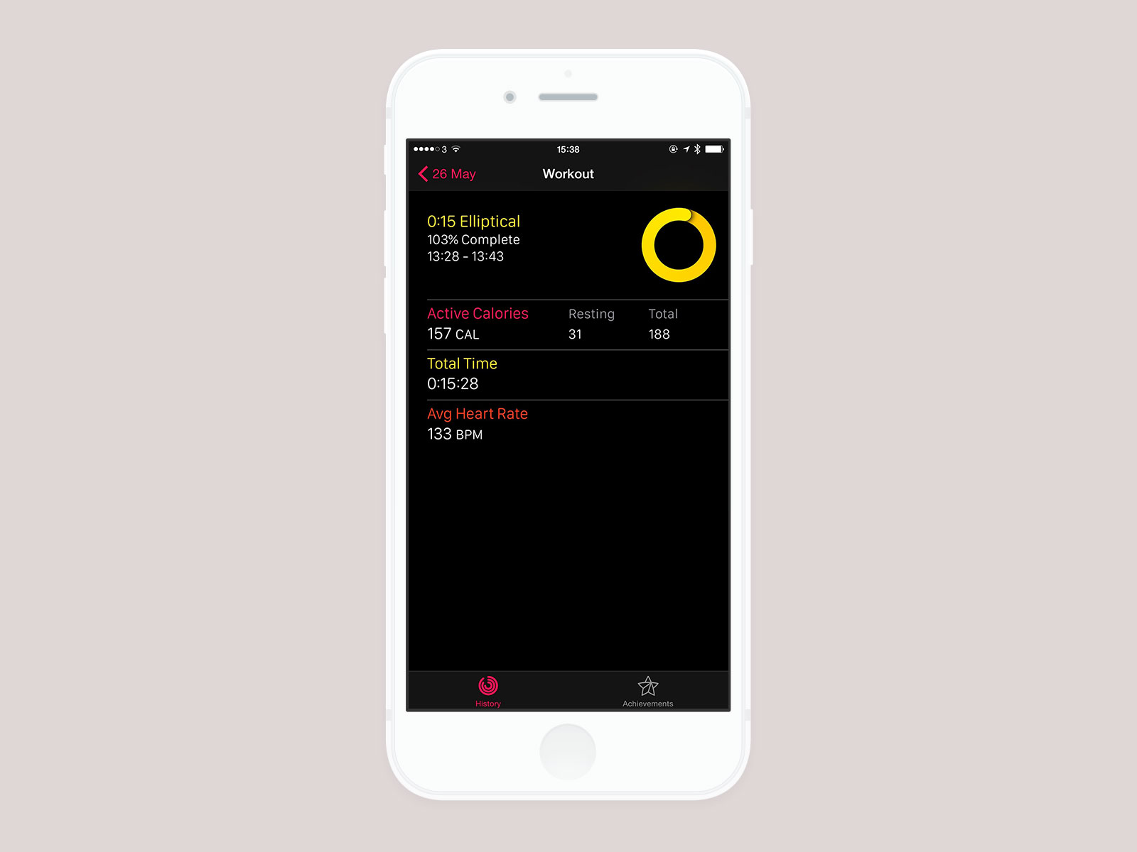
I tweeted about this over the weekend but one of the most motivating things for me has been the “Avg Heart Rate” on the above screen. Each day over the past week, that number has decreased with the same 15 minute workout which shows (I think) an improvement in my overall fitness.

Health iPhone App

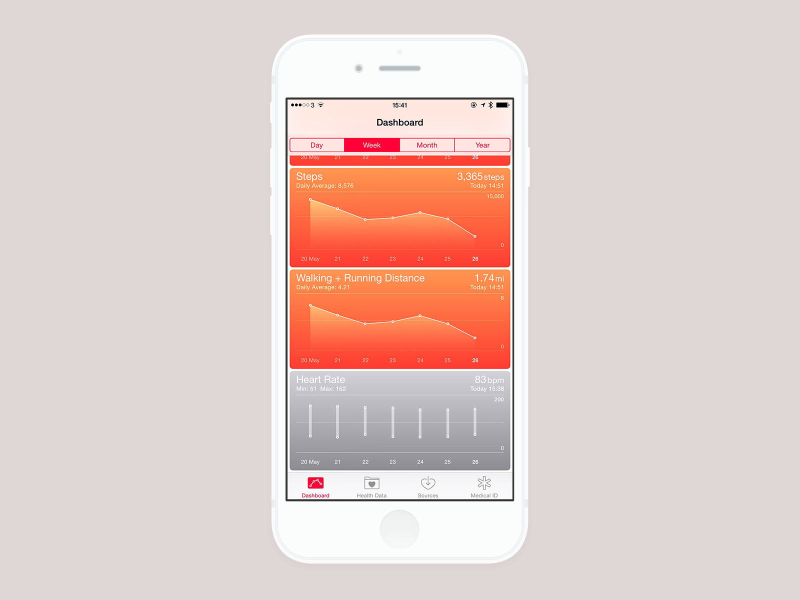
The final part of the fitness puzzle is the Health app on the iPhone. This came as part of iOS 8 and is a way for you to store all of your health data securely. There are loads of apps which can read and write to this store and the Apple Watch is no exception. By default, it will populate the Flights Climbed, Steps, Walking + Running Distance, Active Calories, Workouts, and Heart Rate sections. You can choose to display each of these as graphs within the app although I’m hoping for more control over this in future versions as you can’t view specific dates, only “Today”, “Week”, “Month”, and “Year”. This is one of those areas where the continuous heart rate monitoring is really nice as you can get an overall picture of how much you are fluctuating throughout the day - whilst there are plenty of heart rate monitors available on the market, one you don’t have to think about that is constantly monitoring will always win out (and it is incredibly accurate).
(A small aside, my Apple Watch has just told me to stand up. The nice thing about it doing it 10 minutes before the hour is up is that I often have things scheduled on the hour like phone calls. It’s turned into a nice reminder that I should go and get a drink6 and have a stretch before next hour of work. It is definitely one of those small things I didn’t think about when the Apple Watch was announced but it is the thing that has changed my behaviour more than anything else.)

In conclusion, I’ve found the Apple Watch to be a much better fitness companion than I expected. My assumption was that it would cater for those that like to do running and cycling but wouldn’t do much for the more casual exerciser. In actual fact, it has made me more aware of how little movement I was doing and also helped motivate me more to do things as simple as standing every hour. The majority of its features can be done on other devices, such as the FitBit, but the tight integration is key. The heart rate monitoring showing up in the Health app satisfies the stats nerd part of me whilst the simplicity of 3 goals per day has definitely made me more likely to succeed as I don’t want to break the streak I’m on. If you’ve got the Apple Watch and haven’t explored the exercise parts, I’d definitely recommend giving it a go; once you’ve done it for a day or two, you’ll find it very hard to stop!
  1. Apparently they were inspired by Olympic medals. They do look really nice especially when animating - the black background definitely helps make them stand out more than something like Game Center achievements. ↩︎

  2. I started with the FitBit One, then went up to the Flex, and eventually the Charge. ↩︎

  3. A summary of the Apple Watch could really be “something that makes interactions quicker” - it isn’t necessary but it feels so good to be able to get things done quickly. “But it only takes 5 seconds to get your phone out and check it” I hear you cry; true, but those instances add up. Like I say, it isn’t necessary but it’s definitely nice. ↩︎

  4. I did this a few times whilst walking the dogs but I don’t log them anymore - a walk isn’t really a workout in my eyes. Also, you still get credit towards your Exercise ring if you go for a walk but don’t activate a workout - it knows when you are walking briskly and so that does count as exercise. ↩︎

  5. It’ll show you how long your last workout was and when it was when you open the Workout app but you can’t see calories burned, average heart rate, etc. ↩︎

  6. I’ve also been trying to drink the recommended amount of water per day so this has been a good point to go and top up my water. I’ve been using the WaterMinder app to keep track of this as they have a nice Apple Watch app which follows a similar circular goal design. ↩︎

Using Stripe for In-App Purchases

When I launched Unique Items for WallaBee a few years ago, I didn’t completely grasp how popular they’d be. Within a few weeks, we had hundreds of orders (all processed through PayPal) and ended up with a year-long backlog which has only now been cleared. In anticipation of allowing players to commission these items again, I’ve been looking at payment providers and settled on Stripe now that they’ve fully launched in the UK. After having a quick look at their docs, I realised it was going to be insanely easy to integrate their SDK into a website and that is when I started thinking about using them for In-App Purchases (IAP).

Apple allow developers to use their StoreKit to create In-App Purchases but it comes at a steep price: 30% of all sales. For that 30%, you get simplicity and ease of use for the customer who can just tap a button, type in their iTunes password, and buy any digital content upto $999. This is what we’ve been using with WallaBee for over 3 years but with several issues arising lately1 I thought I might have a go at creating a way for players to buy our in-game currency and lock mechanisms on our website. After a couple of hours, I had a fully functioning site which does just that with full integration with Stripe. Players log in and then click a button to begin using Checkout, Stripe’s own JavaScript based checkout system which will either operate in an overlay on desktop or open in a new window on mobile. The card form is incredibly simple (and no doubt well tested) and allows customers to pay within seconds. It also has the ability to remember a customer so later purchases will be quicker.

The end result so far has been that 50% of our players have chosen to purchase online2 which adds up to a sizeable increase in income as Stripe charge roughly 4-5% once currency conversion (if necessary) is taken into account. Another nice benefit is that Stripe pay you daily for transactions 7 days ago - that means the sales from today will be in our account next week whereas with Apple we have to wait as long as 2 months for a transaction to be paid. We also get more control over the refund process as at the moment anybody can ask Apple for a refund and will usually get it - we don’t get notified when that happens so it means some players can get purchases for free3.

The only issue with this is that it has to be completely confined to the web and we’re not allowed to add a buy button or similar to the app to direct people to the purchase site as per rule 11.13 of the App Store Guidelines:

11.13: Apps that link to external mechanisms for purchases or subscriptions to be used in the App, such as a “buy” button that goes to a web site to purchase a digital book, will be rejected

It is permissable to sell content for your apps online, you’re just not allowed to have any buttons linking to the site within the app. This means that we’ll need to keep both the Apple IAP system and our Stripe online system running separately but so far the results look good. If you have some form of gaming app that relies on IAP, you’d be crazy not to look at doing something similar.

  1. It seems to be that if Apple changes it’s ToS, players who make a purchase are then asked to verify their agreement and end up getting charged without having the charge hit my servers so they end up getting nothing. There is also a complex dance to verify everything with a successful purchase going to my server, my server verifying with Apple, Apple replying that it’s all ok, and then me adding the purchase to the database - if a connection is dropped at any point, then customer ends up with nothing. ↩︎

  2. No doubt helped by the 5% discount we added whilst trialling it. ↩︎

  3. I’ve not seen many instances of this but it has happened and there isn’t anything we can do about it as Apple don’t say who has been refunded, just that a refund has occurred. ↩︎

iTunes Artwork Finder Source Code

I had an email this morning from a developer who wanted to connect directly to my iTunes Artwork Finder in order to power their own artwork finding app. This seemed like a good time to point out that there is no need to do this1 as I have the source code freely available for everyone on GitHub.

If you’re a developer and you want to use my API for iTunes Artwork, please instead get the source code and host it on your own server. You can get the code from https://github.com/bendodson/itunes-artwork-finder

  1. And I’d prefer that people didn’t for two reasons; it costs me money in bandwidth to hit the iTunes Search API on your behalf and it is more likely to result in my IP addresses being banned by Apple which would take the service down for everyone. ↩︎

A Month-Year UIPickerView Written In Swift

I’ve just shared some code on GitHub which may be useful to somebody; MonthYearPickerView-Swift. It’s a basic UIPickerView subclass that allows you to choose just a month and year in a scrolling picker. This is useful for things such as expiration dates on credit cards. It uses a simple block-based callback to let you know once a date has been selected and may be a good way of seeing how to make other custom pickers if you are new to iOS or Swift.

Check out MonthYearPickerView-Swift on GitHub.

Update (2015-10-07): The project has been updated to support Swift 2.0 and is compatible with Storyboards and Xib files. I’ve added tags to the repository so you can choose if you want the Swift 1.2 or Swift 2.0 version.

TV for the UK politics fan

With just 1 day left until the 2015 General Election, I thought it might be fun to put together a list of some of my favourite TV shows that show how UK politics works:

Blackadder

One of the finest episodes is the series 3 opener, “Dish and Dishonesty”, which covers the by-election of “Dunny-on-the-Wold” as Blackadder attempts to stop Pitt the Younger from striking the Prince from the civil list. Every line is a winner but my one of my favourites has to be “Marvelous thing, democracy. Look at Manchester: population, 60,000; electoral roll, 3”. Also notable for the fact that the “Standing-At-The-Back-Dressed-Stupidly-And-Looking-Stupid Party” appear to be wearing UKIP colours.

The Thick Of It

This is really just a modern version of “Yes, Minister” (which I’ll come to) covering the last Labour Government with the more recent series looking at the current coalition. Made famous by Peter “Doctor Who” Capaldi’s sweary Malcolm Tucker character, it’s a very accurate portrayal of how UK politics has been for the last few years with special advisors holding much of the power. One of the best episodes for me involves the minister going on a factory visit1 and being accosted by a worker unhappy with the state of the NHS…

Yes, Minister

Made during the 80s, “Yes, Minister” was a comedy portrayal of the struggle between ministers and their civil servants. Every episode is fantastic, as is the related series “Yes, Prime Minister”, with the witty dialogue of Sir Humphrey Appleby providing the best laughs. I particularly like one episode in which Sir Humphrey is pointing out that a British democracy exists solely to keep the important things in life out of the hands of ordinary people such as Radio 3, the countryside, the Royal Opera House, and “the universities; both of them”:

To Play The King

Without a doubt, House of Cards is one of the best series to come out of the UK. Whilst the US version is also incredibly good, nothing compares to the asides that Ian Richardson does to camera throughout2. I think the second of the trilogy, “To Play The King”, is best with Urquhart pitted against a new King (played by Michael Kitchen) who is not pleased with the old-fashioned Tory values of the PM. Probably the most true-to-life portrayal of the Conservative Party during the late 80s, early 90s. Just fantastic.

Absolute Power

I stumbled upon “Absolute Power” completely by chance when browsing iTunes a few years ago. Only 2 series were made but they feature Stephen Fry and Martin Bird as the heads of a London PR agency. In my favourite episode, “Tory Women”, Fry performs a makeover on a female Conservative shadow minister (played by Rebecca Front who went on to be the minister in season 3 of “The Thick of It”) and comes up with the following immortal line about Neil Kinnock:

“If the British public were forced at gunpoint to appoint a new Prime Minister and they could only choose between Jeffrey Archer and Neil Kinnock, who would they pick do you think? A convicted crook and mythomaniac or a sincere and dedicated socialist? They’d choose Archer every time, and why? Because Kinnock is Kinnock and there’s something about that poor bastard that makes you just want to run shrieking from the room. And you’re the same.”

The New Statesman

After the success of “The Young Ones”, Rik Mayall wanted to do something which was more “grown up” and eventually persuaded ITV to produce “The New Statesman”. Whilst I don’t think you could really call it “grown up”, it’s certainly a hilarious alternative view on Conservative MPs. Mayall plays “Alan B’stard”, a Tory MP with the largest majority in the House of Commons. There’s innuendo, slapstick violence, and an awful lot of truth in this series. My favourite episode3 features both Stephen Fry and Hugh Laurie in an excellent scene in a restaurant:

Ballot Monkeys

The newest item to my list, “Ballot Monkeys” is an ambitious programme being aired this year on Channel 4. It was advertised as being “so topical we haven’t written it yet” and that is certainly true - each episode is produced on the day it airs with the plots (such as they are) being directly influenced by the news events of the day. The first two episodes aired a week apart but it is now on every night until election night. The series follows each of the 4 main parties in this election (Labour, Conservative, Lib Dem, and UKIP) on their respective “Battle Buses” with both candidates and media advisors discussing the topics of the day. It’s already led to some of the funniest political comedy I’ve seen in years with the Lib Dems desperately searching through a paper for any mention of themselves4, the Labour social media campaigner creating fake tweets from “Milifans”, and the UKIP candidate who doesn’t trust their new bus driver5:

  1. I love this bloody factory” ↩︎

  2. “Did you enjoy my little speech? I thought my “deep personal wound” was a rather good touch. I am in fact extremely angry with His Majesty and I intend to do him harm. I feel exhilarated. Prospect of a fight, of course, with the odds unfairly weighted in my favour. Next to a small war, there’s nothing quite like a general election to stiffen the sinews and summon up the blood.” ↩︎

  3. I can’t fail to love an episode with the lines “we’re Thatcher’s stormtroopers and we’re in a hurry” or “indeed I do remember the Falklands, made a fortune!” ↩︎

  4. And a brilliant comparison to a Grand National horse that “didn’t win, but came in the top 4 with odds of 300-1… only slightly better than our odds” ↩︎

  5. “Terrorists eat biscuits too” ↩︎

The Correct Way To Watch Star Wars

May 4th has got a bit out of hand now that it seems to be celebrated as an actual holiday every year. That said, I do like to watch Star Wars fairly regularly1 and so I often get a Tatooine style yearning at this time. However, the question that used to always pop up was “which order do you watch them in”2. It used to be that I’d do the old “IV, V, VI, I, II, III” sequence but that was until I learned about the “Machete Order”:

Next time you want to introduce someone to Star Wars for the first time, watch the films with them in this order: IV, V, II, III, VI

Notice something? Yeah, Episode I is gone.

The full post explains it more thoroughly (along with benefits and drawbacks) but the basic idea is that you treat episodes II and III as flashbacks whilst The Phantom Menace is relegated to being an “expanded universe” kind of deal similar to The Clone Wars animated series or video games like The Force Unleashed. I’ve watched the films in this order a couple of times now and it really does work a lot better. It also works great if you are introducing the films to someone for the first time (i.e. kids).

I’m probably not going to watch them this year, but if you do, give the Machete Order a try. You won’t regret it.

  1. Maybe not annually like I do with Lord of the Rings, but at least every two years. ↩︎

  2. There is no question of not watching the prequel trilogy. I’m just going to go out and say it; Episode II is amazing (especially if you are a politics geek like me). So there. ↩︎

Great British Bee Count iPhone App

I’m happy to announce that another app I worked on earlier this year has gone live in the App Store; Great British Bee Count.

The Great British Bee Count is a cause started by Friends of the Earth which invites the public to help monitor the British bee population. To do this, you can download the free app and then choose to log individual types of bee that you see or, new for this year, perform a timed count which invites you to count as many bees as you can (regardless of type) within 2 minutes.

I was asked to update the existing app by Two Thirds Water - I decided it would be quicker to rebuild the app from scratch in Swift rather than try and update what existed previously. This allowed me to easily use several new technologies such as AutoLayout which let me render the pixel-perfect design on all four sizes of iPhone. In addition, I built an offline caching mechanism so you can perform your counts without an internet connection - once a connection is re-established, the counts will be uploaded.

This was a fun project to work on and I think the end result works really well. You can check out Great British Bee Count on the App Store (it’s free) or learn more about the bee cause.

Initial thoughts on Apple Watch

After a bit of hassle with the delivery company1, I was lucky enough to get my Apple Watch yesterday. A few people have asked for my opinions so I’ve jotted down a few rough observations:

  • It’s small. Surprisingly so (especially when compared to other smart watches). I went for the 42mm Apple Watch (Stainless Steel2) and it feels incredibly comfortable. It probably could have been 44mm or more and still feel comfortable. It isn’t bulky, heavy, or thick. Of course this is just my own aesthetic opinion and your mileage may vary - the “try on” appointments are a great way to see them up close before ordering. I also like the detail that has gone into it. For example, my watch came with a white sport band but what I hadn’t realised is that the band has the same stainless steel for the pin as the watch body. If you buy the band separately, it is aluminium like the sport watch. One other thing: the box that it came in was incredible and really made it feel like this was a special product. I won’t post pictures as I’m sure there are thousands of unboxing videos online but the steel watches come in a big cube - the sport watches, in contrast, come in a flat oblong box which is probably the reason for the awesome spring-loaded UK plug.

  • My main use case is notifications. I’ve already had several instances where a small nudge has allowed me to see and dismiss a notification in 2 seconds or so. I typically have my phone on silent with no vibration3 which means I frequently have to get my phone out of my pocket to check the screen and see if I’ve missed anything. This has become even more important now my wife is doing shift work in the evenings as she texts me when she needs me to come collect her from work - I frequently miss these texts! With the watch, I get a subtle nudge4 and when I raise my wrist it shows me what type of notification it is: iMessage, Facebook, Mail, etc. At that point, if I’m not bothered I can lower my wrist and it’ll go but if I keep it raised a half second longer then it shows me more detail (generally the content of the message). Today whilst I was washing up I got a breaking news notification from the BBC, an “it’s about to rain” notification from Dark Sky, an email from my mum, and a few likes on Instagram. The only time I had to stop what I was doing was when I tapped on my wrist to read the email in full as that was the only thing I wanted to read right then. Had that been my phone buzzing on the table, I probably would have stopped and started several times.

  • Apps are a bit pants. I didn’t have high expectations for 3rd party apps as they are really just glorified extensions. They are better than I thought but can be quite slow to load sometimes and generally I could have done whatever I needed to do quicker on my phone by that point. For example, Philips has a Hue app which lets me turn my lights on / off around the house and change the colors. However, it’s an app rather than a glance so you have to go to the home screen, tap on the icon, wait (a while) for it to load, and then finally choose from the options. The issue is that is is slower than using the “today widget” they have for notification center on my iPhone which I can access from the lock screen (and the iOS widget is more useful as one tap turns a scene on and another turns it off - the Watch app only does “on”). These are things that will improve and some of the glances are pretty good for an overview but this isn’t a native app experience. It’s very much iOS 1.0 with the HTML “apps” than the App Store we have now5.

  • Some 3rd party apps aren’t there. The thing I’ve found most surprising is that there are many big name apps which simply aren’t there at launch, most notably (for me) are Facebook and WhatsApp. This means when you get a notification from these services, you can read the text (same as an iOS push notification) but you can’t reply from the watch or do anything at all. Bearing in mind there are over 3000 apps at launch, I’m very surprised that these two aren’t there. As above, this is something that will improve over time but it is frustrating getting a “someone commented on your photo” notification and not being able to read it. This is a tad hypocritical as I’ve publicly said we’re not doing an app extension for WallaBee6 but then Facebook has a lot more money and developers than me…

  • Some 1st party7 apps aren’t there. Much has been made of the lack of a web browser8 but the thing that really surprises me is the lack of the reminders app. One of the use cases I had for the watch was grocery shopping lists. When my wife goes to the gym I typically drop her off and go and do the weekly grocery shop - we have family sharing enabled so recently we’ve been using reminders so she can add things to the list and I can see it whilst shopping. However, holding an iPhone 6 Plus in one hand and pushing a full trolley is actually quite hard whilst you’re looking for a specific type of quinoa seed9. Hence I thought that the watch would be great as I’d be able to see our list and cross things off as I grab them. It isn’t to be though as there is no reminders app - you can set reminders via Siri and you get the notifications but you can’t just view your reminders and tick them off in a list. There are 3rd party apps available (such as the wonderful “Things”) but then you start having to do jiggery pokery with certain reminder lists being imported and I don’t really want to see 60 items in my to-do list on my desktop. It seems a very odd omission so I’m hopeful that a WatchOS update will see that app added.

  • Exercise. I haven’t done anything other than walking the dogs but from what I’ve seen it works well. I started up the exercise app and chose “outside walk” and it logged my distance, calories burned, heart rate, etc. I’m looking forward to taking it out for a run at some point soon.

  • Notifications again. I just had to mention “Knock”. It’s an app that allows you to unlock your Mac by knocking on your iPhone (by some sort of dark magic as far as I can tell) but it is now updated for Apple Watch. Basically, when I sit at my desk and move my mouse, the computer comes out of standby and shows the lock screen and I get a notification on my wrist - tapping it unlocks the Mac. I have a pretty long password so it is a nice feature but it shows some of the potential of location-aware apps. I’ve always said that the Apple Watch will be like Disney’s MagicBands and this seems to be true when you consider you can use it to unlock doors (and computers) and pay for things (in the US… grrrr). Knock is just one of those “this is cool” moments about the watch.

  • Apple Pay. Seriously, this needs to come to the UK. We already have all of the NFC hardware so I can’t see what the hold up is. I firmly believe that Apple Pay will become my #1 use case for the watch.

  • Digital Touch. I had a chance to play with the digital touch stuff this morning and it works pretty well. The only thing I dislike about it is that you don’t get the taps in real time unless you have the requisite app open; you get a standard notification to say “someone sent you a digital touch message” which when you open then plays it back. I really wanted this to happen without the notification step so my wife could send me some taps and I’d receive them on my wrist without doing anything (so, for instance, she could send 2 taps to say she is ready for me to pick her up). Might as well just send a txt if it is going to require me to look at the watch to open the message.

  • Ordering process. I’ve seen a lot of complaints about the ordering process and how Apple has screwed everyone over with a 2-week release period and no ability to queue and get one. My assessment is that the watch has been much more popular than they imagined and that gauging which models people would choose is a lot tricker than many give credit for. With the iPhone and iPad, it is fairly easy as you have a choice of storage tiers and, in the case of the iPad, Wi-Fi or Cellular. You can do market research (based on what they’ve sold previously) to work out which ones you need the most of and where. However, with the watch the majority of it is purely aesthetics. How do you get the right split between the different coloured bands or know if people will be willing to pay extra for Stainless Steel, a leather loop band, or a link bracelet? It seems there could be some manufacturing issues as well in that there hasn’t been a single pink band seen in the wild yet (not even in the demo units at Apple Stores) and none of them have shipped. Several of the other bands aren’t shipping yet either - I wanted my watch to come with the black leather loop but that would have meant waiting 4-6 weeks so I went for a white sport band (I ordered the leather loop separately and it could be here next week).

I think that is pretty much all of my first impressions for the time being. In short, I’m finding it to be a great device for small interactions and for being able to triage incoming notifications when your hands are full. It’s the first step to an incredible wave of products (from all manufacturers) and I think most people will be pleased with it. Just don’t go in expecting the 3rd party apps to be at the level that they are on iOS devices currently.

  1. It’s the first time Apple have shipped anything by UK Mail and I hope the last. Whilst it was in the UK well in advance of the dispatch notice, it went out for delivery at 5.40am and then an hour later was listed as “delayed” with a date of 27th April for delivery. I phoned UK Mail and had to wait 2 hours for them to call me back to say that I could come and pick it up from the depot on the Saturday - however, during that time, the status had changed back to delivery for that day. When the driver turned up, he was quite rude and complained about all the people buying Apple products as meant he had to deliver more! ↩︎

  2. I wish there was a better way of saying “the watch that isn’t the sport one or the gold one” - peculiar to name a specific model the same as the whole line. Reminds me of when they went for “the new iPad” rather than “iPad 3” (but at least then you could call it that). ↩︎

  3. The reason being is that when I’m working on my computer, I frequently get notifications on both (i.e. from Tweetbot) - I don’t like having my phone vibrating across the desk all the time so I have that switched off. ↩︎

  4. I have the sounds on at the moment but I’ll turn them off soon - it’s just for the novelty of being able to say “oh, is that my APPLE WATCH” to people nearby. I’m a bit of a dick like that. ↩︎

  5. That might a bit unfair. Some of the apps work well but it is very hit and miss. ↩︎

  6. The main reason being that adding more interactivity to the notifications (like the ability to reply to a message) would mean adding an app to the watch. Once you do that, you’re getting into a lot of work. I wish there was a way you could add a custom design to notifications without doing an app (so I could show an image when we release a new item) but again, the only way to do that is to go for a full watch app. The experience of that would be slower than the iPhone so for now it isn’t very compelling for me with my business hat on. ↩︎

  7. Whilst typing this I realise we have a concept of “1st party / 3rd party” and “1st person / 3rd person”. Does “2nd party” or “2nd person” exist? After a bit of googling, the “2nd party” would be “you” (i.e. 1st party is Apple, 2nd party is consumer, 3rd party is developer). There’s a few times a day where little questions like these pop up - Siri on the watch is pretty good for getting quick answers to them. ↩︎

  8. It reminds me of when iBooks launched and it was iPad only. Lots of people asked why it wasn’t on iPhone to which the general consensus was “It would be shit”. Of course, it then did appear on iPhone but I don’t think it’ll happen with Safari on the watch. There is a 3rd party browser available already though. It looks shit. ↩︎

  9. First world problems, right? ↩︎

« Older Entries Newer Entries »