Poor Usability on the Web - Part 1: Online Banking
For some reason, I get frustrated really easily on the internet when I come across something that doesn't work intuitively. It seems that the majority of people are desensitised to the various hurdles of thought on both the internet and computers in general (e.g. pressing "Start" in windows to get to the "Shut Down" option) yet more and more I find myself getting annoyed that people can't get the most basic things right on the internet. Now that I'm working as a web consultant, I'm hoping to be able to get a lot of clients to just look at the systems and sites they have created and apply a bit more common sense to them in the way popularised by the excellent "Don't Make Me Think" by Steve Krug. This is a view extended by Joshua Porter's "Designing for the Social Web" (which I shall be reviewing here shortly) although that is geared slightly more towards customer service and social networks than the all encompassing issue of usability and best practice.
So, for my first real post on my new website I thought I'd perform a basic usability study of the online banking system from the Royal Bank of Scotland; a website that frustrates me every time I want to check my bank balance online.
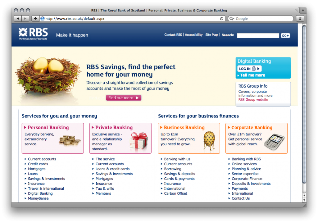
I'm using the Safari 4 Beta on a MacBook for the purpose of this demonstration and wanted to demonstrate that the RBS homepage (above) loads absolutely fine in this configuration. However, as soon as you click on the "Log In" button on the right hand side, you get this page:
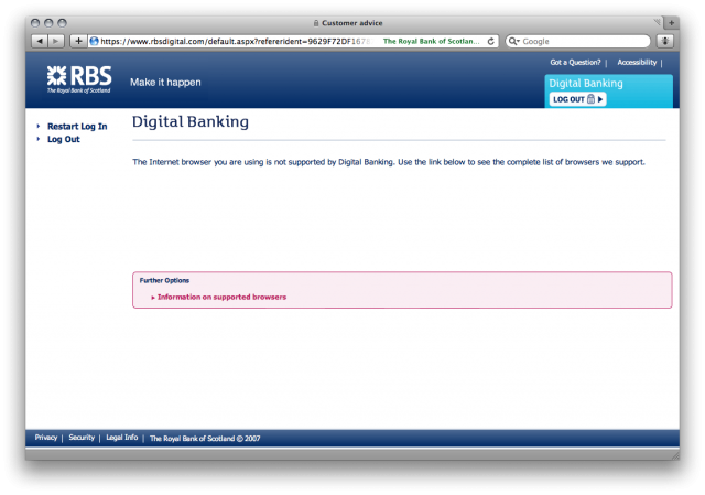
To be fair, the unsupported browser thing isn't a problem for me as Safari 4 has a very useful 'Develop' menu in the toolbar that lets me choose a different user-agent so I can pretend it's Safari 3.2.1 (which I'll do shortly to let me into the banking). What does annoy me is that there is no reason for them to detect your browser as the site isn't any different depending on your browser. At the very least, if the browser isn't supported (for some sort of CSS hacking rules perhaps?) it should load up a plain text version rather than just lock you out completely. It really adds insult to injury seeing as by changing the user-agent, the site works absolutely fine. Now I'm not suggesting that they should be updating their site every time a new browser comes out to avoid this message. On the contrary, I'm suggesting that they should completely abolish the specific browser sniffing and just detect browsers (by functionality rather than name) which definitely don't work (e.g. IE 5.5 or Netscape 4) and offer them a textual fallback.
Other usability problems with this page include a "Log Out" button when you haven't logged in yet, and a "Restart Log In" button which just reloads the page. On the plus side, they do have a link to "Information on supported browsers" but this rapidly turns to a negative as there is absolutely no information there at all on supported browsers - the problem isn't even acknowledged! At the very least there should be a list of supported browsers with links so you can upgrade, etc, but to have a link which goes to no meaningful information is just ridiculous.
Anyway, if we happen to be using a supported browser (or if we spoof our user-agent as I have to do), then we'll move on to the next page; the first stage of actually logging in.
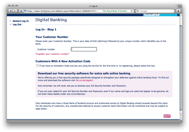
Now this page in itself isn't too bad. Yes you have to enter a 10 digit number decided by the bank rather than an email address or an easy-to-remember username and it's only one field when it could in fact have been added to the previous page (e.g. enter number and then begin log in as HSBC does it) but compared to the other pages it's fairly acceptable. The only thing I would change is minimising the amount of text and enlarging the 'Next' button - it doesn't need to be small and hidden away at the bottom of the page!
We now come on to my favourite page; security clearance.
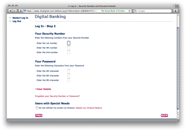
For me, this page is where all notion of web standards, accessibility, and best practice fall apart. Before I begin, I would like to say that I understand fully the need to break up a security number and only enter certain digits for authorisation - it's obviously to stop anything like keyloggers or people watching you type as they'll only get a portion of the password and the next time you come to login you'll be asked to enter a different part. I don't have a problem with that. I do, however, have a problem with being asked to enter parts of my password in a completely random order. Is there any particular reason why I have to enter 1st digit, 4th digit, then 2nd digit? It makes every attempt a brain-teaser in itself as I have to conciously remember the security code, count up the number of digits, and then do it twice more to work out the order. More often than not I'll be saying it under my breath in order to keep it in my fairly poor short-term memory so anybody near me would get the code anyway!
To make it even worse, once you've typed a digit, some javascript runs that automatically moves your cursor to the next input box. I have never liked this convention as it falls against best practice and expected behaviour. Nobody expects it to automatically move you to the next box as there are few websites that do it - it's not the default action on input forms. The only time I have ever been able to see an acceptable use for this is when entering in a product key or something similar e.g. a long (over 20 characters) string of randomly generated text that has been broken apart into smaller chunks of 4 or 5 to make it easier for humans to transcribe. That is the only situation that people expect the behaviour as it is the only place that the majority will have seen it happen before (although one could argue that my description of a product key could equally apply to a telephone number and I wouldn't dispute that). However, for a single digit number that is masked by an asterix, it is completely unneccessary and confusing. The part that really gets me though is that if you mistype, you can't tab back and delete it as you'll be automatically moved forward to the next input. You either have to press shift + tab and then backspace incredibly quickly or disable javascript. I'm quite quick on a keyboard thanks to a lifetime of being sat behind one but I can imagine that this is incredibly frustrating for a user who doesn't know what's going on or is a little slower at typing!
Speaking of slow typers or disabled users, we come to the "Users with Special Needs" section. This seems to have been bolted on to the end of the login process almost as an afterthought or simple nod to the fact that people may have accessibility issues preventing them from accessing the system. Rather than disabling the javascript or making the buttons bigger, the "Users with Special Needs" checkbox simply serves to disable the automatic refreshing of the page when the security timer expires. Like most online services of a secure nature, the website will lock you out if you're inactive for a certain period of time. In the case of the RBS banking system, this is done with JavaScript and you are physically kicked out of the system rather than getting an error when you navigate to a page after the timeout. I've no idea why disabling this feature falls under "special needs" but there we go!
So, if you managed to decipher your password, enter it correctly first time, and scrolled down and squinted to find the next button, you will move to your welcome screen where you can get the basic overview of your accounts, right? Wrong!
Occasionally a screen will appear with something in capitals along the lines of *WARNING* WATCH OUT FOR PHISHING ATTACKS - WE DON'T EMAIL YOU. I don't really mind these as they don't happen all of the time and it's good to know that the bank is trying to protect it's customers by reminding them of common sense. It does have a ridiculously small 'next' button under-the-fold (similar to the other pages) but it's not a regular occurrence so not a major gripe for me. This next screen which does show up every time is though…
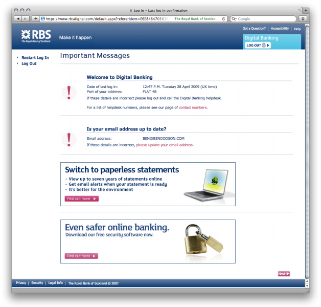
This page has been designed for the sole purpose of getting people to keep their information up to date as well as advertising new products / services. There is absolutely no benefit to the user as far as I can tell. If we look at the first part, it tells the user when they last logged in, part of their address, and their email address. Knowing when you last logged in might be useful as that way you can see if someone else has logged in than wasn't you - however, in reality most people don't remember exactly when they last logged in and I would assume that the vast majority of people don't even read that sentence. The address section is completely redundant as it only shows a small section and again people are unlikely to read it. If you move house, you are quite obviously going to change your bank details and I don't think a reminder every time you log in to your internet banking is necessary. The final section about your email address is again redundant as the bank never emails it's customers. Why? There are too many phishing attacks in this day and age so the majority of emails from banks look like spam! Besides, what are they going to email you? Probably just adverts for other services such as advanced bank accounts and mortgages.
Everything below-the-fold (including the next button again!) is just advertising space. In this screenshot, they are advertising paperless billing (which you probably already know about if you're using online banking) and the misleading "Even safer online banking" which is advertising for it's free security suite which basically tells you that you're connected to the banks website and not another website. It only works on 32-bit windows running either IE or Firefox and won't work with screen readers. Whilst this 'advertising' is inevitable, it does not need to be shown every time the user logs in especially not on the confirmation of login page! It's also ironic that they choose to advertise their free software to make you more secure after you've logged in rather than at the start of the journey (where they do mention it but in much smaller writing rather than the large banner ad they use here).
Once you have clicked the next button, you are finally taken into the online banking system and you can get on with whatever task you need to perform such as checking your balance or making a payment (which requires an external card reader and a whole lot of hassle, but that's a rant for another day!)
Summary
As I've tried to point out above, there are numerous accessibility and usability problems in the above scenario of logging into a mainstream online banking system. As a brief recount, I need to:
- Go to homepage
- Fake my user-agent
- Type in my 10-digit 'customer number'
- Fill out random digits from both a security number and password (in a random order)
- Occassionally see a notices page
- View a reminder of my last login, part of my address, and email address as well as bank service advertising
- Finally get to my online banking overview
That weighs in at an astonishing 6 pages just to login to my account! That doesn't include going back to the start if you happen to mistype some of the details or if you get trapped in the "ever advancing javascript inputs of doom" (patent pending).
Recommendations
There are several basic steps that RBS can take to rectify the process of logging onto their online banking system.
Firstly, they need to remove the browser sniffing and instead take up the practice of graceful degradation, that is to say show the best way of doing it and then fall back to more simple methods if the browser is too old. There is no good reason why the latest browsers (which are by virtue more secure) should not be allowed access to the site.
Next, the javascript 'enhancements' need to be completely removed not only due to accessibility concerns but also because they break traditional UI design and user expectation. This goes for both the self-advancing input boxes and the automatic logout - you shouldn't need to tick a box to say that you don't want to be redirected from a site with JavaScript.
Finally, the entire process can be minimised down to 2 pages. This is done by adding the 'customer number' input next to the initial 'Log In' box on the RBS homepage, and then having a single page to have both the two security checks (no random ordering of input boxes please!) and details of their antivirus package. Once you've passed security, you should be taken to the overview page where you can then at the top of the page have a small section about when you last logged in and then use sidebars for advertising of services such as 'paperless billing' or reminding customers to keep their address details up to date.
With these three simple steps, the headaches for all customers can be removed, and the process would become easy-to-use rather than a constant struggle!
I'd be interested to know of anyone's views on accessibility and usability with regards to online banking systems - please use the comments box below or contact me. You can also let me know if there are any particular sites that have glaring usability issues that you'd like me to investigate in the future.