'Chaise Longue to 5K' and porting a tvOS app built with UIKit to iOS, iPadOS, and macOS
A little while ago, my chiropractor recommended that I take up the “Couch to 5K” program in order to improve my fitness in a way that wouldn’t see me literally running before I could walk. It was a huge success and I was able to lose a significant amount of weight and improve my overall health. Unfortunately, the 2020 lockdowns and the birth of a new child meant most of that effort was undone and I found myself once again needing to embark on a gradual increase in exercise.
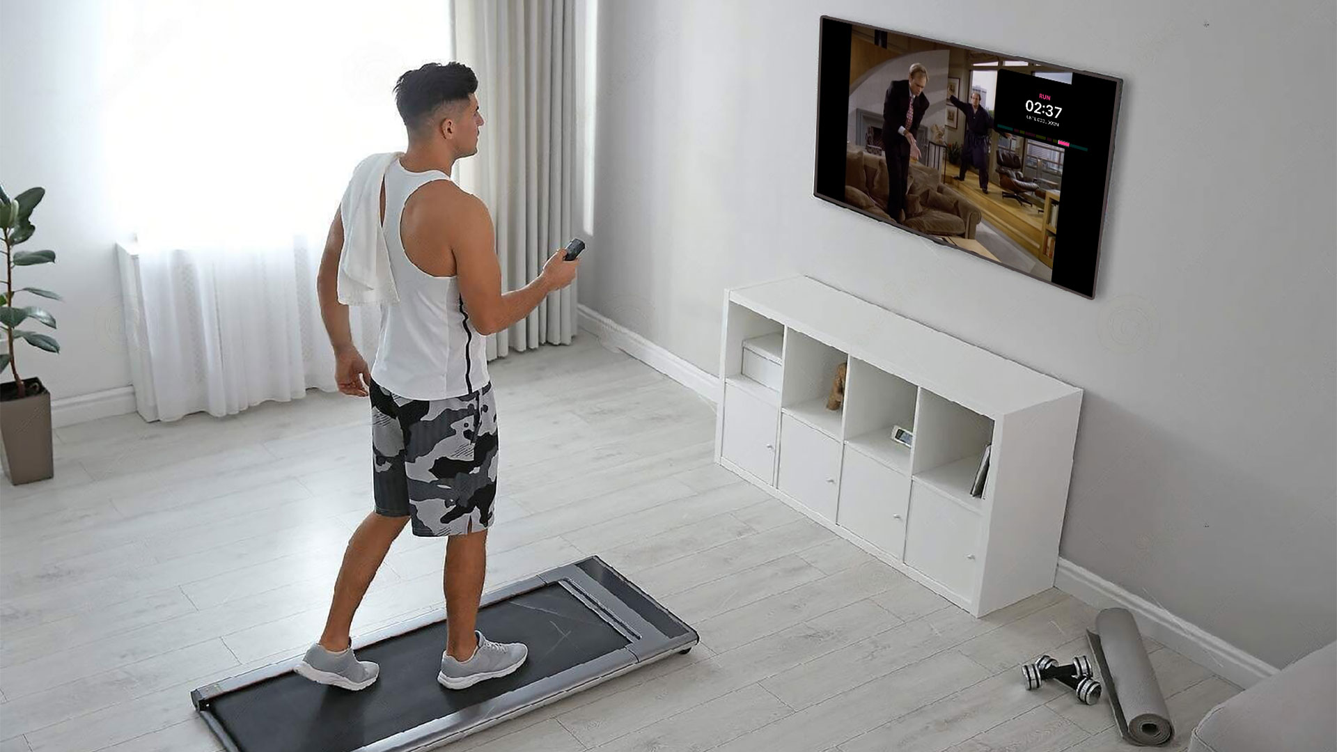
One of the key features of Couch to 5K is that you do intermittent bursts of running and walking; for example, in the first week you’ll do three runs consisting of alternating 60 seconds of running (x8) and 90 seconds of walking (x7) sandwiched between a 5 minute warm up and cool down. To keep track of this, I used the free NHS Couch to 5K app which tells you what to do at each stage via an audio voiceover which also offers encouragement throughout your run. This worked well for me as I listened to music whilst doing my runs, but nowadays I prefer to run whilst watching TV shows or YouTube videos on an Apple TV in front of my treadmill. For this use case, audio interruption wasn’t necessarily what I wanted, especially as I was already vaguely familiar with the different run timings. Instead, I wanted an app on my Apple TV that could show me my run progress in a Picture in Picture window.
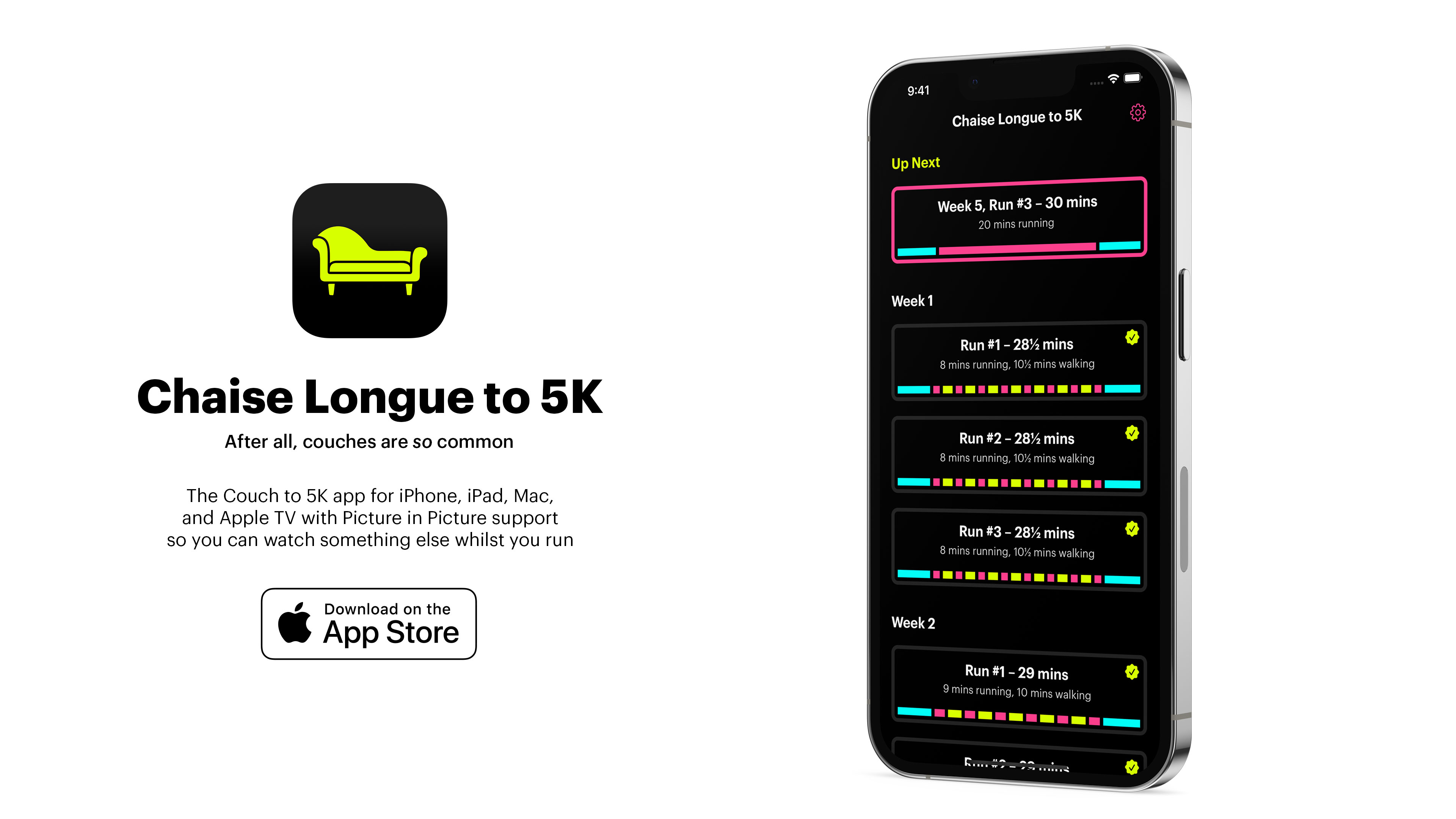
Introducing “Chaise Longue to 5K” (after all, couches are so common):
The idea is straightforward enough; you open the app to a grid showing all of the available runs1 and then navigate to a fullscreen running page with a timer and coloured blocks that show what you should be doing. This can then be shrunk down into a Picture in Picture window so you can see the critical information whilst you watch something else.
Originally I’d planned to use the new AVPictureInPictureController.init(contentSource:) API that was introduced with tvOS 15.0 as that would allow me to fairly easily render the UIView of the run screen into the PiP window; unfortunately, there is a bug with tvOS which prevents that from working and is still present in the tvOS 16 betas.
My next plan was to have the app render a video of the run on the fly. Essentially I would display the running UI, snapshot it with UIView.drawHierarchy(in rect: CGRect, afterScreenUpdates afterUpdates: Bool), and then pipe the UIImage into an AVAssetWriter at 1 second intervals to generate a video. Unfortunately that proved too intensive for the Apple TV hardware (especially the non-4K model) with the render taking a couple of minutes for each video. However, as I’d already built the render pipeline, I instead updated the system to generate all of the videos sequentially and store them; I then ran that in the tvOS Simulator to generate the 12 videos2 and then bundled them in the app. Much easier 🤣
The final part was to add a button to the top of the run selector page that would show you your next run. To do this, I store the week and number of the last run that was completed3 within NSUbiquitousKeyValueStore; this is a similar API to UserDefaults with the advantage that it is synced through the user’s iCloud account meaning it’ll survive reinstallations or switching to a new Apple TV without restoring from backup.
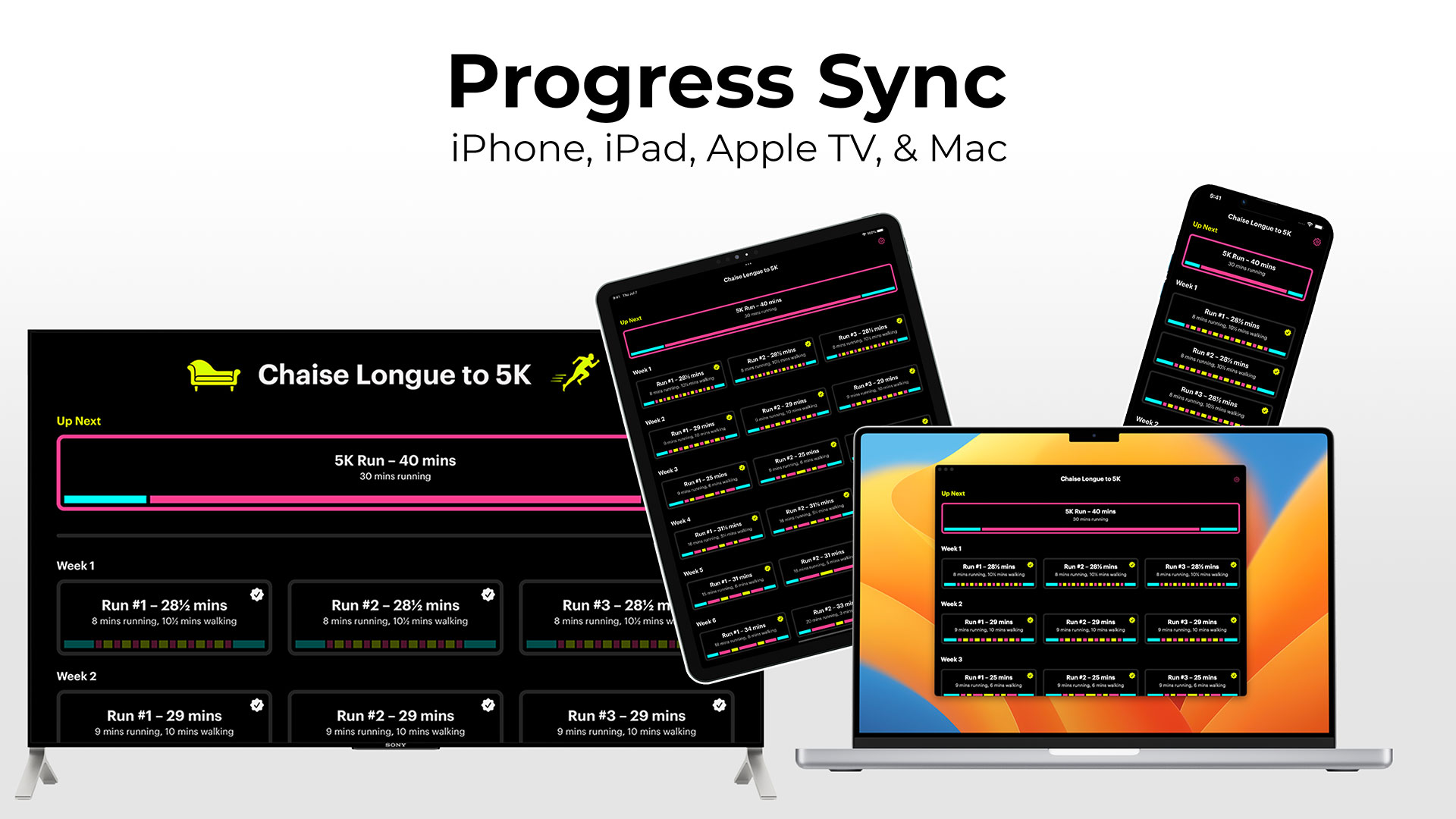
However, that led to an interesting idea. Could I port this to other platforms? And if I could, would I be able to do it in a single day?
Yes.
Despite using UIKit rather than SwiftUI, I was able to port everything over to iPhone, iPad, and Mac within 5 hours or so. I started by rejigging the project files so shared code would be separate from the xib files I use for the interface. I then added a new target for iOS and went through the laborious process of recreating the xib files; unfortunately tvOS and iOS xibs are incompatible even so far as you can’t copy and paste standard elements like UILabel between them.
The design was such that it was quite easy to make it work for iPhone. The run page itself just needed some font size adjustments whilst the grid view showing all of the runs had some stack views tweaked so they were shown vertically rather than horizontally.
The next step was to optimise the design for iPad. Again, this mostly worked out of the box as I use AutoLayout for everything. I just needed to monitor trait changes and update the code to render slightly differently depending on whether we were in compact or regular width mode. This had the nice side effect of enabling the three column layout on an iPhone 13 Pro Max in landscape and also working across the various split screen views that are available on iPad.
Finally, I checked the box for Catalyst support for macOS and was surprised to find that everything pretty much worked out of the box. I only needed to add the following code to get the app looking just fine on the Mac:
#if targetEnvironment(macCatalyst)
    if let titlebar = window?.windowScene?.titlebar {
        titlebar.titleVisibility = .hidden
        titlebar.toolbar = nil
    }
    window?.windowScene?.sizeRestrictions?.minimumSize = CGSize(width: 1024, height: 768)
#endif
That code effectively hides the toolbar so the traffic light window management buttons blend into the app view and then restricting the minimum view size to that of a regular iPad so you can’t break the layout4.
With that done, I then went through the app and added a few quality of life improvements such as a native menu bar on the Mac, keyboard shortcuts for Mac and iPad, and adding the ability for PiP to automatically engage when you leave the app during a run on iPhone and iPad.
SwiftUI would undoubtedly have made the UI faster to port, but I still think the platform is too immature for full app development. As Richard Turton put it:
SwiftUI allows you to move so incredibly fast that by the time you realise what you want isn’t yet possible, you’re already off the edge of the cliff, like Wile E Coyote
That certainly matches my experience 🤣. Whilst it can be a phenomenally quick tool for building UI, it can’t quite match the smooth experience that users expect when it comes to the small but crucial details.
In Conclusion
As I’ve said many times before, one of the great joys of being a software developer is that you can build apps bespoke for your own needs and interests. I’ve massively enjoyed having Chaise Longue to 5K on my Apple TV whilst doing my runs, but I also really enjoyed the challenge of porting the app across to all the other Apple platforms that support Picture in Picture5. As ever, there are a number of small details that I’d like to highlight:
- Whilst adding extra platforms didn’t take that long from a development point of view, it massively increased the amount of time preparing for App Store submission as I had to create a lot more screenshots, text, etc. Trying to work out the best way to show PiP on macOS was an interesting challenge! It was also difficult to work out a way to show it on tvOS without using copyrighted video content.
- A nice side effect of using the same bundle identifier for all three versions of the app (Apple TV, iOS/iPadOS, Mac) is that if you buy it on one platform you get it on all of them! As I’m selling it for £1.79 currently, that makes it a pretty sweet deal…
- I spent quite a lot of time on a little animation effect that happens when you first complete a 5K run. Confetti in front of and behind a real time blur that animates seamlessly. Beautiful.
- I’m really pleased with how the Apple TV app icon came out as I’m always a big fan of the parallax effects you can create. I found a very cheap designer on Fiverr who created a first pass and then I tweaked it to match my needs; I can’t draw to save my life but I can recompose and recolor objects pretty well!
- I was amazed that all of the Picture in Picture stuff just worked across all the platforms; I didn’t have to change any code whatsoever and whilst the videos were rendered from the tvOS app UI they look good on all platforms.
- Thanks to using
NSUbiquitousKeyValueStorecoupled with.didChangeExternallyNotification, completing a run on one device will see the UI automatically update on all other devices within seconds. No 3rd party frameworks or private data collection required!
I’d love it if you would give Chaise Longue to 5K a try. It’s available now on tvOS 14 and above, iOS / iPadOS 14 and above, and macOS Big Sur (11.0) and above. One low price unlocks it across all platforms.
-
Here’s a rough drawing I did in Notes compared with the final product. ↩︎
-
Even though there are 27 runs, that only equates to 12 videos as most weeks the three runs are identical so they can use the same video. Generating those on my M1 Ultra Mac Studio took less than 3 minutes and means I can easily update them should I want to update the UI in future. Each video is rendered at 720p and weighs in at around 3mb leaving the overall app size at under 40mb. ↩︎
-
Which is defined as getting to the cool down section. ↩︎
-
Views in Catalyst always seem to be of the “Regular / Regular” size regardless of what tiny windows you create so it isn’t possible to have the view seamlessly change between iPad and iPhone style sizes when resizing hence the need for a sensible minimum size. ↩︎
-
I did not bother porting the app to Apple Watch as there are loads of Couch to 5K apps that will serve you better on that platform; this app is predominantly about the Picture in Picture experience. ↩︎


