
When TipKit was first mentioned during the WWDC 2023 State of the Union, I assumed it was going to be a way for apps to appear within the Tips app and maybe appear within Spotlight. Instead, it’s a built-in component for adding small tutorial views to your own app across all platforms complete with a rules system for condition-based display and syncing across multiple devices via iCloud! Even better, it’s something Apple are using themselves throughout iOS 17 such as in the Messages and Photos apps.
Having built a fair few popover onboarding systems in the past, this was quickly my most anticipated feature from WWDC 2023. I was slightly disappointed then when Xcode beta after Xcode beta was missing the TipKit framework. Fortunately, Xcode 15 beta 5 (released last night) now includes the relevant framework and documentation allowing me to integrate tips into my own apps.
Before I demonstrate how TipKit works and how you can incorporate it into your own apps, here is a really key piece of advice from Ellie Gattozzi in the “Make features discoverable with TipKit” talk from WWDC 2023:
Useful tips have direct action phrases as titles that say what the feature is and messages with easy to remember benefit info or instructions so users know why they’d want to use the feature and are later able to accomplish the task on their own.
With that said, let’s create our first tip!
Note: I’ve included code for both SwiftUI and UIKit below but Apple also provided a way to display tips in AppKit. It should be noted that the UIKit versions are not available on watchOS or tvOS. It’s also worth noting that there are a few bugs in the TipKit framework in beta 5, particularly around actions which I’ve documented below.
1. Creating a Tip
First we need to initiate the Tips system when our app launches using Tips.configure()1:
// SwiftUI
var body: some Scene {
    WindowGroup {
        ContentView()
        .task {
            try? await Tips.configure()
        }
    }
}

// UIKit
func application(_ application: UIApplication, didFinishLaunchingWithOptions launchOptions: [UIApplication.LaunchOptionsKey: Any]?) -> Bool {
    Task {
        try? await Tips.configure()
    }
    return true
}
Next, we create the struct that defines our tip:
struct SearchTip: Tip {
    var title: Text {
        Text("Add a new game")
    }

    var message: Text? {
        Text("Search for new games to play via IGDB.")
    }

    var asset: Image? {
        Image(systemName: "magnifyingglass")
    }
}
Finally, we display our tip:
// SwiftUI
ExampleView()
    .toolbar(content: {
        ToolbarItem(placement: .primaryAction) {
            Button {
                displayingSearch = true
            } label: {
                Image(systemName: "magnifyingglass")
            }
            .popoverTip(SearchTip())
        }
    })


// UIKit
class ExampleViewController: UIViewController {
    var searchButton: UIButton
    var searchTip = SearchTip()

    override func viewDidAppear(_ animated: Bool) {
        super.viewDidAppear(animated)
        Task { @MainActor in
            for await shouldDisplay in searchTip.shouldDisplayUpdates {
                if shouldDisplay {
                    let controller = TipUIPopoverViewController(searchTip, sourceItem: searchButton)
                    present(controller)
                } else if presentedViewController is TipUIPopoverViewController {
                    dismiss(animated: true)
                }
            }
        }
    }
}
This code is all that is required to display our provided tip the first time the view appears:
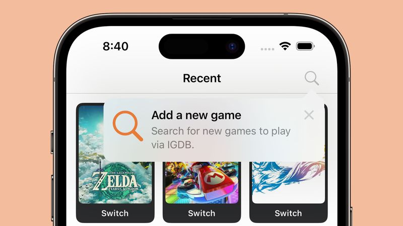
There are two kinds of tip views:
- Popover: appears as an overlay on the app’s UI which lets you direct users without changing the view
- In-line: temporarily adjusts the app’s UI around it so nothing is covered (this is not available on tvOS)
If we wanted to display an in-line tip instead, our code would look like this:
// SwiftUI
VStack {
    TipView(LongPressTip())
}

// UIKit
class ExampleViewController: UIViewController {
    var longPressGameTip = LongPressGameTip()

    override func viewDidAppear(_ animated: Bool) {
        super.viewDidAppear(animated)
        Task { @MainActor in
            for await shouldDisplay in longPressGameTip.shouldDisplayUpdates {
                if shouldDisplay {
                    let tipView = TipUIView(longPressGameTip)
                    view.addSubview(tipView)
                } else if let tipView = view.subviews.first(where: { $0 is TipUIView }) {
                    tipView.removeFromSuperview()
                }
            }
        }
    }
}
UIKit also has a TipUICollectionViewCell for displaying tips within a collection view which should be the route used for table-based interfaces as well. The SwiftUI code is definitely less verbose 🤣
The Dodo Developer: Enjoying this article? Sign up to my free newsletter to get notified about future posts. Subscribe now.
2. Making your tips look tip-top 🎩
You can customise your tips with changes to text colour and fonts along with background colour, corner radius, and icons. The tip views are also fully compatible with dark mode.
Fonts and text colour
These are customised within the Tip structs themselves as you are returning instances of SwiftUI.Text even if you are ultimately rendering your tip in UIKit or AppKit.
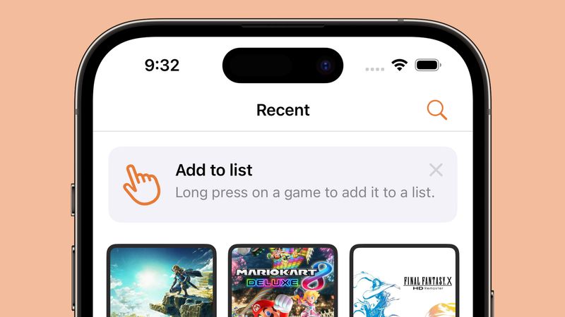
struct LongPressTip: Tip {
    var title: Text {
        Text("Add to list")
            .foregroundStyle(.white)
            .font(.title)
            .fontDesign(.serif)
            .bold()
    }

    var message: Text? {
        Text("Long press on a game to add it to a list.")
            .foregroundStyle(.white)
            .fontDesign(.monospaced)
    }

    var asset: Image? {
        Image(systemName: "hand.point.up.left")
    }
}
As the title and message both use Text, you can use any modifiers that return a Text instance such as foregroundStyle, font, and convenience methods like bold(). The icon is returned as an Image so if we want to change anything like the icon colour we have to do this from the Tip view itself:
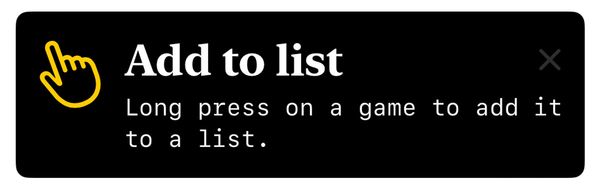
Icon colour, background colour, and dismiss button colour
// SwiftUI
TipView(LongPressGameTip())
    .tipBackground(.black)
    .tint(.yellow)
    .foregroundStyle(.white)

// UIKit
let tipView = TipUIView(LongPressGameTip())
tipView.backgroundColor = .black
tipView.tintColor = .yellow
A method is provided to change the colour of the tip background itself but to change the icon colour we need to use a global tint whilst the dismiss button colour is affected by the foregroundStyle; note that this button appears to be 50% opaque so if you are using a dark background you’ll struggle to see anything other than white. There does not appear to be a way to alter this button with UIKit.
Whilst there are no Human Interface Guidelines for tips yet, looking through the iOS 17 beta and the WWDC 2023 talk shows that Apple uses un-filled SF Symbols for all of their tips. For this reason, I’d suggest doing the same!
Corner Radius
// SwiftUI
TipView(LongPressGameTip())
    .tipCornerRadius(8)
The default corner radius for tips on iOS is 13. If you want to change this to match other curved elements within your app, you can do this with tipCornerRadius() in SwiftUI. UIKit does not have a way to change the corner radius of tip views.
I was pleasantly surprised by how flexible the design was for this first version of TipKit. However, I’d urge caution in customising tips too far as having them match the default system tips is surely a boon in terms of user experience.
3. Lights, Cameras, Actions!
Tips allow you to add multiple buttons known as actions which can be used to take users to a relevant setting or a more in-depth tutorial. This feature is not available on tvOS.
To add an action, you first need to adjust your Tip struct with some identifying details:
// SwiftUI
struct LongPressGameTip: Tip {

    // [...] title, message, asset

    var actions: [Action] {
        [Action(id: "learn-more", title: "Learn More")]
    }
}
Note that the Action initialiser also has an option to use a Text block rather than a String which allows for all of the colour and font customisations mentioned earlier.
With this in place, we can alter our tip view to perform an action once the button has been pressed:
// SwiftUI
Button {
    displayingSearch = true
} label: {
    Image(systemName: "magnifyingglass")
}
    .popoverTip(LongPressGameTip()) { action in
        guard action.id == "learn-more" else { return }
        displayingLearnMore = true
    }

// UIKit
let tipView = TipUIView(LongPressGameTip()) { action in
    guard action.id == "learn-more" else { return }
    let controller = TutorialViewController()
    self.present(controller, animated: true)
}
Alternatively, we can add action handlers directly to the Tip struct:
var actions: [Action] {
    [Action(id: "learn-more", title: "Learn More", perform: {
        print("'Learn More' pressed")
    })]
}
Important: Whilst you can add actions in Xcode 15 beta 5, the handlers do not currently trigger when pressing the button regardless of whether you use the struct or view method to attach them.
One final thing to note on actions is that they can be disabled if you wish to grey them out for some reason (i.e. if a user isn’t signed in or subscribed to a premium feature):
var actions: [Action] {
    [Action(id: "pro-feature", title: "Add a new list", disabled: true)]
}
4. Laying down the rules
By default, tips appear as soon as the view they are attached to appears on screen. However, you may not want to show a tip in a certain view until some condition has been met (i.e. the user is logged in) or you may want a user to have to interact with a feature a certain number of times before the tip is displayed. Luckily Apple has thought of this and added a concept known as “rules” to let you limit when tips will appear.
There are two types of rules:
- Parameter-based: These are persistent and are matched to Swift value types such as booleans
- Event-based: Defines an action that must be performed before a tip is eligible for display
Important: In Xcode 15 beta 5 there is a bug which will prevent the @Parameter macro from compiling for simulators or for macOS apps. The workaround is to add the following to the “Other Swift Flags” build setting:
-external-plugin-path $(SYSTEM_DEVELOPER_DIR)/Platforms/iPhoneOS.platform/Developer/usr/lib/swift/host/plugins#$(SYSTEM_DEVELOPER_DIR)/Platforms/iPhoneOS.platform/Developer/usr/bin/swift-plugin-serverParameter-based Rules
struct LongPressGameTip: Tip {

    @Parameter
    static var isLoggedIn: Bool = false

    var rules: [Rule] {
        #Rule(Self.$isLoggedIn) { $0 == true }
    }

    // [...] title, message, asset, actions, etc.

}
The syntax is relativelty straightforward thanks to the new Macro support in Xcode 15. We first define a static variable for the condition, in this case a boolean detailing if the user is logged in or not. Next we provide a rule based on that condition being true.
If we ran our app now, the tip would no longer be displayed on launch. However, once we mark the static property as true the tip will show up the next time the relevant view is displayed:
LongPressGameTip.isLoggedIn = trueEvent-based Rules
struct LongPressGameTip: Tip {

    static let appOpenedCount = Event(id: "appOpenedCount")

    var rules: [Rule] {
        #Rule(Self.appOpenedCount) { $0.donations.count >= 3 }
    }

    // [...] title, message, asset, actions, etc.

}
The event-based rules are slightly different in that instead of a parameter we use an Event object with an identifier of our choosing. The rule then checks the donations property of this event to determine if the app has been opened three or more times. In order for this to work, we need to be able to “donate” when this event has occured. We do this by using the donate method on the event itself:
SomeView()
    .onAppear() {
        LongPressTip.appOpenedCount.donate()
    }
The donation on an event contains a date property that is set to the time at which the event was donated. This means you can add rules to check if somebody has opened the app three times or more today:
struct LongPressGameTip: Tip {

    static let appOpenedCount: Event = Event(id: "appOpenedCount")

    var rules: [Rule] {
        #Rule(Self.appOpenedCount) {
            $0.donations.filter {
                Calendar.current.isDateInToday($0.date)
            }
            .count >= 3
        }
    }

    // [...] title, message, asset, actions, etc.

}Important: Whilst this code should be possible according to the WWDC 2023 talk, it gives a “the filter function is not supported in this rule” when run on Xcode 15 beta 5.
5. To display, or not to display?
Whilst rules can limit our tips to displaying at the optimal time, there is always the possibility that multiple tips might try to display at the same time. It may also be that we no longer want to display a tip if the user interacts with our feature before our tip was displayed. To get around this, Apple provides us with ways to manage frequency, display count, and to invalidate tips. They also provide a mechanism for syncing the display status of your tips across multiple devices.
Frequency
By default, tips appear as soon as they are allowed to. We can change this by setting a DisplayFrequency when initiating our Tips store on app launch:
try? await Tips.configure(options: {
    DisplayFrequency(.daily)
})
With this in place, only one tip will be able to appear each day.
There are several predefined values for DisplayFrequency such as .daily and .hourly but you can also provide a TimeInterval if you need something custom. Alternatively, you can restore the default behaviour by using .immediate.
If you have set a non-immediate display frequency but have a tip that you want to display immediately, you can do so by using the IgnoresDisplayFrequency() option on the Tip struct:
struct LongPressGameTip: Tip {

    var options: [TipOption] {
        [Tip.IgnoresDisplayFrequency(true)]
    }

    // [...] title, message, asset, actions, etc.

}
Display Count
If a tip is not manually dismissed by the user then it will be reshown the next time the relevant view appears even after app launches. To avoid a tip being shown repeatedly to a user, you can set a MaxDisplayCount which will limit the number of appearances until the tip is no longer displayed:
struct LongPressGameTip: Tip {

    var options: [TipOption] {
        [Tip.MaxDisplayCount(3)]
    }

    // [...] title, message, asset, actions, etc.

}
Invalidation
Depending on our rules and display frequency, it may be that a user interacts with a feature before our tip has been displayed. In this case, we would want to invalidate our tip so that it is not displayed at a later date:
longPressGameTip.invalidate(reason: .userPerformedAction)There are three possible reasons for a tip to be invalidated:
- maxDisplayCountExceeded
- userClosedTip
- userPerformedAction
The first two are performed by the system depending on whether the display count or the user caused the tip to be dismissed. This means you will always want to use .userPerformedAction when invalidating your tips.
iCloud Sync
During the “Make features discoverable with TipKit”, Charlie Parks mentions:
TipKit can also sync tip status via iCloud to ensure that tips seen on one device won’t be seen on the other. For instance, if someone using the app has it installed on both an iPad and an iPhone, and the features are identical on both of those devices, it’s probably best to not educate them on both devices about the feature.
This feature appears to be enabled by default with no options for disabling it meaning you’ll need to provide custom identiers for each tip on the platforms you support if you want to make sure tips are re-displayed on every device for some reason (i.e. if the UI is significantly different between devices).
6. Debugging
TipKit provides convenient APIs for testing, allowing you to show or hide tips as needed, inspect all the tips without satisfying their rules, or purge all info in the TipKit data store for a pristine app build state.
// Show all defined tips in the app
Tips.showAllTips()

// Show the specified tips
Tips.showTips([searchTip, longPressGameTip])

// Hide the specified tips
Tips.hideTips([searchTip, longPressGameTip])

// Hide all tips defined in the app
Tips.hideAllTips()
If we want to purge all TipKit related data, we need to use the DatastoreLocation modifier when initialising the Tips framework on app launch:
try? await Tips.configure(options: {
    DatastoreLocation(.applicationDefault, shouldReset: true)
})
Conclusion
Tips are instrumental in helping users discover features in your app be it on iOS, iPadOS, macOS, watchOS, or tvOS. Remember to keep your tips short, instructional, and actionable, and make use of the rules system, display frequency, and invalidation to ensure tips are only shown when they need to be.
-
Note that this differs from the
TipsCenter.shared.configure()that was previewed in the WWDC 2023 talk “Make features discoverable with TipKit”. ↩︎