Ben Dodson

Freelance iOS, macOS, Apple Watch, and Apple TV Developer

The tale of the "O2 Fail" (starring the iPhone 3GS)

Ever since the iPhone 3GS was announced in the Apple WWDC Keynote last week, the internet has been ablaze with criticism about both AT&T and O2 with regards to their upgrade policies to the new phone for existing iPhone 3G customers. I have battled long and hard on Twitter and on the O2 Forums to try and put across that they have in fact done nothing wrong, it is the public that are misguided, yet this has fallen on relatively deaf ears. I decided it would be easier to put one whole post together about the "O2 Fail" (or #o2fail for you Tweeters) and the rational response to it so I could just point people in this direction rather than re-explaining myself over and over!

Disclaimer: I don't work for O2 and never have done. I used to be on the 3 mobile network in the UK as it was the cheapest before switching to O2 in order to get the iPhone. I bought the original iPhone about 4 months before the 3G came out (and so paid full price for it which was around £330 plus a £35 contract) and then upgraded to the iPhone 3G by paying £59 and upgrading to the £45 18-month contract. I will be buying the iPhone 3GS next Friday by taking out a second contract and letting the remaining 6 months on my current contract run out. Therefore, I have no reason to be supporting O2 as I would benefit greatly if they caved in and let people upgrade for free - the point I'm putting across is that there is good reason why they aren't doing that and people need to understand why that is.

O2 Fail Twitter

The iPhone 3GS

During the WWDC Keynote, Apple announced that the new model of the iPhone (the iPhone 3GS - the 'S' stands for 'Speed') would be released on the 19th of June in 6 countries at a price of $199 for the 16GB model and $299 for the 32GB model. Crucially, these were prices on a specific AT&T 24-month tariff for new customers. Here in the UK, the prices vary from 'free' to £280 or so (or even £550 if you choose Pay As You Go). Again these prices are for new customers only. So, as was bound to be the case, there are a large number of iPhone 3G customers who want to upgrade to the iPhone 3GS who are being told they have to finish their existing contracts before they can get the new model. This can be done in two ways; wait until your contract ends or pay to get out of it now. This very simple issue is the basis for all of "O2 Fail" comments over the past few days. Let's look at why it has annoyed people so much...

"But last time..."

When the iPhone 3G as announced, O2 allowed original iPhone customers to terminate their contracts early at no cost and start a brand new contract. The only cost was that of the phone and was the same cost that applied to new customers. In my own case, this was around £59 as I moved up to the £45 a month contract (18 months). The reason O2 did this (when they and other carriers have never done this for a phone before) is because they didn't subsidise the original iPhone. When you went to the Apple Store or to an O2 store, you paid the full retail price (which was around £330 for the 16GB model). Therefore, the contract you were on was purely making money based on calltime - that was a pretty sweet deal for O2 and so it was surprising they allowed people to upgrade.

In any case, most people seem to think that as it happened last time it should happen this time. They have failed to grasp the crucial word 'subsidy'. The original iPhone wasn't subsidised, the iPhone 3G was (as is the iPhone 3GS). This means that a large portion of the money you now pay to O2 from your contract goes directly to Apple for the cost of the phone. It's worth pointing out that this is the same with every other phone on the market with every other carrier (unless you're using Pay As You Go in which case you pay the full price for the phone up front). So, if O2 were to say at this point "of course you can upgrade under the same conditions as last time" they would lose a HUGE amount of money as not only would they not have made any money on airtime, they would have lost the money on the subsidised phone.

What about paying off the remaining subsidy on my phone?

There have been a fair number of people asking this question - "why can't I just buy out my subsidy and get a new contract". The key problem here is that O2 would still not have made any money as they would have basically given you free airtime for the last 12 months. If you only pay your subsidised part, then they aren't making money. This is where the crucial word 'contract' comes into use as you signed an agreement to pay a certain amount of money per month to cover the cost of the phone and the airtime.

But what about customer loyalty!?!

The follow up argument to the above is "but they'd make money on the airtime in my new contact". So, you've just screwed O2 for the past 12 months by using their network without effectively paying for it and now you want a new contract where they will be able to make their money back? I don't follow that for one instant as what happens when the next iPhone comes out in 12 months ? We'll go back to square one with the argument being "they did it the last 2 times, why can't I upgrade now" which means that again O2 will go without being paid for their network usage.

Ok, how about they just add my remaining contract to my new contract?

This is a slightly harder argument as in a way it makes some sense. Rather than waiting 6 months for my contract to expire and then upgrading to a new 18 month contract, why can't O2 just let me upgrade now and add an additional 6 months to my new contract? This would work in theory but the problem is that you'll start getting people on contracts from 18-36 months and I'll guarantee that come next year they'll be the first ones to ask for another extension putting them on 24-42 month contracts and so on. This is a similar problem to people extending loan terms forever and ever in that there comes a point where they simply aren't going to pay it back. I don't know the full details but I imagine there are some laws on how many times a contract can be extended as well in order to ensure fair fiscal management but don't quote me on it!

Don't they realise we're in the middle of a recession!

This is by far the best argument I've seen used - people actually pointing out that due to the "credit crunch", O2 should be lowering prices so they can get the phone cheaper. If the recession is really that bad, don't you think it's a little stupid of you to be arguing about getting a slightly faster iPhone? Surely you should be worrying about the price of basic essentials like food, clothes, and petrol rather than the ability to get a slightly better camera in your smart phone? And how do you think mobile phone carriers are doing in the economic crisis? They need to make money as well!

The Facebook Group

One of my other favourite things during this whole saga has been the Facebook group I DONT WANT TO PAY TO UPGRADE MY IPHONE! - I don't think I even need to provide an argument against this.

My Point

I've spoken about the reasons why these arguments are flawed but my real point is that people don't "need" the iPhone 3GS so I don't understand why so many people are desperate to upgrade. I'm an iPhone developer and therefore want the new hardware so that I can write better apps that utilize it's hardware, but to everybody else there is very little gain. Sure you get a slightly better camera, the ability to film video, and a digital compass (as well as a processor and RAM upgrade) but you get far more from the 3.0 upgrade than you do from the hardware upgrade.

I suppose my real point is that there are things called "contracts" that people have entered into - they are now throwing their toys out of the pram because they can't get the latest shiny object from Apple without paying for it but unfortunately that's just how it is and O2 are not going to change their minds. Why not? Because if they did they would lose huge amounts of money. At this point people decry the greedy networks and the fact that they are going to take their business elsewhere. The crucial point is that O2 is the only network that can cope with the iPhone properly and they are the only supplier so you either stay with them or you get a Palm Pre, a Google Android, or one of the new Windows Mobile phones from another supplier. But, I can guarantee that in 12 months when a new model of those phones comes out, the networks won't let you upgrade early for free so you'll be back where you started.... just with a rubbish phone instead!

The key point is that the iPhone 3GS has not been designed for existing iPhone 3G customers - it has been designed specifically to address the concerns of people who were deciding whether to get one of the other smartphones I mentioned or an iPhone. They have added MMS, Video, and a better camera - the three major flaws with the iPhone that any undecided customer would count as negatives. If you're an iPhone 3G user at present, I highly doubt that you are going to stop becoming an iPhone user over this issue as you have already been sold on the idea of the phone and you know that no other phone currently suits your needs.

Besides, as a network O2 has proved itself to be far better than many other iPhone carriers (*cough* AT&T *cough*). They are supporting MMS on launch day (including video for those with the 3GS), the push notification system has worked flawlessly so far (I've been beta testing it), and they have internet tethering working as well (which also works very well - I'll be coming back to the price of this later).

What can I do?

So if you're read this and been swayed over to rational thinking rather than getting involved in the anti-O2 hype, what are your options for upgrading to the iPhone 3GS?

Wait. I know it's difficult but you don't need the iPhone 3GS. If you had a great need for video then you would have bought a different phone in the first place. If you bought your iPhone 3G on launch day, you should have 6 months of you contract left and this may be reduced to 0 months, 3 months, or 5 months depending on how much you've spent recently - take a look at the O2 Priority List for details.

Buy a Pay As You Go iPhone 3GS and sell your old iPhone 3G on eBay (or to a friend, etc). You get the full functionality, get to keep your number, and it'll all work on launch day just by putting your existing SIM card into the new phone. Visual Voicemail, etc, will work as you'll still be on a contract plan (the hardware between the contract and PAYG phones is the same). Plus you might even make money this way as the iPhone 3G's are selling for a high price - best to get on their quickly though!

Pay off your existing contract. This route is the most expensive but you could pay off your existing contract and take out a new one - the price is generally the number of months remaining times your monthly rate so in my case it was £270 (£45 x 6). This is the easiest way but the most expensive.

Take out a second contract. This is what I'm going to be doing next Friday. Rather than paying off my contract in one lump sum, I'll keep that contract and my iPhone 3G (I use it for app testing) but I'll just get a new contract with the iPhone 3GS. This means I'll be paying for 2 contracts for around 6 months but that spreads the cost a bit rather than having one big hit all at once. Also, you can downgrade your iPhone contract one level after 9 months so I'll be able to move my iPhone 3G down to the £35 plan this month (and the £30 the month after) which will save some money - it also means I have a spare, live phone in case I need it for anything. This is again an expensive method but it spreads the cost rather than having it all in one hit - however, it may be subject to a second credit check to make sure you can afford two contracts at once.

What should O2 do?

To my mind, this whole saga could have been avoided if O2 still offered 12 month contracts. Of course, the main problem is that phones are getting more and more expensive and operators want to keep overall contract prices as low as possible so they look competitive. I believe it was 3 mobile who were the first to bring in 18 month contracts as they could do so incredibly cheaply - they got a huge market share simply because people didn't realise what they were signing up for.

So, on the one hand you could have 12 month contracts but charge people a large amount a month so you cover both subsidy and airtime, or you can have 18-24 month contracts which are cheaper but then the customer has to pay out if they want to upgrade to the latest and greatest phone. Both have their issues and overall the cost is probably the same; the real difference is when you pay it. Personally, I would like to see mobile operators offer all three services so people can choose straight up if they want 12 months (high price, low lock-in), 18 months (medium price, medium lock-in), or 24 months (low price, high lock-in). That would avert this whole discussion on upgrading to new phone models!

Conclusion

So there you have it - O2 haven't done anything wrong, they are simply doing the same as every other provider has done since they were created. We can shout all we like but they won't back down on this issue as it doesn't make any financial sense for them to do so. If you are desperate for the iPhone 3GS, then you'll just have to pay for it or wait it out a bit longer.

Now, if I've convinced you to stop petitioning O2 about iPhone 3GS upgrades, perhaps I can convince you instead to spend your time petitioning them about their ridiculous Internet Tethering charges as that is a fight I believe can be won - £15 for 3GB of transfer is far, far too much and I can't see any justification for it! So, give up the 3GS battle and instead shout about the tethering charges :)
Mastering phpMyAdmin 3.1 for Effective MySQL Management

I was recently asked by Packt Publishing to review a copy of their latest book, Mastering phpMyAdmin 3.1 which promises to "increase your MySQL productivity and control by discovering the real power of phpMyAdmin 3.1". I was a little skeptical at first of a book on phpMyAdmin, the most widely used MySQL admin tool, especially when it arrived at 325 pages! However, there is a huge amount of information that really is very useful to every PHP developer out there whether you are a beginner or an advanced user.

[123/365] Mastering phpMyAdmin 3.1

Now, most people I've mentioned the book to have scoffed and said something along the lines of "I already know how to use phpMyAdmin". Like them, I thought I knew what phpMyAdmin was and what it could do but it turns out there are huge amounts of functionality I never knew existed in MySQL let alone in phpMyAdmin!

For the Beginner

The book starts off with a very gradual introduction to phpMyAdmin covering everything from basic installation and setup to a detailed explanation of the overall interface. I was particularly pleased to see an in-depth chapter on security configuration at the beginning of the book which would help any newcomer make sure that their setup is completely secure - usually such chapters are found at the back in the appendices! The first six chapters follow in a similar vein with very basic information about how to run SQL queries, edit data, change structures, and so on but chapters seven and eight deal with exporting and importing data which is one of the many areas that I have seen developers struggle with in the past. There is a good explanation of the different methods for importing / exporting including the benefits of certain types over others. Crucially, there is a section on CSV using LOAD DATA which is something that has always seemed to lack proper explanation to me in the past.

There then follows a few more chapters which more advanced users can probably skip such as searching, an overview of relational databases, and table / database operations.

Advanced Topics

I would say that the real meat of the book for experienced PHP developers begins at chapter thirteen with each further chapter adding useful knowledge. I've listed the key highlights of these chapters below:

  • The Multi-Table Query Generator - A powerful tool which enables you to fine tune complex queries via a series of forms thus allowing you to specify multiple criteria. It contains features such as automatic joins which allow you to very easily build up complex queries.
  • Bookmarks - A feature I was completely unaware of that allows you to save queries for future use. This is particularly useful if you happen to be a database administrator that administers purely on a table by table basis within phpMyAdmin and has a number of queries to run. I always used to have popular queries I'd use stored in a notepad on my OS X Dashboard but no need anymore!
  • System Documentation - I recently had a need to produce some MySQL documentation so was very happy to read this chapter and find out about the excellent documentation tools available within phpMyAdmin. This includes not only a basic print view, but also a data dictionary and a relational schema which are all exported as PDFs.
  • MIME-Based Transformations - If you're the kind of developer that likes to store images, etc, as BLOB fields. With transformations, you can make images appear as images within the phpMyAdmin results rather than as indecipherable encoded text. Very useful!
  • MySQL 5.0 and 5.1 - a quick look at the enhancements that MySQL 5 added with things such as views, routines, stored procedures, and very interestingly, triggers (a way to run other MySQL commands when a certain thing happens - e.g. when a table gets updated). You'd probably want a separate book to cover MySQL 5 if you were planning on doing any development with it, but this chapter gives you a good overview of some of the things you can expect.
  • MySQL Server Administration - The final chapter deals with some of the more fundamental maintenance tasks related to the actual server and improvements that can be made with caching etc as well as a good comparison of the different types of storage engine you can choose.

Summary

All in all, I would highly recommend this book to any PHP developer or anybody that is using phpMyAdmin on a regular basis. It could really have been broken into two books - a beginners and an advanced - but it works well by acting as a reference for those developers that have grown up using phpMyAdmin. The main thing though is that it taught me a great deal about phpMyAdmin that I didn't realise was even there - just goes to show that even a basic sounding book can have a great deal to offer.

Mastering phpMyAdmin 3.1 is available online from Packt Publishing

TwitterFollowers PHP Class - A Better Way To Track Followers, Quitters, and Returning Followers on Twitter

Over the past few months, there have been a number of web apps that have popped up with the task of feeding your ego (or indeed deflating it) by telling you exactly who is following you on Twitter and giving you pretty graphs to show you how your followers are increasing - some of them even go so far as to estimate how many followers you are likely to have in a weeks time! However, the key thing for me that is missing from Twitter is the ability to see who has stopped following you and also those people that stopped but are now following you again as you don't get email alerts from Twitter for these two things. This is a useful piece of information to have as it will let you know when people drop off and whether they are important (e.g. friends who don't care what you are talking about thus suggesting you should stop talking crap) or not (e.g. spam bots).

I did a bit of research and the only real web app to fulfill this need that I could find was the beautifully designed Qwitter. However, the problem with Qwitter is that it only gives you the details for one person with the idea being that you say "tell me when this username stops following me" - it's a little bit stalkerish in my opinion! Like any PHP developer, I decided that I could build my own little system to give me my Twitter ego boost and so have come up with the class below which you can all now take and use as you see fit.

Update: Turns out I was wrong about Qwitter as the username you put in to follow is supposed to be yours, not the person you want to watch when they leave you. They need to do better copywriting! In any case, the class below serves as a good demo of the public Twitter data and allows you to extend it the way you want.

Note: This won't work straight out of the box - I've put in a few comments which say "SQL Required". This is because you may well have your own schema (although I do provide one) and you may have your own framework or DB connection functions (I know I do). Once you've done those, just substitute the constants for your own details and it should all work

TwitterFollowers.class.php

<?php

/**
 * Crawls Twitter Followers and sends an email alert to show you who has started following, stopped following, and started re-following
 *
 * @author Ben Dodson
 **/
class TwitterFollowers
{
	// define constants

	const username	= 'bendodson';
	const email 	= 'ben@bendodson.com';
	const subject	= 'Twitter Updates';
	const from	= 'TwitterBot <twitter@bendodson.com>';
	
	// define internal variables

	protected $actualFollowers = array();
	protected $internalFollowers = array();
	protected $followerChanges = array();
	protected $now = '';
	
	function __construct()
	{
		$this->now = date('Y-m-d H:i:s');
		
		$json = file_get_contents('http://twitter.com/followers/ids/'.self::username.'.json');
		$this->actualFollowers = json_decode($json);
		$this->internalFollowers = $this->getInternalFollowers();
		
		foreach ($this->actualFollowers as $actualFollower) {
			if (!in_array($actualFollower, $this->internalFollowers)) {
				if ($this->getTweeter($actualFollower)) {
					$this->followerChanges['returning follower'][] = $actualFollower;
					/*
					--SQL REQUIRED--
					UPDATE TwitterFollowers SET start = $this->now, end = NULL WHERE id = $actualFollower
					*/
				} else {
					$this->followerChanges['new follower'][] = $actualFollower;
					/*
					--SQL REQUIRED--
					INSERT INTO TwitterFollowers (id) VALUES ($actualFollower)
					*/
				}
			}
		}
		
		foreach ($this->internalFollowers as $internalFollower) {
			if (!in_array($internalFollower, $this->actualFollowers)) {
				$this->followerChanges['stopped following'][] = $internalFollower;
				/*
				--SQL REQUIRED--
				UPDATE TwitterFollowers SET end = $this->now WHERE id = $internalFollower
				*/
			}
		}
		
		$this->sendEmail();	
	}
	
	protected function getInternalFollowers()
	{
		$data = array();
		$raw = 
		/*
		--SQL REQUIRED--
		SELECT id FROM TwitterFollowers WHERE end IS NULL
		*/
		foreach ($raw as $r) {
			$data[] = $r['id'];
		}
		return $data;
	}

	protected function getTweeter($id)
	{
		return
		/*
		--SQL REQUIRED--
		SELET * FROM TwitterFollowers WHERE id = $id LIMIT 1
		*/		
	}
	
	protected function getTweeterDetails($id)
	{
		$json = file_get_contents('http://twitter.com/users/show/'.$id.'.json');
		$tweeter = json_decode($json);
		return $tweeter->name . ' ('.$tweeter->screen_name . ')';
	}
	
	protected function sendEmail()
	{
		$to      = self::email;
		$subject = self::subject;
		$headers = 'From: ' . self::from . "\r\n" . 'Reply-To: ' . self::from;

		$message = 'Hi,' . "\r\n\r\n";
		$message .= 'Here are your Twitter Updates:' . "\r\n";
		
		if (count($this->followerChanges) > 0) {
			foreach ($this->followerChanges as $changeType => $change) {
				$message .= "\r\n" . '--'.strtoupper($changeType).'--' . "\r\n\r\n";
				foreach ($change as $tweeter) {
					$message .= '*' . $this->getTweeterDetails($tweeter) . "\r\n";
				}
			}
		} else {
			$message .= "\r\n" . '--NO UPDATES FOUND--' . "\r\n";
		}
		
		mail($to, $subject, $message, $headers);
	}

}

?>

MySQL Database Schema

CREATE TABLE IF NOT EXISTS `TwitterFollowers` (
  `id` int(20) NOT NULL,
  `start` timestamp NOT NULL default CURRENT_TIMESTAMP,
  `end` timestamp NULL default NULL,
  PRIMARY KEY  (`id`)
) ENGINE=MyISAM DEFAULT CHARSET=latin1;

How does it work?

First of all, you will need to substitute the SQL sections for your own particular schema and database functions. Once you've done that, alter the class constants so that they are your own username and the email address you want to send your updates to. Finally, set up a CRON job so that it runs at a certain point every day. I currently have mine set to run at 9am every morning but I may well change it to run every time I post a tweet as then I'd be able to see which tweet had made people start or stop following me.

The script works by checking the publicly accessible JSON feed of your followers and getting all of their IDs. I say it's publicly accessible, but I don't think it is if you have protected your updates which will of course cause problems! Once it has all of the IDs, it checks this against the IDs stored in your database - if there aren't any then everyone will show up as following you on the first run. If it finds an ID in your database that isn't in your JSON string then you've been dumped! Conversely, if it finds an ID in the JSON string but not in the DB then, congratulations, you've got a new follower. The final instance is if it finds an ID in the JSON string that is in the DB but has an end datetime assigned to it. This means the person was following you, stopped, and has now decided to re-follow you.

The whole lot then gets packaged up and emailed to you with each section broken down so you can read it clearly. In order to do this, it looks up each ID that goes into the email against that persons publicly available Twitter information to give you both their "real name" and "username".

Known Problems

  • I don't think it will work if you have your updates set to hidden.
  • If one of your followers gets banned from Twitter, then their name won't show up in the email (it will just be blank)
  • This script won't work if you have more than 5000 followers - this is because that is the maximum result set from the JSON string. You'd need to add paging information to get more than 5000 although this would be fairly easily. Alas I don't have that many followers to be able to test that out!

Conclusion

So now you can easily (if you know PHP) get updates on all your Twitter followers and non-followers. Feel free to use all the above code and modify to your hearts content - if you found it to be useful, then please leave a comment below. Oh, and I couldn't possibly write a post about Twitter without reminding you that you can follow me @bendodson ;)

Getting Xbox Live Achievements Data: Part 2 - The AppleScript Solution

Following on from the first of this series of tutorials on how to extract Xbox Live achievement data using PHP and AppleScript, I thought I would use this second part to look at the AppleScript that powers one side of the system I've put together. In the next part, I'll be explaining the PHP class I've built, and in the fourth part (the last of the series) I'll be showing you how the two talk together and how you can use the collected data with other APIs such as Facebook Connect.

So, let's have a look at some code!

XboxLive AppleScript

set urlFilePath to "http://externals.bendodson.com/weblog/XboxLive/urls.txt"
set dataFilePath to "server:XboxLive:data.txt"
set toCrawl to ""

set dataFile to open for access file dataFilePath with write permission
set eof of dataFile to 0
close access dataFile

tell application "Safari"
	open location urlFilePath
	delay 1
	do JavaScript "window.location.reload()" in the front
	delay 1
	try
		set toCrawl to (the text of the front document)
	end try
end tell

if length of toCrawl > 0 then
	tell application "Safari" to open location toCrawl
	delay 15
	tell application "Safari"
		set sourceCode to the source of front document as string
		set dataFile to open for access file dataFilePath with write permission
		write sourceCode to dataFile starting at eof
		close access dataFile
	end tell
end if

tell application "Safari" to close every window

This is the first time I've used AppleScript for anything other than just playing around and I have to say that as a language it's incredibly good. Just by reading through the above, you'll probably be able to work out what's going on even if you've never seen any type of programming code in the past. Even so, I'll go through each section and explain what it does along with the reasons why I decided to do it in this particular way rather than some of the other ways I could have chosen.

Note: All of this AppleScript is completely self-taught from searching around on the internet. I was going to buy the book AppleScript: The Missing Manual but I was able to read all the sections I needed on Google Books which was convenient - I'll probably buy the book anyway to brush up on a few other areas. If you are an AppleScript guru and you know a way to optimize my code, please use the comments section below so others can learn and so I can update it.

Before we get on to looking at the code, it might be worth briefly recapping how everything will work. My server will check the XboxLive API in order to see if my gamerscore has increased. If it has, then it saves the URL of the achievements page for my most recently played game (which it can't itself read due you needing to login to Xbox Live with javascript enabled - something cURL can't do!) in a text file on the server. My mac mini at home then runs the above AppleScript in order to retrieve the saved URL, open it in Safari, and save the HTML in it's own text file that is available via the internet. My server will then check this text file, parse the HTML, and save the achievements to a database.

How does it all work?

Now we've got that out of the way, let's look at that AppleScript in more detail:

set urlFilePath to "http://externals.bendodson.com/weblog/XboxLive/urls.txt"
set dataFilePath to "server:XboxLive:data.txt"
set toCrawl to ""

These three lines of code are used to define variables which we will use later on in the code. The first one, urlFilePath, is the URL of the text file on my server that will tell our script what URL we need to retrieve the HTML from. You'll see how we populate that text file with my XboxLive php class which will be discussed in part three of this four part series. The second variable, dataFilePath, is interesting as it contains the path to the file we are going to save the HTML to on the local machine. So why the strange syntax? This is referred to as Finder syntax and is a way for AppleScript to reference a particular section within Finder, in this case a text file. It is essentially the same as "/server/XboxLive/data.txt" which we could have used - the difference is that we would have had to have converted that into the Finder syntax in order to use some of the file editing commands we'll use later so I thought it best just to save it correctly at the beginning.

set dataFile to open for access file dataFilePath with write permission
set eof of dataFile to 0
close access dataFile

These three lines are again fairly easy to follow. We set a variable of dataFile to be the handler of the file declared in the path of dataFilePath. Note that we have specifically mentioned we want to use write permissions as the default is just to use read permissions. The next line sets the eof or "end of file" within the handler to 0 whilst the following line tidies up by closing the file handler (which isn't strictly necessary but good practice). The reason for setting eof to 0 is that we want to delete the contents of the file before we put anything else in later. This is practical for the simple reason that we don't want our PHP script on the server to parse a load of data in the text file (or even download it) if it's something it has already read as that would be a waste of processing power and bandwidth.

tell application "Safari"
	open location urlFilePath
	delay 1
	do JavaScript "window.location.reload()" in the front
	delay 1
	try
		set toCrawl to (the text of the front document)
	end try
end tell

Now we get to the first real section of the code that deals with our problem. In these lines, the application Safari is made to open the text file on the server that may contain the URLs, refresh that page using JavaScript, and then attempt to set the variable toCrawl to the text of the file. Before we even examine this in depth, you may be wondering something along the lines of "why don't you download the file or read it with FTP rather than opening it in Safari" and this would be sensible. My initial thoughts on how to get the text on the server into a variable in my AppleScript was to access the file via FTP. OS X has very basic FTP support (read only unfortunately) that can be mounted through Finder and then accessed using the Finder syntax we used earlier on. I had originally written some AppleScript that would run in the startup process of the mac mini which would mount the drive. Then, this AppleScript read the file in using open for access file urlFilePath and set the variable that way. It all worked perfectly until the server changed the contents of the URL text file. No matter what I did, the text file came back the same as it had when first fetched and it was that that I realised that the FTP built into Finder is fundamentally flawed as everything is cached. If you don't edit the file through Finder (e.g. by using a mac application that saves it again through Finder) then it will never know it's updated and thus can't be used in this scenario.

With that out of the way, let's look at my workaround. The first and last lines are the opening and closing of a tell; a way to get an application to do what we want. In this instance we are going to tell Safari to open the URL saved in the variable urlFilePath and then delay for one second. This delay is needed as Safari may take this long to open the URL. Without the delay, we may be in danger of running code on a page that hasn't loaded. In the next line, we tell JavaScript to reload the document before waiting another second for this to complete. This refresh is necessary to clear any caching of the document. The final section is used to set the variable toCrawl to the contents of the browser window. You may wonder why there is a try statement wrapped around it? This is because if the text file was empty and you tried to get the text of the front document, the script would error. To get around that, we initially set the variable (in the very first block of code if you remember?) and then use try to reset the variable only if no error would be caused in doing so. Very useful!

By the end of this block of code, we will have a variable which will either contain a URL if the text file on the server had one, or it will be empty, meaning that the server is not requesting any HTML. Let's move on to the next section:

if length of toCrawl > 0 then
	tell application "Safari" to open location toCrawl
	delay 15
	tell application "Safari"
		set sourceCode to the source of front document as string
		set dataFile to open for access file dataFilePath with write permission
		write sourceCode to dataFile starting at eof
		close access dataFile
	end tell
end if

This is the core piece of functionality that I was trying to achieve all in this block of 11 lines. This script will open a URL in Safari, and then save the source code of the loaded page in a text file. You'll notice that the first and last lines are an if statement relating to the length of the toCrawl variable. I don't unlock achievements every 5 minutes of the day and so, more often than not, the toCrawl variable will be empty. If it is, then we want to completely ignore the next section of code as there is no reason whatsoever to run it!

The next line is a one line tell to make Safari open the URL we saved which is then followed by a 15 second delay. You'll notice this is a lot longer than the 1 second delays earlier. The reason for this is that, in the first case, it was a simple text file with around 100 characters in it and so loaded incredibly quickly. This URL, conversely, will be a very large page (around the 100kb mark) that may go through a series of 5 redirects depending on how recently the page was accessed. This is because after 15 minutes of inactivity, the site forces you back to the login page but I have a cookie stored that will then automatically log me back in. It just takes a few seconds to go through the process of all the redirects to get to the actual page hence the long time delay.

The last section is a simple expansion of the code we used at the beginning. We tell Safari to set a variable of sourceCode to be the source of the page that's open - we also tell it to be forced as a string in case there are any casting issues. Next, we open the dataFilePath and set a handler of dataFile so that we can then write the sourceCode variable into the file starting at the end of the file (which we all know is masquerading as the beginning of the file also as we set it earlier on... keep up!) before tidying up after ourselves and closing access to the handler. Easy!

tell application "Safari" to close every window

In the very final line of code, we tell Safari to close all of it's windows in preparation for the next iteration. This may not seem terribly important, but trust me, if you neglect to put it in and then unlock 10 achievements, you'll find your mac now has 20 open Safari windows!

Conclusion

So that's all there is to this section - a large chunk of AppleScript and a rationale as to why I had to open Safari to get at a text document rather than doing it a slightly more simple way via FTP (due to massive caching issues). I hope this post has introduced some of you to AppleScript which I have found to be a rather powerful tool when it comes to mac development. It's very easy to understand and is a great way of transitioning from a web-based language to a desktop-based one especially as you can save AppleScript as a standard mac application.

Join me again for part three of this four part series when I'll be looking at this from the other angle; the PHP server that needs to parse the HTML we have gathered using this AppleScript. To make sure you don't miss a section, you can subscribe to the RSS Feed or follow me on Twitter. Please feel free to leave any comments or suggestions on this page.

iPhone 3.0 "push" Notification Testing with AP News

As a member of the iPhone Developer Network, I received an email from Apple today inviting me to "test the Apple Push Notification service" by downloading a new version of the Associated Press app. They'd given me a special code to use in iTunes that would redeem into a download of the app but unfortunately the code only works in the US Store. Furthermore, trying to switch to the US Store didn't work as my account is tied to the UK Store. I was going to give up but then I had an idea on how to get around this problem. Here's how I did it:

Creating a new account

When you use the "redeem" section of iTunes, you type in your code and if you're not logged in already it prompts you to. However, you can also register at this stage so I decided to set myself up a nice new US account. You have to link a credit card or payment method to your account and I initially tried to do this but it blocked me as the payment method wasn't based in the US (either using a credit card or paypal). However, as I was redeeming a code, they have to give you the option of registering without a credit card as it might be you've given a $25 gift card to your nephew or something like that. Therefore, all I had to do was choose "no payment method" and then fill out the rest of the form. Email was easy as I run my own domain so just created a dummy email account, and faking an address is made very easy thanks to reverse geocoding. I simply went to getlatlon.com, picked a random place in Florida, and then used a reverse geo-coding app to convert that lat lon into a street address. Easy!

The app

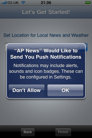
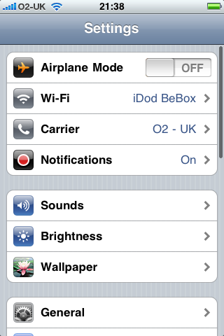
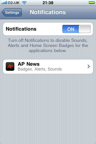
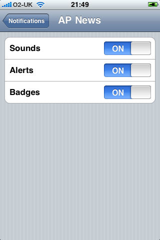
Now that the account was created, my code was automatically redeemed and the app downloaded to my machine. It synced across to my iPhone with no problems and is now running happily. I've attached some screenshots below:

Push Notification Prompt Settings Notification Settings AP News Notification Settings

So as you can see, the app triggers a new "notifications" panel where you can enable or disable individual apps and the alerts that they are allowed to send you. I haven't yet received any notifications but will update photos and any additional functionality as and when it happens.

Update: Just received my first push notification! I remember during the last Apple Keynote (the launch of the 3.0 beta) that the reason push hadn't been introduced before is because it's a complex system that has to be set up differently for every mobile provider. After an hour with no updates, I had begun to think that O2 wasn't set up but it would appear that they are!

AP News Push Notification

Note: Technically, this should fall under the iPhone Developer NDA. However, ever since iPhone Beta 3.0 was released to the development community, every Mac blog has published photos and detailed information without any kind of reproach from Apple so I feel that there is no problem in publishing these photos.

Duplicate Messages Bug Fixed on TubeUpdates.com

As you may already know, I run a website called TubeUpdates.com which provides a RESTful API for the TFL Underground network so you can build apps that utilize that data. Unlike some other services or XML files that try to provide this data, my API scrapes all of the pages on the TFL site in order to give out the specific messages for each line e.g. rather than having "Minor Delays" you'll be given an array of each message from their site about the delays such as "Sunday 17 May, suspended between Liverpool Street and Leytonstone. Two rail replacement bus services operate." which is obviously a lot more useful.

However, as my script relies on screen scraping, problems do occur when TFL decide to change their HTML or site structure which has happened recently. Previously, every tube line had it's own page with it's messages listed on it but now there is one single page with all of them shown and hidden with javascript. This meant that for a short period, my API was posting out the messages for every single line with each line returned (so if you wanted to look at circle line messages, you would in fact get every line).

This has now been fixed and actually makes the service slightly better for me as it now means I can crawl just 3 pages rather than the 14 I was crawling before (thus better for both bandwidth and CPU cycles). I have a number of functions set up to report when TFL change their site structure as the usual problem is that a site redesign changes class names or markup in such a way that the API just breaks. However, in this case none of these warnings kicked in as it was getting the data correctly and all seemed to be ok.

So, a big thank you to those of you that emailed in to report the bug! If you have any questions about the Tube Updates API, then please check out the site or drop me an email.

Getting Xbox Live Achievements Data: Part 1 - The PHP Problems

Those of you with an Xbox 360 (or indeed some "Games for Windows" titles) will know all to well about the achievements system prevalent in every game. For those that don't know, every gamer has a profile which has a gamerscore. This score goes up by completing certain tasks within each game as laid down by the developer. This could be something you would do anyway such as "finish the game" or something random such as "destory 10 cars in 10 seconds". Every full game can give out 1000 gamerpoints (1250 with expansion packs) and an Xbox Arcade title can give out 200. These points are somewhat of a geek badge of honour for most Xbox gamers who will try and do everything to get the full 1000 in each of their games - there are also those that want to increase the number as quickly as possible so you can find numerous guides online for the easiest way to get 1000 points (it seems Avatar is still the best way giving you the full 1000 with about 3 minutes of gameplay!)

When I was trying to compete with my ex-boss over the number of gamerpoints we each had (I lost by the way), I found that there was no public API from Microsoft to allow you to get at the Xbox Live data. There was however an internal API and one Microsoft associate had set up a restful API so that you could publicly call the internal one. This worked well enough for the basic site I put together to compare two gamerscores but I've been wanting to do more with the API for some time.

My overall idea is that I'll be able to type in my userid and then have my server poll Xbox Live at a certain time and then update my Facebook Wall when I unlock new achievements. The message would be something along the lines of "Ben just completed the 'Fuzz Off' achievement in Banjo Kazooie: N&B and earned 20G" and would have the correct 32x32px image for the achievement. I initially thought that this would be fairly easy but I was unfortunately very wrong! In this series, I'm going to show you the problems I encountered as well as the final (rather complex) workaround I'm creating in order to get it all to work! If you've got any questions, please leave a comment or get in touch.

Attempt #1: Using the API

When I first sat down to work on this project, my initial thoughts were "I can just reuse the public API I used for my gamerscore comparison site - there's bound to be an achievement section in the returned data". After eagerly re-downloading all the code, I discovered that although there was some achievement data, it was nowhere near as detailed as the information that I would need. The problem was that the API only shows you your recently played games and how many achievements you have unlocked in each one as well as the overall number of points you have earned for that game. Theoretically, I could check the API every few minutes and compare the number of points with a local copy in order to work out when a new achievement had been unlocked but I'd only be able to say that an achievement had been unlocked in a certain game worth a number of points. To make things even trickier, if I unlocked more than one achievement within the timeframe of the API check, then the results would be wrong (e.g. it might say I'd unlocked one achievement worth 45G when in fact I'd done two; one for 20G and one for 25G). This would become even more complex if I unlocked an achievement, then switched games and unlocked one in that game before the API had been called. In short, the public API, useful though it can be, was not going to work for this.

Attempt #2: Screen Scraping

So now we move to option two; screen scraping. This is the process of getting the server to request pages from a website as if it were a browser and then just ripping the content out of the HTML. It's messier than an API as it relies on the websites HTML not changing and it's also a lot more processor intensive (as you're parsing an entire XHTML page - possibly marked up invalidly - rather than a nice small XML or JSON file). I've done lots of screen scraping in the past, both for my Tube Updates API and for the Packrat Market Tracker (a tracking system for a Facebook game), so I didn't think it would be too much hassle. But then I hadn't banked on Microsoft...

The first hurdle is that although my Xbox Live data is set to be shown publicly, you still have to be logged in with a Windows Live account to view it. This is annoying because it means my script is going to have to log in to Windows Live in order to get the HTML of my achievements listings. The second hurdle is that there is no single page listing my latest unlocked achievements - the main profile page shows my last played game (and it's last unlocked achievements) but that's no good as they are not in order and it might be that I've switched games after unlocking something so the last achievement on the profile page may not be the last achievement I've unlocked. This isn't such a big problem as there are pages for each game so I'll just have to crawl each of my recently played games pages and get the achievements on each one but it's slightly more hassle than having one page of latest achievements (as it means I have to make several requests thus increasing bandwidth and script run time).

Logging In to Windows Live

Generally, logging into a site is quite easy using cURL. You need to work out where the form is posting to, put all of the data to be posted in an array, and then make a cURL request that sends that array to that URL. You will also need to enable both a cookie file and a cookie jar (a basic text file that is used for all of the cookies during the requests) as you will probably only want to login once and then have each future request know that you are already logged in as this will save on overall requests per execution of the task.

The Windows Live login, on the other hand, is an entirely different kettle of fish! The URL you are posting to changes on each request as do the variables that you are posting. This means we need to make a request to the login page first of all and extract all of the data from the hidden input fields as well as the action attribute of the form. We can then go about posting that data (along with our email address and password) to the URL we just extracted. This POST goes through a HTTPS connection though, so we need to modify our cURL request further in order to ensure that SSL certificates are just accepted without question. Our overall cURL request, with all of these options, will look roughly like this:

<?php
// set up cURL request - the $url would be the action URL that you're POSTing to

$curl = curl_init($url);

// make sure the script follows all redirects and sets each one as the referer of the next request

curl_setopt($curl, CURLOPT_AUTOREFERER, true);
curl_setopt($curl, CURLOPT_RETURNTRANSFER, true);
curl_setopt($curl, CURLOPT_FOLLOWLOCATION, true);
curl_setopt($curl, CURLOPT_HEADER, false);

// ssl options - don't verify each certificate, just accept it

curl_setopt($curl, CURLOPT_SSL_VERIFYHOST, false);
curl_setopt($curl, CURLOPT_SSL_VERIFYPEER, false);

// fake the user-agent so the site thinks we are a browser, in this case Safari 3.2.1

curl_setopt($curl, CURLOPT_USERAGENT, 'Mozilla/5.0 (Macintosh; U; Intel Mac OS X 10_5_6; en-us) AppleWebKit/525.27.1 (KHTML, like Gecko) Version/3.2.1 Safari/525.27.1');

// tell cURL to use a text file for all cookies used in the request - $cookie should be a path to a txt file with 755 permissions

curl_setopt($curl, CURLOPT_COOKIEFILE, $cookie);
curl_setopt($curl, CURLOPT_COOKIEJAR, $cookie);

// post options - the data that is going to be sent to the server.  $post should be an array with key=>var pairs of each piece to be sent

foreach ($post as $key => $var)
{
	$postfields .= $key . '=' . urlencode($var) . '&';
}
curl_setopt($curl, CURLOPT_POST, true);
curl_setopt($curl, CURLOPT_POSTFIELDS, $postfields);

// make the request and save the result as $response - then close the request

$response = curl_exec($curl);
curl_close($curl);
?>

I had thought that this would be the end of it and that the returned data would be the first page after logging into Windows Live. Instead, I got nothing. Absolutely nothing. No matter what settings I tinkered with or parts of the code I changed, it was just returning blank. It was then that I noticed the rather unpleasant JavaScript files on the page and some suspicious <noscript> code at the top of the page. If you load the login page without JavaScript in a normal browser, then the code in the <noscript> section gets read which has a meta redirect to send you to a page telling you that you must have JavaScript enabled! I hadn't noticed this previously as my cURL request doesn't understand HTML, it was just returning it as a big lump so I was able to get all of the variables, etc, out without being redirected as I would be in a normal browser.

I didn't think too much of this as obviously the page worked without JavaScript - it must just be a rudimentary way to make people upgrade their browser (although it didn't actually give you any advice - very bad usability!). But no, the login does require JavaScript as when you submit the form a huge amount of obfuscated code does some crazy code-fu to the POST request and encrypts it all before sending thus making JavaScript a requirement to log in to Windows Live. To my mind, this has obviously been done to prevent people from screen scraping their sites such as Hotmail but it really is a pain!

The AppleScript Idea

It was about 3am by the time I'd realised that screen scraping wasn't going to work and I'd been playing with the code for around 5-6 hours so was pretty annoyed with it. So today I sat down and listed all of the obstacles so I could work out a way round them:

  • The data from the API wasn't good enough so couldn't be used
  • Although I could screen scrape the Xbox Live profile page / game pages, I couldn't get to them as needed to be logged in to Windows Live
  • I couldn't log in to Windows Live without JavaScript

After writing this down and having a think, I realised that I have a static IP address and a mac mini which is always turned on and connected to the internet. I also realised that all my server needed to parse the Xbox Live pages was the HTML itself - it didn't necessarily have to come from a cURL request or even from my server. After this 'mini' enlightenment I set about writing a plan that would allow me to get around the Windows Live login using a combination of a server running some PHP and cURL requests and a mac mini running some AppleScript. It will work roughly like this...

The server will store a record of all of my game achievements in a MySQL database. It will therefore know my gamerscore and be able to compare it to the gamerscore found using the API. Every five minutes it will check this and if it notices a difference in the numbers, it will know that I have earned an achievement and thus needs the HTML that alluded me yesterday. It knows the URL it needs so it will log this in a text file on the server that will be publicly available via a URL.

Meanwhile, the Mac Mini will use AppleScript to check the URL list on the server every five minutes. If it finds a URL, it knows that the server needs some HTML so it will oblige by loading the URL in Safari (which will be set to be permanently logged in to Windows Live thanks to authenticating and choosing "save my email address and password" which stores a cookie) and then getting the source of the page and dumping it in a text file on the Mac Mini.

The text file on the Mac Mini (with the HTML we need) will be available to my server thanks to my Static IP and so when the next CRON job on the server runs, it will see that it wanted some HTML (based on their being some URLs in its own text file) and so will check the text file on the Mac Mini and thus get the HTML it needs. It can then parse this, work out the new achievements and log them in the database accordingly. It will then clear the URL list (so that the mac mini doesn't try and do an update when it doesn't need to) and then continue on it's cycle by checking if the gamerscore is equal to the (now updated) database.

The Next Step

So, after a failed evenings development, I have now come up with a solid plan to get around several key hurdles. I'll be posting part two of this series shortly once I have built the application and it will have all of the source code included for those of you that want to replicate a similar system. In the mean time, I hope this post will show you that problems do pop up in application development and that they can be resolved easily by writing out a list of each hurdle before formulating a plan to get around them.

Update: Part two of this tutorial is now available.

Designing for the Social Web

A couple of weeks ago, I went to the London Web Standards Meetup where we discussed the book "Designing for the Social Web" by Joshua Porter. The organiser of the event, Jeff Van Campen, very kindly managed to get a couple of the books for us for free on the basis that we wrote up a review of the book on our respective blogs.

[54/365] Designing for the Social Web

On the whole, I found the book to be very good although it was rather simple and basically consisted of a similar message to the excellent book "Don't Make Me Think by Steve Krug - that is to say, "use some common sense"!

The book is broken down into 8 chapters with each one becoming slightly shorter and slightly more off topic.

1. The Rise of the Social Web

This opening chapter really sets the scene by explaining what is meant by the term "social web" and investigating the move from one-way communication to two-way and then many-way communication. Joshua also looks at something he calls "The Amazon Effect"; the behavioural trait that people will quite often use Amazon for product research even if they have no intention of purchasing there. He also investigates something that I come across more and more these days; "The Paradox of Choice". This is a term given to the problem of having so much choice in front of us that in the end we actually do nothing as we spend all of our time comparing. Whilst not offering any solutions to this problem, it is worth noting that it is present in order to stop the more content happy of us trying to offer every single solution to a user when oftentimes it's better just to give them one or two - this again enforces the idea of keeping things simple.

The chapter goes on to look at how "social software is accelerating" and how at some point the entire internet will be taken over by the social movement. I have a few issues with the figures bandied about at this point (and indeed in many other similar books). The most frequently used statistic is from Technorati in that there are "120,000 blogs being added every day" thus somehow showing that the very face of the internet is changing. To my mind, this is nonsense as for every new blog being added to the blogosphere, there are probably a good few that are just fading into non-existent as their owners fail to update them or their accounts get closed down. Whilst I do appreciate that the take up of social media is indeed growing, it is nowhere near the levels that people would have us believe.

2. A Framework for Social Web Design

This is another excellent chapter that focuses on the bane of all agency-bound developers; feature creep. This is one of the key problems in current web application development as people think that more features means more users and thus a better application. This is of course completely wrong and many would do well to remember the old maxim "quality not quantity". Joshua looks at a wide range of social network sites such as YouTube, Digg, Delicious, Twitter, etc, in order to point out what their key function is and therefore highlight that the most successful social apps are those that stick to what they know.

There is, however, a rather peculiar section regarding giving social objects a URL. Apparently, Flickr was initially a flash application and it wasn't until people had their own page to show off their photos that Flickr really began to grow. The issue here is that a lot of emphasis is placed on having a URL and that this is the main reason that Flickr grew whereas in actual fact it was just the idea that somebody could have their own profile page and their core model went away from flash application to a real web application that probably increased their user base. I'm not contending that social objects should have their own URL but rather that this is fairly obvious and that it probably wasn't the defining feature that turned Flickr around.

3. Authentic Conversations

This is the point in the book that I began to notice that it was slipping away from it's titled purpose of "design" and instead looking at very general good business practice. The entire contents of this chapter can be summarised by "respect your customers and talk to them". There is quite a large section about the "Dell Hell" situation from 2005 and how Dell had basically received complaints and not responded to them. To make it worse, a blogger created a website to publicise this and they still came back and said nothing giving them a very bad image. Joshua's dichotomy of this is to show an incident in which the technical editor of the book posted a message on her blog about a problem she had experienced with Plaxo and that they had then commented on her blog to try and help resolve her problem. In it's way, it is a good example as it shows a company commenting on an issue on somebody elses blog in order to correct them. What isn't pointed out is that the original poster should have just contacted their help desk (or in fact read the instructions in the first place) rather than writing a rant on her blog which the company had to find and then correct her. However, this is probably very realistic of most online conversations as there is always a group of people (especially prevelant on YouTube comments) who will just shout loudly when anything changes. This is exemplified later in Chapter 5 with Facebook. In my opinion, the response from Plaxo wasn't particularly good either as it was far too formal a response (felt a bit auto-generated) and they had performed some rudimentary anti-spam protection on their email address (listing it as "privacy @t plaxo.com" rather than just putting "privacy@plaxo.com"). If the person complaining couldn't read the simple instructions on the task she was performing or search for the technical support when she had a problem, it is probably fairly likely that she'll just copy and paste what is there and then write a follow up article entitled "They never reply to my emails - they just send bounces!".

The chapter does move into a few interesting articles of PR situations that have gone very wrong such as Dreamhost calling an overcharge to their customers of $7.5million a "teensy eensy weensy little billing error" and a good section on how to apologise correctly. However, this isn't dealing with design and isn't what I expected to find inside this book. It's welcome advise but I would consider it to fall under "common sense" or some sort of management category rather than the encompassing role of "design" as the title suggests.

4. Design for Sign-up

Now we get back to intended idea of the book ("design") and approach how to get people over the all important hurdle of signing up to your website. I particularly like this section as it reinforces one of the first eye-opening pieces of knowledge I received about writing copy for the web; keep it very short and very simple. This method was taught to me many years ago as such:

Most people will write copy for the web as if they were writing for a broadsheet newspaper such as The Times or The Telegraph whereas it should be written as if for a tabloid such as The Sun or The Daily Mirror. Notice how tabloids tend to highlight key phrases and keep sentences short. The first thing you should do with any copy you write for the internet is delete 50% of it. Then, once you think it's the right size, remove another 50%.

This obviously doesn't apply to articles or blog posts but is a key tactic for writing easily digestible content for homepages or sign up forms. This chapter espouses this view by forcing people to state very clearly who, what, where, when, why, and how. With these key questions in mind, you can make your inviting text all the more succinct and likely to generate conversions.

The other half of this chapter details how to "reduce sign-up friction" which basically boils down to making your registration form as small as possible. One thing that is missing here which should definitely have been mentioned is the removal of captcha forms and human readable tests. There is no reason at all why companies should still be using these ridiculously outdated methods of spam prevention. They are inaccessible (I have trouble reading a large number of them) and time consuming yet more to the point they are completely useless as a spam bot can be fooled easily by simply having a hidden field named something enticing like "email" and then have your script check to see if it's full. If it is, you'll know it was a spam bot as there is no way for a human to fill it in. To prevent humans submitting applications over and over, use an automated system such as Akismet (which I use for spam prevention on this blog) or just impose an IP limit so you can't have more than one registration from the same address every 15 minutes. This will slow down spammers enough that they won't bother but won't interfere too much with those on shared networks, etc.

5. Design for Ongoing Participation

This is another good chapter as it focuses a lot on the psychology of users and essentially on the mass insecurity they have and the need for them to be able to create their own little home on your site. Any social network these days has to have a profile page and again I find it strange that this needs reiterating as this is surely a given.

There are one or two good points made about encouraging efficacy (a way of giving active users a boost in reputation) and in giving people solid control over privacy options (something that Facebook neglected initially to the general outcry of the public) but these things really are fairly obvious to anybody intent on creating a social network. I think this chapter could have offered a bit more constructive advice and maybe a few more case studies of sites doing the right and wrong things in order to make it as good as some of the previous chapters.

6. Design for the Collective Intelligence

Collective Intelligence is a term used to describe how social applications can be shaped by the users of the system in order to make it work as they would like it and promote content that they would like to use. This is highlighted by the real world example of Digg which obviously works based on the idea of collaboration and in voting on particular pieces of content to move them up and down the social chain.

There is an excellent section on "leverage points" which goes into detail on how your social application will have many points at which the users can control something and how this can be managed correctly e.g. how a homepage of content voted on by users is displayed, what happens when somebody votes, etc. but I would contend that this is all fairly obvious to anybody who has used a social application before.

7. Design for Sharing

Sharing on the internet has supposedly boomed with the invent of networks such as StumbleUpon, Delicious, and Digg yet I am a firm believer that social network badges and sharing forms don't actually get used by the majority of users. This is also true of RSS feeds as I've mentioned in a previous blog posting as these are still mainly the domain of geekier users of the net. It is true that most websites around at the moment have these social badges or sharing forms but I don't think it is true of most social applications that people are going to be building. If you look at the title of the book, you are almost expecting to be taught how to make the next Delicious, not on how to integrate it. There are few social networks that have badges for other social networks on them as they are all very precious about their own traffic (although this has changed to a certain degree with Facebook Connect). This chapter is focusing on entirely the wrong angle as most social apps don't make sharing easy - blogs certainly do, but apps don't.

The one part that interested me was the criticism of too many social network badges which has become a phenomenon of the growth of social networks. As there are so many to choose from, how do you keep all your bases covered? More and more blogs are moving over to systems such as AddThis which do show all of the badges in a hidden button overlay but again this is still rather clunky and doesn't generate much conversion as people are overwhelmed by choice (as discussed in Chapter One). Having said that, I have written a jQuery plugin called jTardis which allows you to show only social networks that the user subscribes to thanks to some javascript trickery but I'll be blogging on this in more detail in the future!

One of the things that frustrated me about this chapter was the fact that the sharing forms that Joshua had designed and used as good examples were in fact really bad! All of the examples look like they had fallen out of the pre-dot com era of web design and didn't really show the basic simplicity of sending a page to someone else. He does note that most people tend to copy and paste the URL and just email. However, writing a form or widget to do this is not difficult yet he seems to have not done it particularly well - I'm sure there are better examples he could have used.

8. The Funnel Analysis

The final chapter is one that to my mind is far too short and doesn't really have a place in this book at all. It is a chapter designed to show how you can monitor the statistics of your social network via funnel analysis - a basic way of monitoring where people drop off from your site (e.g. are they falling at registration signup or at registration confirmation?). This is all very well and good but the chapter is far too short when you consider there are books of many hundreds of pages that still only scratch the surface of site analytics. There are also numbers used to show what small percentages of people actually sign up to certain sites but these are totally irrelevant as the apps involved aren't mentioned and every app is different so your figures could be differ greatly. They may as well have been made up!

I also found this chapter to be a little strange as I read the final sentence about how funnel analysis helps to illustrate that people do drop off as they progress through the site, and then turned the page to immediately drop off... into the index. The book was over with no summary, no recapping of the key points (remember the "writing for a tabloid" I highlighted earlier?). There was just a feeling of "oh, it's finished".

Conclusion

Overall the book is fairly good and does highlight a few interesting ideas. However it strays far too much from it's key focus of "designing for the social web" and thus fails to meet one of the key things it espouses; keeping your application simple by basing it around a single piece of functionality. The book was supposed to be about design and specifically on how to build great social web apps, yet too often the conversation moved to general business ideas such as "talk to your customers" or looking at how to analyse your web stats when it should instead have focused on the key components in a social app and how they work. To an extent this does happen (particularly in chapter 4) yet I don't feel it happened enough.

If you haven't used a great many social applications and are interested in a broad overview rather than a detailed analysis of the social web, then this book might be worth the £28.99 list price. However, if you are looking to build the next great web app and are already an avid user of the social web, then this is probably one you can afford to miss as it will just be covering well-trodden ground.

Poor Usability on the Web - Part 1: Online Banking

For some reason, I get frustrated really easily on the internet when I come across something that doesn't work intuitively. It seems that the majority of people are desensitised to the various hurdles of thought on both the internet and computers in general (e.g. pressing "Start" in windows to get to the "Shut Down" option) yet more and more I find myself getting annoyed that people can't get the most basic things right on the internet. Now that I'm working as a web consultant, I'm hoping to be able to get a lot of clients to just look at the systems and sites they have created and apply a bit more common sense to them in the way popularised by the excellent "Don't Make Me Think" by Steve Krug. This is a view extended by Joshua Porter's "Designing for the Social Web" (which I shall be reviewing here shortly) although that is geared slightly more towards customer service and social networks than the all encompassing issue of usability and best practice.

So, for my first real post on my new website I thought I'd perform a basic usability study of the online banking system from the Royal Bank of Scotland; a website that frustrates me every time I want to check my bank balance online.

The RBS Homepage

I'm using the Safari 4 Beta on a MacBook for the purpose of this demonstration and wanted to demonstrate that the RBS homepage (above) loads absolutely fine in this configuration. However, as soon as you click on the "Log In" button on the right hand side, you get this page:

Unsupported browser on RBS Digital Banking

To be fair, the unsupported browser thing isn't a problem for me as Safari 4 has a very useful 'Develop' menu in the toolbar that lets me choose a different user-agent so I can pretend it's Safari 3.2.1 (which I'll do shortly to let me into the banking). What does annoy me is that there is no reason for them to detect your browser as the site isn't any different depending on your browser. At the very least, if the browser isn't supported (for some sort of CSS hacking rules perhaps?) it should load up a plain text version rather than just lock you out completely. It really adds insult to injury seeing as by changing the user-agent, the site works absolutely fine. Now I'm not suggesting that they should be updating their site every time a new browser comes out to avoid this message. On the contrary, I'm suggesting that they should completely abolish the specific browser sniffing and just detect browsers (by functionality rather than name) which definitely don't work (e.g. IE 5.5 or Netscape 4) and offer them a textual fallback.

Other usability problems with this page include a "Log Out" button when you haven't logged in yet, and a "Restart Log In" button which just reloads the page. On the plus side, they do have a link to "Information on supported browsers" but this rapidly turns to a negative as there is absolutely no information there at all on supported browsers - the problem isn't even acknowledged! At the very least there should be a list of supported browsers with links so you can upgrade, etc, but to have a link which goes to no meaningful information is just ridiculous.

Anyway, if we happen to be using a supported browser (or if we spoof our user-agent as I have to do), then we'll move on to the next page; the first stage of actually logging in.

RBS Login: Entering your customer number

Now this page in itself isn't too bad. Yes you have to enter a 10 digit number decided by the bank rather than an email address or an easy-to-remember username and it's only one field when it could in fact have been added to the previous page (e.g. enter number and then begin log in as HSBC does it) but compared to the other pages it's fairly acceptable. The only thing I would change is minimising the amount of text and enlarging the 'Next' button - it doesn't need to be small and hidden away at the bottom of the page!

We now come on to my favourite page; security clearance.

RBS Login: Entering security details

For me, this page is where all notion of web standards, accessibility, and best practice fall apart. Before I begin, I would like to say that I understand fully the need to break up a security number and only enter certain digits for authorisation - it's obviously to stop anything like keyloggers or people watching you type as they'll only get a portion of the password and the next time you come to login you'll be asked to enter a different part. I don't have a problem with that. I do, however, have a problem with being asked to enter parts of my password in a completely random order. Is there any particular reason why I have to enter 1st digit, 4th digit, then 2nd digit? It makes every attempt a brain-teaser in itself as I have to conciously remember the security code, count up the number of digits, and then do it twice more to work out the order. More often than not I'll be saying it under my breath in order to keep it in my fairly poor short-term memory so anybody near me would get the code anyway!

To make it even worse, once you've typed a digit, some javascript runs that automatically moves your cursor to the next input box. I have never liked this convention as it falls against best practice and expected behaviour. Nobody expects it to automatically move you to the next box as there are few websites that do it - it's not the default action on input forms. The only time I have ever been able to see an acceptable use for this is when entering in a product key or something similar e.g. a long (over 20 characters) string of randomly generated text that has been broken apart into smaller chunks of 4 or 5 to make it easier for humans to transcribe. That is the only situation that people expect the behaviour as it is the only place that the majority will have seen it happen before (although one could argue that my description of a product key could equally apply to a telephone number and I wouldn't dispute that). However, for a single digit number that is masked by an asterix, it is completely unneccessary and confusing. The part that really gets me though is that if you mistype, you can't tab back and delete it as you'll be automatically moved forward to the next input. You either have to press shift + tab and then backspace incredibly quickly or disable javascript. I'm quite quick on a keyboard thanks to a lifetime of being sat behind one but I can imagine that this is incredibly frustrating for a user who doesn't know what's going on or is a little slower at typing!

Speaking of slow typers or disabled users, we come to the "Users with Special Needs" section. This seems to have been bolted on to the end of the login process almost as an afterthought or simple nod to the fact that people may have accessibility issues preventing them from accessing the system. Rather than disabling the javascript or making the buttons bigger, the "Users with Special Needs" checkbox simply serves to disable the automatic refreshing of the page when the security timer expires. Like most online services of a secure nature, the website will lock you out if you're inactive for a certain period of time. In the case of the RBS banking system, this is done with JavaScript and you are physically kicked out of the system rather than getting an error when you navigate to a page after the timeout. I've no idea why disabling this feature falls under "special needs" but there we go!

So, if you managed to decipher your password, enter it correctly first time, and scrolled down and squinted to find the next button, you will move to your welcome screen where you can get the basic overview of your accounts, right? Wrong!

Occasionally a screen will appear with something in capitals along the lines of *WARNING* WATCH OUT FOR PHISHING ATTACKS - WE DON'T EMAIL YOU. I don't really mind these as they don't happen all of the time and it's good to know that the bank is trying to protect it's customers by reminding them of common sense. It does have a ridiculously small 'next' button under-the-fold (similar to the other pages) but it's not a regular occurrence so not a major gripe for me. This next screen which does show up every time is though…

RBS Login: The confirmation page

This page has been designed for the sole purpose of getting people to keep their information up to date as well as advertising new products / services. There is absolutely no benefit to the user as far as I can tell. If we look at the first part, it tells the user when they last logged in, part of their address, and their email address. Knowing when you last logged in might be useful as that way you can see if someone else has logged in than wasn't you - however, in reality most people don't remember exactly when they last logged in and I would assume that the vast majority of people don't even read that sentence. The address section is completely redundant as it only shows a small section and again people are unlikely to read it. If you move house, you are quite obviously going to change your bank details and I don't think a reminder every time you log in to your internet banking is necessary. The final section about your email address is again redundant as the bank never emails it's customers. Why? There are too many phishing attacks in this day and age so the majority of emails from banks look like spam! Besides, what are they going to email you? Probably just adverts for other services such as advanced bank accounts and mortgages.

Everything below-the-fold (including the next button again!) is just advertising space. In this screenshot, they are advertising paperless billing (which you probably already know about if you're using online banking) and the misleading "Even safer online banking" which is advertising for it's free security suite which basically tells you that you're connected to the banks website and not another website. It only works on 32-bit windows running either IE or Firefox and won't work with screen readers. Whilst this 'advertising' is inevitable, it does not need to be shown every time the user logs in especially not on the confirmation of login page! It's also ironic that they choose to advertise their free software to make you more secure after you've logged in rather than at the start of the journey (where they do mention it but in much smaller writing rather than the large banner ad they use here).

Once you have clicked the next button, you are finally taken into the online banking system and you can get on with whatever task you need to perform such as checking your balance or making a payment (which requires an external card reader and a whole lot of hassle, but that's a rant for another day!)

Summary

As I've tried to point out above, there are numerous accessibility and usability problems in the above scenario of logging into a mainstream online banking system. As a brief recount, I need to:

  1. Go to homepage
  2. Fake my user-agent
  3. Type in my 10-digit 'customer number'
  4. Fill out random digits from both a security number and password (in a random order)
  5. Occassionally see a notices page
  6. View a reminder of my last login, part of my address, and email address as well as bank service advertising
  7. Finally get to my online banking overview

That weighs in at an astonishing 6 pages just to login to my account! That doesn't include going back to the start if you happen to mistype some of the details or if you get trapped in the "ever advancing javascript inputs of doom" (patent pending).

Recommendations

There are several basic steps that RBS can take to rectify the process of logging onto their online banking system.

Firstly, they need to remove the browser sniffing and instead take up the practice of graceful degradation, that is to say show the best way of doing it and then fall back to more simple methods if the browser is too old. There is no good reason why the latest browsers (which are by virtue more secure) should not be allowed access to the site.

Next, the javascript 'enhancements' need to be completely removed not only due to accessibility concerns but also because they break traditional UI design and user expectation. This goes for both the self-advancing input boxes and the automatic logout - you shouldn't need to tick a box to say that you don't want to be redirected from a site with JavaScript.

Finally, the entire process can be minimised down to 2 pages. This is done by adding the 'customer number' input next to the initial 'Log In' box on the RBS homepage, and then having a single page to have both the two security checks (no random ordering of input boxes please!) and details of their antivirus package. Once you've passed security, you should be taken to the overview page where you can then at the top of the page have a small section about when you last logged in and then use sidebars for advertising of services such as 'paperless billing' or reminding customers to keep their address details up to date.

With these three simple steps, the headaches for all customers can be removed, and the process would become easy-to-use rather than a constant struggle!

I'd be interested to know of anyone's views on accessibility and usability with regards to online banking systems - please use the comments box below or contact me. You can also let me know if there are any particular sites that have glaring usability issues that you'd like me to investigate in the future.

London Underground Tube Updates API is live!

I posted an article just over a year ago about an RSS feed of the London Underground Tube Status that I'd created by scraping the TFL website. I was overwhelmed not only by the response via comments and emails, but also by the sheer number of people using it (my apache access logs increased by 7GB per month!) that I decided to make a full blown API so that it would be easier for developers like me to create great mashups using data that should always have been publicly accessible.

I'm happy to announce that after a good test run at the Rewired State event a couple of weeks ago, the Tube Updates API is now live and ready to be used at tubeupdates.com/ - You can request updates from any line (including the Docklands Light Railway) in either JSON or XML format and everything is structured to give you as much information as possible e.g. station closures, why there are 'minor delays', etc.

But that's not all! I am caching the data (and have been since 1st Jan 2009) so you can also go back in time and look at the underground system at any point in time! I wrote a rather rudimentary stats analyser for my Rewired State project which shows you the basic reliability over the past couple of months but that is just a taster of what you can do with the information now available.

I'll be releasing new versions of the RSS feed shortly so that non-developer types can still access the data - I'll be announcing those on this blog and on my twitter feed once they are ready in the next few days. In the mean time, please play around with the API. There are no real usage terms but I'd love to know how you are using it so please get in touch if you make use of it!

For those that come to this site regularly, you may have noticed that it's undergone a major overhaul! I've done a complete redesign (looks best in Safari) and replaced the blog engine with Wordpress so I should be blogging a lot more frequently. I'm also about to become a full time freelance PHP developer and web consultant but I'll be posting more details about that soon!!

« Older Entries Newer Entries »