Ben Dodson

Freelance iOS, macOS, Apple Watch, and Apple TV Developer

Developer pre-orders

I’m often asked if Apple let me pre-order devices earlier than consumers or if they give me a discount. The answer is always “no”; to Apple, developers are just normal consumers. We may get access to SDKs and beta OS releases in advance1 but with hardware we have to pre-order with everyone else.

However, a slight exception has recently been made for the Apple Watch. On a random basis, Apple have allowed developers to register their interest to get an Apple Watch Sport (with blue band) and then out of those that applied they’ve randomly selected a few to actually purchase them (with guaranteed dispatch by the 28th April). Whilst I think this is a great idea, there are several problems:

1) This was only offered a few days before the release of the Apple Watch and over a week after pre-orders had gone live (and sold out spectacularly). If you are going to offer hardware to developers, it would be better to do it in advance of the pre-order or at the same time so that they don’t try and purchase their own if they are only buying for development purposes.

2) This offer was completely random. I didn’t receive an email and neither did several other developers I know who would have liked to. At first I thought this might be because I’d already made a purchase but that was actually with a different Apple ID2. In addition, other developers I know that had already ordered devices were given the chance to register for this lottery. This brings me to…

3) There seems to be nothing in place to stop developers who already had pre-ordered from getting in on this deal and then selling the watch at a high-rate on eBay. A quick search on Twitter will show plenty of developers doing this.

It seems to me that this could have been done in a much better way:

1) Email developers a week prior to pre-orders to let them know that they have the opportunity to skip the queue. Take their payments upfront (to make sure they are serious and to avoid issues later) and then randomly choose those that were successful before pre-orders go live in a similar way to how WWDC tickets were allocated this year. By doing this, those that aren’t successful can still get in the regular queue with everybody else and nobody misses out.

2) Lock the hardware to the developer account so that it can’t be resold (perhaps limited to 1 year). This would prevent developers taking advantage of the deal to enrich themselves in the grey market. The technology for this already exists bearing in mind that hardware can be locked to an Apple ID (so it can’t be resold if stolen) so it shouldn’t be too tricky for Apple to do this.

I think offering these pre-order deals for developers is a great way to help them write apps for the platform (and ensure compatability in an ever growing ecosystem) but the ability for people to make a quick buck and the total randomness of who gets invited to the lottery leaves a sour taste. I was lucky enough to be able to get the watch I wanted delivered on launch day but there are several developers who have weeks of waiting whilst others with several placed orders are able to get a special offer that’ll go on eBay. Its a first step, but hopefully Apple can do better for future hardware releases.

  1. Although not always enough - for instance, there was 9 days to get apps compatible with iPhone 6 and iPhone 6 Plus and realistically you’re going to be in the review queue for 80-90% of that time… ↩︎

  2. I have my personal Apple ID along with two development account Apple IDs, neither of which were contacted about this offer. ↩︎

iTunes Artwork Finder updated with app screenshots and videos (including Apple Watch)

I’ve just pushed out a big update to my iTunes Artwork Finder today that allows you to view the following information about apps:

  • Screenshots for Apple Watch, iPad, and iPhone (in all 4 sizes: 3.5”, 4”, 4.7”, and 5.5”)
  • Video previews, where applicable, for iPad and iPhone (again, in all 4 sizes)

To check it out, simply search for an app in the iTunes Artwork Finder and then click on the “view screenshots / videos” link that will appear above the app icon. This will take you to a new page I’ve created which outputs all of the screenshots and videos available for that app.

Here’s a quick look at a few more of the interesting ones as we reach the Apple Watch launch:

LOLy 2.0

I’m happy to announce that an app I worked on late last year has finally gone live on the App Store; LOLy.

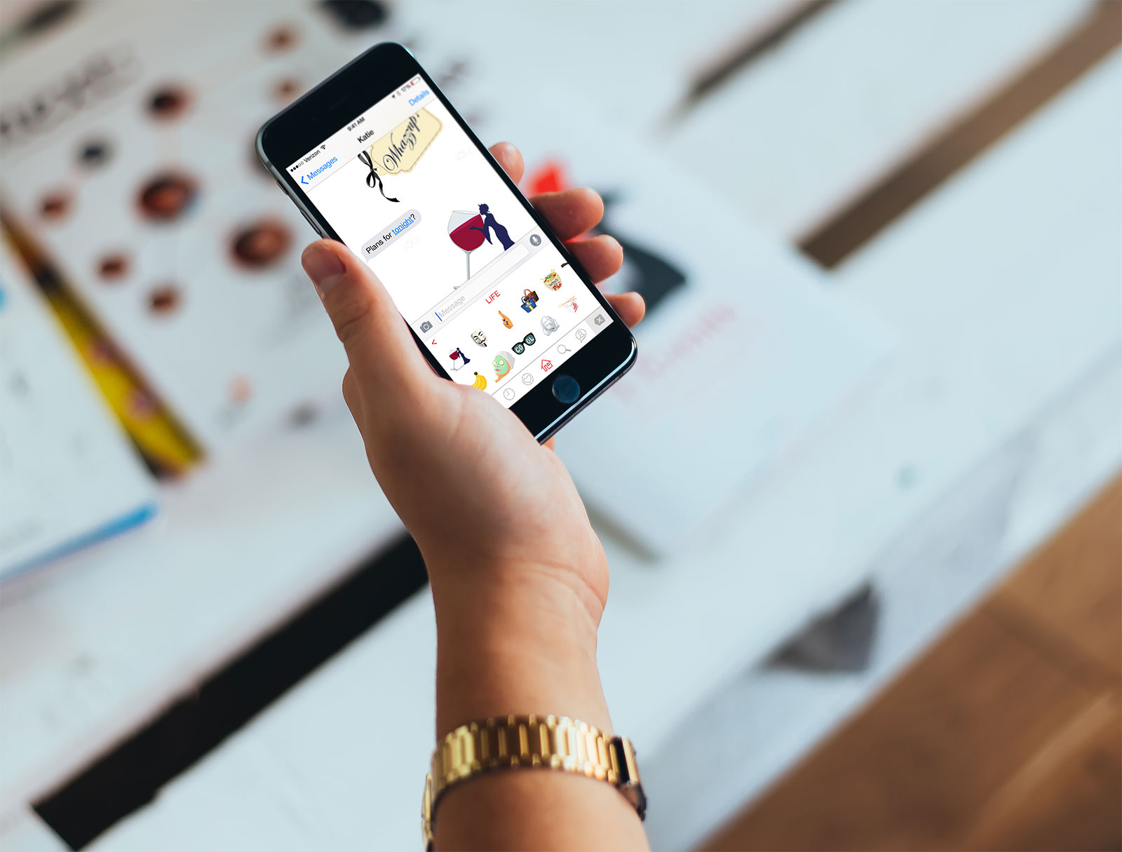
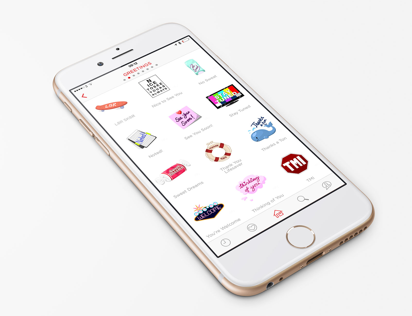
LOLy is an app that allows you to send stylish and beautifully designed large emoji, many of which are animated.

I was asked to work on the v2 app update as the previous app suffered from a few performance issues and there were requirements for new functionality. I completely rebuilt the app from the ground up using Swift along with Realm as a super-fast local database. The app is now super-smooth and images, even animated ones, appear instantly. I also used AutoLayout to ensure that the app looked great on all 4 sizes of iPhone from the tiny iPhone 4S to the massive iPhone 6 Plus. I came up with a lot of the UX changes and integrated iCloud to enable syncing of favourites. Remember that blog post I did about localising prices in Swift? That was also for this project.

However, the big thing with this update isn’t just the speed and performance boosts but the headline new feature: an iOS 8 keyboard.

This was a real challenge and I came across design issues, the technical constraints of the iOS 8 keyboards, and various requirements from the App Store review team. With design, it was important to make the keyboard match the app as much as possible and to try and show as many of these stickers as possible whilst also syncing “recently used” and “favourites” with the parent app. The technical constraints were far harder. There is only a limited amount of memory available to these extensions so trying to show animated images along with the fairly complex design was tricky. Add in the general problem of image-based keyboards requiring full keyboard access (which I’ve discussed before) and being limited to copy/paste for inserting images into apps and it became trickier than expected! Finally, the App Store insisted that the keyboard also contain a full text keyboard and numeric keyboard which had to be added fairly late on. Despite all this, he keyboard looks and works great. I’ve been using it a lot over the past few months and it really is a great way for sending a message with more playfulness than the stock emoji.

In addition to the above, I also built an online admin system so that the packs can be updated, added to, or re-ordered remotely without going through the App Store review process. This is all pushed via an innovative patch system I designed which allows for delta updates to keep bandwidth costs to a minimum both for users and the clients servers.

I had great fun working on this app and I’m really proud of the result. You can check out LOLy on the App Store - it’s a free app with lots of stickers but, at the time of writing, you can download additional packs for $0.99/£0.79.

Introducing "Blind Bags"

Ever since I was little, I’ve loved collecting. As far as I can remember, the first thing I collected seriously was Gogo’s Crazy Bones when I was at school in the 90s1. They came in blind bags so the first couple of times you bought them you’d get all new stuff but then, as your collection got more complete, the chances of getting something you already owned increased. This mode of selling seems to have really caught on over the past few years and I find myself collecting a number of things that work this way, primarily Disney Infinity Power Discs and LEGO Minifigures.

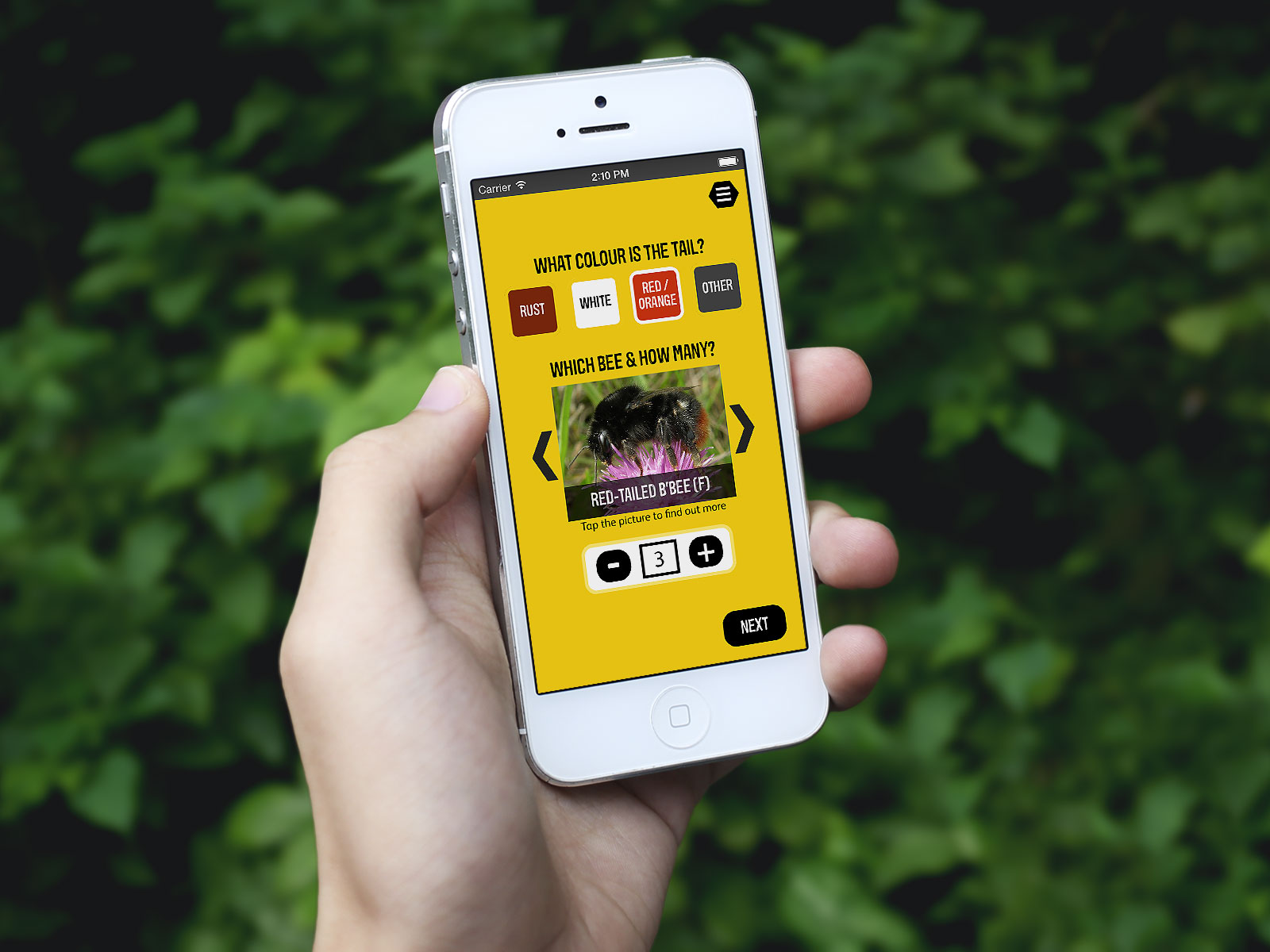
Whilst trying to sort through my Disney Infinity collection last week, I did a quick search on the App Store and found only one app that hadn’t been updated for a while and was a bit basic. After having several weeks away from coding whilst being on jury duty, I thought it might be fun to get back into the swing of things over the weekend by building a basic prototype app to solve my collecting need but also pick up a few new skills along the way. Thus, “Blind Bags” was born:
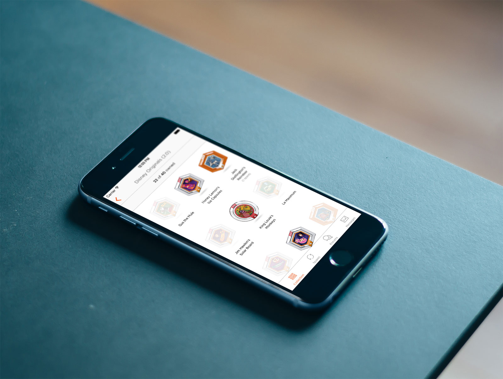
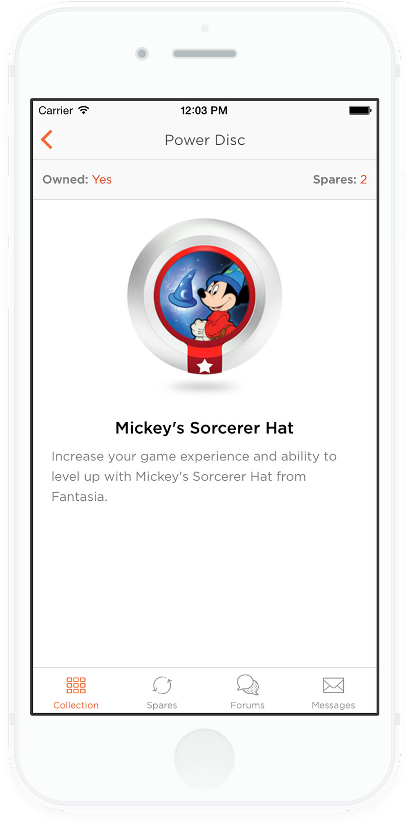
The app is fairly basic in that it lists all of the series of power discs available and then lets you tap through to see a list view showing which ones you own and which ones you don’t (as denoted by whether they are slightly-transparent or not). You can hold your finger down on a disc to change its state making for a quick way of logging new additions to the collection. If you tap on an item, you go through to a bigger detail view which gives you a bit of description text and allows you to enter a number of spares if applicable:
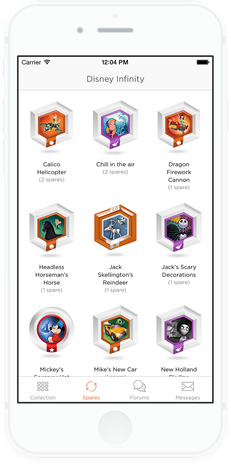
The spares piece is particularly important as you can then build up a list of which items you have spares of and how many:
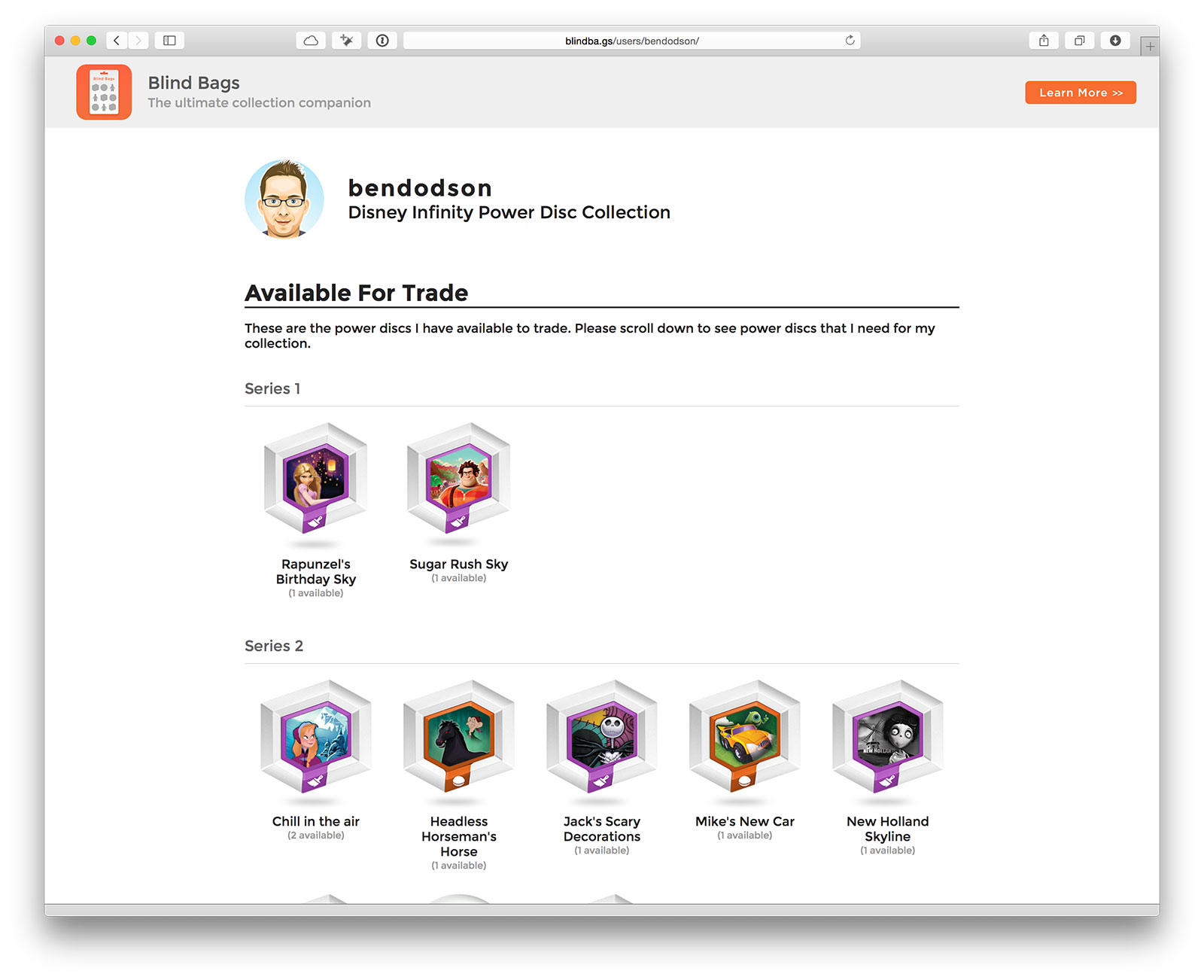
Finally, everything is synced online which allows me to generate a basic page showing which discs I’m missing and which discs I have available to trade:
The best bit of all of this is that the entire project took just 4 hours2 thanks to using Parse. I was able to get their SDK integrated quickly into a new app (using Swift 1.2) and begin prototyping within 20 minutes which is pretty cool as I’ve never used it before. From there, it was a simple case of building some basic UICollectionViews and some CRUD functionality. Parse also has a PHP SDK so within a few minutes I had a basic page which allowed me to output the data that the app was saving. Whilst there is no fallback for loss of connection, etc, at the moment (this is just a prototype after all) these are all things that could be added fairly easily.

The final step was to get a domain name3 and purchase a site template4 to build a basic landing page showing off a few screenshots of the app and giving anybody interested the chance to register their email address.

At the moment the app is solely geared towards one thing for one user but it could easily be expanded outwards into a full service for other collectors to use. Using Parse and a cheap site template, I’ve been able to get a prototype app up and running and a decent landing page in just 4 hours. If there is enough interest, I think 2 days of work is all that is needed to migrate the database to a different hosting solution5 and release it as a full app most likely using a subscription model.

If you’re interested, check out the Blind Bags site and add your email address to get notified as more details become available.
  1. Although, now I think of it, I also collected Pogs and (believe it or not) Panini Football Stickers! ↩︎

  2. Of which at least 1 hour was choosing a font. ↩︎

  3. Obviously I had to go for one in a similar pattern to wallabeegame.com and pouchcreatur.es and settled for blindba.gs ↩︎

  4. Seriously, templates make this so much easier. I’ve not done any serious HTML work in years and I can’t be bothered getting things working on mobile let alone Internet Explorer. For just $13, I was able to get a fully responsive template full of animations along with the original PSDs so I could quickly integrate promo shots. The site was up and running in under an hour with the majority of that time being me writing copy and choosing the right screenshots. ↩︎

  5. I think Parse is great for prototyping but I wouldn’t use it for a live app - for one thing the relational database just isn’t powerful enough for the kind of queries I’d like to do. ↩︎

Three years of WallaBee

Today I’m celebrating three years since WallaBee was released into the world. Originally conceived as an extension to the item collecting side of Gowalla, it launched in February 2012 as a completely standalone game with beautiful artwork and a very dedicated group of players. Since then it has won awards and grown far beyond what I originally anticipated.

It hasn’t been an easy (or cheap1) journey, but today we have a large player base and we’ve stuck to the principles I laid out when I first launched the game:

We are focussed on a single thing; items. We have a location database and we allow players and developers to add to this database but it’s not our key focus. We are fundamentally not a check-in service.

We don’t just want to build a community of players, we also want to build a community of developers. If you build something on our platform, we’ll promote it.

The most important thing, the item that is at the core of who we are, is that we are dedicated to the player. We promise to listen, adapt, and make changes that the community wants rather than just blazing our own trail. We will never fundamentally change our product on a whim when we know that it’s not what our community wants. We built this app because it’s the app we wanted to use. We will never deviate from that course or that core belief.

If there is just one thing I could choose about WallaBee that I’m proud of, it would be that we stuck to those initial promises. We haven’t taken any external funding nor done things simply to boost user numbers or revenue. Every decision we make is based on a simple philosophy: do we like it?

Over the coming months, we’re going to be launching a lot of new things which will grow WallaBee from one game to a global brand. Even so, we won’t change from those core beliefs.

  1. For anybody wondering about the financials of such a game, you need at least $30000 to get started and you will lose a lot of money for the first 18 months (great artists and servers are both expensive and necessary). I started WallaBee on the basis that if it wasn’t break even by year 2 then we’d shut it down. Happily, we’ve been turning a profit since September 2013. ↩︎

IAP and icons in the 'Featured' section of the App Store

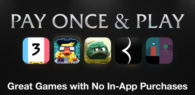
Apple did something slightly different with their weekly update of the Featured section of the App Store today that is bound to get people talking: they singled out Apps without In-App Purchases:

Pay Once and Play on the App Store

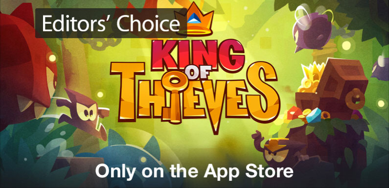
This section contains a number of great games that have no IAP within them. Unfortunately this section is hidden by the first few slides in the top banner the most prominent of which is for King of Thieves, a new freemium game by ZeptoLab (of Cut The Rope fame):

King of Thieves on the App Store

What I find particularly distasteful about this is that it is a timer-filled game in which the top IAP costs £401 and is obviously the complete opposite of what Apple are trying to achieve with the above campaign.

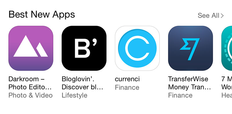
In any case, I noticed some other interesting editorial decisions this week all based in the What’s New section.

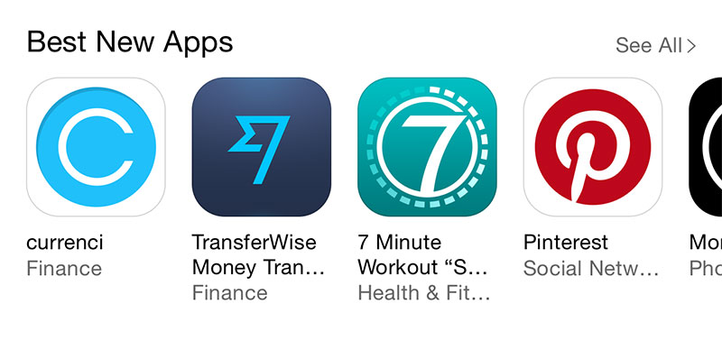
ABC App Icons

Is it just me or does that say A B C?

7 App Icons

Two apps placed next to each other using a number 7 for their icon.

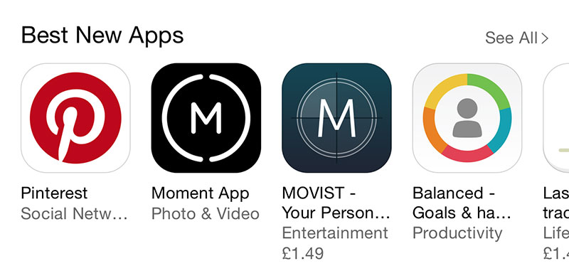
M App Icons

Two apps placed next to each other using an M in a circle for their icon.

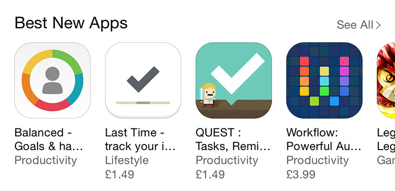
Tick App Icons

Two apps placed next to each other using a tick for their icon.

It seems strange that with so much choice in the App Store, Apple chose to feature so many apps with similar icons and then place them directly next to each other. I can’t remember the last time I found a truly good app on the front page of the App Store (that wasn’t featured elsewhere beforehand) but I really hope they find a way to improve App Store discovery soon2.

  1. What is worse is that if you view the King of Thieves app in the App Store, the section called “In-App Purchases” isn’t listed so you can’t see these IAPs until you download the game. With WallaBee, we keep our prices intentionally low and you can see that reflected in that list. I’m not sure why King of Thieves is exempt from this. It looks like this was just a timing issue - as of now, there are two IAPs listed (the cheapest) so I’m assuming that this is simply a “most popular” list that gets slowly populated over time. ↩︎

  2. On which note, the App Store joined Pinterest today and added a feature called App Pins that allows users to install apps without leaving the app - I’m not sure why this is being pitched as a new thing as this kind of modal App Store pane has been available to developers since iOS 7… ↩︎

Xcode 6 Essentials

I’m happy to announce that a book I worked on as a technical reviewer is now available; Xcode 6 Essentials by Jayant Varma. The book works as a good overview of Xcode 6 and the Swift language and is suitable for both OS X and iOS developers. My role was to ensure technical accuracy and to make sure that all of the code samples work as expected.

Xcode 6 Essentials

You can get it now in both print and eBook formats from Packt Publishing.

SKProduct localized price in Swift

I’m currently working on a Swift project which uses In App Purchasing (IAP). One of the many pitfalls of IAP is displaying the cost of a product in the correct format; all too often developers use the default US formatting leading to apps showing prices of $0.99 in the UK. Gross!

You may think you can use the locale of the device to format the number and you’d be correct apart from the user may be using an App Store in a different locale to that of their device (i.e. a UK account but they have their device sent to French if that is their primary language). The SKProduct object that iTunes returns has a locale attached so it is fairly simple to format the price with that in order to get the localized version:

import StoreKit

extension SKProduct {
    
    func localizedPrice() -> String {
        let formatter = NSNumberFormatter()
        formatter.numberStyle = .CurrencyStyle
        formatter.locale = self.priceLocale
        return formatter.stringFromNumber(self.price)!
    }
    
}

The above is a simple Swift extension (also available on GitHub) which, if it is in your project, will automatically be available on any SKProduct object (similar to using Categories in Objective-C). If we assume we have an SKProduct called product, we can now run:

NSLog("The price of this product is \(product.localizedPrice())")
// Example output: The price of this product is £0.99

It’s amazing how many apps either don’t display the price of an IAP in advance or display it in the wrong locale. Don’t let your app be one of them.

Update, July 2018: I’ve updated this script so that it is now an optional string property and written in Swift 4.

import StoreKit

extension SKProduct {
    
    var localizedPrice: String? {
        let formatter = NumberFormatter()
        formatter.numberStyle = .currency
        formatter.locale = priceLocale
        return formatter.string(from: price)
    }

}

Usage is much the same although it is no longer a function and you are responsible for unpacking the optional string:

NSLog("The price of this product is \(product.localizedPrice ?? "")")
// Example output: The price of this product is £0.99

Yosemite WiFi Workaround: Airport Express and USB Ethernet Adapter

Like many people, Yosemite has been a total killer for my WiFi. I finally broke down over the weekend when my WiFI was disconnecting every 10 seconds or so1. There is now a workaround available but it requires losing the ability to AirDrop which I use frequently. I’ve eventually fixed it with a long winded solution which I thought I’d share, but first a little backstory…

My WiFi is completely Apple-centric. I have an Airport Extreme (the newest 802.11ac model) and nothing but Apple computers. There are a couple of Apple TVs in the house and a few Airport Express’ for AirPlaying music. A little while ago I detailed how Yosemite was erroneously connecting through an Airport Express causing serious slowdown; the solution I had at that time was to separate my WiFi into 5GHz and 2.4GHz channels (with all AirPlay on 2.4 and all devices on 5). That was the setup.

Now, I’ve had to revert to doing this for my work computer:

Fixing Yosemite with an Airport Express and USB Ethernet cable

That’s right, I’ve had to plug in a USB Ethernet adapter and use a LAN cable to an Airport Express operating as a wireless bridge! As far as Yosemite is concerned, that’s a LAN connection and so it doesn’t drop out continuously. Problem solved!

There was one issue though; that Apple USB Ethernet adapter (which they still sell) doesn’t work in Mavericks yet alone Yosemite. To fix it, you need to download the drivers for the chip it is built on (helpfully available from ASIX), restart Yosemite, then manually add a USB Ethernet connection within Network in System Settings.

It’s all working like a charm, complete with full AirDrop support and no dropped connections. My new Retina iMac is coming today2 so I’m hoping that it having an 802.11ac chip will forgoe the need for this ridiculous workaround. At the very least I’ll be able to leave out the ethernet adapter!

  1. When I buy a house rather than rent, the first thing going in will be a gigabit LAN throughout. WiFi isn’t good enough for a media server and work machine. ↩︎

  2. “Out For Delivery”. Feels like I’ve been waiting forever! ↩︎

« Older Entries Newer Entries »