Ben Dodson

Freelance iOS, macOS, Apple Watch, and Apple TV Developer

Disney MyMagic+

Exciting news from Disney:

Linking the entire MyMagic+ experience together is an innovative piece of technology we developed called the MagicBand. Worn on the wrist, it will serve as a guest’s room key, theme park ticket, access to FastPass+ selections, PhotoPass card and optional payment account all rolled into one. We’ve began testing certain aspects of MyMagic+ in Florida last month and the early reactions we’ve gotten have been fantastic.

At present, if you stay at a Walt Disney World Resort (which you really should), you get a plastic card which acts as a room card, charge card, dining plan card, and theme park ticket. It can also be used on their cruise ship to access your room and make purchases if you add that to your holiday. With this update, they’re giving all guests an RFID wristband which they can then use for the same things as well as verifing FastPass tickets (no more annoying paper receipts) and using the PhotoPass service. It’s a great new feature and I can’t wait to see it roll out.

In addition, it sounds like they’re making an iOS app that you’ll be able to book dinner reservations and, more exciting, FastPass tickets through. It’s going to be a good year to go to Walt Disney World!

Freelance availability

I’ve been neglecting this website of late as I’ve been working fulltime on WallaBee for the past few months. However, I’m currently available for a short (< 3 month) freelance iOS contract or project ideally on a remote basis although I can obviously travel for key meetings, etc. If you have something you think may be of interest, then please get in touch.

I’ll be getting around to updating this website more fully at some point but you can always follow me on App.net or Twitter or read my personal blog at bendodson.com.

Passwords and Encryption

I’d been thinking for a while that my password setup wasn’t particularly secure; a fairly basic 10 character password with a mixture of uppercase, lowercase, and some digits that I used on every website and rarely changed (maybe once a year). I’d been reading about 1Password but could never really be bothered to make the switch. I had some spare time over the Christmas holidays so I finally got around to changing over to a much more secure system. This entry is a roundup of the process I went through.

Using a password manager

The first thing to do was switch to a system of having a different password for every website. The reason for this is that a single breach of one account will lead to vulnerabilities in the others (and there are a lot of websites and apps out there that store your password in an unencrypted form). Each password should also be very secure.

To do this, you really need a password manager; an app that will store all of your passwords for you. After a bit of research, I found 1Password to be the most suitable for my needs. As well as storing passwords, it can also generate secure passwords (easily variable by length and number of digits and symbols) and store items such as license keys and credit card numbers. There is also a companion iOS app (very important) with cloud syncing and you can even open the database securely on other machines as the file itself has a web version of the app built in! The main thing though is that it is incredibly secure. I have a lot of trust for a company that is willing to publish exactly how they store passwords and can reliabily demonstrate how difficult it would be to crack (not impossible, but incredibly difficult).

I downloaded the 30 day trial of the Mac app and came across my first decision; what to use for a master password? The core database is secure from automated attacks so the weakest link is going to be the password I choose for it. Obviously I shouldn’t use a basic password as I had before but it needs to be something I can remember (but not be directly related to me - after all, you’re most likely to be hacked by people that know you). Enter an excellent password generation system called Diceware, a completely random way of creating a password. It works by giving you a list of words with a 5-digit code next to each one. You roll 5 six-sided dice and the result is your first word (i.e. if you rolled 1,6,3,2,2 then you’d look up 16322 in the Diceware wordlist and come up with ‘celia’. You repeat this process until you have a string of random words such that you get a password like ‘celia autumn well stern romeo veil’. As they are based on real words, you can remember them quite easily by linking them as a sentence or story. For additional security, you can mix it with your own system of punctuation or spacing so you end up with a possibility such as ‘Celia Autumn. well stern. Romeo:veil’ which would be a difficult password to crack but not too bad to remember. If you don’t like the idea of using a list such as Diceware, you could choose random words from a book with dice to choose the page number, line number, and word. For more ideas and an indepth look at generating a secure master password, read “Toward Better Master Passwords” from the AgileBits blog (I’d also recommend this xkcd comic on password strength).

With a master password chosen, I found it beneficial to type it out 50 times to get my fingers used to it. I had no problem remembering my password after that so I never had to write it down anywhere, something which may be a good idea for helping you to remember for the first few days but just seems a bit lax to me. Next, I went through the websites I used most often and updated their passwords with newly generated ones. I’m still stumbling across websites that I haven’t updated so I just make sure to create a new password for any website when I next use it.

Finally, I purchased the iOS app and set up syncing via Dropbox. This ensures that I can always access the core database i.e. from another machine. The iOS app works very well and whilst it can be a pain to have to type in my mammoth password and then copy / paste whenever I want to do something such as purchasing an app, I deem it a worthwhile inconvenience.

After 2 weeks of using 1Password, I’ve found it to be an incredibly useful solution. I assumed that the hassle of typing in my master password to get to my other passwords would be a hassle but overall I’m actually faster at accessing sites than before. This is mainly because I have different email addresses or usernames for each website or account. That information is now stored along with the password so I never enter the wrong details (or have to go through the time consuming ‘recover password’ options). I tried using the Safari extension for a while (which enables automatic form population) but ultimately found this to be distracting (prompting when I didn’t want it to) so uninstalled it.

Encrypting insecure apps

Whilst I was on a security warpath, I decided to try and do something about securing apps that have very poor or no built-in security. The main two offenders for me are Day One and Money both of which store their (sensitive) data in a completely accessible format. Whilst Day One does provide a password option, that is just for the app; you can read the XML files directly from the hard drive. As I store both of these databases in Dropbox (for easy syncing and backup), I wanted something a bit more secure.

That’s when I found Knox which happens to be made by AgileBits, the same people behind 1Password. Knox is an encryption utility that allows you to create secure ‘vaults’. These vaults are secured by password and when unlocked take the form of a mounted disk image. You can put anything you want in them, and when you eject them they become a single encrypted file.

In my setup, I created a new vault for each app, secured it with a ridiculously secure password (stored in 1Password), and then moved the database for each app into the mounted vault. Whenever I want to use the app, I unlock the appropriate vault and then launch the app from the vault itself. Once I’ve added my diary entry or transactions, I quit the app, and then close down Knox. The advantage to this is that if you open up either app without the vault unlocked, it can’t find the database so it creates a new one (meaning anyone trying to look at my transactions will just get a blank app).

The only issue I had with this set up is that I didn’t want to store the raw database files in iCloud or Dropbox (I do keep the Knox vault files in Dropbox though). This means that I lose the option to sync with a companion device so I can’t update Day One or Money via their companion iOS apps. This is more frustrating for Money (as I’m more likely to want to add a transaction at the point of purchase) but isn’t a dealbreaker for my usage. I’d rather have my transaction history secure and accessible on one machine than insecure and synced on all my devices.

Locking down my laptop

The next thing for me to do was to increase the security on my MacBook which I use as my main machine. OS X has a lot of built-in security options that aren’t enabled by default. The first one I enabled was ‘FileVault’ which automatically encrypts your hard drive. The issue with it is that if you forget your main OS X password then there is no recovery for the files on the machine unless you have a special code that you are given at the time of enabling. I stored this in 1Password for extra security but as everything important in my machine is backed up on Dropbox (and also via Time Machine which you can also encrypt) I don’t feel it’s a big issue for the extra security it affords.

The other setting I enabled was ‘Empty Trash Securely’ which you can enable in ‘Finder Preferences’. This basically performs a government style wipe on files as they are deleted from Trash meaning they are effectively shredded rather than just deleted. Emptying the Trash takes longer as a result but, again, it’s a worthwhile trade off.

Finally, 1Password obviously can’t store my MacBook login (as you can only access it when logged in unless you visually copied it from an iOS device each time) so I needed to choose a new secure password for that. In my opinion, the password should be different to the 1Password master password but just as secure so Diceware combined with personal alterations is a good choice.

Conclusion

This new set up is obviously much more secure than what I was doing previously but I was struck by one fairly big problem; password resets. For instance, my Amazon password is very secure (so secure I don’t even know what it is) but it can be reset by answering security questions which are usually of the order of date of birth and Mother’s maiden name. By their very nature, a security question is a very personal thing (“what was your first pets name?”) so anybody that knows me (or can do a basic Google search) would be able to reset my accounts. That is partly how Mat Honan of Wired was successfully hacked last August.

The best defence (in my opinion) against something like that is to fudge the security questions. If you accept the premise that your 1Password account is secure, then you don’t have need for the security questions (as you’ll never lose the password) so you should just fill them in with rubbish. Alternatively, create lies that you store in your 1Password account. If a website forces you to store something like “first pets name” then choose a random word from the Diceware list (i.e. ‘Celia’) and note that down against the account in 1Password. This is particularly useful for over-the-phone accounts (i.e. trying to reset iCloud) as anybody trying to breach your account will think they know the correct answer (my first pet was called ‘Chip’ to save you searching) but you’ve outsmarted them with a lie. When you need to verify yourself, you can simply look up the ‘correct’ answer from your secure 1Password database. As AgileBits point out ‘there are more ways to lie than to tell the truth’.

Nothing is ever going to be 100% secure, but these new changes should significantly reduce the chances of having my data or identity stolen. Hopefully the steps I’ve outlined above will make you think about how you are securing your information and help make you a bit more secure this year.

Dryathlon

A couple of weeks ago, I saw an advert in GQ which caught my eye; the nation’s first “Dryathlon”. Created by Cancer Research UK, the idea is to give up alcohol for the month of January in order to raise money to help beat cancer.

I’ve lost several family and friends to cancer so I decided to accept the challenge and give up all drinking in January. As many of you will know, I enjoy the odd bottle or three of red wine; by using the calculator on their website, it turns out that I spend around £198 per month on alcohol so I’ll be donating that amount to the fund at the end of the month.

In addition, I’ve made Simon and Alan at WallaBee join in and we’ve had a custom item designed that can only be obtained by making a donation. The item will be available on a donation-only basis for 2 weeks or until we hit our team target of £1000. After that point, it will be available in our Store for 10,000hc until the end of January; for every one of those items purchased, we’ll be donating an extra £1.

My personal target is to raise £500 for Cancer Research so, if you are able to, please consider making a donation. I’ll buy you a drink in February…

Donate Now!

Cleaning Up My Web Presence

I’ve been running BenDodson.com for 6 years. It originally started as a website to showcase my portfolio whilst doing some freelance work and slowly grew into a blog about web development, coding, and eventually iOS and general Apple speculation. Last year, I decided I wanted to split out into having separate personal and professional websites and so the content was moved to BenDodsonApps.com and this site became a standard Wordpress blog for me to post various bits and pieces that interested me.

The problem is that I’ve never really liked it.

Wordpress is too bloated for what I need and was only chosen because it’s easy to get templates for it. I haven’t updated the blog in ages purely because I don’t like the layout or design and couldn’t build up the enthusiasm to change it when I had far more pressing things to do. A few days off at Christmas seemed like the perfect opportunity to change that so today I’ve built the new BenDodson.com; I’ve ditched Wordpress for a static HTML 5 site compiled from Markdown files with Jekyll (read more about it on my about page) and the design has been stripped back to be purely about the text. In addition, all previous content has been removed (my very old posts are still available on BenDodsonApps.com) so that I can have a clean break on a new weblog. It’s intended to be a place for longer posts on topics that interest me (everything from why I hate android to why I love LEGO) as well as a place for interesting links.

Before I started on the new site, I sat down and took stock of all the places that I have a “web presence” with a view to working out a better way to do things going forward.

The current line up (and proposed plan) is as follows:

Personal (Private)

  • Facebook - A necessary evil and a way to stay in touch with family and close friends. If I haven’t met you in person, you won’t be on my Facebook.
  • Day One - My private journal.

Personal (Public)

  • BenDodson.com - This website, a personal blog devoted to the topics that interest me.
  • App.net (@BenDodson) - Microblog that I’ll use to post random thoughts (and links) to on an increasingly infrequent basis.
  • Twitter (@BenDodson) - This will simply syndicate whatever is on App.net but it’s a good way for people to get in touch. I expect to stop using Twitter by the end of 2013 in favour of App.net.
  • Instagram - I stopped using Flickr a while back (and I don’t have a decent camera so it’ll stay deactivated for a while) so this is a good stopgap for sharing photos taken from my phone.
  • Foursquare - I’m planning on deactivating this as I don’t share my location much these days. Maybe 2013 will be the year that I finally build the Gowalla successor that everyone has asked me to. We’ll see.

Business

  • BenDodsonApps.com - My professional website with my portfolio and work-orientated blog. Will be getting an update soon.
  • TubeUpdates.com - My TubeUpdates API. Might discontinue this at some point soon as TfL provide something similar these days.
  • WikiLocation.org - My WikiLocation API. No plans to discontinue this as it doesn’t take up much of my time.
  • Twitter (@BenDodsonApps) - I’ve not posted anything on this for months but may start it up again as @BenDodson becomes more personal.
  • Twitter (@WikiLocation) - Yet another Twitter account that doesn’t get many posts (mainly because WikiLocation doesn’t get updated very often). I think this will get merged into @BenDodsonApps.

That’s quite a lot of accounts and I’m sure I’m missing some of the other things that I’ve stopped using like Last.fm, Flickr, and Tumblr. This also doesn’t include all of the WallaBee social sites that I run such as Twitter (one for the app, one for the APIs), App.net, Google+, Facebook, and Tumblr.

One of the things I’ve noticed most over the past 6 years is that people really don’t give a shit about what other people are doing; they think that people care about what they’re doing though. The ‘lifestream’ was all the rage when I started this site and I naively signed up for every new service and posted everything I was doing in the misguided belief that people actually bothered reading it. As we come to the end of 2012, I’ve realised that there is far too much crap on the internet that I just don’t care about, and I’ve been adding to it by checking in on everything from places to music to wine and everything inbetween. That’s why I’ve taken a good look at my web presence and attempted to strip it back to work and pleasure. Microblogging is going on the back burner and I’ll be partaking in a lot less “social” networking.

From now on, BenDodson.com will be a more wordy diary type affair with entries that reflect my mood and opinion. We’ll see how long it lasts…

iPhone apps on the new iPad

I received a new iPad today (along with a 1080p Apple TV) and whilst I don’t want to review it in detail (there are plenty of other reviews) I will say that the screen is absolutely incredible. Whilst most 3rd party apps are not retina-ready yet, those that are look stunning. I actually used my iPad to answer my emails today as it looked so much crisper than my iMac!

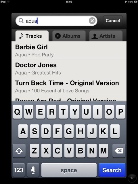
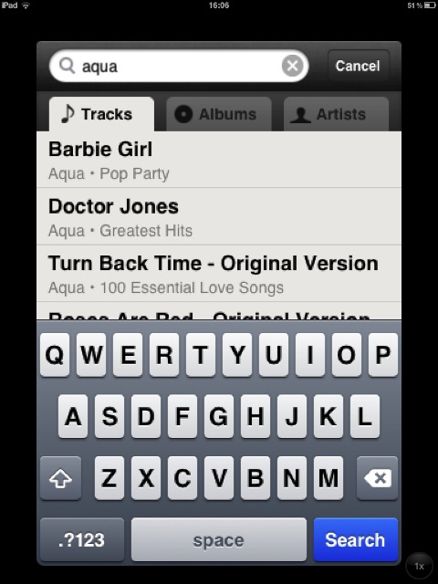
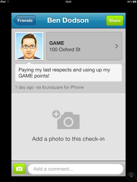
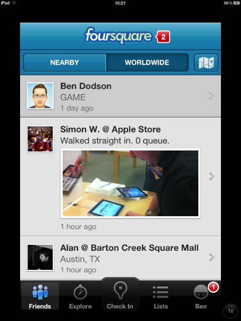
Anyway, one of the things that has interested me is how iPhone apps would look on the new iPad. Bearing in mind that there are 4x as many pixels, I assumed that Apple would use retina versions of iPhone apps scaled up. As you might recall, the original iPad and iPad 2 would use regular iPhone apps and scale them rather than using the retina equivelants (something I’ve written about before). I could understand this for imagery but the keyboard and text looked horrible when scaled making any app that wasn’t a game pretty much unusable at 2x mode on an iPad.

Fortunately this has changed with the new iPad. Apps are stills scaled, but the fonts are much crisper as is the keyboard.

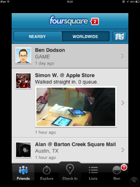
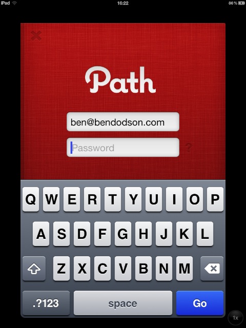
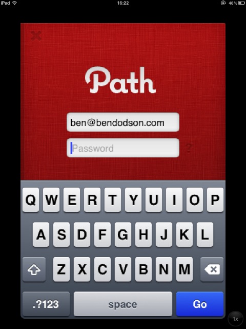
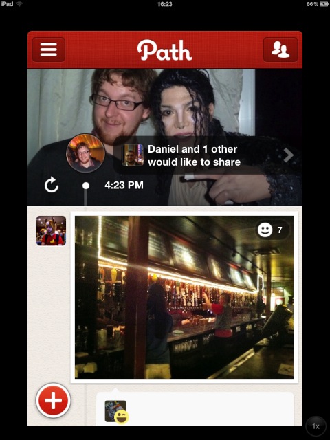
To demonstrate, I’ve tested a couple of apps on iOS 5.1 on both the iPad 2 and new iPad and listed some screenshots below. These have been scaled down to fit the page so you will need to click / tap each one to load up the fullsize versions. You won’t notice the difference (aside from some colour improvements) unless you view at fullsize as they look pretty similar when scaled down.

The new iPad is on the left - iPad 2 is on the right.

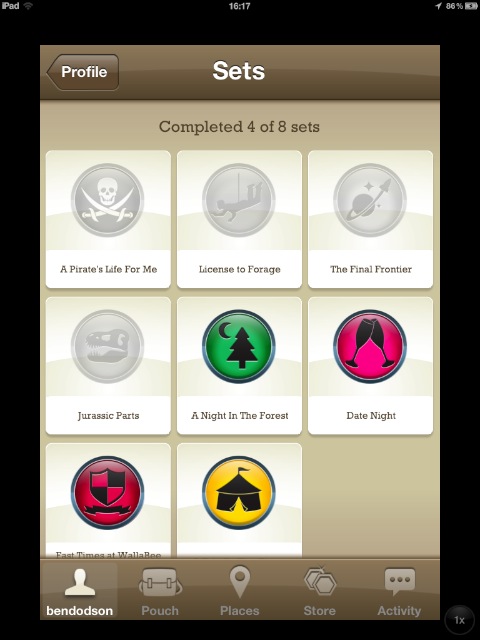
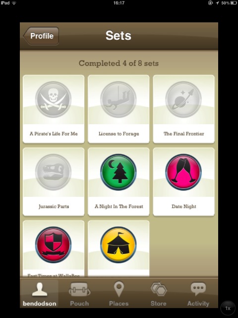
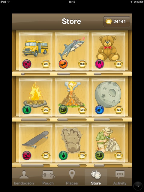
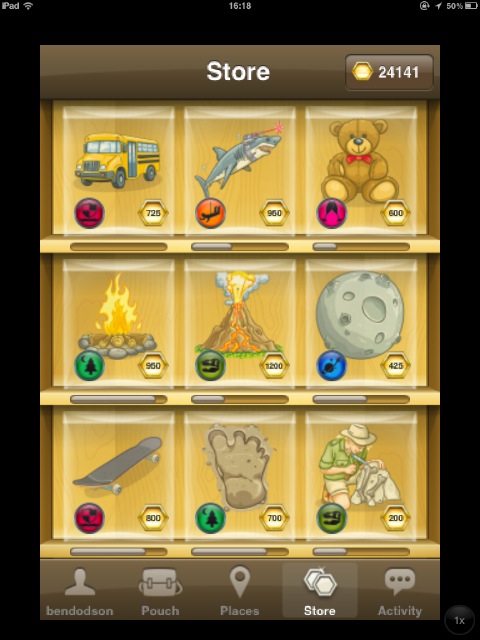
WallaBee

Spotify

Foursquare

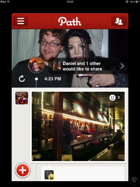
Path

iOS 5.1 Location Services Bug

Whilst using the public version of iOS 5.1 I’ve noticed an interesting bug with one of my apps. WallaBee uses Location Services but as all good apps should it makes a point of stopping location monitoring after a certain amount of inactivity (to save battery) and also when the app goes into the background. Location monitoring starts up again as soon as you go back to the foreground or navigate to a page that will require more precise location monitoring.

On iOS 5.0.*, closing the app would lead to the Location Services indicator disappearing immediately. On iOS 5.1, Location Services stays active for ~10 seconds after it’s been told explicitly to stop monitoring. Initially I thought this might be a problem with the code I’d written but, after some testing on multiple devices and with multiple apps, it turns out this is an issue that affects all location based apps on iOS 5.1.

It isn’t really a big issue but it is fairly annoying, particularly as some apps do keep monitoring your location in the background so you end up trying to work out what is still running only to realise it’s the OS not giving up when it should do. It’s particularly annoying as an app developer - v1.0.3 of WallaBee came out on the day iOS 5.1 was released and I’ve now had 3 enquries as to why Location Services is less efficient in the new version (whereas it’s actually much more efficient in the app).

In terms of why iOS 5.1 is doing this, I can only assume that Location Services is told to turn off after the full amount of background task allowance has been used. If an app doesn’t ask to run in the background, it has around 10 seconds after being closed to do any tidying up (i.e. saving documents, closing network connections) before the OS forcably terminates it. This seems to be the case with Location Services as if you close the app and then force quit, the service is stopped (suggesting ownership is with the app, not the OS).

It’s probably an oversight on Apple’s part (as I can’t think of a good reason why this would be built-in) but I thought I’d put up a post on the issue for any other developers who run into the problem and for anyone using my apps and wondering why Location Services is still active once the app is closed.

The curious case of "the new iPad"

The strangest thing that happened at the iPad announcement last week turned out not to be the lack of Siri, presence of a home button, or uninteresting iOS 5.1 update, but instead the name; “the new iPad” rather than the universally predicted “iPad 3” (or late runner “iPad HD”). Based on this news, most people seem to think that there is a convergence with other product names in that everything will end up as just “iPad”, “MacBook Air”, “iPod Nano”, etc. In particular, people are predicting that the iPhone 5 (which would actually be the iPhone 6 - drives me crazy!) will now be launched as “the new iPhone”.

I don’t think this is correct.

I’ve tried explaining it on Twitter but 140 characters ain’t a lot of room to play with so I thought I’d lay some thoughts out on Apple’s naming conventions in this post. I’ll also try and second guess some of Apple’s future product announcements based purely on naming.

iPod

The iPod is the pure example of the new iPad naming philosophy as they have always just been known as individual products. i.e. iPod, iPod Nano, iPod Shuffle, etc. Every year (pretty much) a new device is launched that immediately replaces the old ones. If you look at something like the iPod Nano, there have now been six of them (all in various shapes and sizes) but you can only ever buy the latest version. In support documents, they are simply referred to by generation i.e. this case will work with “iPod Nano (6th generation)”.

Mac

The Mac lineup is slightly different to the iPod lineup in that there are more customisations that can be made. You can change processors, RAM, hard drives, screen sizes, etc but fundamentally there is only one product per line. When a new product is released, the old one is immediately unavailable. The naming is also slightly different - rather than referring to the latest Mac mini as “Mac mini (10th Generation)” it is referred to by date making the latest one “Mac mini (Mid 2011)”. This works because the Mac line can be updated multiple times per year with processor bumps, etc, so it makes sense to refer to its launch date rather than its generation. This is the same naming convention that a lot of Apple’s software uses such as iWork ‘09. Whilst iTunes isn’t named after a year (it’s just a version) you could add “20” in front to make them year based as they have been annual since v8.0 came out in 2008.

As regards the future of the Mac lineup, there are currently 5 products; MacBook Air, MacBook Pro, Mac mini, iMac, and Mac Pro. I believe that convergence is going to happen on the MacBook Air / Pro lineup as it makes sense that Apple will make the Pro thinner, lighter, and will remove the optical drive. This is further evidenced by the fact that the MacBook itself was removed a while ago leaving the name free. In future, if you want an Apple laptop, you’ll just get “MacBook” - it could be any size from 11”-17” with various configurations but it will be one line. It’s also fairly likely that the Mac Pro will be removed for a slightly beefier iMac leading to just 3 lines; MacBook, Mac mini, iMac. That’s just pure speculation but it makes complete sense to me. If you want portable computing, you choose iPad or MacBook but you choose Mac mini or iMac for desktop computing.

iPad

The iPad lineup should have been simple - a single product that gets updated yearly and will always be known as “iPad”. However, Apple threw a spanner in the works by calling the second generation the “iPad 2”. There was no need to do this when the iPad 2 was the same price as the iPad and completely replaced it as per the iPod lineup but now they are stuck with it. By naming the iPad 3 “the new iPad”, it looks like they are trying to go back to that model but there is a big issue with that; the iPad 2 is still available for sale at a $100 discount. In Apple’s defence they’ve done a pretty good job of making this work with the structure of their website showing only “iPad” and then the “iPad 2” is a small button at the bottom. There is also a comparison chart which very quickly shows that “the new iPad” is newer than the “iPad 2”. It’s hardly an ideal situation though.

So why have they done it? Whilst the iPad 2 could have been completely removed and replaced by the new iPad (which would make the naming all work out nicely) they wanted to keep selling the iPad 2 at a discount as it beats the competition quite nicely. The only real competitor to the iPad has been the Kindle Fire so by making the entry-level iPad slightly cheaper they can appeal to some of the people that might have been stuck choosing between the two. They couldn’t retroactively rename the iPad 2 so they were stuck with the name.

My feeling on this is that the iPad 2 is going to be removed from sale before the end of 2012 and replaced by a smaller form factor (say 8”) and given a new line; “iPad Nano” or “iPad Mini”. This will get Apple to a good place where they have a cheaper iPad and the premium iPad and two simple lines that can be updated in the same way as the iPod lineup. I say this as if the iPad 2 was going to stick around for a full year I think the new iPad would have been called “iPad 2 Pro” as that’s essentially what it is - same form factor, better screen.

iPhone

This is the real issue - what will the new iPhone be called. Based on my tweet yesterday, most people think it will be called “the new iPhone” to follow the iPad example. I highly doubt it. The difference with the iPhone to all of Apple’s other products is that they keep selling the old models for up to 2 years. Just look at the lineup now; “iPhone 3GS”, “iPhone 4”, “iPhone 4S”. If the next iPhone is referred to simply as “the new iPhone” then you’ll end up with “iPhone 4”, “iPhone 4S”, “iPhone”. That might work, but in 2013 you’d have “iPhone 4S”, “iPhone”, “iPhone” and that’s where it falls apart.

This is a tricky one for Apple and I don’t really have the answer. Let’s take a look at possible names for the next generation iPhone:

  • iPhone 5 - it’s the 6th generation iPhone so that won’t work.
  • iPhone 6 - Original, 3G, 3GS, 4, 4S, 6. Doesn’t really work as a numbering system but I wouldn’t rule it out.
  • iPhone 4G - yesterday I thought this was a pretty good idea. Then I remembered that iOS 5.1 now refers to HSDPA+ as “4G” so I don’t think this can be used anymore.
  • iPhone LTE - it’ll definitely have LTE integrated and iPhone’s have been named after their wireless tech before. However, LTE isn’t available around the world like 3G was so I don’t think they’ll go for this.
  • iPhone HD - no. Just no.
  • the new iPhone - I don’t think they can pull that trick twice.
  • iPhone 2012 - maybe.

It’s a difficult situation and there is no obvious choice. I can see it going a number of ways though:

  1. The long rumoured “iPhone Nano” makes an appearance leading Apple to create just two lines; iPhone and iPhone Nano. iPhone 4/4S won’t be sold at a discount (they’ll just disappear) meaning that Apple can refer to the iPhone 6 as just “iPhone”. I don’t think they can do this if they continue selling the 4/4S though.
  2. iPhone changes to a year numbering system much like the Mac lineup - whilst you would just have “2012” instead of “mid 2012” it might work and allows you to distinguish between multiple versions easily. Not the tidiest of solutions though - “iPhone ‘12” or “iPhone 2012” doesn’t have the same simplicity as “iPhone 6” or “iPhone”
  3. Apple name it “iPhone LTE” - it might not be available everywhere but at least it distinguishes. Might have an issue in 2013 though - LTES won’t work and there won’t be another wireless technology to use.
  4. Apple choose something that isn’t in that list perhaps naming it after a design element with something like “iPhone Curve” (though obviously not “Curve” - RIM would have a fit if they’re still around)

Summary

Whilst nearly all of the Apple product line has converged to yearly updates that replace the previous model, the iPad 2 has caused a problem in that it’s still hanging around at a discount. I’m fairly sure this is going to be replaced by a mini or a nano at some point in the near future thus ending this particular story.

The iPhone, however, is a completely different story and I’m confident that Apple won’t name the next model “the new iPhone” unless they stop selling 3 versions of iPhone at the same time. That is doable (if a new line appears in the way I expect it to for the iPad) but I think it more likely that they will name the next iPhone after something about the device that we don’t know about yet; design, haptic touch, etc.

As usual, time will tell. Apple have a habit of choosing things that you wouldn’t expect.

Analyzing the iPad 3 invite

A lot has been made in the Apple press recently about the invite to the Apple Media Event on 7th March which is widely expected to introduce the iPad 3. Specifically, the invite appears to show an iPad with an improved screen and no home button:

iPad 3 Invite

Obviously there will be a “Retina Display” in the iPad 3 (I’ll eat my iPad 2 if there isn’t) but the lack of a home button is something that has floated around before, mainly due to the gestures built into iOS 5 that allow you to close apps with a 4/5 finger grab. I only ever use the gestures to get around on my iPad but I don’t really think the home button would be completely removed. For a start it has too many purposes:

  • Closes apps (can be done with a gesture)
  • Lets you access the multi-tasking tray (can also be done with a gesture)
  • Allows screenshots to be taken (press at the same time as the power button)
  • Access to Siri (on the iPhone 4S at least - one assumes the same will happen in the iPad 3)
  • Accessibility shortcuts (triple tap to invert colours for example)
  • Force restart the device (hold at the same time as the power button for a while)

Whilst some of these things could be done in other ways, I just don’t buy the idea that they would remove it - doing things with gestures is great but they are more like keyboard shortcuts for power users than an intuitive way to navigate.

With the above in mind, it was obvious to me that the invite was showing an iPad 3 in landscape and I set out to prove this with some judicious screenshotting (thanks home button) and photoshopping. However, it didn’t quite work out as I expected…

As Apple have very helpfully used the “bubble” background on the iPad in their invite, it should be quite trivial to work out the placement of the icons by mapping them to the unique bubble clusters in the image. For example. there is a unique cluster next to the calendar icon:

iPad 3 Invite Bubble Cluster

From the invite, we know that there are at least 3 icons showing in the “dock” – Maps, Calendar, and Keynote – and you can only have a maximum of 6 icons. I screenshotted the iPad in both orientations with all the possible combinations of 3, 4, 5, and 6 icons and only one came out close to the bubble layout of the invite:

iPad 3 Invite Mockup - Portrait

Hmm, that scuppered my landscape theory. Let’s take a closer look at the calendar icon when it’s in this formation:

iPad 3 Invite Mockup - Portrait

I’ve also done some basic distortion in photoshop to change the angles so that it matches (roughly) the perspective of the Apple invite:

iPad 3 Invite Mockup - Portrait

I’m pretty confident of the location as it’s one of the only possibilities that causes the page control (the little dots and the search icon) to be cut off when photographed at that angle.

If you look at the two side by side, we can see that the bubble cluster is a pretty good match, but it isn’t exact:

iPad 3 Invite Bubble Cluster iPad 3 Invite Mockup Bubble Cluster

The icons in the invite are actually slightly bigger than those on the iPad 2.

So what does this all mean? I have a number of theories:

  1. The iPad 3 has no home button and its icon layout is slightly different
  2. This isn’t the iPad 3 - it’s a different device (i.e. a 7 inch iPad hence the slightly different icon arrangement)
  3. It’s a photoshopped invite and means nothing - there won’t be any big surprises

If I was a betting man I’d go with option 3. Whilst it’s intriguing to disect these invites to see if they have any deeper meaning, the reality is that it’s probably been photoshopped together with a few mistakes (the bubbles not matching) and something to get the blogosphere worked up (no home button). I highly doubt that the iPad 3 will lose the home button and I have my reservations that a smaller form factor will be announced (despite the fact that I’d prefer a smaller iPad).

In terms of the announcement, my predictions are:

  • iPad 3 with “Retina Display” that is 2048x1536 with the same @2x syntax for developers to make their apps compatible. It will be slightly more expensive than the iPad 2 (say an extra $50-70) but the iPad 2 will see a price drop to something like $399 or $429.
  • Apple TV with 1080p output (the invite says “something to see” and “something to touch” - Apple TV and iPad 3)
  • Updated iTunes content to accomodate a 1080p Appple TV and an iPad that is beyond 1080p.
  • iOS 5.1 with 3rd party Siri APIs.

I guess we’ll see on March 7th!

I've been looking forward to this day for a long time

Today has seen the culmination of several months of work and several years of planning. I launched my latest app, WallaBee, which I like to call “The ultimate collectables game”. It’s a mixup of several ideas from things such as Gowalla, Pokémon, PackRat, and Baseball Trading cards (or Football stickers if you’re in the UK).

I’m not going to do a big post about it now as you can find out all the details at wallabeegame.com (or just download the app) but I did want to give a few shout outs.

Firstly, this app wouldn’t be possible without Alan Shaw and Simon Wicks who have both invested a huge amount of time in this project. They’ve put up with my constant changes and demands as well as suggesting many great ideas that I wouldn’t have come up with on my own. I’m proud to be launching this app with such great co-partners.

Secondly I’d like to thank Andrew Cameron of Karate Grafika who designed the beautiful icons you’re hopefully collecting today. We spent a lot of time searching for the right designer and we’re overwhelmed with the amount of positive reviews we’ve received for Andy’s work. Andy is the ‘secret sauce’ of our app and we’re very lucky to be working with him.

Finally, I’d like to thank Eric Longstaff who has taken on the role of Community Manager and is replying to people on our support forum almost has quickly as they can submit questions! It’s great to have someone with so much charisma on our team who believes in the project and wants to make sure that everybody else is enjoying it.

It’s been a wild ride getting to this point and I really hope that people see the amount of time and effort we’ve spent in trying to get the little details right. We know that there is further work to be done and we have an ambitious roadmap. Version 1.0.1 (coming soon) will add localisation support for 5 languages and a big v1.1 update at the end of March which will introduce a heap of social features. We are essentially a startup but I want to make it clear that our entire focus is on delighting our players - we’ve invested in the most expensive package GetSatisfaction had so we can keep on top of our community and we’re absolutely committed to getting things right.

A few people have pointed out that we’re just using the ideas of Gowalla and PackRat and putting them together. I want to confront that issue head on. Yes, their are similarities, but we believe the devil is in the detail.

  1. We are focussed on a single thing; items. We have a location database (built up from data aquired from Gowalla for my Highlights app - incidentally, this database is not a wholesale copy but something that has been carefully curated and augmented with data from a number of other platforms over a period of 12 months) and we allow players and developers to add to this database but it’s not our key focus. We are fundamentally not a check-in service.
  2. We don’t just want to build a community of players, we also want to build a community of developers. That’s why we launched 3 full APIs with our app that you can interact with today. These include real time notifications and access to all of our high-resolution item artwork. If you build something on our platform, we’ll promote it. You can find out more in our Developer Portal
  3. The most important thing, the item that is at the core of who we are, is that we are dedicated to the player. We promise to listen, adapt, and make changes that the community wants rather than just blazing our own trail. We will never fundamentally change our product on a whim when we know that it’s not what our community wants. We built this app because it’s the app we wanted to use. We will never deviate from that course or that core belief.

I sincerely hope that you’ll enjoy using WallaBee. It’s been my dream for the past few years and, whilst this this is just the start, I treasure it as the biggest moment of my career.

« Older Entries Newer Entries »