Ben Dodson

Freelance iOS, macOS, Apple Watch, and Apple TV Developer

Calling all beta testers

I’m happy to announce that my biggest app yet is going to be available in mid-February. It’s currently running in a closed beta but I’m now looking to expand the beta testing pool significantly in the run up to launch.

If you have some spare time and would like to help me out (as well as maybe getting some free stuff once it launches) then please fill out my beta tester application form. Based on previous betas, I expect interest to be high so I’ve had to implement a cap on how many people I can accept. Please bear in mind that beta testing can take a lot of time (as you’ll be required to feedback on each build that is sent out) so if you don’t have the time please don’t apply as your position could go to somebody else who is available.

If your application is successful, I’ll be in touch by the 3rd of February.

I can’t wait to show you all what I’ve been working on for the past 6 months. More details will be available soon…

What's happening with iOS 5.1?

iOS 5.1 Beta 1 was released to developers back in November 2011. Since then there have only been 2 additional betas (the last of which was just over 3 weeks ago) but not one of them has added anything worthy of a 5.x update. There are only two additions of note for developers.

MacRumors reports:

iOS 5.1 introduces a new API to mark files or directories that should not be backed up. For NSURL objects, add the NSURLIsExcludedFromBackupKey attribute to prevent the corresponding file from being backed up.

Whilst AnandTech reports:

On supported devices, iOS automatically inserts recognized phrases into the current text view when the user has chosen dictation input. The new UIDictationPhrase class (declared in UITextInput.h) provides you with a string representing a phrase that a user has dictated. In the case of ambiguous dictation results, the new class provides an array containing alternative strings. New methods in the UITextInput protocol allow your app to respond to the completion of dictation.

Neither of these things are worthy of a 5.x update as the first is just a reworking of a bug fix in 5.0.1 and the second doesn’t really have much of a practical use. If we look back at previous .x updates, Apple always puts something in that will appeal (and can be marketed) to the end user:

  • iOS 4.1 - GameCenter, HDR Photo Capture, iTunes Ping (haha), HD Video Uploads
  • iOS 4.2 - AirPrint, AirPlay, Fonts for Notes (it’s a big deal), Voice Memos App - was also the release that bought iOS 4 to the iPad
  • iOS 4.3 - Personal Hotspot, AirPlay in 3rd Party Apps, Home Sharing, 2x faster JavaScript in Safari, Mute Switch preference for iPad

These are all big updates and carry a number of new features which end users can relate to (i.e. they are not all dependent on developers integrating a new API). That’s what I don’t understand about iOS 5.1 so far – there are no end user features and the new bits that are there are very minor API updates that most developers won’t use.

In addition to these rather minor updates, there is also the question of timing. iOS 5.1 has been with developers for over 2 months with a very slow release cycle.

So what’s happening?

My theory (and this is all speculation) is that iOS 5.1 does indeed add something big but we won’t see it until mid-February when the iPad 3 is announced. This is because the iPad 3 will come with iOS 5.1 pre-installed and so a number of the new features will be directly tied to that. As soon as the event is over, developers will be given a 5.1 GM along with around 3 weeks to submit apps to the App Store if they want to update to the new features.

My current guess is that Siri will be prominent in iOS 5.1 as the introduction of the iPad 3 means there will be another device out there with Siri support (and that’s if they don’t open Siri up to the iPad 2 / iPhone 4). A 3rd party API for Siri will allow all kinds of amazing apps to appear (take a look at my Tube Updates plugin for SiriProxy for example) and will look great during the iPad 3 announcement keynote when Scott Forstall gets a number of prominent development studios to show off what they’ve done in 2 weeks of having access to the API.

However, Siri APIs do not a .x release make as that isn’t enough to make most people upgrade (such as the iPhone 4 and iPad 2 which I doubt are going to get Siri). A few other things I would hope to see in iOS 5.1 are:

  • Widgets - the ability for developers to create Notification Center widgets such as the Weather and Stocks ones which come preinstalled. This is an area when Android is nominally “winning” and is something which should have been in iOS 5 in my opinion.
  • Facebook Integration - I’m not a big fan of Facebook but I can see it getting iOS level integration similar to Twitter.
  • Improved Siri - Aside from 3rd party dev support, allowing things like “read my mail” or “open this app”. I’d really like a “lower brightness” command.
  • iBooks - Not really a big announcement but I speculated yesterday that iBooks might become part of the core OS.

Aside from that I can’t really think of anything they can add to this release. I’d like to see a new maps app without Google (Apple have aquired enough mapping companies) and profiles on the iPad (so you can have multiple accounts) but I think these are more likely for iOS 6.0. Not related to iOS 5.1, but I’d also like to see iMessages bought over to the Mac App Store as well.

One thing is for certain though – iOS 5.1 beta 3 is a long way off from what iOS 5.1 will actually be. It just isn’t a 5.x update at the moment but I’m certain all will be revealed at the iPad 3 keynote sometime in mid-February. If you’ve got any ideas for what you expect to see in iOS 5.1 send me an email or tweet at @bendodson and I’ll add the best ideas to the list.

Retina display graphics reappear in iBooks 2

Matthew Panzarino for TNW:

Now, with the release of the iBooks 2 application, the Retina-ready images are on display yet again, but our source says it is highly doubtful that including them this time is an accident.

These images would display correctly on a screen 2048×1536 pixels in dimension (double the res of the iPad 2′s screen) at a PPI of 260. That is lower than the iPhone 4/4S display, which clocks in at just over 300 PPI, but should still qualify as a Retina display due to the viewing distance to the iPad being greater.

These @2x files appeared in a version of iBooks during August 2010 but turned out to be a red herring (or an accident as TNWs source puts it). However, with rumours ramping up for a March launch of the iPad 3, it’s highly likely that these retina display graphics are now needed.

The thing that confuses me is that iBooks doesn’t come pre-installed on iOS so Apple could easily push out a v2.0.1 safe in the knowledge that a non-retina version wouldn’t end up on the new iPad. This is undoubtedly what will happen with the iWorks suite of apps (a minor update to add retina compatibility) so why add @2x versions of UI components to iBooks now?

In my opinion, this was either a mistake (again) or Apple are planning on having iBooks installed by default on the iPad 3.

A Sneak Peek at Atomix Magazine v2.0

I’ve long been interested in magzines on the iPad and how they can be adapted to make best use of the medium. I was therefore very excited when Atomix Magazine first launched in April last year as it was made exclusively for iPad and is focussed on videogames. At the time, most iPad magazines were using the Adobe publishing system which allows publishers to simply export their InDesign files to a custom iPad app. Whilst it works as a basic system for getting content to the iPad (which is better than no content), it is lacking when you consider that most magazines are at different physical sizes to the iPad. This means that unless publishers put the work in to rescale their content (and most don’t - I’m looking at you Future Publishing), then you end up needing to zoom in and pan around to read the content. Atomix was different in that the entire magazine was designed solely for the iPad and should have done away with these problems.

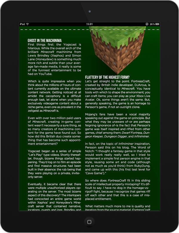
The content itself was absolutely fantastic but there were a number of issues I had with the app itself. In the first few issues they decided to go with a weird parralex background system which meant that the text scrolled differently to the background. You’d actually scroll – sometimes making the text unreadable – and then the background image would rubber band to where it should be. This was eventually sorted but then there were problem with fitting content onto a page (as shown in the image below). Whilst there were dividing lines which looked kind of like page breaks, the content would run to maybe 140% of the iPad height which meant you’d read one column, scroll to keep reading, then have to scroll back up to read the next column. These issues nearly made me give up on Atomix purely because reading it was so frustrating.

Bad page layout in Atomix Magazine

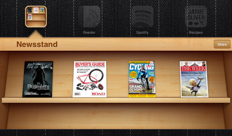
These layout problems were solved late last year (along with some problems relating to downloads) but by that point another bone of contention had cropped up; Newsstand. For those that don’t know, Newsstand was a system introduced with iOS 5 which basically made any magazine app able to show its latest issue as an app icon. This meant that you could see when a new issue was available and there were a number of useful additions such as the ability for new issues to download automatically in the background if you had a subscription. Atomix didn’t have Newsstand support when iOS 5 launched which I felt was unfortunate considering that iOS 5 had been in beta for nearly 3 months (plenty of time to integrate the new APIs for an app which is only available on iPad). Other readers obviously felt the same as the @AtomixMag twitter account was always bombarded with people looking for an update on Newsstand support.

Fortunately, this is now being implemented in version 2.0 of the app which will be available tomorrow. The Newsstand support extends not only to moving the app to the Newsstand folder, but also to implementing background downloads if you opt for a subscription. This is a great feature as issues can sometimes take a while to download (they’re around 300MB on average). Aside from Newsstand support, the app has been updated so that issues open a lot faster, has better graphics when you run or close an issue, and has a new download system meaning that any old issues you try to download will auto-resume if you close the app.

Atomix Magazine with Newsstand support

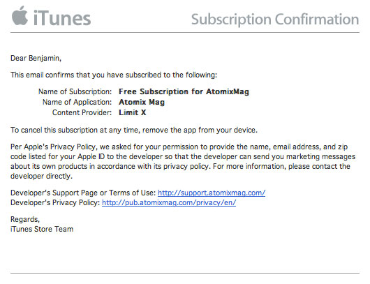
Aside from the new version of the app and a new issue of the magazine coming tomorrow, Atomix also promised a “big announcement” related to the publication. It turns out that this announcement relates to pricing in that Atomix Magazine will be free from now on! With Newsstand support, you are able to take out a free subscription that will work for future issues as well as allowing you to download previous issues free of charge. For this to work, you have to agree to pass on your personal information (a requisite for free subscriptions from Apple) but Atomix has said that they won’t actually store the information that is sent to them as they don’t need it.

Free subscription to Atomix Magazine

I’ve been reading the new issue of the magazine today and I have to say that the whole app does feel a lot snappier and easier to read. Proper paging has been implemented so that all of the content fits nicely into the space and the virtual layout works nicely. You scroll from left to right to go through the different stories but then these are paged vertically so you have to scroll down to read. Some articles have more content underneath so you scroll left to right to read it like a regular magazine but you are prevented from going to the next story unless you scroll to the top of the article. Overall I find it works very well and gives you a good overview of how pages are connected, something that is often a problem in tablet magazines. If I had one criticism, it’s that there is no indication of how far through the magazine you are and I’m hopeful this is something they will look to implement in future versions.

Whilst I was loathe to recommend it a few months ago, this update now makes Atomix a shining example of how iPad magazines should be. It doesn’t try to add too much interactivity but instead focusses on great content laid out in the best way possible with a few interactive elements that delight rather than annoy. If you are an app developer, I would urge you to download Atomix and compare it with a magazine such as Edge, a magazine that could have got it right but instead opted for the lazy InDesign route. The differences should be clear. With Apple promoting Newsstand in a big way, I would expect more magazine publishers to follow Atomix example and go down the bespoke app route.

If you’re a fan of video games, then you should definitely download this magazine. You won’t be disappointed.

v2.0 of Atomix Magazine

BenDodson.com gets an update

The last time my website got a major upgrade was back on the 26th April 2009 when I moved from a self-built system to Wordpress (for my blog at least). Since then there have been a few minor design tweaks and a few page changes but the majority has stayed the same.

Today I’ve put live a big update that covers the design, content, and functionality of the site. The main reasons for a change were two-fold; to help me update the site more frequently and to ensure a better reading experience for visitors, regardless of device.

Design

The design changes are actually fairly minimal. I’ve put in a nicer font with more spacing and I’ve removed some unnecessary sidebars to make the site full width - it should be a lot more comfortable to read in a traditional browser. However, the biggest change is the introduction of a mobile stylesheet which still shows the full content of the site but rendered in a much nicer way. Needless to say, this has been optimised for iPhone but it should work on any mobile device.

Content

Managing the content on my site has always been a bit of a chore from a UX view as it caters to very different audiences. You might want to hire me, look at my apps, play with some of my projects, or simply read my blog. You might have come here looking for a Firefox extension, to read a post about the Apple TV, or because you want to see my portfolio. Regardless, I’ve done a slight reorganisation so that the main pieces of the site are all readily accessible. This was mainly done by separating my apps from my projects and restructuring the work section.

As more and more people have come to my site, the number of emails I have to deal with has increased dramatically. I’m always keen to hear from people and so I had my email addresses displayed loud and proud on my contact page. This hasn’t changed but I have introduced some new pages called “Guidelines” which might help you if your enquiry fits into a particular area. For example, if you’re contacting me about a contract position, you’ll be able to see my day rate and the projects I enjoy so that you can be sure I’m the right person for the job. Whilst I expect to receive significantly less enquiries, I’m hopeful that those I do receive (particularly for work) are more fruitful for both parties.

Finally, my blog has been updated so that I can now link to external sites that I find interesting and just add a comment to them (similar to the linked lists on Daring Fireball). Quite often I see an interesting topic that I’d like to comment on that is too big for Twitter but too small for a full blown blog post. Now that I can link to external stories more easily I should be able to keep the weblog posts more regular.

If you’re wondering about comments, I don’t allow them on my website and I haven’t done for over a year now. Keeping on top of moderation, etc, was providing too much of a hassle and I prefer the one-to-one contact of email or the public sharing of Twitter which ensures that I can actually reply (most people didn’t sign up for email alerts on comments). However, I do frequently update my posts to include any interesting comments people send to me so please do get in touch if you have something to add.

Functionality

This is where the biggest update has come. I’ve long been getting bored with Wordpress and have always found it a bit of a chore to put posts out. Also, the site was quite slow but the various caching plugins I found weren’t quite doing it for me. To that end, the entire site has been replaced with completely static HTML (aside from some of the project pages). I write all my blog posts in Markdown and these are now pushed through Jekyll to be converted to pure HTML. However the coolest bit (for me) is that I’m running a Dropbox instance on my server - this means that whenever I compile the site with Jekyll on one of my macs, all of the generated files are automatically synced to my server and then through a symlink to my web directory. In short, I can post entries more quickly and they will load much faster for you.

Anyway, I hope you enjoy the new site. If you find any problems please let me know.

One More Thing - I almost forgot! All of my code samples and snippets are now available on GitHub.

UK Carrier O2 sends your phone number to every website you visit

Lewis Peckover:

If you’re on O2’s UK mobile network (not ADSL), you’ll (probably) see a line beginning with x-up-calling-line-id - followed by your mobile phone number in plain text

Looks like O2 is sending users mobile phone numbers in plain text over HTTP headers to every site they visit whilst using their network. At the moment the issue appears to be limited to certain APNS on the UK O2 network.

When asked about it, O2 responded with:

The mobile number in the HTML is linked to how the site determines that your browsing from a mobile device

As Lewis points out, a “User-agent header ID’s the device” so this seems a slightly odd stance (particularly as it isn’t happening on all mobile devices).

Update: O2 say that it’s a technical error and that this header should only be sent to whitelisted servers. It does beg the question, which servers are whitelisted? Presumably just O2’s own websites but it’s still not good to be sending information like this in plaintext.

How not to ask for an iOS app review - A review of Jumpship Thrust Control 2

Note: The CEO of Monkeybin emailed me with a few corrections to this piece. Be sure to read the updates at the bottom of the page.

I get contacted by quite a few developers of iOS apps asking for me to write a review up on my blog. Occasionally I agree and I'm always completely honest and independent in my thoughts. If I don't like the app, I say so and this is either met with annoyance ("we only wanted you to publish a good review") or with good grace ("thanks for your honest review - we've taken your criticisms on board and aim to fix them for the next release"). Today, I received an email from Monkeybin Studios asking me to review their game "Jumpship Thrust Control". Be careful what you wish for, it might just come true...

This was a bit of an odd one (as you'll see in a moment) so I think I'll review the app by listing the email that was sent below and then dissecting each section. This will hopefully serve as a) a review of the app and b) as a lesson on how not to ask for iOS app reviews (not just from me, but from any blog or review site).

Hi Fellow Gamer!

Please find attached details of Jumpship Thrust Control 2 - a new game on the scene for iPhone and iPad users - we’d love it if you can review it on your site.

Sounds interesting - maybe I'll review it. Shame they didn't include a download link to the game though as it's actually version 2.0 of an app called "JumpShip Thrust Control". The first time I searched for it (copying and pasting the name), iTunes couldn't find it. Also, there is no detail here (or later in the email) of pricing information. I've no idea if this is a paid app (in which case, where is free promotional code so I can download it) or a free app. Turns out this is a free app and you can use In-App Purchases to unlock later levels. If you are asking for a review of your app, be sure to include pricing information (as it's a key review metric) as well as any promotional codes so that a reviewer can use the full app.

Give it a try – we promise the top-notch graphics and the old school side-scroller “action” nature of the game will have you hooked. It’s a throwback to the days of Atari and Commodore 64 video gaming but with 2012 style graphics!

2012 style graphics you say? An interesting pitch when games like Infinity Blade II came out in 2011. By way of demonstration, here is a screenshot of the app:

IMG_0095.PNG

I think that pretty much speaks for itself. An oil type background (looks alright) with some clipart stuck on top. The only bit that I could claim is even modern is that the flames at the back move a little bit but I believe this is a fairly simple effect to do with Cocos2D so we shouldn't put too much stock in it.

When I say “new game” Jumpship Thrust Control is actually a completely re-vamped and much improved version of an existing game from the team at Monkeybin Studios; you have to steer a spaceship through many different types of beautiful but hazardous terrain, navigating many evil obstacles in the way!

When I first read this sentence, I thought "ah good, at least they admit it's a rip-off game" but then they go on to say that it's a remake of one of their old games! I think you'll find that this exact game mechanic has been popularised oh so many times before. Here's a small history of these games:

  • Super Cobra (Atari game from 1983 - the original game of this type I believe)
  • Helicopter Game (Flash game made in 2004 - the most well known on the internet)
  • Helicopter (iPhone version of the above two games - blatant copying in 2009)

That's just a very quick run through how this game has appeared over the years but there are hundreds of copies with different types of vehicle ranging from tractors to spaceships. This is just another one of those that doesn't even try to avoid the obvious link in that the first level is "cave" where every helicopter version of this genre starts. Why is a spaceship in a cave (and are they sure it's a cave?). They could have at least tried a funny parody to make this game different in the same way that Baby Monkey (Going Backwards On A Pig) did with the platforming genre, but no, it's just a shameless copy.

Gamers said the previous version was too difficult and there was nothing to cater for the serious gamers over the casual gamers.

Let's clarify something here; there are casual gamers and there are serious gamers. Serious gamers play on the PS3 and Xbox, casual games play on the Wii and on mobile phones (with the possible exception of Infinity Blade II which is console quality on the iPhone). This is a casual game by the fact that it's horribly repetitive and is the sort of thing you play on the tube when you've finished reading the paper.

The many improvements in the new version include 3 different player modes (beginner, intermediate and expert) plus 5 new terrains to master and easier controls for the spaceship; there’s also a training mode built in to get you up to speed with controlling the spaceship before you try the beginners’ level for real.

New terrains and level difficulty does not a "serious gamer" game make. If they'd wanted to make it more competitive they should have put in some sort of peer-to-peer mechanic where two people start at the same time on different devices and the first one to die loses. If they'd wanted to make it more engaging over a long time period (rather than a pick up and play kind of game) then they should have put in a levelling system with spaceship upgrades (which you could charge real money for with In-App Purchasing). Adding a difficulty level isn't going to make all the Battlefield 3 and Skyrim players drop their controllers and pick up this app instead.

Just to make your life easier, we attach a couple of reviews we have already written that highlight some of the key features of the game. Perhaps you can cut and paste some of the comments and claim them as your own review?! (Just thinking of your time. :))

This was the part of the email where I made up my mind to do a review of the app. You can download and read their prewritten reviews: review #1 and review #2.

It's difficult to know where to start but this is sort of behaviour is what I hate about the app industry in many ways. There are thousands of apps out there but they are hard to find unless you get coverage in the right places. That does not mean you email blogs with pre-written reviews asking them to "claim them as your own". Just don't do it. If you want to have your app reviewed, you have to accept that people may not like it sometimes. Take their criticism, and improve your app. It's insulting to be given pre-written content as you're basically saying to the reviewer "we don't trust your judgement or other write-ups - just use our content".

That's not to say you shouldn't provide text to a reviewer, but it should be done as a press release. That way, they can pick and choose any interesting elements (e.g. "this is the first game to use x feature") and write it into their review without physically copying / pasting. You can also include reviews from other real people that show off good features of your app, particularly if you've had good press coverage from other outlets. But don't ever write your own reviews and ask people to use them. That is incredibly underhand and doesn't do either the journalism or app development industries any favours.

Thanks in advance for taking a look at our game and Happy Jumpshipping!

I've got a few thoughts on the app which I haven't covered above so I'll quickly list them:

Levels - there is only 1 level included with the game followed by 4 trial levels that you get a little distance with before being asked to make an In-App Purchase. There is also a boss level which can be purchased. Both In-App Purchases cost 69p which is fair enough but this isn't detailed anywhere in the app description. The description says "5 great new landscape levels", the "what's new" text says "5 NEW LEVELS", and the email I got said "5 new terrains to master". At no point does it say you'll need to purchase these until you're in the game. It's a free game, so it's understandable you'll have to pay at some point, but it's deceptive to list "5 levels" everywhere when you are actually only getting one with your download.

Bugs - it's buggy as hell. On my second go on the first level, my ship would no longer blow up. Here's a photo of something that just shouldn't happen on a game thats main bit of code is "if ship hits wall, ship explodes".

IMG_0103.PNG

As well as that issue, the UI would freeze if I closed the app and came back to it whilst it was on the pause menu. Music would still play but I couldn't touch anything so had to force quit the app. That would be annoying if you were on a high-score streak and got a text message or a phone call.

Training - training mode is apparently designed to be a place where you can't crash in order to get you used to the game. They don't tell you this anywhere in the app though so you'd be forgiven for wondering what is going on as the game never ends, you can't crash, and no power-ups or walls appear anywhere.

Power-ups - there are power ups littered through the game (with icons that look like they were plucked from windows 95) but no description of what they do. You have to learn by trial and error that a blue orb means you can delete a bit of level or that something that looks like a move cursor is actually a power up to shrink you temporarily.

Summary

Overall the game is just plain awful. When you take into account the deception around In-App Purchases and that they are trying to get reviewers to post pre-written reviews, it becomes a despicable game. Very little thought has gone into gameplay or design and the only reason I even downloaded it was as an example of how to demonstrate what not to do.

In terms of how you should market your apps, I can strongly recommend putting together a good media pack such as the one outlined by Retro Dreamer (linked to from iOS Dev Weekly Issue 4, a must subscription for iOS developers). I have a media kit for my apps such as Highlights which has some screenshots, information, and release notes that allow any reviewers to have a complete overview of the app. If you follow that guide, you'll find you get a lot more responses from app reviewers than if you follow the example taken by Monkeybin Studios.

Update (12th December 2011): I replied to the email to let them know I'd put this review up and got the following response:

Hi Ben,

Thanks for your review. We respect your opinion and we have taken notes of our mistakes and your sugesstions. Hopefully we'll do better in future. We respect your judgment, pre-written reviews were just because of the fact that many webmasters may receive hundreds of emails daily and they may not find a time to write for every one.

Anyways, Thanks again!

I have respect for a company that actually replies to negative criticism so that's good at least. I still think the app can be vastly improved and hopefully we'll see that happen in this case at some point.

Update (15th December 2011): Today I received an email from the CEO of Monkeybin to let me know that the person who contacted me regarding writing a review was not in fact an employee of Monkeybin but instead a freelancer who had operated outside of their remit.

Hi Ben,

My name is Haakon Langaas Lageng, and I am the CEO at Monkeybin. You have been in touch with ***, and I would like to point out that *** is not a Monkeybin employee.

We hired them as a freelancing marketing manager to do the promotions for JumpShip Thrust Control, and it got out of hand. They were free to do the promotions the way they thought would be best, since we were pressed on time doing other projects. It resulted in methods that is not up to Monkeybin's ethics or standards, and not how we want to be perceived by the gaming community.

As the CEO of Monkeybin, this is of course completely my responsibility. Unfortunately, what was happening here slipped my eyes. I found out only yesterday what has been going on.

I just saw on your site that *** sent you an "explanation" on the 12th December, and I am sorry they got around doing that before I put the brakes on.

If you are going to publish what I just wrote here, please omit *** name. They made some bad judgements, yes, but in the end, as I said, it is all my responsibility.

Thank you for your time.

It takes a lot of guts for a CEO to claim ultimate responsibility for an error by a contractor rather than trying to use it as an excuse and I applaud Haakon for it. Let this be a lesson to everybody that you should fully research anybody you ask to promote apps for you and ensure you stay on top of what is being done in your companies name.

How's the London Underground? Ask Siri!

After seeing SiriProxy in action on YouTube, I was keen to grab an iPhone 4S to have a play with it. I managed to pick one up at the Apple Store yesterday and today I'm pleased to release my first SiriProxy plugin; TubeUpdates. It's a basic plugin that lets you ask Siri for the status of a London Underground line thanks to my TubeUpdates API.

SiriProxy-TubeUpdates - A standard request

I've not dabbled with Ruby for a while but building the plugin was fairly straightforward. All of the code is available on GitHub but the main piece looks like this:

listen_for /[what is,what's] the status of (.*)/i do |line|
	encodedline = line.gsub(' ', '+')
	url = URI.parse('http://tubeupdates.com/siri/?line='+encodedline)
	json = Net::HTTP::get url
	result = JSON.parse json
	say result["status"]
    
	if result["messages"].count > 0
	    response = ask "There are additional details. Would you like to hear them?"
	    if(response =~ /yes/i) #process their response            
	        result["messages"].each { | message |
	            say message
	        }
	    end
	end
	request_completed
end

The matching in the first line ensures that you can ask either "what is (or what's) the status of (the line name)". This is then url encoded and "the line name" is sent to a Siri endpoint I created on the Tube Updates site. The site will return a JSON string of the tube line status which is then parsed and spoken back to the user. E.g. "The Circle line is running a good service".

If there are any messages for the line (these are generally details of delays), then an additional step is performed; the user is asked if they would like to hear the details and answering "yes" will list them.

SiriProxy-TubeUpdates - A delayed line

And that's pretty much it! I've got a few ideas for more complex plugins that can interface directly with iPhone apps so I'll have a play with those when I get a spare moment. If you've got any comments or feature requests for this plugin, then get in touch.

As an aside, this is the first project I've published that is written in Ruby and the first time I've put anything up on GitHub.

Goodbye Gowalla

I'd originally been planning to post up a review of Gowalla v4 (late I know, but it was fairly in-depth look at a company gone mad) but last nights news that Gowalla is to be acquired by Facebook means that I've bought forward another post I'd been planning; my goodbye to Gowalla. After being a loyal user for just over 2 years, the time has finally come for me to delete the app that has been a key part of my life for a rather long time.


Beginnings

Gowalla was built by a company called Alamofire (before they changed their name to just Gowalla) and I became acquainted to it via one of their other projects; PackRat. It was a game that involved collecting sets of cards with different icons on was pretty addictive. When they decided to make a mobile game, I assumed it would be similar to PackRat but with a location element. Instead, Gowalla was created allowing you to check-in at places as well as collect virtual items. The collection part wasn't terribly well thought out and went through several iterations but it garnered quite a cult following. In addition to items, you could collect "stamps" by checking in at locations and "pins" by completing tasks (e.g. check in at 10 different coffee shops).

My first 100 stamps!

For a time, everything was rosy. New items would come out on a Tuesday (leading to mass checkins at the categories the item was likely to appear at) and people were steadily competing to see how many stamps they could get. I think the highest I ever saw was somebody who had checked in at over 9500 places.

During 2009, I quit playing PackRat as they introduced a number of changes which made the game less enjoyable (e.g. locking key cards unless you got friends to join the game, adding "bling"). This was probably a premonition of things to come as Gowalla would eventually make the same mistake - disenfranchising their core audience rather than embracing it.

Developing for Gowalla

In October 2009 I created a basic web app for iPhone that would allow you to find items by showing you the categories that were most likely to drop a specific item. It proved to be incredibly popular, so over Christmas 2009 I introduced 13 new tools or web apps in a project I called "Gowalla Tools" which ranged from being able to view Flickr photos at Gowalla spots to temporarily turning Gowalla.com into a PackRat game (thanks to some JavaScript) which would allow people to collect coins which were then used to give out prizes. This again was so popular that I started to devote more time to making apps that ran on top of Gowalla. There wasn't an official API when I started but by early 2010, Gowalla launched the first version of their API. This is where things started to deteriorate…

The Fallout

The new API started out with good intentions, but constant breakages and undocumented changes made it a frustration to use, let alone build apps with. At the time, I'd been working on a native iPhone app but there was no way it could go out with the Gowalla API as it was. Had Gowalla altered anything, then the app would have remained broken until I could fix it and then sit through the 2 week Apple App Review process - not ideal. So it was that I rallied together a few other developers and a number of Gowalla players and wrote a letter entitled "Thoughts On The Gowalla API". Gowalla never replied or apologised (and one of the team called me a "jackass" when I met them at SXSW a year later) but the API did eventually improve months later.

The Reconcilliation

In August 2010, after the API had been updated and a number of (highly priced) apps had been built on top of it, I decided to relaunch Gowalla Tools. Initially it was going to be called "Gowalla Plus" but that idea didn't sit well with Gowalla:

Hey Ben,

Adam sent along your email to me regarding naming conventions. Hopefully I can address both of our concerns in this email.

These are always sticky situations because we want to support the app developers building great apps on the API, but we also need to avoid confusion from both a legal and customer support standpoint. You've likely observed that our naming conventions follow this standard approach:

Gowalla for iPhone, Gowalla for iPad, Gowalla for Android, etc.

I'm afraid GowallaPlus is simply too close to our mark and if we let it fly, we have to let everything fly from a trademark standpoint. To be honest, I've always been a concerned about GowallaTools, but have wanted to avoid hassling you.

We deal with complaints and support email every week from folks who believe certain apps sold in the iTunes store starting with Gowalla in their names are actually our product. We'll be working with each of these developers to change their names.

I'm not against a mention of Gowalla in the name. I just can't have the name on the front side.

[ProductName] for Gowalla would be acceptable.

The likelihood of folks believing GowallaPlus is our app is super high, based on our experience with the other apps in the store.

Thanks for letting us know your thoughts in advance. I'm in hopes we can encourage you to develop your own brand name for your line up of products. I think you've got a good thing going.

Related: I'd love to get a beta of the "travel edition" if you're open to it. I'm traveling to South America later this month and would love to give it run. Seems perfect!

Let me know your thoughts and questions. I know we haven't always been your favorite guys to be developing with, but I hope we can find some solutions here that work for everyone.

Thanks Ben!

jw

Of course, no other app was ever actually removed for having the word "Gowalla" in it. In any case, I decided to rebrand my projects as "Wallabee" and started off by releasing my "Wallabee: Travel Edition" app; an app that let you check-in multiple people on Gowalla with more than 99% savings on data usage (which translates into big savings if you're using data roaming). Unfortunately, despite being a free app (and the encouragement from Josh above), Gowalla never publicised it in anyway e.g. on their Twitter feed or blog.

Over Christmas 2010, I unleashed some plans for further apps and developments including an Item Hunter, Time Travel Edition (showing historical changes to places), and version 2 of the Travel Edition app. Unfortunately the release of version 2.0 was delayed due to Gowalla having an issue with the mass check-in facility I'd added.

Finally, in March 2011, myself and a number of good friends I've made through Gowalla launched the Wallabee Pouch, a definitive guide to all aspects of Gowalla. It also featured the "Item Directory", the largest repository of information about Gowalla items including real-time item drop rates and statistics.

SXSW / Re-evaluation

In late 2010, I decided to head over to Austin for SXSW in March 2011 as I was keen to meet up with the Gowalla team and a few other Gowalla players were all heading over for a week of item hunting, stamp collecting, and general socialising. I'd also opened up a conversation with Gowalla around their vacancy for an iPhone developer so I was keen to have a discussion about it whilst I was there. Unfortunately, things turned out slightly different to how I imagined. I saw firsthand some of the pettiness and childlike behaviour that certain players exhibited around items and suddenly realised why Gowalla tried not to have much to do with their original players if they all acted like that. Despite organising a meet up around the iPhone developer role, it fell through with the HR contact failing to arrange anything (apparently a systemic problem within the company - departments often have no interaction with each other and there is "rampant disorganisation" - that was a quote from an employee).

The most important part for me of SXSW was listening to Josh's talk on the future of location-based services, a talk that I still maintain is one of the most interesting I've ever attended. It was at that point that I realised the writing was on the wall for the item-based gamification of Gowalla and that they would eventually change into just being a service based on check-ins. I decided to stop focussing on items and stood down from Wallabee to focus on making travel based tools instead. My premonition turned out to be correct when Gowalla announced that items wouldn't be making it to the next version of the app in August 2011.

Highlights

Once I'd stopped working on Wallabee, I started focussing intently on my next big project; Highlights. It was an app that would help you find the best places around you by using recommendations from other users. The twist was that it used location data from both Foursquare and Gowalla and used a complex algorithm to rank them based on comments, tips, highlights, photos, etc. It also pulled in vast amounts of data from other services like Last.fm, Yelp, and Flickr. To power the system, I tapped into the Pubsubhubbub hub for Gowalla courtesy of Superfeedr - this allowed me to get every checkin that happened on Gowalla in real-time and build up my own vast database of checkin data and locations thus bypassing the need to directly connect to Gowalla's API (due to the issues I'd had previously). You can read more about the integration in a post I did about it if that sort of thing interests you!

On September 2nd (which also happened to be my birthday), Apple made Highlights their "iPad App of the Week".

Highlights - iPad App of the Week

I sent some promotional codes direct to Josh (and a few other Gowalla staff members) in the hope that they might at least tweet about the app or put up a blog post about it as they had for other apps (although I found out later that the one app they publicised was part-built by one of their developers). As a one-man development studio, a single tweet from Gowalla would have made a big difference in the number of downloads but unfortunately it didn't happen. Despite being featured by Apple, given high ratings on app review sites, and being reviewed in numerous magazines and popular sites (such as TUAW), Gowalla didn't want to acknowledge it.

If I was running a company with an API and one of the apps got a lot of good press, I'd be the first person to try and publicise it as it can only benefit both parties. It still surprises me that Gowalla never understood 3rd party developers and I often wonder why they even bothered making a public API.

Gowalla v4.0

During September 2011, Gowalla released version 4.0 of their app to great fanfare at TechCrunch Disrupt. On the surface, it looked like a solid update. A beautiful design and a core rethinking of the product meant that they were stepping in the direction I thought they would after the talk at SXSW. However, once I got to use the app, I couldn't believe how badly wrong they had got it. I'm not going to go into a huge amount of detail on it (as I believe the app will disappear soon anyway) but here are my main points about what is wrong with Gowalla v4:

  • Stories - The fundamental idea that a check-in is a story is genius. Whilst going to the grocery store isn't really worthy of a "story", there are many times when story is exactly the word to use. When I heard about it, I thought that Gowalla would extend the great work they'd done on starting and ending points of journeys. They had previously put out an update which would show a little aeroplane graphic showing when people had travelled from one location to another and had gone further to detect when a journey had begun and ended. For instance, I got a "Survived SXSW" badge only once I got back to Gatwick Airport in the UK as that's when my SXSW journey had begun from. I imagined they'd use this so that if I went on holiday, it would detect that and bundle up all my checkins and photos as a single story. What actually happened is that a story is a single place only thing and is more about the people that are there rather than the places. It works great if you have lots of friends in a single place but it kind of sucks if you're doing a pub crawl or going to more than one place. The fact that people can also check you in despite not being there (some people kept saying "Ben's here" at spots in the US which kind of annoyed me) instantly made this a painful update.
  • Notes - In Gowalla v3, you could leave notes for people at a spot. They could only read these notes when they checked in at that place. This was a great usage of the location-based nature of the app but was removed. Apparently it was going to be put back in at some point but it's never materialised.
  • Guides - The main button on the Gowalla app is a section called "Guides". It's beautifully designed (looks a bit like the "popular" section of Highlights) but is completely inappropriate to be the main feature of the app. It basically shows you the best places to go in a city based on check-ins and what Gowalla have featured (as well as other companies like Disney and National Geographic). The problems are twofold; 1) it's poorly implemented (the top spot to visit in Disney's Animal Kingdom was Spaceship Earth, the iconic ride from Epcot - not quite right) and 2) it's limited to 60 places. This means that in the UK, the only guide is for London. The next nearest is Amsterdam. How this is of any use to people day-to-day is beyond me. The key feature should have been stories until such a point that guides were auto-generated (like Highlights is) at which point it could have been more prominent.

Those are just 3 of the main criticisms I have but overall the whole product is just lousy. Whilst it's beautiful to look at, very little thought has gone into how the user will engage the product as highlighted by the way Guides is the largest button in the interface. I also got really frustrated with the way that bits of the UI would load in later (so the photos might appear and then a few seconds later text would appear). This is obviously to keep loading times down but there is no indicator of it happening so the UI is constantly moving leading to a jarring experience. From a technical point of view, it has obviously not undergone any external testing as it crashes a huge amount.

Overall, the product felt like it had been rushed to get it out for TechCrunch Disrupt. Rather than pausing and releasing a top-rate product, they pushed out a half-built poorly thought out mess and they have suffered for it. Whilst there are many reviews hammering them for removing items (and not delivering on their promise of letting people export them in a "really cool way"), there are hundreds of 1 star reviews on iTunes from people hating the new update for the reasons above. I think the biggest problem is that they removed functionality without replacing it within anything better. Also, the changes weren't communicated to regular users. My mum, for example, loved using Gowalla v3 but when v4 came up she had no idea what had happened. She, like many users, doesn't read the Gowalla blog or see the updates on TechCrunch so had no idea that items were going or that they were going to fundamentally change direction.

How could it have been done better? I had always thought that Gowalla would spin off into two kick-ass products; a game (based on items) and a check-in service (with stories as I described them). Instead, it cut off the bit it didn't like and released an updated check-in service that did less than it promised. It doesn't aid in the discovery of places and it doesn't aid in the telling of stories.

Facebook

After a torrent of negative feedback, suspicions grew that Gowalla would be shut down during November 2011. Many of their employees had started using Foursquare and it looked like several prominent members of staff had been sacked. To make matters worse, Gowalla v4.0.3 had mysteriously disappeared from the App Store without warning. When rumours emerged that Gowalla was looking for a buyer (and had been brushed off by Google and Groupon) I thought that they would definitely be disappearing. Who would want to buy a company that had made such a monumental cockup and was haemorrhaging users?

Ah, Facebook.

Using a tactic referred to as "aqhiring", it would appear that Facebook is buying Gowalla out and taking some of the employees to Facebook HQ to work on a new timeline feature. This most likely means that Gowalla will close down (and I'd imagine PackRat with it) as all the staff are reassigned to Facebook projects - I think it highly unlikely that Gowalla will survive as a Facebook product or keep going alone.

Many people are now worried about data from Gowalla being moved over to Facebook. We'll have to wait and see if this actually happens but in the mean time a large number of people are deleting their Gowalla accounts to keep their privacy safe. I'm now officially done with Gowalla and today I did the same.

Screen Shot 2011 12 03 at 12 54 54

In closing...

Gowalla has been a big part of my life for the past couple of years. I've made some great friends and I've had some truly great experiences. Discovering new places when looking for items was a highlight and I'm proud of the apps and features I was able to build on top of Gowalla. However, there have also been some truly horrible times both with Gowalla itself and some of the people that have played it. Whilst I wish them all the best, I honestly don't think Gowalla is going to survive in it's current form and I don't think that it should.

To finish off, I'd like to thank everybody who made Gowalla a great experience for me from the people I've met playing to those that supported the apps I built. I'd also like to personally thank 3 people at Gowalla who helped me out when they could and to whom I'm very grateful; Jon Carroll, Adam McManus, and Andrew Dupont. I hope they get what they want from the transition that is about to happen.

I'd also like to thank whoever at Gowalla designed this icon for my "Ben Dodson Apps" spot...

422 0a295dbebaf7fff8a7590632a228bc08 200

It was never sent to me (I found it on their server - don't ask) and they never used it on my spot page (saying they don't do portraits for spot icons) but I've always really liked it over the one that was eventually used.

The API behind Gowalla v4

A few weeks ago, Gowalla released version 4.0 of their app to an overwhelmingly negative response. I myself will be posting a review soon but in this quick post I wanted to share a few tips on how to use the new API that is powering the app as an official API is apparently not coming until Q1 2012.

 In a post entitled "Where the Gowalla API is going" on the official Gowalla Developers Group, it was revealed that most bits of the existing API "should be working" but a version 2 of the API would be coming in 2012 that enables developers to leverage the new features such as stories, lists, likes, guides, and so on. Unfortunately, several parts of the existing API broke on launch of the new app (including OAuth integration which took out nearly all 3rd party apps, trips, and an advanced search API) and some parts were completely removed (such as PubSubhubbub, one of the key things that actually made the Gowalla API a compelling thing to use). I have a number of apps that use the old API and were affected in small ways (I learnt long ago never to make direct calls to the Gowalla API) but there were a few things like trips that I needed direct access to more immediately. So, I spent a few minutes digging into the new Gowalla app and found the new connection details that are required to talk to the new API.

It's actually fairly easy! Firstly, instead of connecting to http://api.gowalla.com/ change the URL to https://api9000.gowalla.com/

Next, there are 4 headers you have to send with every request. 2 of them, "Accept: application/json" and "X-Gowalla-API-Key", were required for the old API but Gowalla have also added an "X-Gowalla-Bruce-Lee" header (with a password so they know it's the Gowalla app using the API) and an "X-Gowalla-API-Version" header which seems to suggest they are taking my advice of 18 months ago and versioning the API rather than just breaking existing apps. So, the full headers you need to send are:

Accept: application/json
X-Gowalla-API-Key: YOUR-API-KEY-HERE
X-Gowalla-Bruce-Lee: l33tkuned0
X-Gowalla-API-Version: 2

If you do that, you should be able to call an API endpoint such as users/bendodson where you'll find a load of new data that isn't in the normal API. That should also give you a good idea of the naming conventions of new endpoints (e.g. /lists rather than /trips). In all of my testing, existing features such as OAuth have worked fine.

As a final example, the trips detail API is still broken on the current API (despite this being "looked into" 2 weeks ago). If you were to request trips/168 you'll get a 404 not found error. This is one of the many broken API calls that is affecting apps that are currently out in the wild. However, if you change your code to use the new URL and the new headers, you can request lists/168 to get full details of the trip you are after. Some of the keys will have changed name but it should be enough to get your app at least up and running.

Obviously, you use all of the above at your own risk. Gowalla are unlikely to break anything immediately as any changes to the headers, endpoints, or keys will break their app. However, there will probably be changes as and when they release new versions of their apps.

I have been very vocal on both the good and the bad points of the Gowalla API in the past. There had been a real effort to alert 3rd party developers to changes in recent months but the new v4 app fundamentally broke important parts of the API (particularly OAuth login) and fixes were slow coming or have still yet to come with regards to the /trips endpoint. Putting an API out for the new app in Q1 of next year is a very long time to wait for something that really should have launched alongside or shortly after the new app particularly as the API does already exist. In short, Gowalla really have a long way to improve in their dealings with 3rd party developers. Personally, I'm moving my apps away from Gowalla and starting to use other services but I'll be posting more about that soon.

Update [25th Oct 2011]: Andrew Dupont responded to this article on the Gowalla Devs Group with:

At any rate, we've fixed the trips API. Let me know if anything's still out of order.

Turns out Gowalla will fix things if you complain enough...

« Older Entries Newer Entries »