Ben Dodson

Freelance iOS, macOS, Apple Watch, and Apple TV Developer

Scalable bulleted lists with UILabel or UITextView

I’ve recently been implementing auto-renewable subscriptions for a client and came across the need to create a bulleted list of notes1. There are numerous tutorials available that show how you can do this but all of the ones I found had a flaw of some kind be it using fixed values for bullet widths or not taking variable font sizes from Dynamic Type into consideration.

Here, then, is a quick primer on how you can add correctly aligned bullets to a list be it in a UILabel or UITextView and have it scale correctly dependent on the users text size preferences.

class ViewController: UIViewController {

    @IBOutlet weak var label: UILabel!
    
    override func viewDidLoad() {
        super.viewDidLoad()
        NotificationCenter.default.addObserver(self, selector: #selector(updateUI), name: .UIContentSizeCategoryDidChange, object: nil)
        updateUI()
    }

    @objc func updateUI() {

        let bullet = "•  "
        
        var strings = [String]()
        strings.append("Payment will be charged to your iTunes account at confirmation of purchase.")
        strings.append("Your subscription will automatically renew unless auto-renew is turned off at least 24-hours before the end of the current subscription period.")
        strings.append("Your account will be charged for renewal within 24-hours prior to the end of the current subscription period.")
        strings.append("Automatic renewals will cost the same price you were originally charged for the subscription.")
        strings.append("You can manage your subscriptions and turn off auto-renewal by going to your Account Settings on the App Store after purchase.")
        strings.append("Read our terms of service and privacy policy for more information.")
        strings = strings.map { return bullet + $0 }
        
        var attributes = [NSAttributedStringKey: Any]()
        attributes[.font] = UIFont.preferredFont(forTextStyle: .body)
        attributes[.foregroundColor] = UIColor.darkGray
        
        let paragraphStyle = NSMutableParagraphStyle()
        paragraphStyle.headIndent = (bullet as NSString).size(withAttributes: attributes).width
        attributes[.paragraphStyle] = paragraphStyle

        let string = strings.joined(separator: "\n\n")
        label.attributedText = NSAttributedString(string: string, attributes: attributes)
    }

}

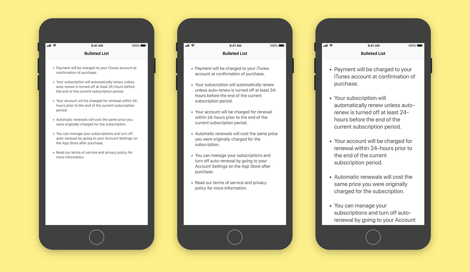
Bulleted List for UILabel and UITextView

The first thing to determine is the bullet you want to use. I like to have a • (press option + 8) with two spaces afterwards. We store this in a variable and then build a String array with which we’ll populate each line of our list2. These are then mapped to append the bullet we chose to the front of each string.

let bullet = "•  "        
var strings = [String]()
strings.append("First line of your list")
strings.append("Second line of your list")
strings.append("etc")
strings = strings.map { return bullet + $0 }

Next we create the base attributes of our label or text view such as the font size and colour. As we want the text to scale dependent on the users own text preferences, we use Dynamic Type via preferredFont(forTextStyle: .body) although you can obviously use any font. The bulk of the heavy lifting is done by an NSParagraphStyle attribute called headIndent which adds a fixed amount of padding to all but the first line of a paragraph. We can determine the size that this indent should be by casting our bullet as an NSString and then providing our previously created attributes to the size method. This gives us the width of the bullet and any spacing you added afterwards in the exact font and size you have chosen.

var attributes = [NSAttributedStringKey: Any]()
attributes[.font] = UIFont.preferredFont(forTextStyle: .body)
attributes[.foregroundColor] = UIColor.darkGray

let paragraphStyle = NSMutableParagraphStyle()
paragraphStyle.headIndent = (bullet as NSString).size(withAttributes: attributes).width
attributes[.paragraphStyle] = paragraphStyle

Finally we join our string with line breaks (strings.joined(separator: "\n\n")) and create an attributed string with the attributes including the new paragraph style.

This all works but there are two more things you’ll need to do to support dynamic font scaling. First of all you’ll want to ensure that the ‘Automatically Adjusts Font’ checkbox is selected in Interface Builder for your label or text view3. Secondly, you’ll want to be notified when the content size changes (i.e. when the user goes to the Settings app and increases or decreases the text size) by subscribing to the UIContentSizeCategoryDidChange notification and regenerating your label. I prefer to do this in a method named updateUI but your personal preference may vary.

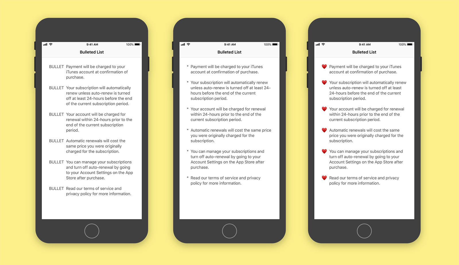
The nice thing about this setup is that it is entirely fluid, doesn’t require any 3rd party dependencies, and can be used with any mixture of bullet types be they a single character, a word, or even emoji:

Bulleted List with custom bullets for UILabel and UITextView

I’ve uploaded a basic project to GitHub to demonstrate this code in action. Hopefully this article will serve as a reminder that you don’t need to import 3rd party libraries to achieve basic text formatting and that you should always be wary of text code that doesn’t take font scaling into account.

  1. Sourced from the excellent tutorial by David Barnard. ↩︎

  2. Don’t forget to use NSLocalizedString - I didn’t bother for the sake of brevity in this article. ↩︎

  3. Alternatively you can use the adjustsFontForContentSizeCategory boolean on UILabel and UITextView↩︎

Solcaster

I’m pleased to announce the release of a new client app I’ve been working on for the last few weeks: Solcaster, the reverse weather app.

I worked as the only iOS developer on Solcaster for Reidefine LLC working remotely from the UK. The app is an interesting concept in that it helps you find weather you might be looking for rather than telling you what the weather is like right now. When you open the app, you can choose the type of weather you are looking for, the area you are searching from, and the maximum amount of travelling you are willing to do. It then runs this through a sophisticated algorithm of my own design to show you where you can find that weather. This is useful for a wide range of people be they searching for sun, snow, storms, wind, or even rain1!

Once you’ve found an area you are interested in, Solcaster provides even more information including the previous and future weather2, interesting hikes and climbs, and any events that may be in the local area. This is all powered by a number of APIs with an intelligent caching layer that makes requests as fast and responsive as possible. In addition, there are deeply customisable settings including temperature thresholds, wind speeds, snow accumulation, and of course the option to choose between Celsius and Fahrenheit.

The app is written entirely in Swift 4.1 and is optimised for all iPhone sizes including the relatively new iPhone X. There are a number of interesting Apple technologies being used including iCloud sync which helps keep the settings the same across all of your devices as well as syncing your favourited trips and recent searches. Whilst the app is free to download, it is limited to searching within a 1 hour radius and does contain ads from Admob. For a single in-app purchase of $1.99, the ads are removed and the radius can be extended up to 8 hours. This unlock is also synced automatically through iCloud sync so that you don’t ever need to hit the “restore purchases” button that is ubiquitious with in-app purchases3.

I really enjoyed working with Reidefine LLC on this project and building something a little bit different to other weather apps on the market. You can download Solcaster on the App Store for free and learn more about it at solcaster.com.

  1. I’m currently in the middle of a heatwave in Leicester. Unfortunately my nearest rain is in 300 miles away in France… tempting! ↩︎

  2. Why the previous weather? If you’re a snowboarder the amount of snow that fell yesterday is probably more important to you than the weather today. ↩︎

  3. It is mandatory for iOS apps to provide a “restore purchases” button when using in-app purchases so that functionality can be restored should you delete and reinstall the app, restore from a backup, or update to a new device. My thinking was that it was far better to sync this information through the secure iCloud sync such that this unlocking is seamless. You can try it by downloading and upgrading Solcaster on one device then opening it on another; within a second or two of opening the app you’ll notice the ads pop away without the need to tap a button and sign in to your Apple account. Wonderful! ↩︎

"iPhone Only" apps on the iPad

Since the launch of the iPad in 2010, any app that runs on the iPhone will also run on the iPad in a scaled format. This is normally1 in the 3:2 aspect ratio which the original iPhone had all the way up until the iPhone 5 when they changed to the 16:9 ratio2. Many developers forget about this fact and happily build their iPhone apps unaware that the App Store Review team will test them on an iPad and reject you if something doesn’t work. The fact that this 3:2 aspect ratio is used has been the bane of my iPhone development life for the past couple of years as even though iOS 10 dropped support for the iPhone 4S you still had to make your iPhone apps run at 3:2 so they could work on the iPad. This is particularly frustrating when designers provide designs at the 16:9 size and you have to find a way to make fixed size assets work on the smaller height without resorting to scrollbars…

It looks like this is set to change with iOS 12 as beta 2 is now running iPhone apps in their 16:9 ratio on all iPads rather than than the 3:2 ratio. Whilst there aren’t any App Store guidelines changes to go along with this, it follows that if you build an iOS 12 app you no longer need to support the 3:2 screen size.

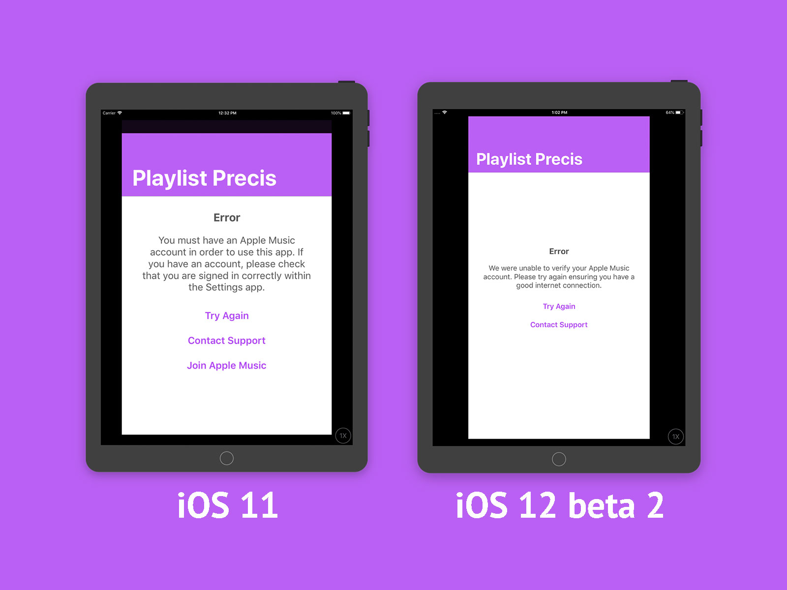
Here is an example of one of my upcoming iPhone only apps running on a 9.7” iPad with iOS 11 and one with iOS 12 beta 2:

As ever, things could still change and Apple may reverse this decision in later betas but it seems unlikely bearing in mind this has been standard practice on the 12.9” iPad Pro since launch.

This is still not a perfect solution. I am desperate for Apple to finally stop the ridiculous notion that iPhone apps need to run on iPad. The App Store actively fights against this edge case by requiring you to choose “iPhone Only”3 when searching for iPhone apps so why not allow developers to choose if their app should be able to run on an iPad or not?

The thing that irks me most about this is that iPhone apps on the iPad are not a good experience. Phil Schiller even said as much at the launch of the iPad Mini:

We’ve learned […] that customers love the ones written for iPad, designed for that screen. What does the other platform have? They have phone applications stretched up; not tablet applications.

He even shows the Android phone version of Yelp scaled up on an Android tablet versus the native iPad app saying:

You get a great experience on iPad mini, you get a scaled up phone experience on that other product. It’s a big difference.

This continues with a number of apps with the message being clear that scaled up phone apps on a tablet are worse than native tablet apps. I couldn’t agree more, Phil.

For now, the change from 3:2 ratio apps to 16:9 ratio is a big win for developers and will avoid a lot of design problems. I can only hope that later Xcode builds will finally allow an option for truly “iPhone Only” builds.

  1. The 12.9” iPad Pro was an outlier that always used the 16:9 ratio for some reason. Doesn’t really make sense that it got this change first as all iPads are the same 4:3 ratio anyway… ↩︎

  2. Unfortunately 16:9 wasn’t the end of it and the iPhone X has a new aspect ratio of 39:18 (or 19.5:9 if you prefer). ↩︎

  3. Which is a ridiculous name. Why not “iPad Only” and “iPad and iPhone”? If they were truly “iPhone Only” they shouldn’t even show up in the same way that Apple TV apps don’t appear on an iPad! ↩︎

Custom Intents with SiriKit on iOS 12

Yesterday was the start of WWDC 2018 and one new feature in iOS 12 caught my attention amongst the many that were demonstrated:
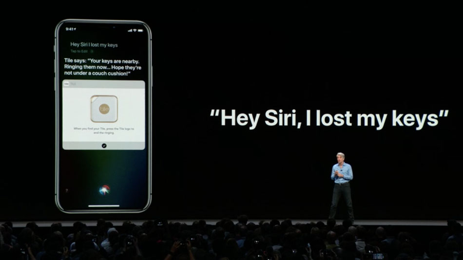
Hey Siri, I lost my keys

The demo was part of the new Shortcuts system and showed that apps could reveal some functionality to Siri, in this case the Tile app being able to search for your keys. Once the keynote was over and the documentation went live, I had a dig through and was intrigued to find a new “custom intent” within SiriKit exposed as INObject. This is paired with a full demo app in the form of Soup Chef that shows how you can create these custom intents and use them as shortcuts for Siri. The most interesting thing about this is the following concept from the Soup Chef overview:

These types define the schema that Siri uses to identify requests the user makes; for example, “Order tomato soup with cheese.” The parameter combination for this example is: soup and options.

When I dug into the code, I found this new Intents.intentdefinition file with which you can create custom intents complete with paramater binding.
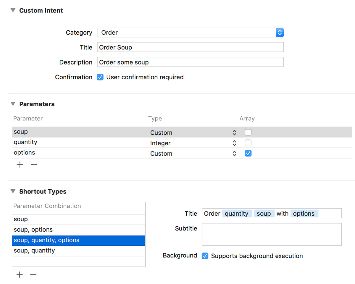
Custom Intent creation with SiriKit

This sure looks like the much anticipated ability to write your own Siri code!

What this isn’t

It turns out that isn’t the case. The new custom intents are for “Siri the all-seeing widget assistant” not for “Siri the thing you control with your voice”. These custom intents are designed to be created for very specific use cases and then exposed as shortcuts so that you can access them quickly from your lock screen, add them to a workflow, or activate them with a custom voice command that the user creates. Despite the schema being present and the documentation alluding to voice control, you cannot create your own custom commands such as “Order tomato soup with cheese”.

By way of an example, I have my own app that I use to update my gaming time on my ShyGuys gaming website and I was hoping to be able to use this system to say “Hey Siri, add 0.8 hours of gaming time to Skyrim on the Switch”. In parameter based terms this would be “add [hours:decimal] of gaming time to [title:string] on the [console:enum]”. Unfortunately this is not yet possible although the system shows promise for this future.

Before I go into how this system works and the intended use case, there is one extra thing in SiriKit that will please many developers; Media Intent Domain which effectively allows you to use Siri to control media apps such as Spotify, Audible, or Overcast once the developers add the necessary updates.

Custom Intents and Shortcuts

If you are unable to write custom Siri scripts, what then is the point of the new custom intent? It is designed to give you a quick shortcut to commonly used tasks.

In many ways, the Tile app is the perfect demo as it really only does one thing which is to find a specific object. The developers of Tile could create a custom intent of the sort “Find [tile:custom]” and when the app first launches on iOS 12 they can donate an INIntent for every Tile that you own; this basically registers the shortcut with the system so you are telling Siri1 that there is a “Find Keys” intent, “Find Remote” intent, “Find Dog” intent, etc. These intents are exposed to the user as Shortcuts both within the Settings app and in the new Shortcuts app2. Every time you use the Tile app to find something, the specific intent for that device can be re-donated to the system which helps Siri learn and enables it to prompt you when you may need to do this. For example, if you open your Tile app every morning at 8am and tap on your “Keys” Tile to find it, then that “Find Keys” intent is donated to the system helping Siri realise it should probably show you that intent just before 8am. How does it show an intent? By displaying it as a Shortcut on your lock screen, notification centre, Apple Watch, or within the Shortcuts app where it can then be paired with other Shortcuts from other apps (i.e. you could have an “I’m running late” workflow which sends an iMessage to your boss, activates your find keys intent, loads up your route to work in Maps, and opens the garage ready for you to jump into your car).

The piece that makes this slightly more confusing is that you can add a custom Siri voice command to a Shortcut. When Craig demonstrated saying “Hey Siri, I lost my keys”, that is really just a voice command on the “Find Keys” custom intent and is highly specific to that particular Tile; you’d have to record a new one if you wanted to find your TV Remote Tile. These Shortcut Phrases can be created either from within the Settings app or an app can present a view controller3 (complete with a suggested command text) that lets the user record their custom snippet.
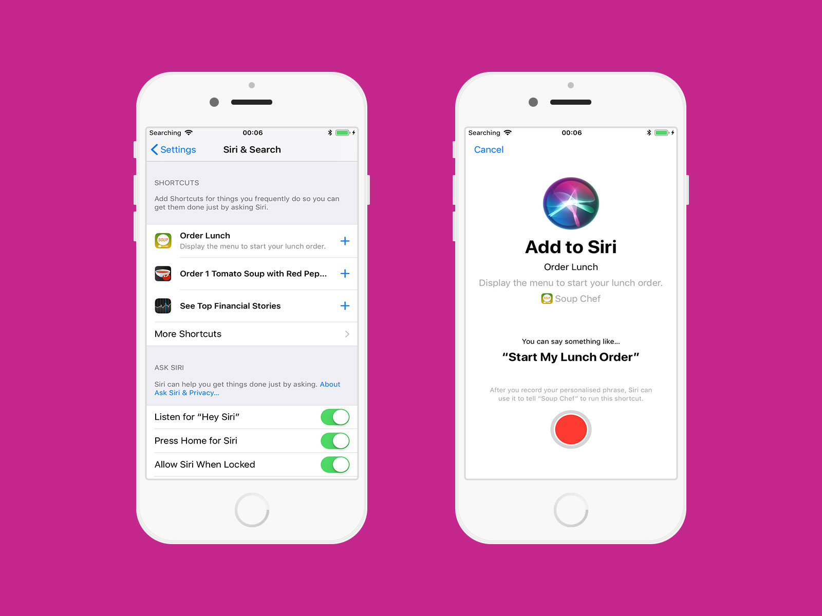
When a Shortcut is invoked (either by a Shortcut Phrase or by tapping on a Shortcut) it can either launch your app in the foreground or fire up your INExtension that will allow you to then return a custom UI directly within Siri. Both have their uses although again they are fairly specific.

By way of an example, lets say I order a Chinese takeaway every Friday night4 via the Just Eat app. When I place my order, the app could create two custom intents:

  1. A generic intent for the takeaway venue: "Order from [name:string]"
  2. A specific intent for my meal: "Order [menuitems:array] from [name:string]"

The first one could launch the Just Eat app and take me directly to the menu for the takeaway I order from so I can peruse and then place my order. The second one would instead be able to place my regular order without opening the app and even provide custom UI to perform an Apple Pay transaction within Siri.

This is super powerful when combined with other Shortcuts as I could then record a Shortcut Phrase “Hey Siri, it’s Friday Friday got to get down on Friday”5 which would turn on my living room lights, open up the Netflix app on my Apple TV6, lock the front door, and place my Chinese order.

The fact that these Shortcuts can be created silently by the app and then donated to Siri so it can then suggest them to you at certain points is also super interesting. Siri already knows to show the Just Eat app in my Siri App Suggestions on a Friday night so having it in the future automatically prompt me to place a repeat order will cut out some time. Once lots of apps add support for this it will be cool and perhaps a little scary to see what regular habits we have that we didn’t even realise.

(Update: It turns out that apps have been creating Shortcuts since as far back as iOS 8. If you make use of NSUserActivity then these are donated automatically when calling becomeCurrent() or you can use the donate(completion:) method of INInteraction since iOS 10 to donate any of the standard SiriKit interactions such as starting a workout, initiating a voip call, or booking a ride. Any app that has done this, regardless of whether it has been updated for iOS 12, will show in the Shortcuts system.)

To be clear, this system is not yet at the same stage as Alexa or Google Home. You can’t say “Order half crispy aromatic duck and some egg friend rice from Peking House” without first having already placed that order and assigning a Shortcut Phrase to it. However, the jump to that system suddenly doesn’t seem so far. Siri is already getting all of the data it needs thanks to the intents parameter builder and I can’t shake the feeling that these custom Shortcut Phrases are just going to be used to train Siri to lots of different words over the coming year. There is going to need to be some clever work to avoid collisions7 but on the whole I’m excited to see where this heads next.

All of the topics above are due to be covered at WWDC today and tomorrow at the following sessions:

  • Tuesday 5pm: “Introduction to Siri Shortcuts” [link]
  • Wednesday 10am: “Building for Voice with Siri Shortcuts” [link]
  • Wednesday 11am: “Siri Shortcuts on the Siri Watch Face” [link]

Also, don’t forget to check out the Soup Chef demo app.
  1. Siri the widget master, not the voice. ↩︎

  2. Which is not available in iOS 12 Beta 1. ↩︎

  3. INUIAddVoiceShortcutViewController ↩︎

  4. And maybe Tuesday night as well. Sometimes. ↩︎

  5. It’s a classic. ↩︎

  6. I can dream - this might be possible with the Shortcuts app but we won’t know until it appears in a later beta seed! ↩︎

  7. Even saying “Hey Siri, use Just Eat to order half crispy aromatic duck and some egg fried rice from Peking House” isn’t great as an app name is not unique (only the app name on the App Store is and even then it can’t distinguish between “Just Eat”, “JustEat”, and “Just Eat!”). It’s a solvable problem but it does add an extra layer of difficulty. ↩︎

Developers who work from spectacular locations

I was recently asked some questions about how I work for an article about developers who work from spectacular locations. You can read the full piece over at InfoWorld but I’ve put their full questions and my answers below:

What work do you do?

I am a freelance app developer working on apps for iPhone, iPad, Apple Watch, and Apple TV.

When/how did you go remote?

I used to be a Development Manager in a London-based digital agency back in 2009 and when I moved to another agency it wasn’t a good fit (far too many meetings, not enough actual work). I made the decision to go freelance as a PHP developer which necessitated me working from home essentially forcing me into remote work. I was intrigued by the recently launched iPhone and so started to develop for that - thanks to a lucky appearance on The Gadget Show, I’ve been able to do that ever since.

How did you end up in the location you are in?

I’ve always worked from home as a freelancer so the location I’m in now is really just because I live here (which was due to meeting my wife). The greatest joy of remote working is that you can literally work from anywhere so whilst I could theoretically work in a hammock on a beach I’m much happier sat in bed with a cup of tea and my laptop!

What did it take to go remote? (Buy a laptop? Outfit an office? Argue with a boss/team? Something else?)

The only thing I needed was the confidence to quit my job and base all of my income on freelancing. That wasn’t an easy decision and it was fairly difficult for the first few months but it all worked out in the end.

Have you compared the economics of your remote situation to your previous one? How do they compare?

Initially I was earning a lot less money due to having very few clients and I was paid irregularly compared to a monthly salary. This changed fairly quickly though and now there is no question that financially it was the right decision to make. Even more importantly is the economics of happiness; I am far happier in my life as a freelance remote worker able to choose when and where I work than I ever was working in an office. This is so true that I refuse to work as a contractor in a clients office even if only for a few days as I find I just can’t produce the same quality of work when stuck in an open plan office on a fixed time schedule.

Are there hassles you didn’t expect?

The biggest problems are distractions and motivation. It is very easy, especially in the first few months, to kick back and do very little work as you don’t feel the need to rush. Then, when you run out of money you panic and work ridiculously long hours to try and get some invoices sent out. Freelancers typically have periods they call “feast and famine” or “rollercoaster dips” but they are generally referring to having enough advance work; my problem was always that I introduced those periods myself by putting things off as sometimes I’d wake up and just want to play on the Xbox rather than writing an algorithm for a social feed. Thankfully I have now gotten myself into a comfortable routine (especially now that I don’t live on my own) and so things tend to be smooth sailing but at the start it was very difficult to stay motivated when surrounded by nice distractions!

DrinkCoach+

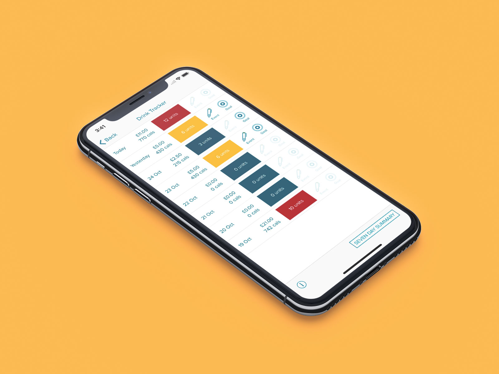
I’m pleased to announce the release of a new client app, DrinkCoach+, that I worked on over the summer:

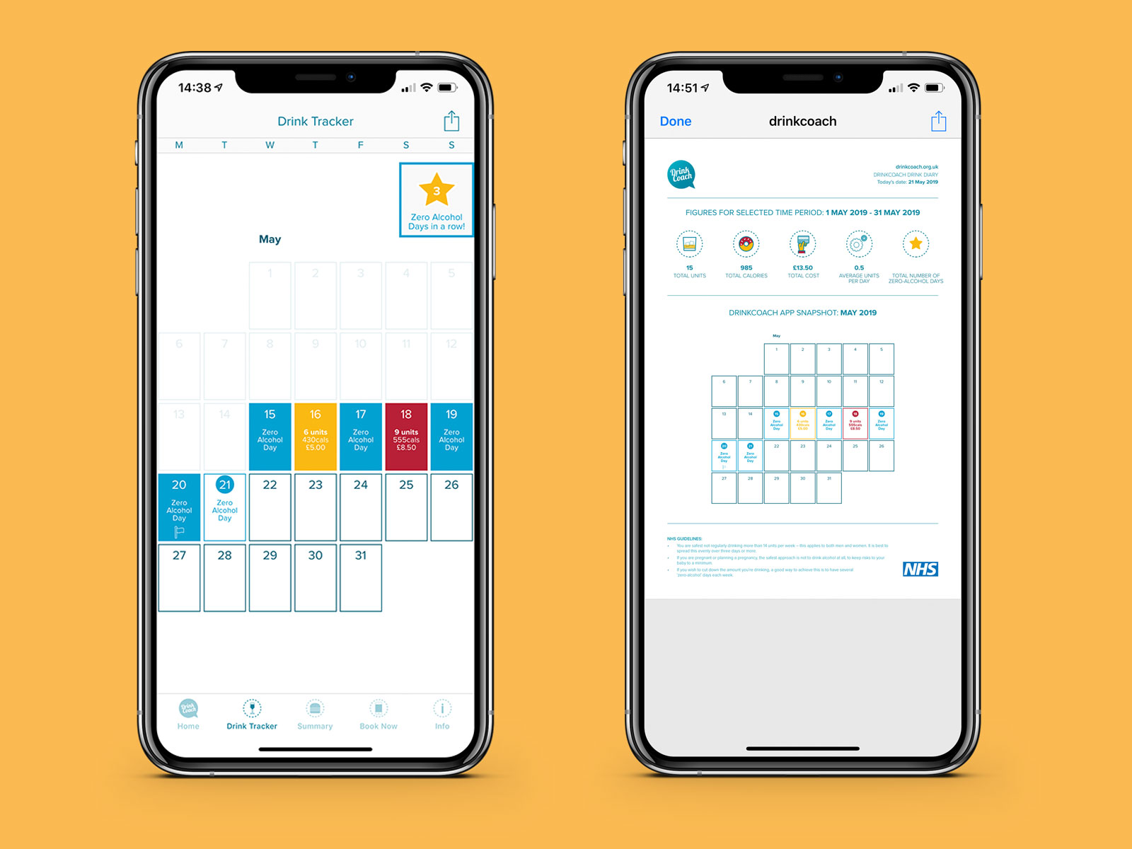
I worked on DrinkCoach+ for Orbis Media as a freelance iOS developer. The app was designed for the Haringey Advisory Group on Alcohol (HAGA) and is designed to help people keep a track of their alcohol intake with measurable goals and monitor any events caused by drinking such as moodswings, cravings, or accidents. This is actually version 3.0 of the app with the previous versions having been created by a different developer. The old code was neither available or desireable and so I rebuilt the app from scratch using Swift 4.0 and the latest iOS SDKs to ensure it was future proofed for any future developer to work on.

The app is optimised for all iPhone and iPad devices (including the iPhone X) and makes use of AutoLayout to scale perfectly across the growing number of screen resolutions and aspect ratios. In terms of functionality, there are a number of interesting technologies used in the app including:

  • Local notifications: the app can notify you at certain times and even locations to help keep you on track with your goals. This was all done locally on the device so that notifications could be triggered without an internet connection or unreliable push notifications.
  • Infographic generation: an infographic detailing how many calories and units you’ve consumed along with your total alcohol expenditure can be displayed in the app and shared as an image.
  • Full customisation: the drinks in the app can be customised with specific units, calories, and pricing information so that they accurately reflect your usual tipple. Drinks can also be dragged and dropped so that your regular drinks are easier to access.

It was really great to work with Orbis Media again and I’m confident that people will love the improvements to this version of the app. You can download DrinkCoach+ on the App Store for free and learn more about it at drinkcoach.org.uk.

Forcing left-to-right text in iOS localizations

Since iOS 6 it has been the case that any localization that utilises a right-to-left language (such as Arabic) will automatically flip your views so that everything scans from right-to-left. Usually this is desireable but there are certain instances where you may want to disable this functionality (such as with a media player that should scrub from left-to-right). I was recently asked by a client to completely disable the right-to-left functionality for all languages as it was causing too many display issues within the app and customers were specifically saying they’d prefer it to scan that way.

After a bit of searching, the general consensus was that I’d need to manually alter1 all of my horizontal constraints in order to force them to be left to right rather than leading to trailing which will flip based on localization. In a project with 1000s of these constraints this did not seem a suitable course of action and would require any future developers on the project to keep this in mind when creating new constraints.

Instead, I came across a property added to UIView in iOS 9 named semanticContentAttribute. This allows you to choose unspecified (the default which flips based on localization), playback and spatial which are special cases for media controls or directional controls, and forceLeftToRight and forceRightToLeft which work as their names would suggest. Thanks to the UIAppearance protocol, disabling the flipping globally is a simple one-liner:

UIView.appearance().semanticContentAttribute = .forceLeftToRight

This not only flips all content back to left-to-right but also ensures that your UINavigationController will animate from left-to-right as well. Of course, you can also use the appearanceWhenContainedIn: method to limit this global change to specific view controllers of your app should you wish to or to set certain controls to other directions.

The only other thing I needed to change in my project to get this all working was some paragraph styles for attributed strings. I frequently use NSMutableParagraphStyle to set custom line heights and I leave the other properties to their defaults. One of these is alignment which is always left on my devices due to my English language but the default is actually natural which means it renders depending on the language. Searching through my project and finding the few places I’d left out a default and setting it was fairly trivial:

let paragraph = NSMutableParagraphStyle()
paragraph.lineSpacing = 4.0
paragraph.alignment = .left

In total, I only needed to make 8 edits to my project; much easier than trying to edit every horizontal constraint in your storyboard!

  1. If I had gone down that route I likely would have written a build script that would go through every xib and storyboard file and do this for me but I have been burned by manually editing xib files in the past. That’s a young man’s game! ↩︎

MPMediaItem+CanAddToLibrary.swift

Since iOS 9.3 it has been possible to add Apple Music tracks to the media library as such:

let library = MPMediaLibrary()
library.addItem(withProductID: id) { (entity, error) in
	if let error = error {
		NSLog("Error: \(error.localizedDescription)")
	}
}

This is powerful as you can use a simple identifier to both play a song and add it to the library but it is likely that your UI will want to show an add to library button similar to the Music app on iOS. To remedy this, I’ve created a simple Swift extension1 for MPMediaItem that tells you if a currently playing track is available in your library:

import UIKit
import MediaPlayer

extension MPMediaItem {

    var canAddToLibrary: Bool {
        let id = MPMediaPropertyPredicate(value: persistentID, forProperty: MPMediaItemPropertyPersistentID)
        let query = MPMediaQuery(filterPredicates: [id])
        let count = query.items?.count ?? 0
        return count == 0
    }
    
}

Why an extension on MPMediaItem? The only way to know if a track is in your library is to search the user library with an MPMediaQuery. Unfortunately you can’t search on the MPMediaItemPropertyPlaybackStoreID (as some tracks may not be on Apple Music) so instead you need to use the persistent ID property. If you try and play an Apple Music track using an identifier, then you can retrieve an MPMediaItem and use that to get the persistent ID for searching the media library. I use this in my own apps2 by listening to the MPMusicPlayerControllerNowPlayingItemDidChange notification and then checking if there is a nowPlayingItem on my MPMusicPlayerController instance; if there is then check it to find the current status:

var player = MPMusicPlayerController()

override func viewDidLoad() {
    super.viewDidLoad()
    
    player.beginGeneratingPlaybackNotifications()
    NotificationCenter.default.addObserver(self, selector: #selector(playbackStateDidChange), name: .MPMusicPlayerControllerNowPlayingItemDidChange, object: nil)
}


@objc func playbackStateDidChange() {
    
    guard let item = player.nowPlayingItem else {
        return
    }

    // at this point we do not know if the track can be added - any UI for adding should be hidden

    if item.canAddToLibrary {
    	// show your "Add to library" button
    } else {
    	// show some UI to explain "Already in library"
    }
}

I am fairly sure this is how the Music app works on iOS as you’ll notice when skipping tracks that the UI for the track status is completely hidden until the track is ready to play at which point either an add button or a tick will appear. One thing that caught me out was listening for MPMusicPlayerControllerPlaybackStateDidChange but this seems to fire inconsistently both on iOS 10 and iOS 11 (unless you are on an iPad and run the Music app in split-screen mode in which case it always works) - checking for MPMusicPlayerControllerNowPlayingItemDidChange works consistently and will still yield an MPMediaItem with which to work with.

IMPORTANT: The user will need to have granted permission to access their media library in order for this extension to work. It will crash your app if you do not have NSAppleMusicUsageDescription in your Info.plist (although that is the bare minimum - you should actively check for capabilities before using this as no point showing an “Add to library” button if the user doesn’t have that capability!)

Checkout the MPMediaItem+CanAddToLibrary Swift extension on GitHub

  1. I wrote the extension using Swift 4 with Xcode 9 / iOS 11 SDK but it should work just fine in Swift 3 as it isn’t using any new language stuff. ↩︎

  2. Including an exciting iOS 11 only Apple Music app I’m working on. If you’re an Apple Music subscriber with the iOS 11 beta installed (developer or public), contact me for a test version before it launches in September… ↩︎

Flawless

One of the great things about Twitter is the way it can connect you to other developers. For many years, I’ve been chatting with Lisa Dziuba and she got in touch with me last year along with her colleague Ahmed Sulaiman to tell me about a new app they were working on, Flawless, which has now officially launched.

Flawless is an absolute godsend for developers working on pixel perfect designs. It is a plugin for the iOS simulator that allows you to compare what is rendering on screen with a static image via various different modes and a slider for opacity. In this way, you can make sure that what you have built matches the image precisely. The app is a plugin for the simulator itself so you don’t need to add any extra code or frameworks to your project. It also works with static images1 so you don’t need to worry how your designs are provided be that by Sketch, Photoshop, or other2.

I’ve been lucky enough to be both a beta tester and to be interviewed by Lisa and Ahmed about my workflows to help them tweak the app. If you are an app developer that has to work to a fixed design, you should definitely check it out. Flawless is available for macOS at the bargain price of $153 and you can find out more (and get a free trial) on their website at flawlessapp.io.

  1. I believe the original idea was to be integrated with Sketch but after they spoke with me and many other developers who don’t work exclusively with Sketch they decided to pivot to being an iOS simulator plugin instead. ↩︎

  2. I have one client who provides me designs via InDesign and he is also the most likely to create a GitHub issue for a dividing line being 0.5px out of alignment - love ya Niki 👊 ↩︎

  3. This has saved me so many subsequent bug follow ups that $15 is almost criminally low. ↩︎

Great British Bee Count 2017

For the past couple of years, I have worked with Two Thirds Water on the Great British Bee Count iOS app for Friends of the Earth. Today, an updated version of the app has gone live to support this years count which runs from 19th May until 30th June 2017:

The main update has been a completely new design which fits the more modern “flat” design which was made popular by iOS 7 whilst also putting the navigation within easy thumb reach even on plus-sized devices. There are also many new functionality changes such as an improved bee picker and fact files on each type of bee that can give you a lot more information.

As I also needed to migrate the app to Swift 3.1, I took the decision to completely rebuild the app from scratch1 so I could make use of some newer iOS features such as stack views and improved auto layout constraints. I also made improvements to the way in which content is stored on the device locally in a Realm database making the whole app feel even faster whilst increasing the reliability of sending count information in the background2.

You can check out the Great British Bee Count on the App Store (it’s free) or learn more about the bee cause.

  1. This was a decision the client was not made aware of and whilst it cost me more time (as I worked to a fixed budget) the end result is an app I can be really proud of. I’d much rather spend a bit more time and money from my own pocket to make something perfect than try and hack something together quickly especially if it is a full redesign of an existing app. Due to changes in the Swift language and a move away from separate xib files to storyboards, I was able to reduce the overall file size by 20% and the amount of code by 45%. ↩︎

  2. For example, if you try and submit a count when you have no network connection, the app can automatically upload this information once connectivity is restored even if it is no longer in the foreground. ↩︎

« Older Entries Newer Entries »