Ben Dodson

Freelance iOS, macOS, Apple Watch, and Apple TV Developer

The API behind Gowalla v4

A few weeks ago, Gowalla released version 4.0 of their app to an overwhelmingly negative response. I myself will be posting a review soon but in this quick post I wanted to share a few tips on how to use the new API that is powering the app as an official API is apparently not coming until Q1 2012.

 In a post entitled "Where the Gowalla API is going" on the official Gowalla Developers Group, it was revealed that most bits of the existing API "should be working" but a version 2 of the API would be coming in 2012 that enables developers to leverage the new features such as stories, lists, likes, guides, and so on. Unfortunately, several parts of the existing API broke on launch of the new app (including OAuth integration which took out nearly all 3rd party apps, trips, and an advanced search API) and some parts were completely removed (such as PubSubhubbub, one of the key things that actually made the Gowalla API a compelling thing to use). I have a number of apps that use the old API and were affected in small ways (I learnt long ago never to make direct calls to the Gowalla API) but there were a few things like trips that I needed direct access to more immediately. So, I spent a few minutes digging into the new Gowalla app and found the new connection details that are required to talk to the new API.

It's actually fairly easy! Firstly, instead of connecting to http://api.gowalla.com/ change the URL to https://api9000.gowalla.com/

Next, there are 4 headers you have to send with every request. 2 of them, "Accept: application/json" and "X-Gowalla-API-Key", were required for the old API but Gowalla have also added an "X-Gowalla-Bruce-Lee" header (with a password so they know it's the Gowalla app using the API) and an "X-Gowalla-API-Version" header which seems to suggest they are taking my advice of 18 months ago and versioning the API rather than just breaking existing apps. So, the full headers you need to send are:

Accept: application/json
X-Gowalla-API-Key: YOUR-API-KEY-HERE
X-Gowalla-Bruce-Lee: l33tkuned0
X-Gowalla-API-Version: 2

If you do that, you should be able to call an API endpoint such as users/bendodson where you'll find a load of new data that isn't in the normal API. That should also give you a good idea of the naming conventions of new endpoints (e.g. /lists rather than /trips). In all of my testing, existing features such as OAuth have worked fine.

As a final example, the trips detail API is still broken on the current API (despite this being "looked into" 2 weeks ago). If you were to request trips/168 you'll get a 404 not found error. This is one of the many broken API calls that is affecting apps that are currently out in the wild. However, if you change your code to use the new URL and the new headers, you can request lists/168 to get full details of the trip you are after. Some of the keys will have changed name but it should be enough to get your app at least up and running.

Obviously, you use all of the above at your own risk. Gowalla are unlikely to break anything immediately as any changes to the headers, endpoints, or keys will break their app. However, there will probably be changes as and when they release new versions of their apps.

I have been very vocal on both the good and the bad points of the Gowalla API in the past. There had been a real effort to alert 3rd party developers to changes in recent months but the new v4 app fundamentally broke important parts of the API (particularly OAuth login) and fixes were slow coming or have still yet to come with regards to the /trips endpoint. Putting an API out for the new app in Q1 of next year is a very long time to wait for something that really should have launched alongside or shortly after the new app particularly as the API does already exist. In short, Gowalla really have a long way to improve in their dealings with 3rd party developers. Personally, I'm moving my apps away from Gowalla and starting to use other services but I'll be posting more about that soon.

Update [25th Oct 2011]: Andrew Dupont responded to this article on the Gowalla Devs Group with:

At any rate, we've fixed the trips API. Let me know if anything's still out of order.

Turns out Gowalla will fix things if you complain enough...

Highlights v1.1 - Gowalla Trips, Last.fm Events, and Translations

If you've been following my blog or twitter feed, you'll know about my iOS app "Highlights" that lets you find interesting places around the world based on data from Gowalla and Foursquare. The app is doing phenomenally well in the UK becoming the #1 paid iPad travel app and reaching the top 20 of all paid iPad apps! I'm happy to announce that version 1.1 is now available as a free upgrade on the App Store and has a number of great new features.

  • Last.fm Events - When looking at a theatre, park, or music venue, Highlights will show you the upcoming events and let you tap through to Last.fm to find out more and list yourself as attending.
  • Gowalla Trips - Each location can now show you every trip it has been added to on Gowalla. This isn't just the featured trips, but every single trip ever created. When you're looking at a trip, you can choose to add it to your planner with one tap making it really easy to plan a day out in a new town. Additionally, you can find trips near you via the planner and also search for trips around the world.
  • View plans on a map - In the previous version, you could see your plans on a map if you were running the app on an iPad. With version 1.1 we've bought this feature to the iPhone as well. Just look at any of your plans and you'll find a new toggle to switch between list and map.
  • Review Translation - When browsing reviews, you may come across some that aren't in English. Just double-tap the review to have it automatically translated!
  • Faster Navigation - If you find yourself jumping from location to location via the trips or nearby spots features, you may find you have to go back through lots screens to get back to the first location you were looking at. You can now just hold down your finger on a back button anywhere in the app to be taken back to the first screen.
  • Report a Problem - Sometimes mistakes are made and old or incorrect data is pulled down through Foursquare or Gowalla. You can now tap a "Report a Problem" button on any location page to have it automatically flagged for us to fix it.

In addition, there are various speed improvements and bug fixes (including an issue with the iPad app not showing all of the screens in certain situations) - there is also the option to send a crash report anonymously in the unlikely event that the app crashes.

Thanks to everybody who has downloaded the app so far. If you enjoy this update, please leave a review on iTunes. If you run into any problems, please email me via help@highlightsapp.com before leaving a negative review as I'm unable to respond to reviews on iTunes.

The inside story on powering Highlights

Last week I released my latest iOS app, "Highlights", which is designed to show you the best places in your area or anywhere in the world based on crowd sourced data from Gowalla and Foursquare. In this article, I want to explain how the recommendations engine works and also how I managed to solve some of the biggest challenges along the way.

Search by recommendations

During SXSW 2011, I made the decision to move away from doing development on apps based around Gowalla items and instead to apps based on travelling and discovery (mainly due to an excellent talk by Gowalla CEO Josh Williams on the subject of check-in apps). It was in Austin that I had the idea for Highlights as I was constantly trying to find the best places to eat, drink, or visit as a tourist and finding it hard to choose amongst the variety of locations on offer. I initially decided to do some prototyping based on the Gowalla API to see if I could come up with a way to sort places based on popularity but the API only lets you sort by creation date or number of checkins. In my opinion, the number of people at a place does not form a recommendation - more people probably go to McDonald's than the local burger joint yet that does not necessarily make it a better choice for dinner. What I needed was a way to filter based on a recently added Gowalla feature; Highlights (from which the name of the app descends). At the time there was no API call to do this (e.g. searching for the "steak" highlight in Austin) so I posted a request on the Gowalla developer boards - The feature was added as part of the "advanced spot search API" by Andrew Dupont just under a month later.

Whilst toying with the idea of searching by Highlights, I realised that there was a big problem with the way I was going to approach recommendations - whilst Highlights were a definitive recommendation, there just weren't enough of them being created to power an app of the scale I imagined. It would work great in places where Gowalla use is pervasive (e.g. Austin) but even in a capital city like London searching by Highlights just doesn't return enough places. What I needed was a way to give a location a score based on a number of criteria such as number of users, highlights, comments, photos, artwork, etc - basically all the data that was available for a spot. The only way that was going to happen was with a huge API change from Gowalla or if I could somehow get a hold of all the data they had...

PubSubHubbub to the rescue

Back in 2010, Gowalla launched a PubSubHubbub hub powered by Superfeedr that allowed for realtime notifications of checkins either by user or spot. Whereas before you'd have to subscribe to an RSS feed and check it every so often for updates, PubSubHubbub allows for you to subscribe to that feed and have them push the data to you as soon as an update is available. It's very similar to the difference between checking mail on your iPhone manually or having it pushed to you automatically.

At the time, I was working on some funky Gowalla item stuff and so I wanted to use realtime notifications so that I could track items around the world. The biggest issue was that I'd need to manually subscribe to each feed which was tricky as there were around 3 million to follow at the time (it would have taken a month for all the subscriptions to go through if I looped through them one at a time and that doesn't include the work to follow new spots as they're created). I had been chatting to Julien Genestoux (CEO and Founder of Superfeedr) about getting access to the Track API which gets around that problem by letting you subscribe to feeds in a much more powerful way (e.g. by keyword, location, or hub). With access to Track, I'd be able to subscribe to every notification, in realtime, that Gowalla pushed out.

It was whilst chatting to Julien after SXSW that I realised that PubSubHubbub could solve my problems. By using the Track API, my server would be hit with data every time somebody checked in anywhere in the world with Gowalla. I could save that information each time and basically build up my own version of Gowalla's database that I could search with a custom ranking engine. With the theory solved, it was time to get practical and put everything to the test.

The Walrus and The Carpenter

After a few nights I was able to put my first test version together codenamed "The Walrus" (purely because it uses feeds and I like the way the oysters say "feed" during the story of "The Walrus and The Carpenter" in Alice in Wonderland). Its task would be to get the spot information from the data Superfeedr were sending and work out if it was a spot I wanted to keep - I automatically remove a lot of nonsense spots (e.g. Airport Gates, Houses, McDonalds) so there was no sense saving what wasn't needed. Only a certain amount of data is sent through such as the name and location of the spot and some of its imagery, but I would need a lot more than that so when a spot was saved to the database for the first time, a note was placed on it to tell me to go and get more information.

At the same time as The Walrus was churning through the data was being sent, a script on the server (codenamed "The Carpenter") would run once a minute and look through the database for any spots with missing data. When it found one, it would go to the Gowalla API and the Foursquare API and get all of the data it needed and then update its record before marking it as suitable for use within the Highlights app.

It took a few revisions (and a massive server upgrade) until everything was running smoothly but it enabled me to process the thousands of checkins that occur every day in realtime. With thousands of checkins coming in every day, I was ready to write an algorithm that would let me search spots based on popularity.

Search by recommendations: Attempt 2

Whilst I originally started by ranking based on checkins and highlights, I was able to do much more than that with the huge dataset I'd amassed. Every spot is now searched based on a huge range of standard criteria (i.e. number of photos taken at a place) as well as time sensitive information that I have such as frequency between checkins and times of day. This means that a new spot in the area can still be ranked higher than an old place with a huge number of visitors as I can see that it is gaining traction faster and will overtake it at some point in the future.

It wasn't until June 2011 when the first version of the app was in beta and I was visiting my parents in Devon that I realised a second big problem. Places with few active Gowalla or Foursquare users were showing very few spots. This wasn't because of a lack of places or data, but just because nobody had checked in anywhere in the last month meant that no alert for me to get the spot data had been sent to "The Carpenter" script. Essentially, whilst my dataset was vast and comprised of millions of active spots, it wasn't showing those niche places (which are often better) that don't get checked into as often. Of course, these places would get added the next time someone checked in but I didn't want to have gaps when the app launched.

To fix this oversight, if the app finds less than 50 results in the area, it will go and do a manual check with Gowalla and get a basic listing of spots with the rubbish ones removed by the same filter "The Walrus" uses. It adds these to the browse page sorted by checkin but it crucially adds them as "pending" to my database so that "The Carpenter" can check them and rank them for next time. Basically, every time you browse an area, the app learns!

Reviews and Photos

Rather than just listing places, I wanted to show more about them when you went through to a detail page. I was able to show a map, address, telephone numbers, and various other bits but the two key areas of information come from Reviews and Photos. With Reviews, a call is made to both the Gowalla and Foursquare APIs in order to get Highlights and Tips from each service and merge them together with the most recent shown first. This gives an excellent and balanced overview of a place that I think works really well. I wanted to add Yelp recommendations as well but unfortunately their API is very poor for matching places or for pulling out recommendations (it limits you to 3 teasers) - I hope to add them in future if their API improves. With Photos, a similar system was used but this time it pulls images from Gowalla, Foursquare, and Flickr thanks to their geolocation API. This again adds a brilliantly balanced view which should always return some results.

The Future

My database currently has over 1 million locations in hundreds of countries with over 7 million checkins recorded, yet this increases every second of the day as people check-in around the world as well as browsing with the Highlights app. I'm constantly tinkering with the algorithm to make sure it gives the best results as well as finding ways to remove duplicate spots or rogue locations but version 1.1 of the app will make it possible to flag up any issues so they can be cleared up immediately.

I wrote Highlights out of a desire to find the best places and I am its biggest user as well as its creator - it has helped me find some great bars as well as finding a dinosaur-themed crazy golf course less than 5km from my house that I knew nothing about! The unique way in which it finds and sorts places means it should be able to find the best places anywhere in the world. In short, I'm confident it will help you whether you are finding places to eat on holiday or are just planning a pub-crawl at university. Give it a try and let me know how you get on with it.

Review: GeoWiz

One of the things that amazes me about the iPhone is the way in which it can be used in so many different ways thanks to the power of apps. I'm always interested to see new uses of the technology and so was particularly keen to take a look at GeoWiz which is a new app in the area of teaching. GeoWiz is an app aimed at children to help them make Geography "fascinating and interesting". It originally started as a board game elementary school project in California before becoming a "social mission software solution" app of which 50% of the apps selling price goes towards supporting schools. With some interesting features such as Game Center integration and a points system, this should be an interesting app in the new medium of digital teaching.

So what is it like?

When I was growing up, I had a subscription to an excellent magazine called "Wally's World". It was part of the "Where's Wally" series and each issue looked at a different country and details such as culture, flags, animals, etc. It was a great way of learning as it was fun, had a few games (mainly word searches), but above all it was easily digestible knowledge. In many ways, I was hoping GeoWiz was going to be something similar with fun games and lots to learn. Unfortunately, that is not the case.

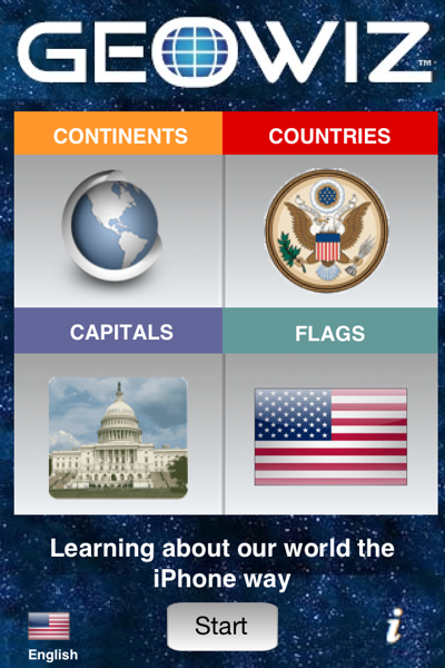
GeoWiz

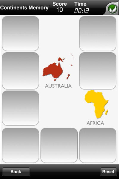
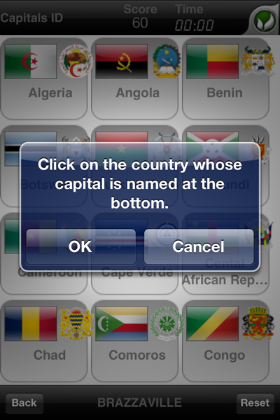
Firstly, lets take a look at what GeoWiz offers. The general premise is a number of games based around memory retention of key facts around Geography, namely continents, countries, capitals, and flags. These games can either be the standard "matching certain objects under revolving tiles" genre or tapping on a country to match it to the capital listed at the bottom of the page.

Continents Memory Click on the country whose capital is named at the bottom.

The tile game is pretty good but doesn't really help you learn anything (after all, you're matching shapes as quickly as possible, not taking them in). The flag game, on the other hand, is incredible difficult. I had no idea which country had "Brazzaville" as a capital so I just tapped each of the flags as quickly as possible until I found which one it was. There aren't any point deductions for getting answers wrong so you can win the game fairly quickly just by tapping all over the place. That's when I found an interesting bug; all of the answers are behind tiles in reverse order. If I tap on the bottom right-hand corner and then move my way right to left up the board, then that appears to be the solution almost every time as demonstrated by the screenshot below showing a perfect score in 3 seconds.

Cheating on GeoWiz

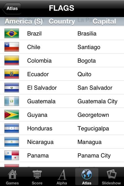
So much for the gaming, how do you go about learning? Rather than details on each location in the style of an encyclopaedia, countries are just listed out with their flag, name, and capital. There are 4 screens yet each of them are the same just with a different sort order.

Learning in GeoWiz

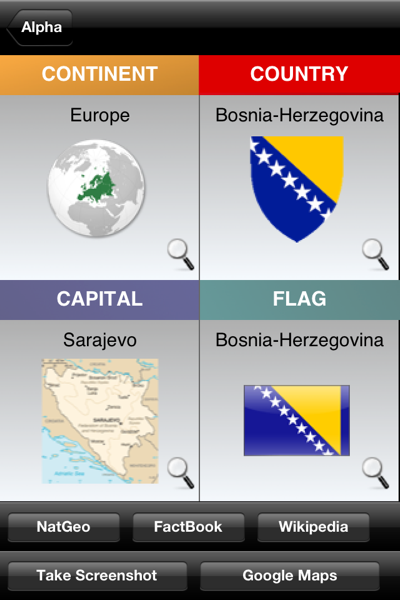
Tapping on a country gives you the same information but a bit larger. However, there are links to other services such as Wikipedia and NatGeo. Unfortunately, these are just inbuilt Safari windows that show no indication of loading and lack the controls of the native browser. It would probably have been better to have external links open in Safari or even to have an "Open in Safari" control for those that want to bookmark or have more control over the browsing experience.

Looking at a country

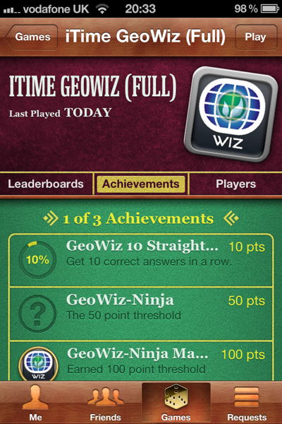
I was willing to put the issues above aside as the app has some interesting credentials in terms of it's creation and how it is supposed to be used. For example, it contains OpenFeint and Game Center integration to keep children interested in progressing and competing with their friends. I appreciate the idea of adding integration for gaming networks and it's one of the things that persuaded me to review the app, but the implementation is lacking. There are only 3 achievements and they are all trivial to unlock, especially for the Angry Birds generation. Also, the issues with gameplay I mentioned (e.g. easy to cheat) will make a mockery of the leaderboards very quickly.

GeoWiz on Game Center

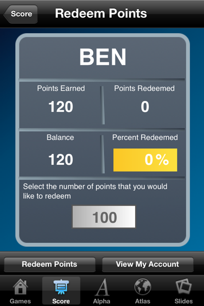
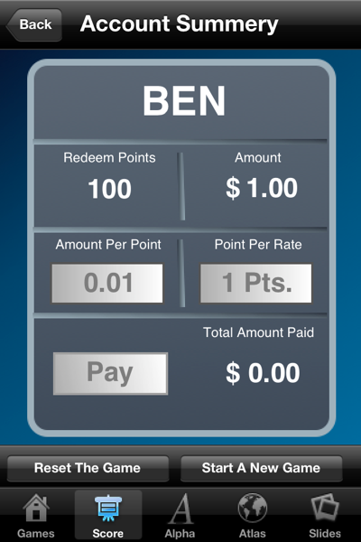
Another area of interest is to use points earned in the games to get pocket money. Again though, the feature is let down by lack of basic UI work. The feature is hard to find and it isn't immediately obvious how it works or how you set it up - I only knew what it was due to a short description on the iTunes app page. I also have an issue with tying revision into pocket money as this smacks of bad parenting to me. Not being a Father, I can't really comment but I wouldn't want my children coming to me with an app and saying "I got 150 points so you owe me £1" especially when it is so easy to game the system. It seems to me that both parent and child would be better served by reading through a child's atlas together and keeping rewards for when they've actually passed a test or school or gained a good grade, not for when they've done a bit of revision.

Points in GeoWiz Account Summary on GeoWiz

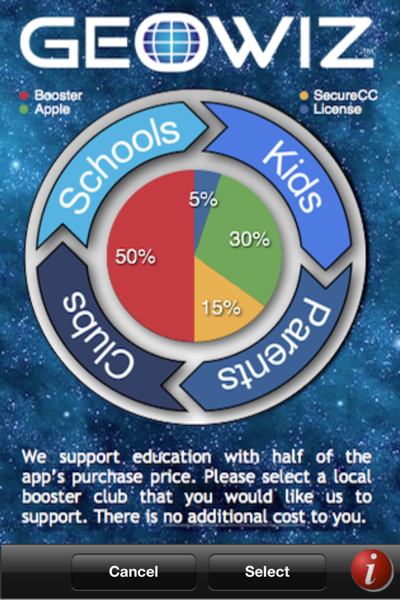
The final area in the app that interested me is the promise that 50% of the app sale price goes to your child's school. It turns out that you need to find the button to do this (which isn't obvious) and then choose from a prefilled list of US schools. Whilst I appreciate the intention, it seems a little pointless to me. I'd rather use the 50% (which is £6 or $10) on the pocket money reward or actually giving it directly to my school especially as I'm based in the UK. Also, it would make more sense in my mind for the "choose your school" screen to happen automatically the first time you open the app. That ensures that everyone who uses the app gives a donation and also makes much more sense from a users perspective.

GeoWiz Donation

On the whole, I'm not terribly impressed with GeoWiz. It has good intentions but the app is severely lacking in polish or finesse. From the app side of things, it doesn't support the iPhone 4 Retina Display so looks awful on any new devices. This is unacceptable in my mind as adding retina support is trivial, especially for a new app. Aside from technical implementation, there is a distinct lack of structure to the application. The main menu can only be accessed when you first open the app and you can't go back unless you force quit from the multi-tasking tray. Whilst all of the menu options are available on every page, it's the fact that you can't go back to a page you've previously seen that doesn't sit well. Add to this the lack of the regular status bar so you can't see battery life, network activity, or the time (all important things), poorly laid out navigation controls, and lack of instruction on complex features like points rewards and I can see both children and parents getting frustrated quickly. Yes the games are fun (for a time) but the poor build quality means they are easily cheated.

In short, your child is unlikely to gain much from this app. Geography is not simply knowing what the capital of the Congo is and identifying it's flag. It's about culture, the uniqueness of a place, and what we can learn from it. If I had £11.99/$19.99 to spend on teaching my child geography, I'd invest in either a child edition atlas or encyclopaedia and spend some quality time with them telling them about the world. I'm hopeful that one day someone will create an app similar to the "Wally's World" magazines of my youth as there is real potential for child and parent to learn together (especially with the iPad). However, GeoWiz is not it.

Disclosure: I was given a free copy of this application to review. I tested it on an iPhone 4 running iOS 5.0 beta 2. If you have an app for iOS that you would like me to review, please contact me.

Does iOS 5 finally allow retina display iPhone apps to run unscaled on the iPad?

When the iPad was first launched, one of its original touted features was the ability to run the majority of apps available in the app store (the only ones that wouldn't work were those requiring a camera but they should now work on the iPad 2). This was a great boon for Apple as they were able to claim that there were hundreds of thousands of apps available at launch but the implementation kinda sucked. Unless the app was a game (which tends to scale quite nicely if built using OpenGL), you'd end up with a pixelly mess. With the launch of the iPhone 4 and Retina Display level apps, I had always assumed that the iPad would get an update to allow it to run Retina Display iPhone apps at their full 960x640 resolution but nothing was forthcoming. So, has this been fixed in iOS 5?

In a word, no, nothing has changed at all (as of iOS 5 Beta 1 at least).

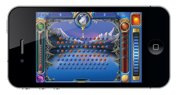
I had been meaning to write a post about the issue of app scaling a few months ago but what finally pushed me into action (aside from the iOS 5 beta) was an update for one of my favourite games, Peggle, which finally bring Retina Display graphics to the iPhone. It was then that I thought that perhaps Apple had finally gotten Retina Display apps working on the iPad but unfortunately it looks like that isn't going to be happening. This is a great shame as there are many brilliant iPhone games that have been optimised for the iPhone and would work brilliantly on the iPad, but the developers just haven't bothered to update them. Peggle is a good case in point so I'm going to use it as a demonstration with some screenshots I've knocked up to illustrate my point (note that you can click on the images below to see the real size versions).

First off, here is Peggle running on the iPhone 4 at full Retina Display resolution:

iPhone 4 with Peggle on a Retina Display

Looks pretty nice! Now let's take a look at it on the iPad 2:

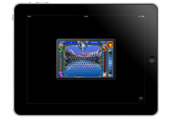
iPad running Peggle at 1x resolution

That is running at 480x320px black boxed in the middle of the screen. Now this doesn't look too bad as it would look exactly as the app would on a handset without a Retina Display (that is to say that there would be no pixelation at this size). Obviously it's awful from a usability point of view (why play a game using less than 25% of your screen?) but the real problem comes when we tap 2x to scale it up to almost full size on the iPad:

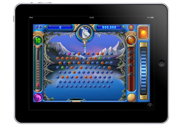
iPad running Peggle at 2x resolution

(it probably doesn't look too bad in the thumbnail but click to see it at it's native size and you'll see the issue).

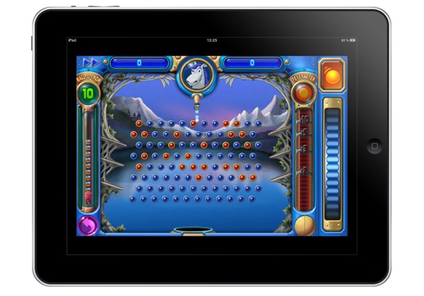
The problem is that rather than using the 960x640px assets that are available in the app (as they are used on the iPhone 4), the iPad instead just doubles up the 480x320px version resulting in a fairly fuzzy mess. Seeing as the assets exist in the app already, it should look something more like this:

Mockup showing an iPad running Peggle at iPhone 4 Retina Display resolution

The iPad (both the original and the iPad 2) are more than powerful enough to cope with it so it can't be an issue of hardware specs. The only technical problem I could see would be what happens when you scale between 1x and 2x modes (as it would be difficult to have it dynamically switch between the two resolutions). However, my solution would be that if you are running an app updated to Retina Display quality, it should always run at the full size removing the need for the button.

Overall, I think the real problem is that Apple don't want iPhone apps to look good on the iPad. If games like Peggle worked on the iPad at pretty much native resolution, then there would be no incentive for iOS developers to develop solely for the iPad. This isn't a problem so much for games (aside from losing revenue for games that have "HD" added on the end... I'm looking at you Angry Birds) but it might be for apps like Facebook (not that they've bothered making an iPad app anyway). If normal utilities worked at double-resolution, the main argument for developing apps on the iPad would be for UI reasons, and not all iOS developers care about that (though they should).

Looks like the iPad is forever going to be limited to running iPhone apps at a scaled resolution.

Update - 22nd June 2011: Ben Wetzel emailed me to let me know about RetinaPad, an app for jailbroken iPads that allows you to run Retina Display iPhone apps at full resolution - it will also scale up common components and text for non-Retina Display apps.

AirPlay Mirroring, TV Out, and the Apple TV as a games console

In my article yesterday following up on the WWDC keynote, I mentioned that I'd be looking more deeply at the AirPlay Mirroring mode in iOS 5 as it holds a number of interesting surprises. Whilst the ability to mirror the content of the iPad 2 wirelessly to the Apple TV is still impressive, the fact that developers can utilise the existing TV-Out functionality to use the Apple TV as a secondary screen is much more exciting.

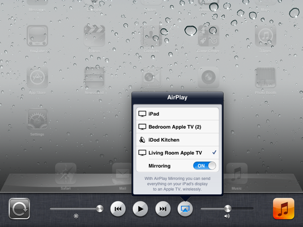
Before I look into that, let me go over a brief introduction of what AirPlay Mirroring is and how it works. At the moment, it is only supported on the iPad 2 due to it's superior CPU (the A5 chip which is widely rumoured to be making an appearance in the next iPhone and next Apple TV allowing for full 1080p resolution... at last). To enable it, all you need to do is go to the usual AirPlay icon hidden in the multi-tasking tray and you'll find a new option that allows you to enable mirroring mode.

AirPlay Mirroring on iOS 5

As soon as this is enabled, anything that is displayed on the iPad is instantly displayed on the Apple TV as well. If you rotate the device, the screen rotates on your television as well and it works with every app. If, like me, you've been waiting for the BBC to update their iPlayer app to work with AirPlay, you need wait no longer - the mirroring feature works with every single app (with no way of stopping it) as it is baked into the OS so you can stream content from any app to your television.

However, whilst that is impressive, my later discovery has much more potential. Every since the Apple TV was announced, blogs and forums have been full of people saying "we want apps for the Apple TV". I have always felt this to be a bad move as a) there is limited space on the Apple TV and b) they would suck. Why, you ask? Well, the Apple TV only comes with a standard Apple Remote with it's 4 directional buttons, and the "play" and "menu" buttons. This might be good enough for basic browsing through a filesystem (although text entry is a pain) but it's not conjusive to the sort of experience iOS users have come to expect from their apps. I have always maintained that the best option would be to allow anybody with an iOS device to transmit apps to the Apple TV as a secondary monitor as you can then display content on the big screen and use the iPhone or iPad to control it with touch gestures.

Luckily, that's what Apple have done.. they just haven't told anyone.

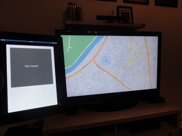
AirMaps

This is a screenshot of a test app I built for the iPhone last year called "AirMaps". Originally, I used an iPad-to-VGA adapter to plug the iPhone into my screen. The app was a simple trackpad that allowed you to manipulate Google Maps on the television. It works well enough with pinch, double-tap, etc, but having to plug in via a cable was always going to be arduous. However, now with the AirPlay mirroring any app with TV-Out functionality will automatically broadcast it's secondary screen to the Apple TV. This is exactly what I've been talking about for the past year.

"Now", you might say, "that all looks rather fancy, but what are the real world implications". In a word, gaming. This feature, unmentioned though it has been, is going to bring iOS gaming to a new level. With this functionality, you can now turn the Apple TV into a games console (and a particular cheap one at that when you consider hardware and software costs).

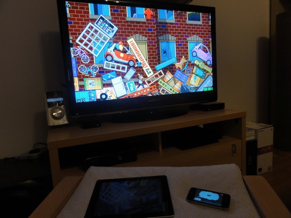
By way of example, I have loaded up "The Incident" on my iPad 2 and iPhone. This game made some headlines a few months ago when it announced it was adding TV-Out in a rather special way. You could plug your iPad into the television with the cable, but then use WiFi on the iPhone to control the iPad app (which in turn was broadcast to the television). This was much better than the previous route but still meant you needed 2 iOS devices and a £50 cable. Now with AirPlay Mirroring on iOS 5, this functionality works out of the box without the need for the cable.

The iPad is connected wirelessly to the AppleTV thanks to AirPlay mirroring, and the iPhone is connected to the iPad over WiFi to enable it to work as a controller. Amazingly (considering it's running at 720p), the whole thing works incredibly quickly and responsively. Obviously, this setup is rather convuluted (as you still need an iPad 2 and an iPhone) but there are other apps that will work with just an iPad 2. For example, you can now present using Keynote wirelessly (the iPad will display your presenter notes whilst the AppleTV shows the slides) but you can also play games like Real Racing 2 HD completely wirelessly using your iPad as a controller. This is truly remarkable stuff and something that I know is going to be huge once iOS 5 comes out in a few months time.

I put together a brief video to demo this a little better but please feel free to get in touch on Twitter or via email if you have any questions.

WWDC 2011 Keynote - Predictions vs Reality

The day before the WWDC 2011 keynote, I posted an article with a number of predictions that I was making along with a promise to do a follow up to see how accurate that was. Having now watched the keynote video and had a chance to play around with iOS 5.0 (on both models of iPad and the iPhone 4), I'm now ready to take a look at what I believe are the most exciting changes coming around the corner.

iOS 5.0

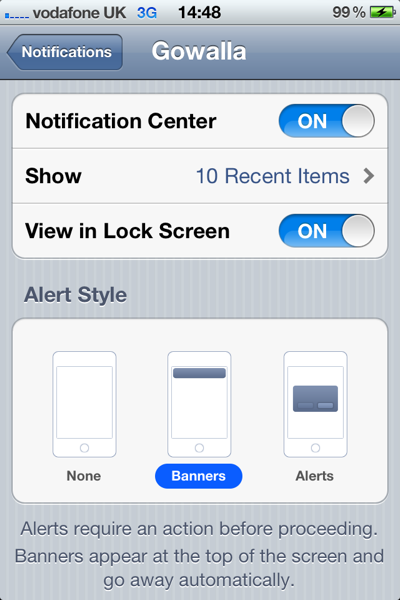
Apple did pretty much as expected by introducing a whole new notifications system. It was not, as I'd hoped, a part of the wasted screen space currently used for search but copied completely from Android by using a swipe-down gesture from the status bar. I'm still not convinced that this is the best place for it (as new users won't know to swipe-down from the top of the screen - there is no indication anything is up there) so we might see it move before iOS 5 gets made public. In terms of how notifications work, it is a similar system to Game Center with a nice Growl-style overlay appearing at the top of the screen - this is tappable to go direct to the app or you can ignore it and look at it in the Notification Center overlay. One thing I will say about notifications is that the customisable options are incredibly good - each app can be customised so you can have notifications show up in the old modal style (I do this for txts), the banner style, or not at all. You can also choose whether they appear in the Notification Center, on the Lock Screen, and how many notifications an app is allowed to display. This was unexpected from me as Apple doesn't usually give you the option to personalise - whilst there is a lot of complexity in what can be done, they have laid it out in the settings in a very clear fashion.

Notification Center Options

Speaking of "View in Lock Screen", this was something else I'd thought might be available. Notifications stack up in the unused space as they come in but the really nice touch is that you can slide a notification (just like the unlock slider) in order to go direct to that app. For example, if you had notifications for txts, emails, and Twitter, you could slide the email notification to go direct to that email. It's a minor thing, but saves a huge amount of time and is more effective than going to the app that last sent you a notification which was the default unlock action.

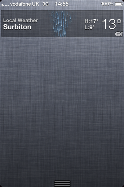
In terms of widgets, there was a lot less than I had anticipated. Whilst there are widgets, there are only two of them and they're hardly exciting; weather and stocks. Thankfully, they can be turned off in the settings if you don't want them. If enabled, they reside at the top of the Notification Center which is as good a place as any but there is no option to put them on either the home screen or the lock screen. I disabled stocks (as I have little interest in them) but I've had weather enabled for the past 2 days. The unique feature they've added is localisation in that it uses the GPS to show you the weather where you are - sure enough, it flips between London and Surbiton depending on if I'm at home or in the office. But what is the point of the feature? I looked out the window earlier to see it was raining - the widget qualified this by also saying it was raining. It would be far more useful to have a widget that shows weather at a specific location (e.g. is it raining in London whilst I'm at home) rather than what the weather is doing at your current location. Also, whilst you can swipe the weather to get a forecast it doesn't remember this setting the next time you look at it (so I'm always having to swipe to see the bit that could be of interest).

Weather Widget, iOS 5

I'm sure we'll see the ability to create widgets at some point, but probably not for the launch of iOS 5. Adding the ability for 3rd party devs to create them (i.e. having a Facebook widget) would be a good move in my opinion and would be even better if they could be added to the lock screen.

Aside from widgets and the notification positions, the rest of my iOS 5 predictions were on the mark. Wireless syncing with iTunes is in complete with delta updates (so you no longer need to download 500MB update every time they update the OS). As a bonus, when syncing with iTunes, you can still use the phone even if you are plugged in via a cable. This makes a huge difference as getting a txt just before you start a half hour import of all your music is very tedious! Game Center saw a number of improvements and the new iCloud functionality allows for the saving of game state as I suggested. No word yet that FaceTime is working on 3G but that may happen before we get to the end of the beta period. Also, Apple quite often add additional functionality before going Gold Master so it's quite plausible that things will move around and we'll see the introduction of improved voice control.

One interesting piece which I hadn't seen coming was the introduction of iMessage. This is basically a silent update to the Messages app so that when you are sending a message to somebody else who has an iOS device, it does it through your internet connection for free rather than via SMS or MMS. This is a genius move (and bound to annoy the people at RIM and the mobile carriers) as it means you can now use an iPod Touch as an iPhone when on WiFi (as you have iMessages and FaceTime). The UI works incredibly well with the colour of the speech bubbles and some minor differences in text to differentiate between a free message and a paid message. It also automatically updates on all of your devices so you have all of your conversations no matter whether you are using an iPad or iPhone. All in all, a very good update.

Lion

As I'd thought, there wasn't a lot to say about Lion although they did spend half an hour going over all of the pieces that had already been demoed in the past. The most interesting announcement was that Lion was going to retail for $29.99 and would only be available via the Mac App Store. This is another bold move from Apple but there are a lot of details left open (which my Twitter feed is full off!) such as "what happens if I want to reinstall from scratch" and "what if I have no internet connection". I'm sure Apple will address these in good time but my gut feeling is that Lion will update the BIOS on your machine in order that you can install from the Mac App Store. At the moment, holding "cmd" allows you to boot from CD, USB, or over WiFi network from another machine so it wouldn't be a stretch for that WiFi support to expand to connect to the Mac App Store to download the OS. Lion also creates a backup partition from which it can restore itself so that would solve many problems.

In my last article I did briefly mention that AirDrop might be expanded to allow wireless file sharing with iOS 5 - as iOS 5 didn't get an updated file system, this didn't materialise but it might be something that appears in later versions (e.g. iOS 5.2). The other speculation I had was that iBooks would make it to the desktop - again, this didn't happen but iTunes has been updated (for Snow Leopard users as well) so that you can now purchase books on the desktop and have them automatically sent to your iOS devices (with support for iOS 4.3 available now as well). This is a good step but I'm sure we'll see iBooks in the Mac App Store soon.

iCloud

This was the one piece that nobody knew much about and was therefore the most anticipated - it certainly didn't disappoint.

Everybody had agreed beforehand that there would be some sort of iTunes-sync system so that you would be able to access your iTunes library everywhere. Unfortunately, I hadn't thought that this would be US only (in that you still can't redownload your purchased music outside of the US). This is most likely due to the legal licenses required and, if past experience is anything to go by, it will most likely be 6-12 months before we see sight of that here in the UK. However, the fact that it's coming is noteworthy in itself and is a good push for the music industry.

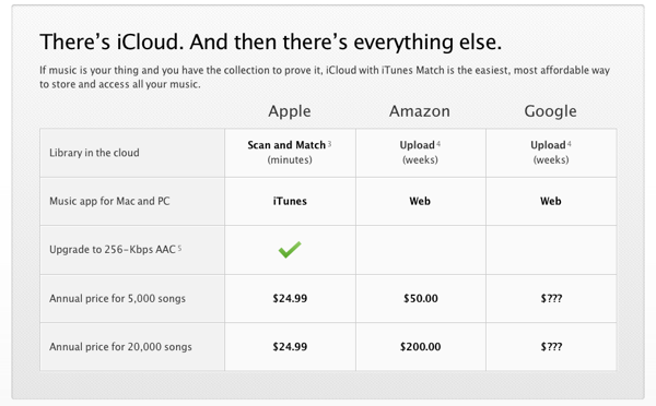
However, iTunes Match was the showstopping announcement. A service whereby your music is scanned, uploaded (if they don't have it already), and then shared to all devices for $24.99 a year... oh, and that includes any MP3s from other locations (e.g. Amazon, Google, Bittorrent). How they managed to make the music industry accept that I'll never know but it is an amazing announcement to make. I particularly like the way they've compared the service with rivals Amazon and Google on the official website:

There's iCloud. And then there's everything else.

There is still no sign of a subscription iTunes deal (i.e. pay $9.99 a month and get free streaming access to all iTunes content) but I'm sure that will be appearing at some point in the next year now that they've made such headway with iTunes Match (which is a much bigger legal minefield).

In terms of the rest of iCloud, it was pretty much as I'd had it on my wish list. Completely free syncing of all your information between all devices along with 3rd party APIs so your apps can sync state as well. The API looks well thought out and very easy to use so I'm sure uptake will be strong from other developers. Making it completely free across the board was also a brilliant move.

One More Thing...

I had speculated that there would be a "one more thing" which would deal with the Apple TV. My dream has been for developers to be able to use the Apple TV as a secondary screen for their apps rather than using a component cable plugged into a HDTV (which works, but isn't a graceful solution). Whilst it wasn't mentioned, the Keynote did have one slide showing "AirPlay Mirroring" which turns out to be a solution just for the iPad 2 allowing you to mirror everything on the screen to your Apple TV. This isn't AirPlay, this is fully baked in mirroring of all apps with no way for developers to disable it (so I can finally watch BBC iPlayer on my Apple TV). It's not without flaws at the moment (quite jerky probably as rendering on two screens - it could turn off the iPad screen really but doesn't) but I'm sure these will be ironed out before launch.

However, the mirroring goes further than that as if you are using an app which supports TV-Out (e.g. Keynote), then turning mirroring on treats the Apple TV as a secondary screen. I'm not sure why they didn't make a big deal out of this future as it is a game changer - you can now play games like "The Incident" on your TV wirelessly from your device and it works incredibly well. I built a little proof-of-concept mapping application which put a trackpad on my iPad and Google Maps on the Apple TV and it works brilliantly - I'll be posting an article about this soon...

Update: I've now posted an article entitled AirPlay Mirroring, TV Out, and the Apple TV as a games console.

Summary

Overall, the WWDC 2011 Keynote was one of the best Keynotes in recent years. Whilst the 30 minute ramble about Lion (which we'd already seen) probably wasn't necessary, the low price-point and Mac App Store only made it interesting. iOS 5 is a massive leap forward with a number of very interesting features (including custom text message tones.. finally!) and iCloud is going to be an incredible revolution once 3rd party apps get updated to use it. As a user, I'm excited by the new software coming out, but I'm even more excited as a developer. There is a huge amount of documentation to go through but what I've seen so far has been nothing short of exceptional. It looks like 2011 is going to be another great year for iOS.

WWDC 2011 Predictions - iOS 5, Lion, and iCloud

I've been watching Apple keynotes with a keen interest for many, many years and I usually make a number of predictions; some correct, some completely off the mark. However, this is the first time I've decided to publish my thoughts prior to a keynote. I don't claim that all of these things will come true -- some of them are just on my wishlist -- but I will come back to this list tomorrow to see how accurate I was.

Update: My follow up article is now available with details of the WWDC Keynote and how my predictions panned out.

 The most crucial thing about the core Apple products -- Macs, iPhones, iPads, and iPods -- is not the hardware. There are cheaper, faster components for personal computers, there are lighter more powerful smartphones, and I dare say we'll see some tablets soon which make the iPads engorged iPod Touch design feel dated. Whilst they are all aesthetically pleasing, the hardware is actually fairly underwhelming (aside from a few innovations such as the Retina Display). What makes Apple products so desirable is the software and it is for that reason that I think WWDC 2011 is going to be one of the most important conferences in recent years. With major updates for iOS and OS X at the same time, Apple has everything to gain if it gets it right, and a lot to lose if it gets it wrong. Throw into the mix a pre-announcement on cloud technology, and we could yet be surprised by what was generally perceived to be a keynote which would lack anything completely unexpected. Apple have released a press announcement and plastered the Moscone Center in posters showing that WWDC 2011 = iOS 5, Mac OS X Lion, and iCloud. For that reason, I'll take a look at each one in turn to give my predictions on what we might see announced tomorrow.

iOS 5.0

Definitely the highlight for me (as an iOS developer), I firmly believe that iOS 5 is going to be the biggest update to iOS since iOS 2.0 added the App Store. Why? Up until this point, iOS has been a leader in both innovation and in user experience. However, the home screens are now feeling dated and Android, Windows Phone 7, and WebOS are now creeping up in terms of features and UI (especially in the area surrounding notifications, widgets, and tiles). So, what will Apple add to iOS 5?

Notifications

The notifications system in the current versions of iOS is pretty shameful when stacked up against the competition. Alerts come in one at a time and overwrite previous alerts (for example, if my app sends 2 pushes, you'll only see the second one. If another app sends a push, you won't even see mine just theirs). The advent of local notifications, push notifications, and badge icons worked well as a stopgap for true multitasking, but the horrible modal UI just doesn't feel right on a phone anymore when consumers are getting more used to seeing unobtrusive notifications. When you start getting issues such as a push notification overlaying the phone panel (so you have to close a push before you can hang up on someone), the system is obviously broken. I expect this will be one of the major tentpoles of iOS 5 and we'll see a notifications system more similar to a cross between Android and Growl. On Android, you can pull down the status bar to see a list of all notifications and every app that has an unread notification is visible in the status bar as a small icon. There are notifications for new emails, tethering, available wi-fi hotspots, and 3rd party apps (e.g. new tweets). However, they are totally unobtrusive.

I don't think this will be copied verbatim as the UI convention doesn't work (how many users know to pull down the status bar?). What I think more likely is that the search dialogue (swipe to the right from the first home screen) will be replaced with search and notifications. At the moment, the keyboard slides up automatically to take up half the screen and the search box takes up about 50px at the top. If the keyboard didn't come up, there would be a large amount of space to list notifications in a similar way to search results (e.g. by app with a badge or other count to show notification titles) with one-touch access to the application in question.

But how do you know when you have notifications? I would guess that there will be an Android-similar status bar icon but that there will also be Growl-style notifications in-app. These are already used for Game Center (ever noticed when you start up a Game Center enabled app that you'll get a dialogue slide in from the top saying "Welcome back, username"?) so it's not a stretch to expect that they would be available, and tappable, for 3rd party notifications.

Home Screens / Widgets

The home screens have been the same on iOS since version 1.0 and are now feeling slightly dated, especially when you consider the number of apps available on the App Store. iOS 4 saw the introduction of folders and 11 screens worth of apps (meaning you can install over 2000 apps) but this still seems a way of adding more rather than making it easy to prioritise. I love the folders system, but there are other players now who are doing this better. Ashamedly, Microsoft are one of them with their tiles system which is integral to both Windows Phone 7 and the recently previewed Windows 8. It is most likely that the home screens will stay as they are but a new dashboard system (or perhaps "Mission Control" to keep in with Lion branding... see later) will be added in order to add one or two screens of your most-used apps. This might come in the form of a gesture, an app, or just being the default landing page after you unlock the phone (with another swipe necessary to take you to all apps) but I think it likely we'll see some changes to how apps can be organised.

This leads me nicely into Widgets which are another thing which has been popular for a while, both in OS X in the form of Dashboard, and on Android phones. On Android, some apps can drop widgets onto the home screen so you can have a space (maybe 4 app icons by 2 app icons in size) that shows you your Facebook updates or a wall clock, etc. The problems are that on Android there are no design conventions so they generally look awful - they also take up far too many system resources (e.g. the Facebook app used up 10% of my battery on average due to the way in which it checked for updates). I would expect Apple to solve both of these problems in a graceful way.

One last word on the home screen - I don't expect them to be gotten rid of or for widgets and apps to coincide (as on Android). The reason for this is that OS X Lion has an app overlay modelled on iOS but maintains its dashboard separately (interestingly with a swipe to the right from the apps page as per my suggestion for notifications). Whilst this could be an interesting tactic by Apple to lull us into a false sense of security (e.g. Lion beta has iOS home screens therefore home screens aren't changing but actually they are *dun dun daaaaaaaa*) I doubt it. I expect the home screen to remain as it is but for there to be a new dashboard screen to replace the first home screen (or some other way of accessing a widget laced dashboard).

Lock Screen

Heavily connected to both of the above, the lock screen needs an overhaul. A system which combines notifications and widgets would be best (so you can see, without unlocking your phone) how many emails, texts, and Twitter mentions you have as well as seeing what the weather is like in your area) but I think it's linked fairly intrinsically to the home screen system. It could be that the "Dashboard" I mention above is in fact the lock screen with home screens being unchanged but I think that would be a mistake - you can't add too much to the lock screen as the whole purpose is for it to have no touch input (incase it is activated by accident). Having a list of your notifications (so you can see if that *bing* was a notification of a baseball game starting or a new email) would be an excellent addition, but loading it up with touchable widgets would not be.

Updates

There are two kinds of updates available to iOS; app updates and system updates. At present, both suck and for pretty much the same reasons. The first major problem is incremental updating. If you want to update your device or an app, you have to download a whole new version of the software (which can be hundreds of megabytes in the case of system software and games) when there may only be a handful of lines of code changed. I don't think that 3rd party apps will get the ability to do incremental updates yet (as I imagine this to be hard to implement and check for Apple and developers) but there is no reason why iOS software can't be updated in this way - OS X has been doing it for years with full combo updates available to download when things go completely wrong. The other issue (for iOS updates at least) is that you need to be tethered to iTunes. This wasn't an issue for iPods as it was generally accepted that you need to be connected to iTunes to add music so doing updates through it is logical. However, iTunes is now a bloated mess, dealing with a multitude of media and updating. It is no longer suitable for updating things like phones and post-PC devices (the iPad). iOS devices need the ability to update themselves without being linked to a computer and iOS 5 is the time to make that happen (in fact it has already been discovered that this is on the cards thanks to an over-zealous copyeditor on iTunes). The update to iOS 5 will be done in the old fashioned way but I expect that updating to iOS 5.1 (or 5.0.1) will be able to be done independently from a PC (and hopefully over a 3G connection if incremental updates are issued).

To learn more about software updates on iOS, check out my post about iOS updates vs Android updates.

Other improvements

There are lots of other areas that could use improving but these are all fairly minor in comparison with the design overhauls above. Maps would do well to be updated as it pales in comparison to Android but this is largely in the hands of Google (see the problem there?) until Apple break away with their own mapping solution. I was hoping that would happen this time around but from the rumours flying around it would seem that we are going to be stuck with Google as the only built-in mapping solution for at least the next year. Game Center is another tool which needs a radical overhaul in order to make it relevant. Adding a gamification layer equivalent to Xbox Live seemed a good idea but Achievements are half-baked (you can't see a total gamerscore as per Xbox Live) and the interface is, well, horrible. Now that there are Universal apps, it would make sense for game progress to be syncable (although I'll come to this in the iCloud section below) as there is nothing more frustrating that having to play a game twice on two separate devices (or on one as if you do a restore on your phone you lose your app data). The file system is something which could do with a tweak as syncing pages documents to iOS devices is quite painful through iTunes - this is something more likely to be solved by iCloud but the actual process of accessing files on the device may well be changed. Finally, there are things like "read it later" which we already know are coming to Safari (I bet Instapaper are happy about that) as well as minor updates to each of the major apps bundled with iOS so that Steve can say "there are over 100 updates" or something similar.

On the whole, the main basis of iOS 5 should be about a fundamental rethink of how apps are accessed and used. Whilst apps and the home screen system were revolutionary, they are now 4 years old and showing their age - it's time for an update which allows for unobtrusive notifications, easy access to app information via widgets, and lightweight updates available everywhere. Getting FaceTime to work on 3G (as promised) would also be a nice touch seeing as Skype has been doing it for months...

Lion

I'm not going to say a huge amount about Lion as I think we've seen the majority of the biggest pieces in the numerous developer previews (which despite NDA have been demoed extensively on YouTube and Apple Rumour sites as well as on the official Apple website). There is obviously a huge UI overhaul with Mission Control and Launchpad as well as bring a number of other innovations from iOS (reverse scrolling, iOS scrollbars, new segmented controls, overhauled calendar interface, etc) but the most exciting things for me are Mail, Auto Save, Versions, and AirDrop.

Mail

The built-in Mail app has been lacking for a little while, especially now that competitors such as Sparrow are taking a lot of the limelight on the Mac App Store. With Lion, Mail is becoming more like the iPad version which for me is one of the nicest email clients around. Apple will claim "conversations" as a big step forward but the truth is that Gmail has been doing it for a very, very long time (10 years or so in fact It was actually 7 years as Gmail started up in 2004 - thanks to @mattydsmith for the correction). However, it is a welcome improvement. I for one haven't got on well with Sparrow (bit too buggy for me at the moment) so I'm looking forward to the new version of Mail just for a few of the most basic improvements like conversations.

Auto Save

Just like iOS apps, Mac apps will now be built to take advantage of "auto save" - basically, whenever you change something, it is saved automatically rather than when you press the floppy disk icon (maybe this is the death of that button at last?). To be fair, this has existed for a long time in the OS itself (e.g. when you are in System Settings, you never save anything apart from when you apply network settings - everything is saved as soon as you change a toggle) and apps have faked it with autosaves (even Office does that) but this is the first time that support is baked into the OS making it a lot more efficient and reliable. A minor feature, maybe, but one that I'm sure will be welcomed by anybody that has lost data due to power failure or human error.

Versions

Related in many ways to Auto Save, Versions is basically Time Machine for files. Every time you alter a file, a backup is stored away somewhere so you can go back in time and get that version you wished you hadn't overwritten by accident. This has happened to be from time to time (especially when I get overzealous with my copy-paste commands and overwrite something I didn't mean to but then do something to break the "undo" button) so this will be another welcome addition. To an extent, I have this already for most of my work material as I have the packrat addition for Dropbox (which means every single file in my Dropbox is versioned automatically) but it will be nice to have the feature when I'm not connected to the internet.

AirDrop

A feature that hasn't been mentioned much in the press is AirDrop, a way for you to share files easily between computers. Basically, with two computers near each other, opening up AirDrop will allow you to share files without any of the usual network hoops such as Bluetooth handshakes or passwords. Whilst this could be done already if you have setup file sharing, the point is that it works out of the box. The reason I'm excited about it is because I expect it to be compatible with iOS 5 so you can very easily share files between your Mac and iPhone / iPad without a) tethering via a cable or b) iTunes. Definitely something to watch out for.

In addition to the above, I would expect there to be a few new headline features announced tomorrow for Lion. iWork is well overdue for an update and I don't think it's a stretch of the imagination to expect iBooks to make its way to the desktop (or at least the iBooks store). Ideally I'd like to see iTunes completely rebuilt as separate apps with the Mac App Store becoming the place for Mac and iOS apps (maybe even Universal apps that run on all devices - e.g. download Twitter and it will work on iPhone, iPad, and Mac with one binary.. no reason it can't be done. I'm not saying iOS apps running on Mac OS X, just that the Mac version could be bundled so for one payment you get all 3 versions). iTunes should be an audio playback utility (and store) only with Quicktime taking over TV Shows and Movies and iBooks managing your ebooks. It astounds me that everything is still controlled from iTunes. Do I expect it to be updated tomorrow? Realistically, no. iTunes updates tend to come with iPod updates in September but I'd still hope that at some point (and Lion would be the best time to do it) that some parts of iTunes could be split out to other apps. This was one thing that iOS does very well (e.g. the iPod app doesn't control everything) so taking this "back to the mac" would make sense.

iCloud

This is the big unknown quantity. What is iCloud? Apple have made the unprecedented move of announcing the name (and the icon) ahead of the announcement although this was most likely to stop people wondering if the iPhone 4S (or iPhone 5) would be announced or not (hint: it won't be). Most bets are on iCloud being a storage locker for music so that you can stream your iTunes library but there are a lot better things that can be done. I've broken them down by type:

Music

Starting with music, it is generally accepted that iCloud is going to be heavily tied to iTunes. Music labels have apparently done deals with Apple so that streaming will be enabled but the real question is on implementation. Consensus appears to be that your iTunes purchases will be available to stream from Apple's servers to your iOS devices and Macs wherever you are. There would be no upload (as they have the master copies) and there is some advantage to this approach in that you don't need to have your iPhone synced with your 20GB library - you can just stream as and when you need it. The downside is a) you need to have purchased from iTunes (fair enough) and b) you need an internet connection. Apple tends to introduce new systems which are essentially crippled at launch and then build them up over time so I'd expect that the above is true and pretty much the extent of the music portion of iCloud. In future, we'll be able to upload our own MP3s to stream and cache things offline, etc, but for now it is most likely to be just previous iTunes purchases (although this is good news for me as I have many iTunes purchases which were lost due to a nonexistent backup strategy and now have to be re-bought as iTunes doesn't allow you to re-download music for free like it does with apps). I expect Apple to also launch a Spotify rival in the form of a monthly subscription to get streaming (and maybe offline caching) of iTunes content but this is more likely to come in September with new iPods and a new version of iTunes than at this announcement. I'll happily be wrong on that issue though as whilst I love Spotify, its library of music is nowhere near as comprehensive as Apple's.

Files

iDisk sucks. I don't know anybody who thinks otherwise. I also don't know anybody who uses a Mac who doesn't use Dropbox. This is a problem for Apple and one it needs to sort out fast. With their fancy new data centre and OS X Lion, there is no reason why they can't rule the online file storage space (especially if they tie it in with Versions and Time Machine along with fancy new routers to do the whole thing without your Mac being on). For this to work, there is one key requirement - uploading must be fast and easy (iDisk seems to take an age) and files need to be accessible everywhere (by which I mean, on iOS). That's pretty much it, nothing revolutionary. The keynote part of this will probably revolve around new Time Capsules and Airport Extremes which allow for your mac to sync incredibly quickly with their internal hard drives and then for the router to sync with the cloud whilst your computer is off. This is better for the environment and uses less resources on the Mac (as Dropbox hogs all memory and CPU cycles if you have a lot of updates to do) but I expect it to be an optional extra - obviously you'll be able to use file sharing on iCloud without an Apple router, it'll just be better if you have one.

Apps

The best thing that iCloud could do would be to open itself up as a 3rd party API. This would allow app developers who don't have access to servers and web technology (which is a lot of them bearing in mind most come from software development backgrounds, not web development like me) to sync their data between their own apps with minimal hassle. A good example of this is Things, a to-do list app by Cultured Code. It's a fantastic app but its main failing is that there is not yet a public way for you to sync content over the internet between iOS apps (e.g. iPad and iPhone) or to the Mac (e.g. iPhone to Mac or Mac to Mac). It can be done with WiFi and they are working on cloud-sync solutions, but with a 3rd party API this would have been done already. Another good example is games like Angry Birds in which you lose your progress if you wipe your iPhone or switch to your iPad (or upgrade from an iPhone 3GS to an iPhone 4). With a 3rd party API, developers could sync game save data to the cloud ready for it be downloaded on all of your devices so you never again lose your high scores. Developers win as their apps become more intuitive and cohesive and consumers win as they now have an ecosystem for their devices which maintains their data without them thinking about it. If anything, I would say that this is the biggest potential area for iCloud and I really hope to see this announced tomorrow.

MobileMe

The final area of iCloud is the takeover of MobileMe. I think it's fairly safe to say that MobileMe won't exist after tomorrow and will be absorbed by iCloud. However, there are updates that need to happen. At £59 a year, it's overpriced for a system which most people only use to sync their address books and calendars. Free email has been around for years (with Gmail having a superior offering), Flickr is better than the photo syncing and Dropbox is better than iDisk - the only thing worth having (aside from contact / iCal sync) is Find My iPhone which was recently made free for new iOS devices anyway. I won't speculate on pricing for iCloud (as we don't know what it is yet) but I'd expect that the syncing aspects will be free for anyone with OS X Lion or iOS devices in future (and just a nominal fee, around the $30 mark, for everyone else). The cost advantage of having syncing between all devices will net Apple more profit (just from apps and devices) than charging for that syncing service.

One More Thing...

There is one other thing that I've been predicting for a while and I'm hopeful we'll see a push in the right direction tomorrow; Apple TV Apps. When I say apps, I don't mean native apps on the Apple TV. That won't work for the simple reason that the Apple TV only comes bundled with a basic remote which provides very little control for things more advanced than the YouTube app that comes bundled (and that's bad enough when it comes to text entry). No, what I mean is that iOS 5 apps on iPhone and iPad should be allowed to use the Apple TV as a secondary screen. APIs exist for this (in a way) with a cable in that an iPad-to-VGA adapter can let you display your apps on a secondary monitor (e.g. using the Keynote app you can display your presentation on a projector and notes on your iPad) and the iPad 2 introduced mirroring mode allowing you to play games at HD resolution on your TV with the component cable. However, I want to be able to play something like Real Racing wirelessly with my iPhone providing the app and acting as a wireless steering wheel, yet transmitting the data to the TV so that the Apple TV can display the game. There are issues to solve with lag (especially in HD gaming) but these could be solved by having an app payload sent over to the TV and cached locally as part of an initial load (kind of like buffering a movie) and then the remote only sending light data packets with control information. As an example, use the Apple Remote app with an Apple TV and you'll find it highly responsive - you can scroll and tap on the iPhone to control the Apple TV and it all works in real time. Just imagine if you could transmit your Keynote presentation wirelessly and then control it in the same way or play Angry Birds on the big screen. Throw in a built-in version of Game Center and suddenly Apple will be up against the entrenched console systems in the living room - you wouldn't even need to change the name AirPlay as the "play" could be about gaming rather than just AV playback. I've been talking about this ever since the iPad was launched but I think now is the time it could become a reality - it's a long shot but we'll see tomorrow!

Summary

In conclusion, tomorrow could be one of the many defining moments in Apple's history. If iOS 5 gets enough of a redesign to keep it fresh when compared to the newcomers, if OS X Lion launches soon with more upgrades than those previewed, and if iCloud introduces true syncing between them, then it will set the tone for Apple for the next 5 years. However, if iCloud is anything like the MobileMe launch (e.g. a shambles), then things will turn out very differently.

I'll be tweeting any major announcements as they happen and I'll chuck up a summary post tomorrow to see how many of my predictions have come true. In the meantime, if you have any opinions, fire me a message on Twitter or drop me an email.
WikiLocation adds support for 36 locales

It's been just over a year since I started WikiLocation, a simple REST-ful API to access geocoded Wikipedia articles. During that time, hundreds of developers have made use of the API in mashups, apps, and commercial products.

Today, I'm happy to announce that I've added locale support to the WikiLocation API. This means that the API now provides access to over 3.8 million geocoded articles across 36 different languages. The following languages are now supported via a simple "locale" parameter which can be added to any API call (full details can be found in the WikiLocation API Documentation):

  • ar - 6,273 articles
  • bg - 17,689 articles
  • ca - 128,364 articles
  • cs - 7 articles
  • da - 23,041 articles
  • de - 335,275 articles
  • en - 1,101,616 articles
  • eo - 45,864 articles
  • es - 141,352 articles
  • fa - 15,519 articles
  • fi - 16,494 articles
  • fr - 248,977 articles
  • he - 1 article
  • hu - 25,830 articles
  • id - 16,634 articles
  • it - 149,882 articles
  • ja - 60,780 articles
  • ko - 7,805 articles
  • lt - 33,280 articles
  • ms - 24,628 articles
  • nl - 446,506 articles
  • no - 42,267 articles
  • pl - 166,734 articles
  • pt - 141,814 articles
  • ro - 23,297 articles
  • ru - 190,546 articles
  • sk - 5,451 articles
  • sl - 9,719 articles
  • sr - 52,093 articles
  • sv - 31,790 articles
  • tr - 9,448 articles
  • uk - 96,889 articles
  • vi - 71,375 articles
  • vo - 94,470 articles
  • war - 91 articles
  • zh - 19,828 articles

In addition to these new articles and language filters, I have also updated the WikiLocation.org website with a new visual design which should make it easier to find critical information. Finally, the API has been relocated to a new dedicated server to provide even faster access for your applications.

If you have any feedback or questions relating to the API, please get in touch.

One year on: further thoughts on the Gowalla API

Today is the one-year anniversary of a letter I put together entitled "Thoughts on the Gowalla API", a very critical look at the ever-changing API provided for the popular location-based service. The article was picked up on TechCrunch and has been mentioned at conferences and events but I also like to think that it prompted a few changes. In this post, I want to revisit some of the points I made and hopefully highlight some of the changes that have come about as well showing where further improvements could be made.

History

When I first put the post together, I was running a service called Gowalla Tools and coming up against constant changes to the API and a very unresponsive developer community. I decided to put the tools and services I was building on indefinite hiatus whilst I waited for some changes to take place. The most important of these was putting in place a process of notifying API developers when changes were going to happen rather than making them and only occasionally sending out a notification a few days later. Fortunately this is now the case and Gowalla have assembled a fantastic team of developers who are constantly available on the Gowalla Developers Google Group. The big changes really started to happen in August 2010 when Gowalla announced that their OAuth 2.0 implementation was now complete and you could now make secure authenticated calls including the ability to check users in at a spot (something which hadn't existed up until that point).

Once OAuth 2.0 was introduced, I started to play around with the API again and launched a new service called Wallabee in September. The first application was entitled "Wallabee: Travel Edition" and allowed users to check-in using over 95% less data than the official app making it a) much faster and b) a lot cheaper when you are travelling overseas. The app was a big success, frequently appearing in the "What's Hot" section of the App Store, and several of the Gowalla employees have used it whilst travelling. Over Christmas I made a number of announcements about future app plans and in March 2011 I, along with a number of contributors, launched The Wallabee Pouch. It was a new player guide, a directory of information, and home to The Item Directory, the largest and most up-to-date repository of Gowalla items. This was all made possible due to an API that no longer changed and the incredibly helpful advice provided by many of the Gowalla Developers. I'd like to personally thank Adam McManus who provided a lot of advice and support whilst I was working on The Item Directory, probably the biggest drain on their API at present.

I went to SXSW in March and was very privileged to meet the Gowalla team and spend some time chatting to their developers. I also listened to some incredibly powerful talks by Josh Williams and Jon Carroll which made me make some fundamental changes to the way I was working with Gowalla - you can read all about that on my SXSW and Gamification post. It eventually led to me handing over Wallabee to another developer so I could focus on some of my own Gowalla apps that were focussed on the story and travelling elements of the service rather than the item and game based sections, but I'll get back to this shortly.

The API

We accept that changes have to happen but these just need to be conveyed to developers in a better way. We propose that any changes be submitted to the Gowalla Developer Group at least 1 week in advance of a change so that we can update our code as necessary. We also suggest that a “version” parameter be added across the API so that legacy scripts can continue to work without changes. In this way, a developer can move to the next API version to take advantage of any new features and data but won’t risk having their hard work undone by what could be a very minor change (e.g. renaming a parameter).

This is probably the biggest area of improvement that the Gowalla API has undergone. This time last year, parameters were changed without consultation and code breakage was a frequent distraction. Now however, many changes are submitted to the Developer Group in advance and opinion is sought on the best ways to improve the API. This was highlighted most recently to me by Rob Mack who sent out an incredibly detailed post about changes they were going to make to the Check-In API. The changes were detailed along with a timeline of when they'd go into effect (3 weeks in future) and a promise that anybody who wouldn't be able to meet the deadline would be able to get an extension if they emailed. This was followed up weekly with reminders of the impending changes. It's this kind of conversation and service that goes beyond what I had originally suggested and makes it such a pleasure to work with the API now. There have been numerous suggestions from the community that have been added to the API in recent months and responses to bugs or questions are incredibly fast. Whilst versioning hasn't come into effect, it hasn't really needed to as any changes have been non-destructive or have had a sensible transition period.

It may also be worth setting up a dedicated Twitter account for API changes as Foursquare has done with @foursquareapi - this would allow you to make quick posts to the community about any changes or downtime.

Whilst posts on the Developer Board have been greatly improved, I still believe that having a Twitter account for broadcasts about downtime or any major changes would be a good idea. I currently subscribe to the full emails of the board and so I can get an email whenever anybody posts something new - sometimes these are API developers asking basic questions yet sometimes they are important posts by the Gowalla devs that could easily get lost in the noise (especially if you have digests on). By having a feed that just posted notices from the Gowalla developers, visibility of changes would be greatly improved.

Cheating

I originally wrote a section about cheaters purely because the option to check-in was not available in the API despite the fact it could be done easily using a JavaScript hack on the mobile site. The main reason for not having it in the API was that it would increase the ease for cheaters to make false check-ins just to collect stamps and items. Whilst the API was eventually updated to allow check-ins, the number of people cheating the system is still very high. A lot of trips are completed by people that haven't been to the spots and increases in check-in radius (which was a sliding scale depending on spot size and is now 5km regardless) have only exacerbated the problem. A lot of Gowalla players report these users to Gowalla via GetSatisfaction or email but there isn't any visibility on action taken. There have, however, been instances where users have been suspended for checking-in too fast, oftentimes incorrectly just on the basis of community feedback. In my letter last year, I said:

With regards to cheating, it should be fairly simple to ascertain if somebody is checking-in illegally as you can measure the time and distance between two spots and see if the speed is over a certain threshold (e.g. if you have checked-in at Austin and London within 2 minutes then there is obviously a problem). An automated system could monitor such things and then suspend an account giving it limited permissions (e.g. no item trading) until a Gowalla developer (or STE member) has a chance to review the account and unlock or ban the user.

I know that this is possible as I decided to build my own system to do exactly this detection in order to stop the vigilante justice that had been seen. However, many of the cheating accounts are private and are therefore unaccessible through the API which means Gowalla needs to tackle this problem themselves. I still believe that an automated system could work and involving the STE members would allow for a certain level of visibility on solving the issue.

These issues are particularly troubling at the moment due to the launch of Gowalla Rewards, the ability to pick up items at certain locations which have some form of real world reward attached to them. This issue has been solved slightly by a policy Gowalla put in place which basically limits how many items you receive based on the number of check-ins you make - whilst a good system, it did essentially pitch those players who like items against those that like the stamps and trips (again read my post on gamification for more details on this) and it wasn't relayed to the community very well at all. There is still a lot of work to be done in this area in my opinion.

Publicising

One of other items I suggested was:

Creating a directory of applications that use the API (such as Foursquare has)

Again, this is something that hasn't happened yet but there have been some very small moves to publicise things that have been made with the Gowalla API. On the post announcing OAuth integration, a couple of projects that used the API were mentioned and on the official Gowalla twitter feed, a couple of web apps have been mentioned (they both did the same thing about 4 months apart, but still). However, making brief reference to 4 apps over the course of a year doesn't really promote all of the cool things that people are making. It also doesn't encourage other developers to get involved as, without promotion by Gowalla, the API feels a little like an afterthought which is a shame given the huge amount of improvement that has been made.

A page highlighting some of the applications made using the API would enable new developers to see a benefit to writing apps for the service - it also enables developers to get their app across to the core audience (as most apps developed are going to be targeting users already on the Gowalla service). I'm hopeful that the Gowalla twitter account will be posting out a few more of the great 3rd party apps that people have made over the coming months.

Documentation

One of the final criticisms I had was in the documentation of the API as it was particularly sparse. Most of the comments on the Developer Boards were about errors being returned that weren't documented anywhere or about nuances in the API calls (e.g. why can't I check-in at the same place twice within an hour?) - However, the documentation has improved dramatically over the last few months with the Gowalla team listening to feedback from developers and patching up the docs or adding new pages as requested. A particularly difficult area was the new PubSubHubbub feature (which should really be publicised more - it's amazing) yet documentation was put up within a few days of a request on the boards.

Summary

Overall, the Gowalla API has improved dramatically in the past year. With a solid foundation and regular updates from developers, there is now very little risk to basing an app on the API as opposed to last year when maintenance was taking longer than development. There are still a few areas which could use improvement, particularly around publicising of 3rd party endeavours and communicating better around misdemeanours, but on the whole I can wholeheartedly recommend the API to any developer interested in location based services. There have been a lot of new API calls created and I get the feeling that there is some very exciting stuff around the corner. I would also recommend looking into the PubSubHubbub functionality as this puts Gowalla way ahead of its competitors by providing real-time notification of check-ins.

Finally, I'd like to thank all the developers at Gowalla who have put so much time and effort into improving the API, particularly Adam Keys, Andrew Dupont, and Rob Mack who have been incredibly responsive on the Developer Boards.

« Older Entries Newer Entries »