Ben Dodson

Freelance iOS, macOS, Apple Watch, and Apple TV Developer

Introducing the Apple TV Shows & Movies Artwork Finder

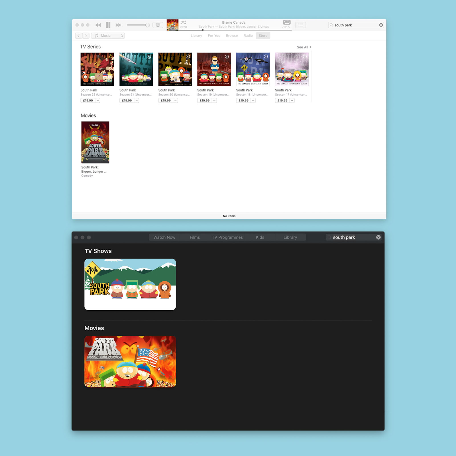
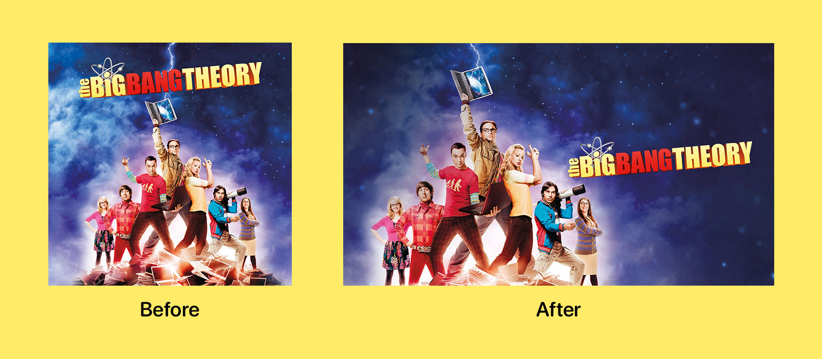
With iOS 12.3, Apple unveiled a new design for the TV app featuring an industry unstandard 16:9 aspect ratio for cover artwork. This new design was used for both TV shows and movies which had been 1:1 squares and 3:2 portraits respectively. Apple doubled down on this design with the preview of macOS Catalina over the summer and the imminent removal of iTunes.

Apple TV and Movie artwork: before and after iOS 12.3 redesign

This new art style is notable for a few reasons. Firstly, it is almost the exact opposite to every other platform that uses portrait style artwork. Secondly, there must have been an insane amount of work done by the graphics department at Apple to get this ready. These aren’t just automated crops but brand new artwork treatments across tens of thousands of films and TV shows (which get this new treatment for each season).

The Big Bang Theory artwork before and after the iOS 12.3 TV update

This update doesn’t extend to every single property on the store but the vast majority of popular titles seem to have been updated. For those that haven’t, Apple typically places the old rectangular artwork into the 16:9 frame with an aspect fit and then uses a blurred version of the artwork in aspect fill to produce a passable thumbnail.

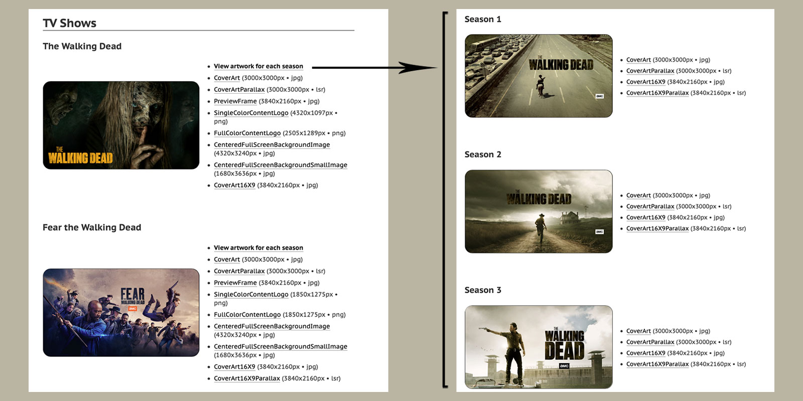
Since this new style debuted, I’ve received a lot of email asking when my iTunes Artwork Finder would be updated to support it. Unfortunately the old iTunes Search API does not provide this new artwork as it relates to the now defunct iTunes and a new API has not been forthcoming. Instead, I had to do some digging around and a bit of reverse engineering in order to bring you the Apple TV Shows & Movies Artwork Finder, a brand new tool designed specifically to fetch these new artwork styles.

The Walking Dead in Ben Dodson's Apple TV Shows Artwork Finder

Jurassic World in Ben Dodson's Apple Movies Artwork Finder

When you perform a search, you’ll receive results for TV shows and movies in the same way as searching within the TV app. For each show or film, you’ll get access to a huge array of artwork including such things as the new 16:9 cover art, the old iTunes style cover art, preview frames, full screen imagery and previews, transparent PNG logos, and even parallax files as used by the Apple TV. Clicking on a TV show will give you similar options for each season of the show.

I’m not going to be open sourcing or detailing exactly how this works at present as the lack of a public API makes it far more likely that Apple would take issue with this tool. However, in broad terms your search is sent to my server1 to generate the necessary URLs and then your own browser makes the requests directly to Apple in order that IP blocking or rate limiting won’t affect the tool for everybody.

As always, this artwork finder is completely free and I do not accept financial donations. If you want to thank me, you can drop me an email, follow me on Twitch, check out some of my iOS apps, or share a link to the finder on your own blog.

Apple TV Shows & Movies Artwork Finder »

  1. I don’t log search terms in any way. I don’t even use basic analytics on my website as it is information I neither need nor want. I only know how many people use these tools due to the overwhelming number of emails I get about them every day! ↩︎

Customising a website for iOS 13 / macOS Mojave Dark Mode

On our The Checked Shirt podcast yesterday, Jason and I were discussing the announcements at WWDC and in particular the new “Dark Mode” in iOS 131. One question Jason asked (as I’m running the iOS 13 beta) is how Safari treats websites; are the colours suddenly inverted?

No. It turns out that just before the release of macOS Mojave last year, the W3C added a draft spec for prefers-color-scheme which is supported by Safari (from v12.1), Chrome (from v76), and Firefox (from v67). Since iOS 13 also includes a dark mode, Mobile Safari now supports this selector as well.

There are three possible values:

  • no-preference (evaluates as false): the default value if the device doesn’t support a mode or if the user hasn’t made a choice
  • light: the user has chosen a light theme
  • dark: the user has chosen a dark theme

In practice, usage is insanely simple. For my own website, my CSS is entirely for the light theme and then I use @media (prefers-color-scheme: dark) to override the relevant pieces for my dark mode like such:

@media (prefers-color-scheme: dark) {
    body {
        color: #fff;
        background: #000;
    }

    a {
        color: #fff;
        border-bottom: 1px solid #fff;
    }

    footer p {
        color: #aaa;
    }

    header h1,
    header h2 {
        color: #fff;
    }

    header h1 a {
        color: #fff;
    }

    nav ul li {
        background: #000;
    }

    .divider {
        border-bottom: 1px solid #ddd;
    }
}

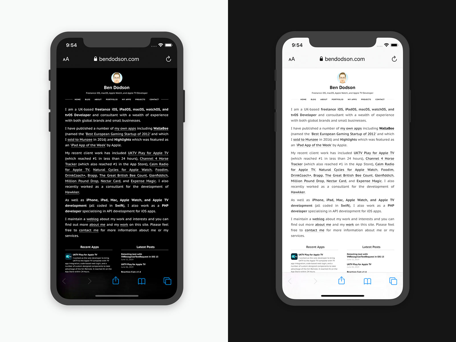
The result is a website that seamlessly matches the theme that the user has selected for their device:

Enabling Dark Mode on a website for iOS 13

A nice touch with this is that the update is instantaneous, at least on iOS 13 and macOS Mojave with Safari; simply change the theme and the CSS will update without the need for a refresh!

I haven’t seen many websites provide an automatic dark mode switcher but I have a feeling it will become far more popular once iOS 13 is released later this year.

  1. Of which I am rightly a hypocrite having complained for years about the never-ending demand for such a mode only to find that I quite like using it… ↩︎

Detecting text with VNRecognizeTextRequest in iOS 13

At WWDC 2017, Apple introduced the Vision framework alongside iOS 11. Vision was designed to help developers classify and identify things such as objects, horizontal planes, barcodes, facial expressions, and text. However, the text detection only recognized where text was displayed, not the actual content of the text1. With the introduction of iOS 13 at WWDC last week, this has thankfully been solved with some updates to the Vision framework adding genuine text recognition.

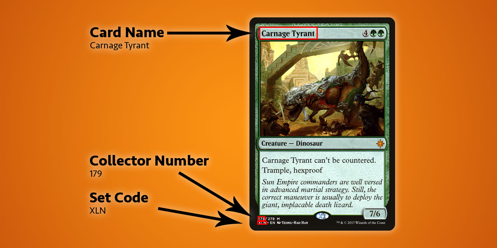
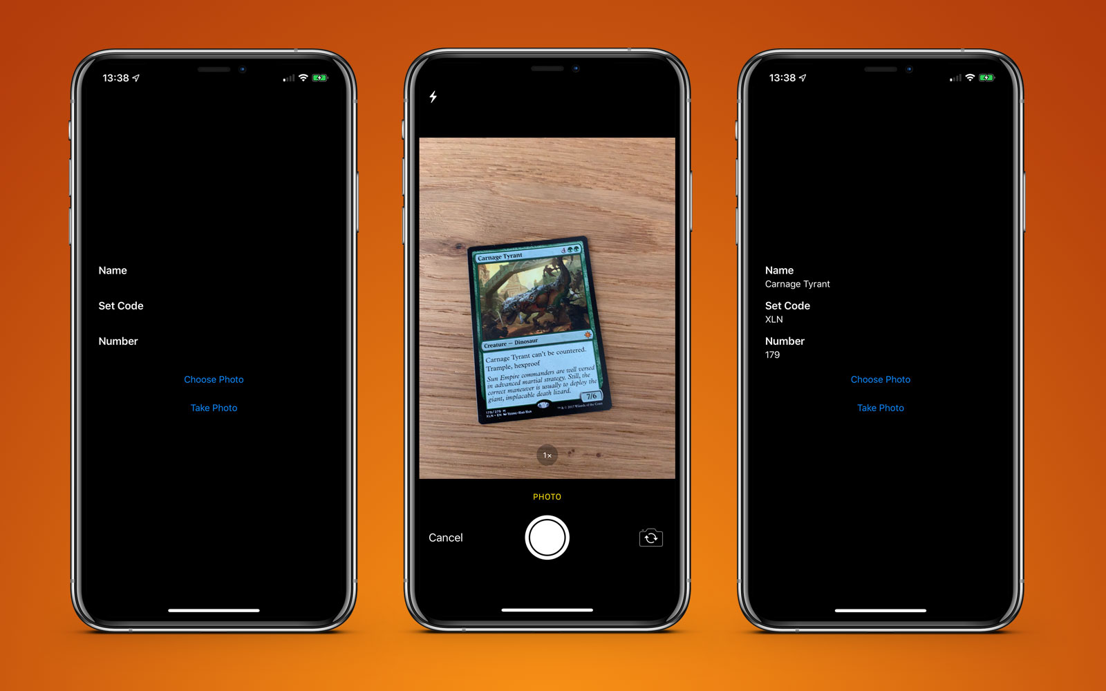
To test this out, I’ve built a very basic app that can recognise a Magic The Gathering card and retrieve some pertinent information from it, namely the title, set code, and collector number. Here’s an example card and the highlighted text I would like to retrieve.

The components of a Magic card to extract with Vision

You may be looking at this and thinking “that text is pretty small” or that there is a lot of other text around that could get in the way. This is not a problem for Vision.

To get started, we need to create a VNRecognizeTextRequest. This is essentially a declaration of what we are hoping to find along with the set up for what language and accuracy we are looking for:

let request = VNRecognizeTextRequest(completionHandler: self.handleDetectedText)
request.recognitionLevel = .accurate
request.recognitionLanguages = ["en_GB"]

We give our request a completion handler (in this case a function that looks like handleDetectedText(request: VNRequest?, error: Error?)) and then set some properties. You can choose between a .fast or .accurate recognition level which should be fairly self-explanatory; as I’m looking at quite small text along the bottom of the card, I’ve opted for higher accuracy although the faster option does seem to be good enough for larger pieces of text. I’ve also locked the request to British English as I know all of my cards match that locale; you can specify multiple languages but be aware that scanning may take slightly longer for each additional language.

There are two other properties which bear mentioning:

  • customWords: you can provide an array of strings that will be used over the built-in lexicon. This is useful if you know you have some unusual words or if you are seeing misreadings. I’m not using it for this project but if I were to build a commercial scanner I would likely include some of the more difficult cards such as Fblthp, the Lost to avoid issues.
  • minimumTextHeight: this is a float that denotes a size, relative to the image height, at which text should no longer be recognized. If I was building this scanner to just get the card name then this would be useful for removing all of the other text that isn’t necessary but I need the smallest pieces so for now I’ve ignored this property. Obviously the speed would increase if you are ignoring smaller text.

Now that we have our request, we need to use it with an image and a request handler like so:

let requests = [textDetectionRequest]
let imageRequestHandler = VNImageRequestHandler(cgImage: cgImage, orientation: .right, options: [:])
DispatchQueue.global(qos: .userInitiated).async {
    do {
        try imageRequestHandler.perform(requests)
    } catch let error {
        print("Error: \(error)")
    }
}

I’m using an image direct from the camera or camera roll which I’ve converted from a UIImage to a CGImage. This is used in the VNImageRequestHandler along with an orientation flag to help the request handler understand what text it should be recognizing. For the purposes of this demo, I’m always using my phone in portrait with cards that are in portrait so naturally I’ve chosen the orientation of .right. Wait, what? It turns out camera orientation on your device is completely separate to the device rotation and is always deemed to be on the left (as it was determined the default for taking photos back in 2009 was to hold your phone in landscape). Of course, times have changed and we mostly shoot photos and video in portrait but the camera is still aligned to the left so we have to counteract this. I could write an entire article about this subject but for now just go with the fact that we are orienting to the right in this scenario!

Once our handler is set up, we open up a user initiated thread and try to perform our requests. You may notice that this is an array of requests and that is because you could try to pull out multiple pieces of data in the same pass (i.e. identifying faces and text from the same image). As long as there aren’t any errors, the callback we created with our request will be called once text is detected:

func handleDetectedText(request: VNRequest?, error: Error?) {
    if let error = error {
        print("ERROR: \(error)")
        return
    }
    guard let results = request?.results, results.count > 0 else {
        print("No text found")
        return
    }

    for result in results {
        if let observation = result as? VNRecognizedTextObservation {
            for text in observation.topCandidates(1) {
                print(text.string)
                print(text.confidence)
                print(observation.boundingBox)
                print("\n")
            }
        }
    }
}

Our handler is given back our request which now has a results property. Each result is a VNRecognizedTextObservation which itself has a number of candidates for us to investigate. You can choose to receive up to 10 candidates for each piece of recognized text and they are sorted in decreasing confidence order. This can be useful if you have some specific terminology that maybe the parser is getting incorrect on the first try but determines correctly later even if it is less confident. For this example, we only want the first result so we loop through observation.topCandidates(1) and extract both the text and a confidence value. Whilst the candidate itself has different text and confidence, the bounding box is the same regardless and is provided by the observation. The bounding box uses a normalized coordinate system with the origin in the bottom-left so you’ll need to convert it if you want it to play nicely with UIKit.

That’s pretty much all there is to it. If I run a photo of a card through this, I’ll get the following result in just under 0.5s on an iPhone XS Max:

Carnage Tyrant
1.0
(0.2654155572255453, 0.6955686092376709, 0.18710780143737793, 0.019915008544921786)


Creature
1.0
(0.26317582130432127, 0.423814058303833, 0.09479101498921716, 0.013565015792846635)


Dinosaur
1.0
(0.3883238156636556, 0.42648010253906254, 0.10021591186523438, 0.014479541778564364)


Carnage Tyrant can't be countered.
1.0
(0.26538230578104655, 0.3742666244506836, 0.4300231456756592, 0.024643898010253906)


Trample, hexproof
0.5
(0.2610074838002523, 0.34864263534545903, 0.23053167661031088, 0.022259855270385653)


Sun Empire commanders are well versed
1.0
(0.2619712670644124, 0.31746063232421873, 0.45549616813659666, 0.022649812698364302)


in advanced martial strategy. Still, the
1.0
(0.2623249689737956, 0.29798884391784664, 0.4314465204874674, 0.021180248260498136)


correct maneuver is usually to deploy the
1.0
(0.2620727062225342, 0.2772137641906738, 0.4592740217844645, 0.02083740234375009)


giant, implacable death lizard.
1.0
(0.2610833962758382, 0.252408218383789, 0.3502468903859457, 0.023736238479614258)


7/6
0.5
(0.6693102518717448, 0.23347826004028316, 0.04697717030843107, 0.018937730789184593)


179/279 M
1.0
(0.24829587936401368, 0.21893787384033203, 0.08339192072550453, 0.011646795272827193)


XLN: EN N YEONG-HAO HAN
0.5
(0.246867307027181, 0.20903720855712893, 0.19095951716105145, 0.012227916717529319)


TN & 0 2017 Wizards of the Coast
1.0
(0.5428387324015299, 0.21133480072021482, 0.19361832936604817, 0.011657810211181618)

That is incredibly good! Every piece of text that has been recognized has been separated into it’s own bounding box and returned as a result with most garnering a 1.0 confidence rating. Even the very small copyright text is mostly correct2. This was all done on a 3024x4032 image weighing in at 3.1MB and it would be even faster if I resized the image first. It is also worth noting that this process is far quicker on the new A12 Bionic chips that have a dedicated Neural Engine; it runs just fine on older hardware but will take seconds rather than milliseconds.

With the text recognized, the last thing to do is to pull out the pieces of information I want. I won’t put all the code here but the key logic is to iterate through each bounding box and determine the location so I can pick out the text in the lower left hand corner and that in the top left hand corner whilst ignoring anything further along to the right. The end result is a scanning app that can pull out exactly the information I need in under a second3.

iOS app to detect Magic The Gathering cards with iOS 13 Vision Framework

This example app is available on GitHub.

  1. This seemed odd to be me at the time and still does now. Sure it was nice to be able to see a bounding box around individual bits of text but then having to pull them out and OCR them yourself was a pain. ↩︎

  2. Although, ironically, the confidence is 1.0 but it put TN instead of ™ and 0 instead of ©. A high confidence does not mean the parser is correct! ↩︎

  3. In reality I only need the set number and set code; these can then be used with an API call to Scryfall to fetch all of the other possible information about this card including game rulings and monetary value. ↩︎

UKTV Play for Apple TV

In January 2019 I started working with a large brand on an exciting new project; bringing UKTV to the Apple TV.

UKTV is a large media company that is most well known for the Dave channel along with Really, Yesterday, Drama, and Home. Whilst they have had apps on iOS, the web, and other TV set top boxes for some time, they were missing a presence on the Apple TV and contracted me as the sole developer to create their tvOS app.

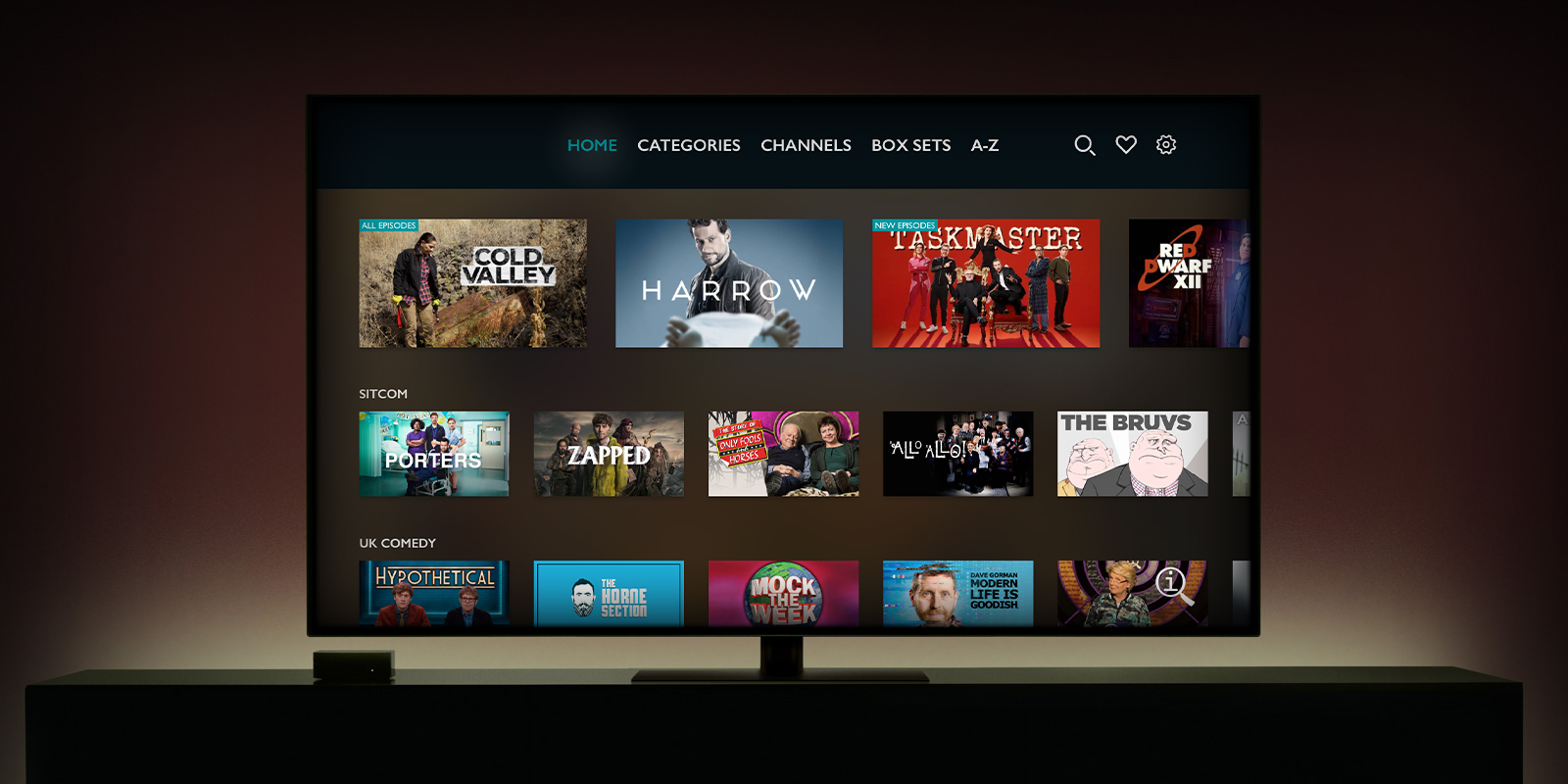
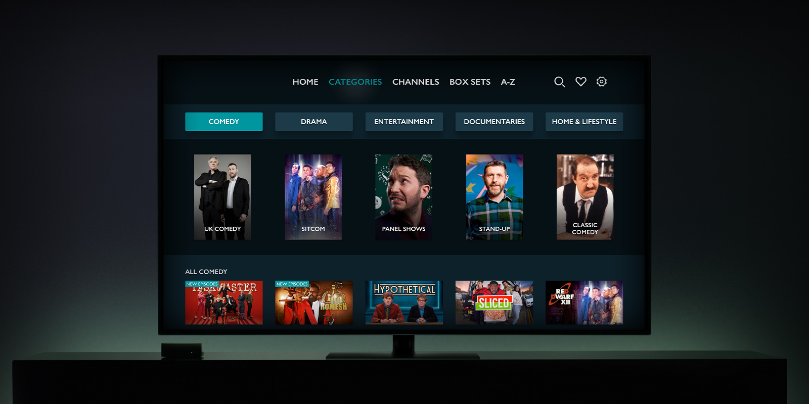
Whilst several apps of this nature have been built with TVML templates, I built the app natively in Swift 5 in order that I could match the provided designs as close as possible and have full control over the trackpad on the Siri Remote. This necessitated building a custom navigation bar1 and several complex focus guides to ensure that logical items are selected as the user scrolls around2. There are also custom components to ensure text can be scrolled perfectly within the settings pages, a code-based login system for easy user authentication, and realtime background blurring of the highlighted series as you scroll around the app.

Aside from the design, there were also complex integrations required in order to get video playback up and running due to the requirements for traditional TV style adverts and the use of FairPlay DRM on all videos as well as a wide-ranging and technical analytics setup. A comprehensive API was provided for fetching data but several calls are required to render each page due to the rich personalisation of recommended shows; this meant I needed to build a robust caching layer and also an intricate network library to ensure that items were loaded in such a way that duplicate recommendations could be cleanly removed. I also added all of the quality of life touches you expect for an Apple TV app such as Top Shelf integration to display personalised content recommendations on the home screen.

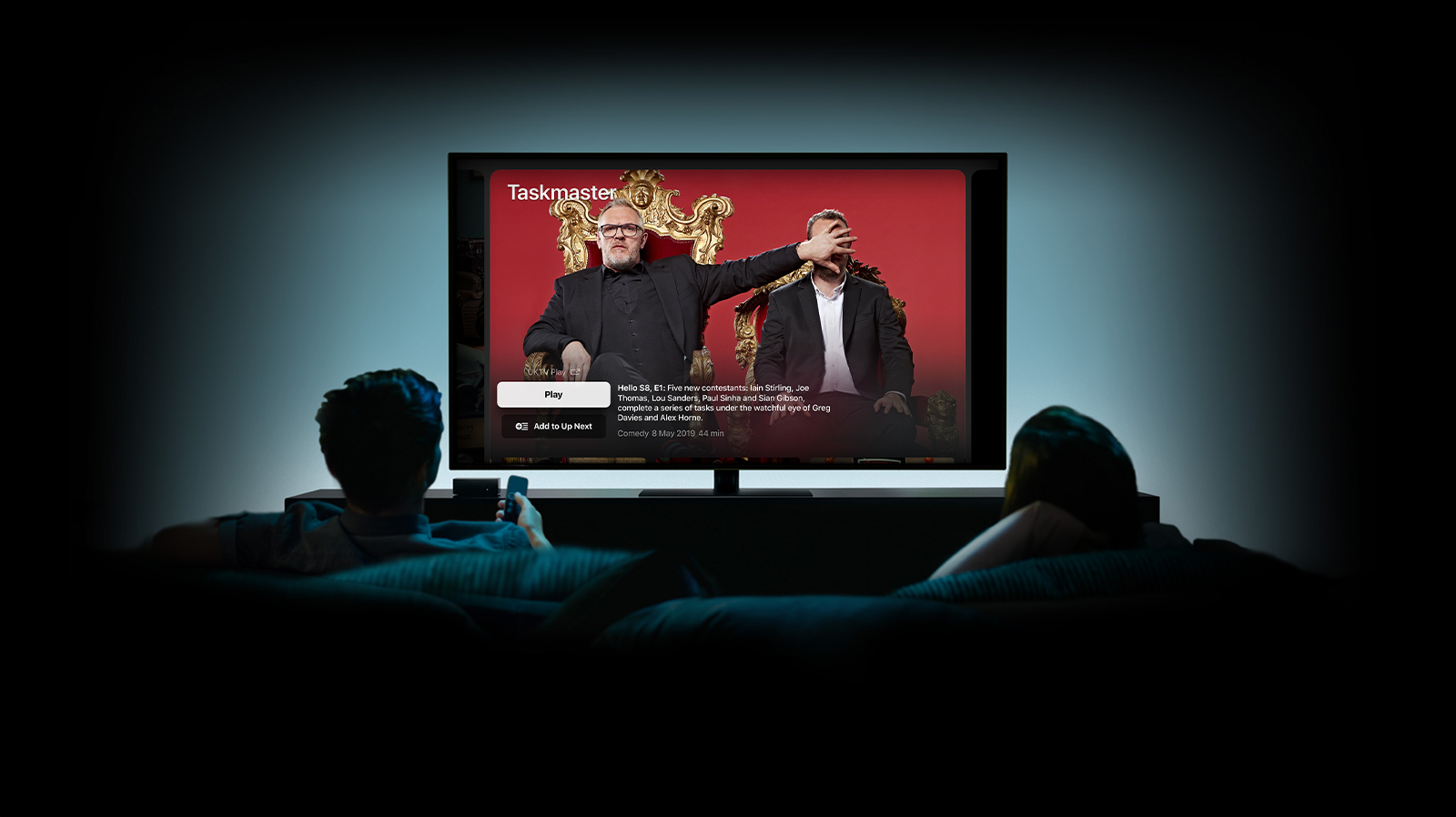
The most exciting aspect for me though was the ability to work on the holy grail of app development; an invitation-only Apple technology. I had always been intrigued as to how some apps (such as BBC iPlayer or ITV Hub) were able to integrate into the TV app and it turns out it is done on an invitation basis much like the first wave of CarPlay compatible apps3. I’m not permitted to go into the details of how it works, but I can say that a lot of effort was required from UKTV to provide their content in a way that could be used by Apple and that the integration I build had to be tested rigorously by Apple prior to submission to the App Store. One of the best moments in the project was when our contact at Apple said “please share my congrats to your tvOS developer; I don’t remember the last time a dev completed TV App integration in just 2 passes”.

UKTV on the TV app

All of this hard work seems to have paid off as the app has reached #1 in the App Store in just over 12 hours4.

I’ve really enjoyed working on this project and I’m looking forward to working with UKTV again in the future. You can download UKTV Play for Apple TV via the App Store and read the official launch press release.

Please note: I did not work on the iOS version of UKTV Play. Whilst iTunes links both apps together, they are entirely separate codebases built by different teams. I was the sole developer on the tvOS version for Apple TV.

I was later asked to rebuild the iPhone and iPad apps as the sole iOS developer and the new modern version of these apps launched in September 2021. I maintain both the iOS and tvOS apps which have both received regular updates throughout 2022.

  1. Replete with a gentle glimmer as each option is focussed on. ↩︎

  2. For example, the default behaviour you get with tvOS is that it will focus on the next item in the direction you are scrolling. If you scroll up and there is nothing above (as maybe the row above has less content) then it may skip a row, or worse, not scroll at all. This means there is a need for invisible guidelines throughout the app which refocus the remote to the destination that is needed. It seems a small thing, but it is the area in which tvOS most differs from other Apple platforms and is a particular pain point for iOS developers not familiar with the remote interaction of the Apple TV platform. ↩︎

  3. CarPlay is now open to all developers building a specific subsection of apps as of iOS 13. ↩︎

  4. Which I believe makes it my fourth app to reach #1. ↩︎

Reaction Cam v1.4

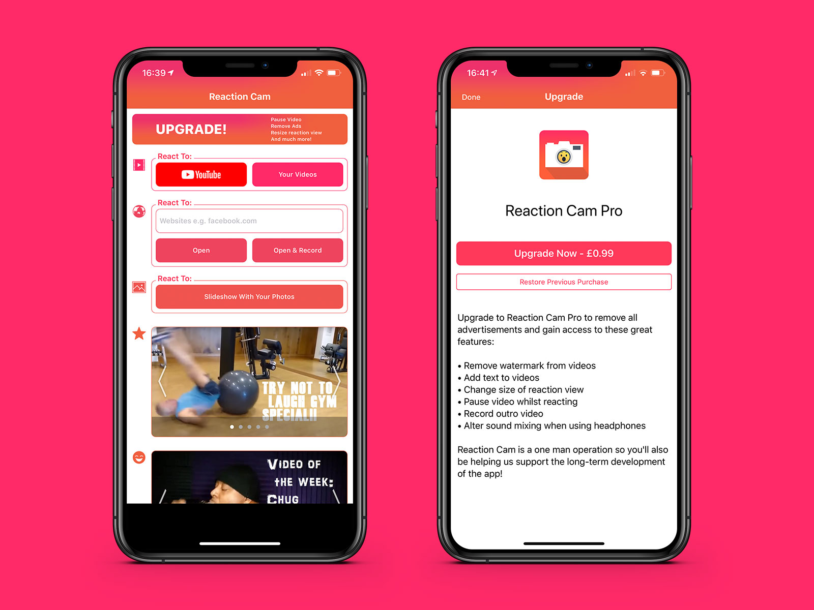
Over the past few weeks I’ve been working on a big update for the Reaction Cam app I built for a client a few years ago. The v1.4 update includes a premium upgrade which unlocks extra features such as pausing video whilst you are reacting, headphone sound balancing, resizing the picture-in-picture reaction, and a whole lot more.

The most interesting problem to solve was the ability to pause videos you are reacting to. Originally, when you reacted to a video the front-facing camera would record your reaction whilst the video played on your screen; it was then a fairly easy task of mixing the videos together (the one you were watching and your reaction) as they both started at the same time and would never be longer than the overall video length. With pausing, this changes for two reasons:

  1. You need to keep track of every pause so you can stop the video and resume it at specific timepoints matched to your reaction recording
  2. As cutting timed sections of a video and putting them into a AVMutableComposition leads to blank spaces where the video is paused, it was necessary to capture freeze frames at the point of pausing that could be displayed

This was certainly a difficult task especially as the freeze frames needed to be pixel perfect with the paused video otherwise you’d get a weird jump. I was able to get it working whilst also building in a number of improvements and integrating in app purchases to make this the biggest update yet.

I’m really pleased with the update and it looks like the large userbase is too with nearly 500 reviews rating it at 4 stars.

If you haven’t checked it out, go and download the free Reaction Cam app from the App Store. You can remove the ads and unlock extra functionality such as the video reaction pausing by upgrading to the premium version for just £0.99/$0.99 - it’s a one-off charge, not a subscription.

Foodim

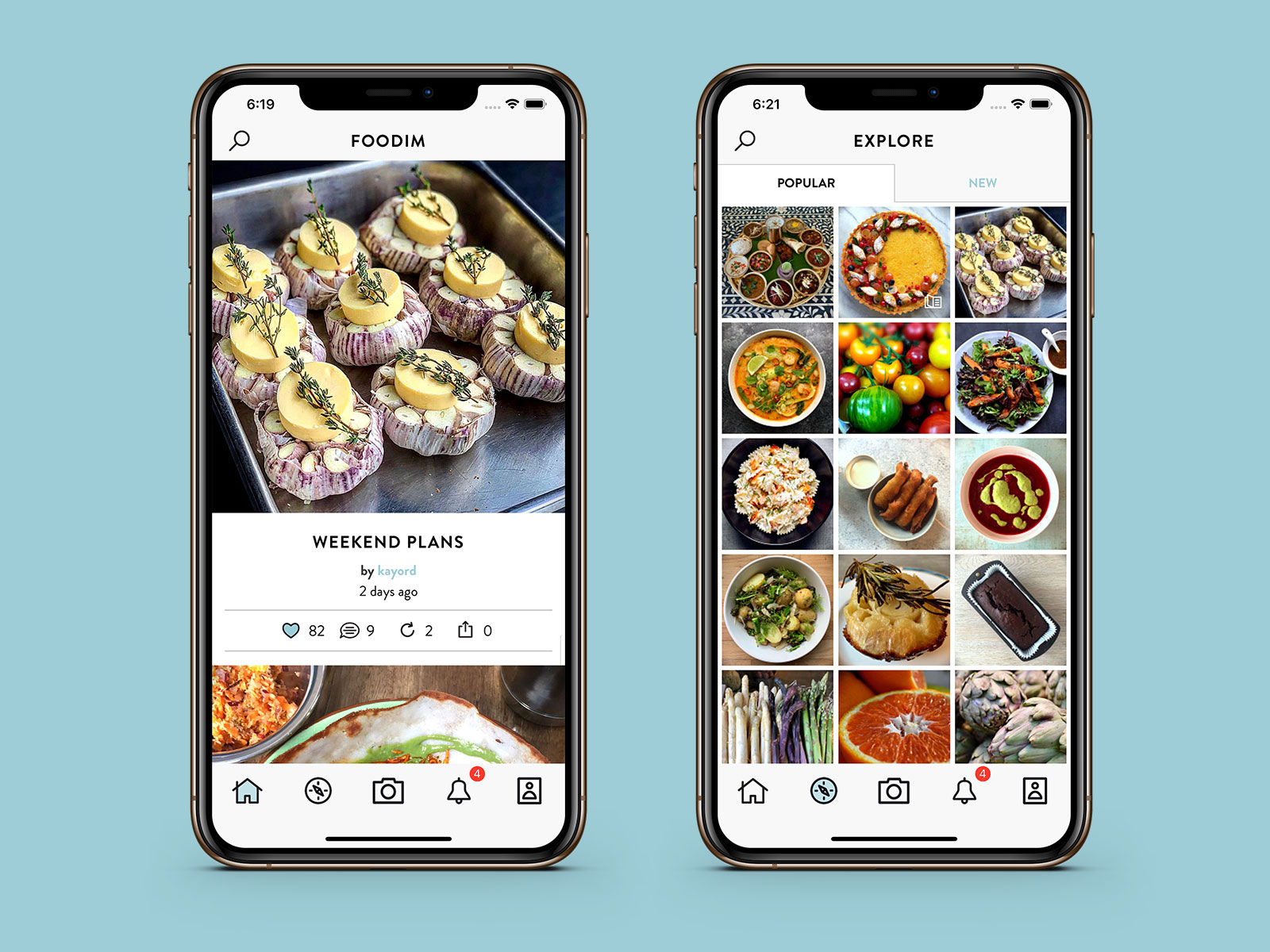
Back in 2014, I was approached by a team representing Nigella Lawson to work on an app centered around food photography. As a big fan of Nigella, I jumped at the chance and spent several months working on the Foodim app. Nearly five years have passed since then but the app is now finally live in the App Store!

It is probably best to let Nigella explain what the app is all about:

It has always been vexing to me that there is no dedicated food photography app, and so many of the filters and so on that are meant to applied on general photography apps do food no favours. So, based on the principle that if something you want doesn’t exist, just go ahead and make it, I’ve been working for some time with my longtime cameraman to develop a food photography app with a built-in filter designed to optimise food and a back-of-shot blur dependent on the angle of the phone (as well as a draw-to-blur feature) to give depth of field.

When I first joined the team, there was a basic app that had been built but it wasn’t anywhere near polished enough for launch. The custom made blur filter was working but the app would crash from memory constraints after you took a few photos. I started by rebuilding the photo memory subsystem and working on the fundamental basics of the networking. For example, I worked with the API developer to develop a patch system that pushed short bursts of data to the app when changes were made ensuring that the local cached copy was always up to date and that there was no loading time when answering push notifications1. I also created a system for the background uploading of images; the image would appear in your feed instantly but the image would update in the background before silently reloading in the feed to use the online copy.

Over time I helped work out UX issues, redesigned various aspects, and helped move some of the camera code over to a newer image processing system including working on the draw-to-blur functionality and improving the gyroscopic tilt mechanic to adapt depth of field. I also used my contacts with Apple Developer Relations to setup a meeting between Apple and Foodim to showcase the app and get their opinion on improvements that could be made.

My work on the app was complete in 2015 but I’ve had the odd bit of correspondence in the mean time as minor issues were resolved. Since then, I believe a new team has been working on some camera improvements and further changes to the app to accommodate newer devices and the changing landscape of iOS development that has occurred since iOS 7 was released. I’ve no idea why it has taken quite so long to launch the app but I’m extremely happy to see it available now in the UK, Australia, and New Zealand.

The app is totally free and can be downloaded from the App Store. You can find out more details about the app over at foodim.com.

And, in case you were wondering, I never did get to meet Nigella in person. I was meant to meet her in London but a printing error at the train station meant I missed my train and had to join the meeting via Skype instead. From that day onward, I never travelled by train without having printed my ticket days in advance…

  1. In most apps of this nature, you’ll get a push notification when a new photo is uploaded; when you tap on the notification, the app is opened but you then need to wait for the post and image to load as they haven’t been prefetched. With this project, a silent push notification was sent that would wake up the app in the background; it would then fetch all of the relevant information and cache it locally before sending a local notification to the user. When that notification was tapped, the post was opened and was ready and waiting for them with no additional downloading required. This is far more common in apps today but was something of a rarity back in the days of iOS 7 when I originally built it! ↩︎

Announcing the Apple Music Artwork Finder

When I launched my iTunes Artwork Finder a few years ago, I had no idea how popular it would become. It is currently used thousands of times per day to help people find high resolution artwork for their albums, apps, books, TV shows, and movies. Since the launch of Apple Music, I’ve had regular emails from users that wanted to access the artwork used for playlists across the service; I’ve finally done something about it!

Today I’m happy to announce the Apple Music Artwork Finder which grabs ultra high resolution artwork of albums, playlists, and radio stations from Apple Music. It’s ridiculously easy to use and just requires you to paste in an Apple Music URL. With that, it can make some requests to the Apple Music API to retrieve the artwork.

Whether you want the artwork for your New Music Mix Playlist, the latest Panic! At the Disco album, or for the Beats1 banner, the artwork finder should be able to get you the highest quality artwork. Oh, and it’s totally free as well!

Try out the Apple Music Artwork Finder »

Hawkker

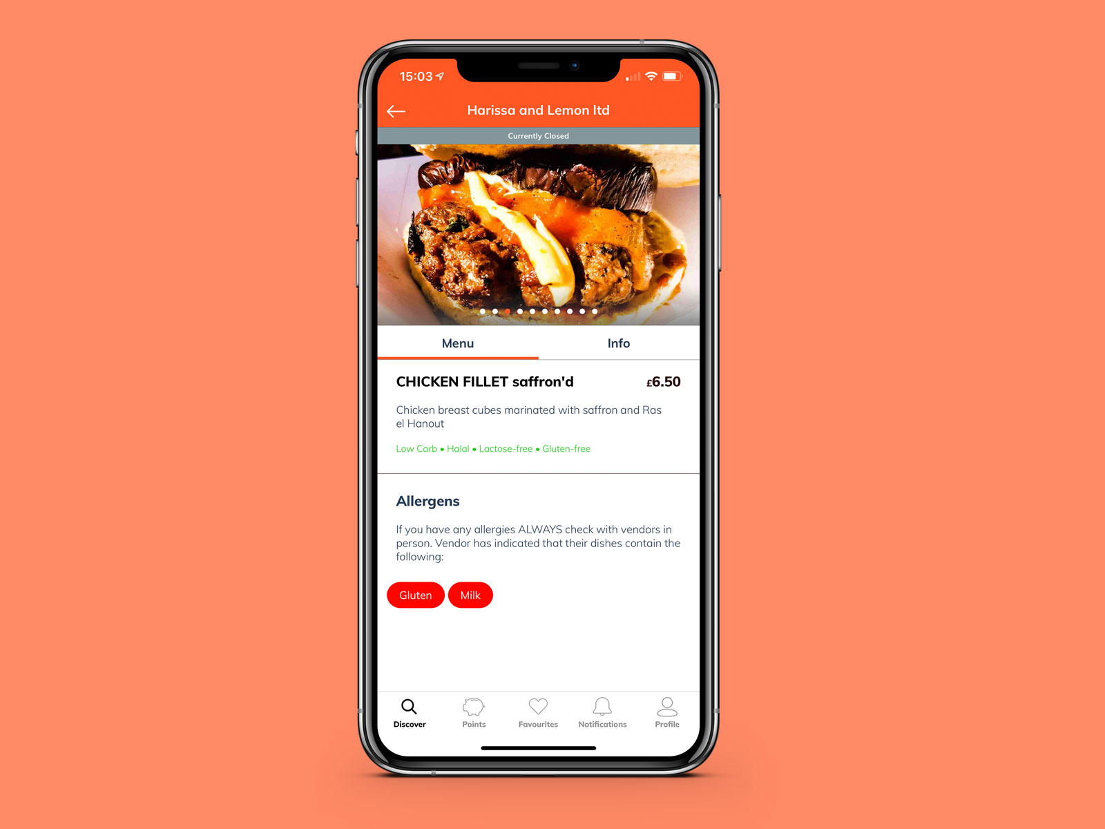
If you’re an entrepreneur that is looking to get an app built by a large digital agency, how do you ensure you are staying on top of the project if you don’t have any knowledge of how app development works? That was the predicament that Zeid Bsaibes had when he came to me in September 2017 with his project Hawkker, an app to find the best independent food from street markets. He had ruled out working with a sole freelancer as the project was too large comprising of two apps, a website, and a complex server infrastructure, but he didn’t feel comfortable outsourcing to a large agency without some form of oversight. To that end, he hired me in a consultancy role to act as a sounding board for functionality whilst also being able to act as a middle-man between himself and the agency he chose, Hedgehog Lab.

The result is two apps, Hawkker and Hawkker Vendor, both now available on the App Store.

To begin with, Zeid and I looked through his copious wireframes and documents to pinpoint any issues, especially with the QR code redemption system he was proposing for Hawkker Points, a rewards scheme that benefits both eaters and vendors. I had extensive experience with QR codes from my work on Chipp’d and was therefore able to alter the designs so that everything would work smoothly in an environment where network connectivity may not be perfect.

From October 2017 until September 2018, I acted as a liason and mediator between Hawkker and Hedgehog Lab as the app was developed. I performed code reviews, inspected contracts, acted as a constant point of contact to discuss functionality and ideas, and helped mediate where necessary. I was able to assist the agency by explaining to Zeid in depth why something may take x amount of time to develop but I was able to assist Zeid by pushing back at the agency when they were providing unrealistic timelines and also use my technical knowledge to speak with their developers directly rather than going through a non-technical account manager. My role can basically be boiled down to being someone able to translate between entrepreneur and technical staff whilst also providing my own suggestions based on my vast experience of app development.

Towards the end of the project, I acted as a QA performing extensive testing and was able to provide code-level bug reports for Hedgehog Lab to work on.

Once the app was completed, I was asked to take over the development of the iOS app and was tasked with cleaning up some of the remaining bugs that had been left unresolved due to lack of time. I rebuilt the vendor detail pages within the eater app to include a fluid animation system and improved the photo gallery to ensure that eaters were getting the very best experience. Now that the app has launched, I am periodically called on to work with the rest of the Hawkker team to resolve issues and improve the apps.

Whilst this is not the sort of work I usually do, it has opened my eyes to the need for some clients to have a consultant alongside them when engaging with large agencies. Had I not been a part of this process, I have no doubt that the apps would have been far poorer and that Zeid would not have had the wide knowledge he now has of how the apps actually function behind the scenes.

It has been a real pleasure working with Zeid and the rest of Hawkker over the past few years. I’d encourage you to check out the free eater app on the App Store or recommend the vendor website to your favourite street food sellers. You can also learn more about the entire platform at hawkker.com.

If you are considering hiring a large agency to deliver your product, I would strongly advise hiring a consultant to sit in on meetings and keep track of the development process. I’d obviously like you to choose me (you can contact me to find out more) but having any technical consultant along with you is going to make the process far easier and help you navigate the sometimes awkward world of agency development.

DrinkCoach Updates

Over the past few weeks I’ve been working on some big updates to the DrinkCoach+ app that I developed for Orbis Media and the HAGA last year:

The big change is a new ‘month-at-a-glance’ screen with a scrollable calendar giving you a great overview of your alcohol intake over time. This is enhanced with a ‘Zero-Alcohol Days’ badge that increases each day to show your current streak. In addition to this, a new summary PDF is available which can be generated from a range of dates (i.e. everything from past week and past month to specific from and to dates); this PDF will show you the total number of units, calories, and cost along with an average units per day count and total number of zero-alcohol days. The PDF can be easily downloaded or shared with your healthcare professional. Finally, a number of UX changes were made to improve the layout of the app, support was added for the most recent Apple devices, and the code was updated to Swift 4.2.

In show business, it is often said that you should never work with children or animals. In software development, the equivalent is that you should never work with date formatting. I certainly found building this calendar system from the ground up a challenge and keeping it performant when the local Realm database is full of data was definitely not easy. That said, I’m incredibly pleased with how the update has turned out and it seems the users of the app are too; to date, the app has received over 1200 reviews on the App Store averaging a 4.8 rating whilst also being featured by publications such as The Observer, The Guardian, and The Huffington Post.

It was really great to work with Orbis Media again and I look forward to working with them again in the future. You can download DrinkCoach+ on the App Store for free and learn more about it at drinkcoach.org.uk.

Building a Twitch Panel Extension

A couple of months ago I started streaming some of the many video games I play on Twitch. For those that aren’t aware, your Twitch profile can be customised with a number of text or image based panels along with a relatively new “extension” panel which is essentially an iframe. I was spending some time adding the type of wine I was drinking on each stream in a text-based panel and decided it would be more efficient to build a simple panel extension to display this information in a more customised format.

Thus the “Currently Drinking” extension was born which allows users to add a name, type, location, price, ABV%, description, notes, and an image about the drink they are currently enjoying. I also added the ability to provide a URL for a website such as vivino.com, distiller.com, or untappd.com which is then screen-scraped to provide the information automatically.

This post isn’t going to be a complete tutorial on how to build an extension as I didn’t expect it would be that complex and so didn’t write down the instructions on how to get everything working as I was going along. Suffice to say, the process was a lot more difficult than I initially anticipated! That said, if you have any specific queries, do feel free to get in touch and I’ll try and help as best I can.

To start with, a panel extension is basically a website comprising of HTML, CSS, and JavaScript. This is all loaded into an iframe with some restrictions and you can choose to make use of the Extension Backend Service (EBS) which is essentially a NodeJS instance that sends notifications via PubSub. It is recommended that you download the developer rig that Twitch provides which allows you to run and test your extension on a localhost such that when you load your profile page from Twitch.tv you can see your extension loaded in. The setup process for the developer rig is fairly arduous, especially on macOS, and I found myself having to run a fair few more npm install commands than I would like that weren’t documented. I also found that there were a number of differences between the locally hosted version of the extension compared to when it was run on a server, most noticably in that the local version allows the external loading of assets which the hosted version does not1.

In terms of coding, as you are essentially just writing HTML there isn’t much to be aware of when writing an extension. A panel is always 300px high and you can set a global height for the panel within the Twitch settings2 and make use of vertical scrolling if you need to show more content. To configure your extension, you supply another HTML file which is loaded whenever the configure button is pressed but again this is just loaded within an iframe.

As I haven’t really used JavaScript since 2009, I decided to forego the EBS in favour of a PHP backend that I could control. Thankfully this is fairly easy as you can get a unique identifier for the channel that is being viewed via the window.Twitch.ext.onAuthorized(auth) callback. With this, I was able to use a simple AJAX POST request to send the data in my config page to my PHP backend along with the ID of the currently authorized channel. When a panel is loaded, an AJAX GET request with the same channel ID is used to load a JSON response of the data stored in my database. Using this PHP system was also more useful as I was able to add my screen-scraping library to rip out details of the drinks I was enjoying from Vivino, Distiller, and Untappd. Whilst my initial version provided a link back to these pages, I found that each URL needed to be whitelisted on the Twitch extension otherwise they wouldn’t work. As I would have liked to let people link to other websites I ultimately decided to drop the ability as it wouldn’t be feasible to maintain a whitelist that would please everyone.

Once the basic panel was built, I was able to test it on Twitch’s own servers by performing an asset upload. With this, you basically zip up your directory containing your HTML, JS, and CSS code and upload it to their servers at which point it will let you use that code as your panel on your live Twitch page. Crucially, this is only seen by you and accounts you whitelist. As I’d set up the developer rig on my laptop and didn’t want to get it all set up again on my Mac Pro, I ended up tweaking some of my extensions by editing the files locally and just uploading them directly in this way to test them - it took slightly longer but that way I knew what I was looking at is how the extension would look to others.

With the extension looking good, it was then time to submit it to Twitch for approval. I’ve been through this sort of process with Apple before hundreds of times so I’m no stranger to a review process but this one was slightly more arduous. To start with, there are a lot of restrictions on what you can and cannot do such as not being allowed to have any JavaScript console logging, you aren’t allowed to load into the DOM directly from AJAX (i.e. loading HTML from a remote location), you can’t obfuscate your code nor use a double-click as an input. Your code is inspected by Twitch as part of the review and so everything has to be provided locally except for the Twitch Extension Helper which must be loaded from a specific location. At first I found the idea of an actual code review to be slightly strange as even Apple doesn’t do this3 but it makes sense given the nature of JavaScript embedded in an iframe.

After a couple of days, the extension was approved and I was then given the option to release it publicly at which point it shows up in the extension directory with screenshots you provide. As this first extension was relatively easy, I decided to produce a number of “wishlist” panel extensions which would initially be for Steam, Humble, and GOG. These worked in much the same way using a PHP backend to send the URL of the users wishlist; my server would then screen-scrape these pages and store the games in my database where the panel extension could request them in order to load the list. As each extension was for a specific store, I used the URL whitelisting feature to whitelist each domain so you could click on the game to go to the relevant store page.

Whilst the extensions were relatively quick and easy to write, the approval process took several weeks as a bug in the process meant they got stuck in limbo for violating one of the rules, namely that “extensions may not transact or encourage the transacting of monetary exchange in relation to any non-Twitch/Amazon commerce instruments”. In essence, an extension could not link to a Steam store page as it is a competitor to Twitch/Amazon. I find this to be slightly silly, especially as a user can happily just write up a list of links in a text-based panel without issue, but those are the rules and the team at Twitch Dev were incredibly helpful at resolving the issue reaching out to me via Twitter DM. I was able to re-submit the three extensions provided that they didn’t link to the external storefronts; this seemed like a reasonable compromise and so I re-submitted and they were approved within several minutes.

The only other thing to mention is the process of updating an extension. I foolishly didn’t test my original “Currently Drinking” extension with the Twitch “dark theme”4 and received a complaint from a user. Updating an extension is thankfully very easy requiring only that you bump up the version number and upload a new zip file. This goes through the review process again but was approved in under an hour for me. As far as I can tell, there is no forward facing “What’s New” notes or a way for a user to see an extension has been updated; it just happens automatically. It would be nicer if there were a way for users to see when an update has occurred and what has changed but I guess that will be something for the future.

Overall the process of creating a Twitch extension was slightly longer than I would have liked but now that everything is set up and I’ve been through it a few times I think it’ll be very easy to add new ones in future. I’m tempted to try my hand at a video overlay extension but haven’t yet found a compelling enough reason to do so. For now though it has been a pleasant diversion from building iOS apps and so far the extensions have been installed by far more users than I expected.

If you’d like to give them a try, you can find some direct links on my Twitch Extensions page. You can also follow me on Twitch if you’d like to see some of my extensions in action!

  1. To be fair, the guidelines do state that you should “include all JavaScript and CSS files in the extension’s uploaded assets” but this is not enforced by the developer rig so I spent a lot of time wondering why jQuery worked locally but not on the Twitch site. ↩︎

  2. The default is 300px but you can choose anything from 300px to 500px. Unfortunately it isn’t possible for an extension to say at runtime how high it wants to be - it is something that is set globally in advance. ↩︎

  3. Aside from the automated checks when compiling in Xcode to ensure you aren’t using private frameworks. ↩︎

  4. It’s a bit of a pain to check if you are in dark mode or not. You need to run the window.Twitch.ext.onContext(context) callback and then check that for the context.theme. I do this and then append or remove a .dark class to my \<body\> to make it a bit simpler to work with. ↩︎

« Older Entries Newer Entries »